Famous Acrylic Paintings – The 10 Best Examples in History
When it comes to popular paintings, most times we assume that it is an “oil-on-canvas”, as the majority of well-known works seem to have been produced in this medium. However, there are actually many famous acrylic painters and acrylic artworks. There are acrylic portraits paintings, acrylic nature paintings, and even artworks produced by famous acrylic pouring artists. Let’s find out more about acrylic artwork by examining the most famous acrylic paintings.
An Exploration of Acrylic Artwork
In art school, many artists come to believe that acrylic paint belongs in kindergarten instead of a professional artist’s workshop. Many people think that experienced artists use oils instead of acrylics and it is often a terrible shame that this generalization has been passed down from one arrogant artist to the next. Acrylic paint has supplied painters with an alternative to hazardous, expensive, slow-drying oil paint ever since its introduction in the middle of the 20th century. Yet, its quality grade was not always great. People used to avoid working with acrylic since they were matte, chalky, and didn’t have a lot of pigment in them when they were initially made, but that has improved.
 Ulysses (1947) by Robert Motherwell; Wmpearl, CC0, via Wikimedia Commons
Over time, it has evolved into an incredibly safe and bright medium for painting. Because acrylic is made of plastic, its quality has improved as polymers have advanced. For instance, owing to the improvements in transparent polymers, acrylic paint today exhibits vivid, rich colors. Despite the medium’s rocky beginnings, famous acrylic painters recognized the paint’s distinct properties and started using it in their canvases on a regular basis. David Hockney was among the first notable painters to pick up acrylic paint, together with Mark Rothko and Helen Frankenthaler. Contemporary painters such as Katherine Bernhardt and Lubaina Himid continue to use the medium. As more people grow to learn more about what they can create with it, they will become more receptive to acrylics as a competent creative medium.
Famous Acrylic Paintings
Acrylic painting is currently one of history’s most well-known art forms. Because of its fast-drying capabilities and the fact that famous acrylic painters learned that they could generally do more with acrylics than with traditional oil paint, this form of paint proved extremely appealing to painters in the middle of the previous century. Acrylic, unlike oil, is formed from pigments contained in a polymer emulsion, giving it a significantly thicker structure and the capacity to set in a shorter amount of time than oil-based paint does.
Despite their differences, acrylic and oil are nearly indistinguishable once set.
Numerous painters started working with acrylics in the early 1950s for these and other considerations, and critics rapidly took note of the spectacular images they were able to produce utilizing this newly created style of painting. A deeper look into some of the most famous acrylic paintings ever produced indicates that these painters swiftly became experts in this medium and created masterpieces that are still regarded among the best works in contemporary art history.
Point of Tranquility (1960) by Morris Louis
| Artist | Morris Louis (1912 – 1962) |
| Date Completed | 1960 |
| Medium | Acrylic on canvas |
| Dimensions (cm) | 258 x 344 |
| Current Location | Hirshhorn Museum and Sculpture Garden Collection, Washington D.C., United States |
Morris Louis was one of the famous acrylic pouring artists. He went so far as to alter the canvas itself, bending and twisting it to influence the flow of the pigment in addition to staining the weaves of his canvas with thinned acrylic paint. By using this invention, he was able to accentuate the fluidity and rich colors of his medium without adding any of his personal touches to the canvas. This acrylic artwork is an illustration from Louis’s Florals series, which was a later development of his Veil works.
Instead of working from a single perspective, Louis innovated technically by turning the canvas as he poured the paint. The bleeding pigment created a jumbled, thicker region at the center of the acrylic layers, which flowed and dried into a shape like a flower. He took another step away from prior Abstract Expressionist methods, which relied on “all-over” compositions, with the centered compositions of the Florals.
Louis’s method here also begs the crucial question of whether or not his audience will be able to perceive the canvas from various angles if it was constructed using a variety of ways as opposed to a single fixed point.
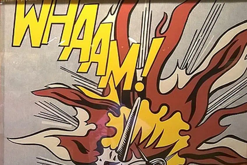
Whaam! (1963) by Roy Lichtenstein
| Artist | Roy Lichtenstein (1923 – 1997) |
| Date Completed | 1963 |
| Medium | Acrylic and Magna |
| Dimensions (cm) | 170 x 400 |
| Current Location | Tate Modern, London, United Kingdom |
The mammoth work has been interpreted as an anti-war declaration, an absurdist comedy, and a biographical contemplation. The original DC Comics regular Men of War cartoon artwork has been recreated using Lichtenstein’s distinctive Ben-Day dots – a 19th-century print method that employs colored dots separated and overlapped to generate images. The picture, which was created in two equal-sized panels, was initially shown by the legendary Pop art curator Leo Castelli in 1963 and was promptly purchased by the Tate. It may now be viewed in the permanent exhibition at the Tate Modern.
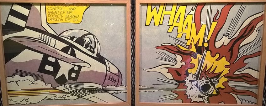 Whaam! (1963) by Roy Lichtenstein; GualdimG, CC BY-SA 4.0, via Wikimedia Commons
In the mid-1960s Lichtenstein and Warhol were the unquestioned masters of Pop art. And if Warhol was influenced by the odd attraction of consumerism, Lichtenstein stayed focused on the contrasts between the sexes. Women in anguish and men using their equipment were two themes Lichtenstein frequently returned to during his career. Halfway through the 1960s, Roy Lichtenstein’s comic-inspired acrylic artwork upended the art world by firing an ambiguous volley at both post-war depictions of battle and the rules of creative expression.
By altering a comic book illustration of a US fighter shooting down an enemy aircraft, Lichtenstein defies viewer expectations.
Liz #3 (Early Colored Liz) (1963) by Andy Warhol
| Artist | Andy Warhol (1928 – 1987) |
| Date Completed | 1963 |
| Medium | Acrylic silkscreen |
| Dimensions (cm) | 101 x 101 |
| Current Location | The Art Institute of Chicago, Chicago, United States |
The acceptance of popular culture by Andy Warhol fundamentally changed the trajectory of late 20th-century art history, changing both what an artwork may or should show and how it can be created. His use of the photo-emulsion silkscreen commercial printing technique to canvas marked his creative breakthrough. This made it possible for him to swiftly and effectively duplicate the same image repeatedly.
Warhol honored both things and people, giving tin cans and Hollywood actors equal weight. Early in 1962, he started utilizing pictures of Elizabeth Taylor. This piece of art is one of a group of 13 paintings that all feature the same portrait of Taylor on a jewel-toned backdrop. Taylor was the subject of a previously published advertising photo that Warhol cropped and then magnified so that she practically filled the frame. Her eyes and lips, which are her defining features, have been emphasized with hues that vacillate between vivid and offensive.
This tacky application of “makeup” is intended to imply fashion and glitz, highlighting Taylor’s star status.
Canyon (1965) by Helen Frankenthaler
| Artist | Helen Frankenthaler (1928 – 2011) |
| Date Completed | 1965 |
| Medium | Acrylic |
| Dimensions (cm) | 111 x 132 |
| Current Location | The Phillips Collection, New York, United States |
Frankenthaler began experimenting with diluted acrylic paintings in 1963, which dry rapidly and do not leave a turpentine residue like thinned oil paint. Acrylic paint was simpler to handle for Frankenthaler, and she could utilize them to create precise boundaries between thickly painted and clear color regions. Her observations resulted in large-scale art that showcased the dynamic interplay of vivid colors. In 1965, Frankenthaler prepared canvases with poured acrylics, using rollers, brushes, sponges, and squeegees to move the paint. In Canyon, scorching reds and oranges flow and pool, while cool blue-greens curve and encircle the core flaming figure. The chromatic saturation of this little cropped image increase and explode further than the picture plane.
Like other paintings, Canyon may conjure a feeling of location, possibly a convergence of her memories from 1965 – a journey following the loss of David Smith, and travels to Croatia and the Greek Islands. Most probably, it shows Frankenthaler’s return to previous compositional concerns, such as a reconnection with larger-scale but similarly colored paintings like Tangerine (1964). A truly beautiful image seems as though it all happened at once, according to Frankenthaler, who outlined her approach. For her, it sometimes takes 10 of those excessively laborious attempts to develop just one truly lovely wrist motion that is coordinated with your brain and heart.
Once you get it, it appears to have been created in a matter of seconds.
A Bigger Splash (1967) by David Hockney
| Artist | David Hockney (1937 – Present) |
| Date Completed | 1967 |
| Medium | Acrylic on canvas |
| Dimensions (cm) | 242 x 243 |
| Current Location | Tate Britain, London, United Kingdom |
Although it is perhaps David Hockney’s most renowned artwork, it was not the only artwork of a swimming pool that he produced. In reality, Hockney liked swimming pools and even utilized pool equipment brochures to get inspiration for several of his paintings. After visiting Los Angeles, Hockney created a number of famous acrylic paintings of swimming pools. He also liked creating acrylic nature paintings, particularly seascapes and flora and wildlife. In the early 1960s, Hockney visited California and fell in love with the brilliant colors and laid-back atmosphere.
His art instantly mirrored his newfound appreciation for the sharp and brilliant Californian sun, seeking new techniques for representing the landscape surrounding him. He also bought a 35mm camera to create source images for his acrylic artworks. The picture displays a kind of modern building that is popular in Los Angeles. Two palm palms cut the beautiful blue sky with child-like joy. The location of the scene is indicated by a director’s chair on the deck. The diving board abruptly cuts into the foreground highlighting the artwork’s startling flatness.
Then the splash crescendos with a blast of froth and motion.
Graded Exposure (1967) by Kenneth Noland
| Artist | Kenneth Noland (1924 – 2010) |
| Date Completed | 1967 |
| Medium | Acrylic on canvas |
| Dimensions (cm) | 225 x 58 |
| Current Location | Private collection |
Noland’s concentric rings were not meant to represent targets, nor did his chevron patterns depict receding distance, and his broad horizontal strips were not true horizons. Each was entirely for the purpose of experimenting with pure color. This austere style also anticipated the rise of Minimalism. With his striped works, Noland explored uncharted terrain in the late 1960s. With this piece, which is approximately 19 feet wide, Noland painted his stripes getting thinner as they got higher up, giving the impression that the picture was fading away.
Furthermore, the coloring’s rainbow-like look alludes to a horizon that stretches beyond the canvas. Yet, this visual impression must not be mistaken for any specific subject matter or setting because Noland insisted that the only elements of his work are color and shape. He stated as much in a 1977 interview “In order to balance the design, the form, and the composition, I intended color to be the artwork’s starting point. Color was supposed to be the driving element in my work”. Josef Albers’ notion of “the interaction of colors”, which explores the interactions between opposing or complementary hues, was used by Noland in his own creations.
Created in opaque, thin layers, each tone shows its unique distinctive weight, thickness, and transparency.
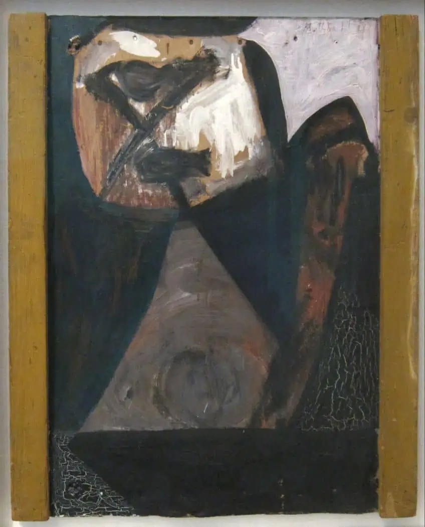
Elegy to the Spanish Republic No. 110 (1971) by Robert Motherwell
| Artist | Robert Motherwell (1915 – 1991) |
| Date Completed | 1971 |
| Medium | Acrylic, charcoal, pencil, and canvas |
| Dimensions (cm) | 208 x 351 |
| Current Location | Museum of Modern Art, New York, United States |
This acrylic piece depicts a regal transition between organic and geometric elements that is both accidental and intentional. Like other Abstract Expressionists, he was drawn to the Surrealist idea of automatism – of techniques used without the artist’s control – and his brushstrokes have an emotional intensity inside a framework that leans toward the severe. In actuality, according to Motherwell, the essence of abstract painting is in the precise arrangements of form and colors, which are “deprived of other things in order to accentuate it, its rhythm, and color structure”.
After the Spanish Civil War, Motherwell intended his more than 100 artworks to function as a death song. Here, he uses a rough black oval as a recurrent pattern that is reproduced in a variety of sizes, compressions, and distortions. These light-absorbent splotches stand out against a background of very even, mostly white vertical rectangles, not as holes opening into a deeper region. They have many connections, but Motherwell himself drew a connection between them and the Spanish bullring’s presentation of the dead bull’s testicles.
The Elegies, according to Motherwell, are his “secret conviction that a horrible death occurred and should not be forgotten”.
Cantus Firmus (1973) by Bridget Riley
| Artist | Bridget Riley (1931 – Present) |
| Date Completed | 1973 |
| Medium | Acrylic on canvas |
| Dimensions (cm) | 241 x 215 |
| Current Location | Tate Museum, London, United Kingdom |
After Riley incorporated color into her works in 1967, she proceeded to broaden her palette to include a spectrum of colors. Riley creates a repetitive pattern of straight lines of varying lengths in turquoise, pink, and lime green set against further lines of white, black, and gray throughout the canvas. This variety in breadth and shade gives the piece a sense of motion that evolves across the piece and a depth that appears to challenge the flat plane of the painting. The title is a musical phrase that refers to a set musical topic that is altered in numerous ways by variations in melody, rhythm, or instrumentation.
Riley’s artwork has a rhythmic impact comparable to music, and the idea of musical variety is repeated in the way Riley’s strong and intentional arrangement of various colors influences what the observer perceives. The black bands instead accentuate the colors and their placements, exhibiting the mutability of colors based on their surroundings. The pink and lime-green stripes adjacent to white or gray induce the eye to blend these hues into the imagination.
Because stripes are an “unassertive shape”, Riley found that employing them didn’t detract the spectator from her investigation of color and light.
The Sources of Country Music (1975) by Thomas Hart Benton
| Artist | Thomas Hart Benton (1889 – 1975) |
| Date Completed | 1975 |
| Medium | Acrylic on canvas |
| Dimensions (cm) | 50 x 75 |
| Current Location | The Country Music Hall of Fame and Museum, Nashville, United States |
Benton’s thematic emphasis on depictions of regular people and folklore may have been his greatest contribution to 20th-century American painting. The accentuated curvilinear lines and forms in his emotive naturalism stand out, as does the aggressive use of essential colors. Benton was persuaded to come out of retirement in 1973 at the age of 84 to produce a fresco for the Country Music Hall of Fame and Museum in Nashville; this painting would be his final piece of work. In this work of art, Benton honors American customs, particularly folk music. Benton was a self-taught musician.
A barn dance, ladies singing church songs, an African American plucking the banjo, and a white woman belting Appalachian ballads on a dulcimer are just a few of the scenarios presented. Benton’s most recent work is stylistically and conceptually similar to his Regionalist paintings from the 1930s when he was regarded as America’s most admired artist. Given the stylistic advances of some of his past students, such as Pollock, and the several creative trends that followed, Benton stayed unchanging and hence away from the progressive art world.
Benton’s art represents a populist, conservative vision of depicting American life.
Riding with Death (1988) by Jean-Michel Basquiat
| Artist | Jean-Michel Basquiat (1960 – 1988) |
| Date Completed | 1988 |
| Medium | Acrylic |
| Dimensions (cm) | 249 x 289 |
| Current Location | Private collection |
This artwork has a brown backdrop that looks to have been rushed, with little concern for smoothing out the stroke lines that remain. This blandness may be reminiscent of some of Joan Miro’s backdrops. They both employ darkness and an absence of detail to enable the next layer of material to take center stage, and Basquiat uses the same technique in this famous acrylic artwork In the latter, he depicts a frenzied brown person astride a skeleton, both loosely shaped in his signature Neo-Expressionist manner. It is instantly obvious that it is a play on race, but we must go further into both the piece and his career to fully get what the artist is saying.
There are several intriguing details to analyze if we examine this artwork. The skeleton’s head is turned toward the observer, and its eyes are blocked out in an infinity pattern. The figure on top is depicted side-on, although its arms are just briefly addressed. Because the main torso is adequately filled up, this might imply movement. The face is likewise left in an abstract state, with multiple outlines overlapping each other and no precise features added. This painting’s aesthetic is undoubtedly associated with primitive or naïve art styles. Basquiat links to his Afro-Caribbean heritage while also drawing inspiration from European art. It is an excellent illustration of his technique in this respect.
From acrylic portrait paintings such as Liz #3 (Early Colored Liz) to the experimental works of famous acrylic pouring artists such as Morris Louis, that concludes our list of famous acrylic paintings. These famous acrylic artists all created masterpieces with a type of paint that most people regard as an inferior medium and hard to work with. Yet, as we can see from this list, there are plenty of famous acrylic paintings all around us that are highly admired.
Take a look at our acrylic paintings webstory here!
Frequently Asked Questions
Why Do Some People Dislike Acrylic Paint?
There has for many years been the idea that acrylic paint is somehow inferior to oil paint. Some artists would even go so far as to say that it’s a type of painting better left for children. Yet, modern acrylic production methods ensure that acrylic paint is presently easy to use and can produce vivid colors.
Why Do Some Artists Prefer to Work With Acrylic Paint?
For artists who like to paint quickly, it is definitely the preferred choice. It dries really quickly and can be applied to most surfaces. It is also considerably less toxic than other paints.

Nicolene Burger, a South African multimedia artist and creative consultant, specializes in oil painting and performance art. She earned her BA in Visual Arts from Stellenbosch University in 2017. Nicolene’s artistic journey includes exhibitions in South Korea, participation in the 2019 ICA Live Art Workshop, and solo exhibitions. She is currently pursuing a practice-based master’s degree in theater and performance. Nicolene focuses on fostering sustainable creative practices and offers coaching sessions for fellow artists, emphasizing the profound communicative power of art for healing and connection. Nicolene writes blog posts on art history for artfilemagazine with a focus on famous artists and contemporary art.
Learn more about Nicolene Burger and about us.
Cite this Article
Nicolene, Burger, “Famous Acrylic Paintings – The 10 Best Examples in History.” artfilemagazine – Your Online Art Source. October 10, 2023. URL: https://artfilemagazine.com/famous-acrylic-paintings/
Burger, N. (2023, 10 October). Famous Acrylic Paintings – The 10 Best Examples in History. artfilemagazine – Your Online Art Source. https://artfilemagazine.com/famous-acrylic-paintings/
Burger, Nicolene. “Famous Acrylic Paintings – The 10 Best Examples in History.” artfilemagazine – Your Online Art Source, October 10, 2023. https://artfilemagazine.com/famous-acrylic-paintings/.