Contrast in Art – Creating Emphasis Through Opposing Elements
What is contrast in art and how do artists apply contrast in artworks? According to the contrast art definition, it is a principle of art that is applied to create variation in a work, drawing the viewer’s eye around the piece through the application of opposing elements. If you would like to gain a better understanding of contrast in art, then read further as we explore the use of contrast in artwork and check out a few contrast painting examples.
What Is Contrast in Art?
The proper application of contrast in art results in artworks that engage an audience’s attention by guiding the eye to specific elements or sections within an artwork. By adding an element of contrast, paintings look more aesthetically balanced and intriguing.
Contrast in art is achieved by adding something that juxtaposes with the rest of the piece and creates a sense of variety, novelty, and individuality.
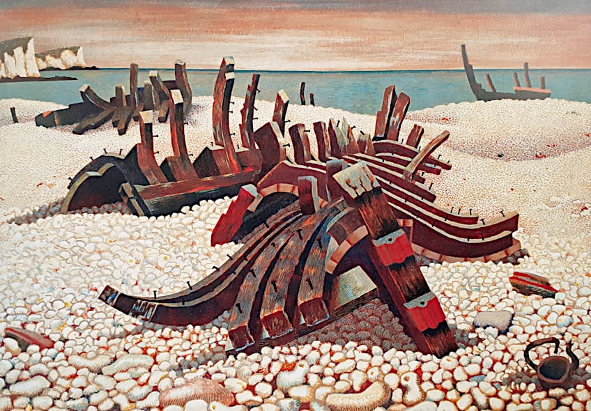 Requiescat (Let Him Rest) by Edward Wadsworth (1940); Edward Wadsworth (1889-1949), Public domain, via Wikimedia Commons
Ways of Creating Contrast in Artwork
Based on the contrast art definition, we can intensify the various elements in artwork by juxtaposing them to create a sense of variation. This can be achieved by using contrasting light and shadows, complementary colors, and variations in texture and size. Let us examine each way in which you can add contrast to your artwork in more detail.
Color Contrast in Art
Using contrasting colors is a great way to make your artwork pop out. The most common type of color contrast that artists use is called hue contrast, which is placing two opposing colors next to each other such as green and red. There are a few more types of color contrast that you can use though, such as saturation contrast and value contrast.
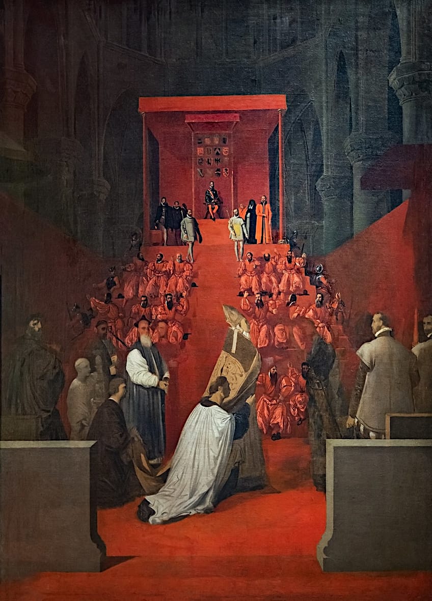 The Duke of Alba at Sainte-Gudule in Brussels by Jean Auguste Dominique Ingres (c. 1815); Jean Auguste Dominique Ingres, Public domain, via Wikimedia Commons
Hue Color Contrast in Art
One of the most effective ways to create contrast in art is to use opposing colors. These are the colors that sit directly opposite each other on the color wheel, such as red and green. Even though they are opposites, they are also referred to as complementary colors as they are both enhanced when placed next to each other.
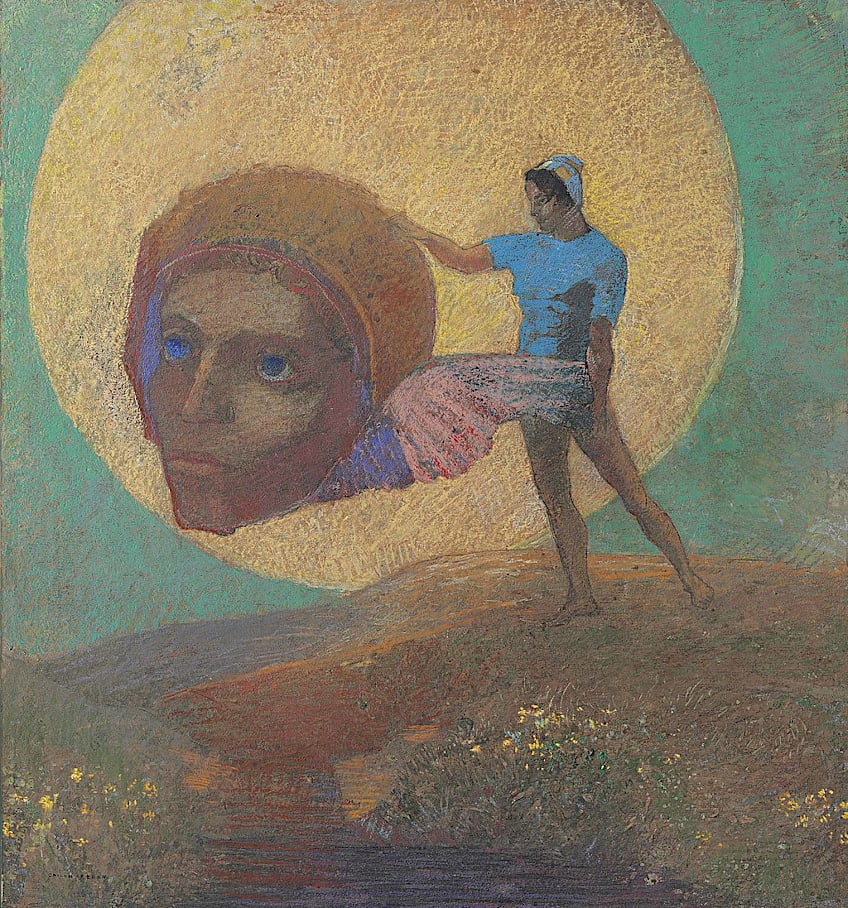 Figure Bearing a Winged Head or The Fall of Icarus by Odilon Redon (1876); Painting by Odilon Redon, Public domain, via Wikimedia Commons
Vincent van Gogh was renowned for his distinctive application of contrasting hues.
Value Color Contrast in Art
Not only can colors be contrasted in their hue, but they can also contrast in value. The value of a color is determined by how light or dark it is. This is used by artists to make an artwork look more realistic and three-dimensional. For example, a round object that is usually one color, like an apple, can be made to look more realistic by using different values of red.
By using a range of color values, an artist can emphasize visual elements by juxtaposing very light areas with dark colors.
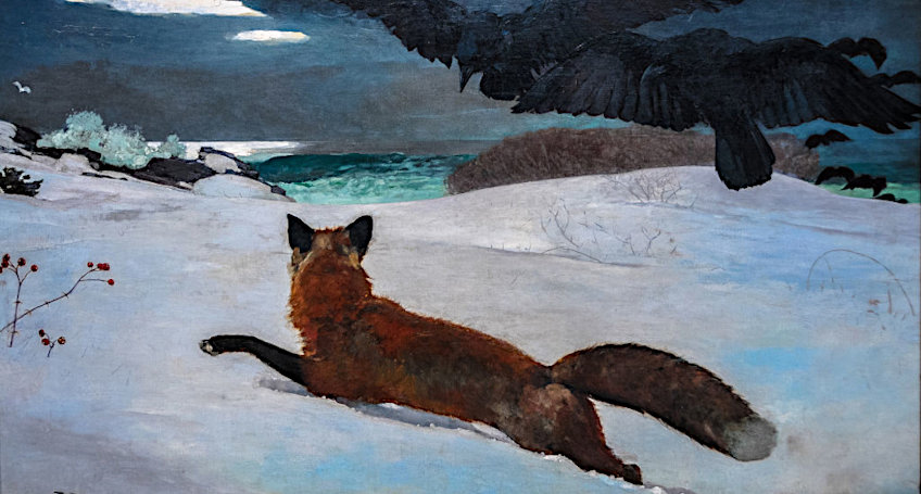 Fox Hunt by Winslow Homer (1893); Winslow Homer, Public domain, via Wikimedia Commons
Saturation Color Contrast in Art
Colors can also contrast in their level of purity or intensity. The same color can be both muted and vibrant, subdued and bold. You can therefore use the same color next to each other effectively by applying different levels of saturation.
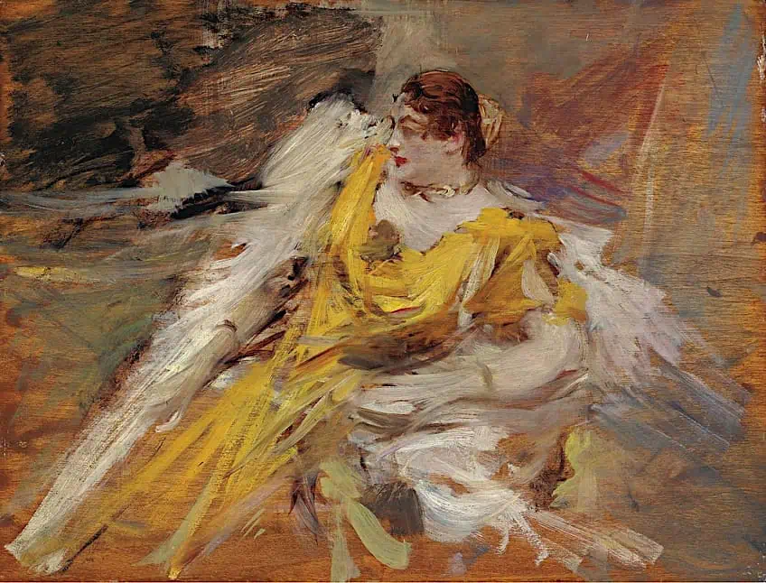 Lady in Yellow by Giovanni Boldini (1912); Giovanni Boldini, Public domain, via Wikimedia Commons
Colors that are richly saturated will stimulate and charge the image, while muted colors will make a certain part look more introspective and calming. A highly saturated color will contrast strongly against a backdrop of desaturated colors, immediately drawing the eye and establishing emphasis.
Texture Contrast in Art
Another way to add interest and depth to an artwork is by using contrasting textures. You can use contrasting textures like smooth areas and rough areas to add depth to an artwork. This can be achieved by rendering the background in a landscape in fine smooth strokes and the foreground elements in more broad and rough strokes, or vice-versa.
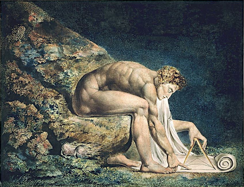 Newton by William Blake (c. 1804-5); William Blake, Public domain, via Wikimedia Commons
You can create a contrast in texture in mixed-media artwork by placing smooth patches next to rough patches of fabric. Or you can create the perception of opposing textures in contrast paintings by varying the brushstrokes for different sections.
These opposing textures can help artworks feel more alive and they generate a sense of movement as the eyes move from one texture to another.
Shape Contrast in Art
You can make your artwork appear more balanced by using contrasting shapes, such as opposing geometric shapes with organic shapes, long and short shapes, and so on.
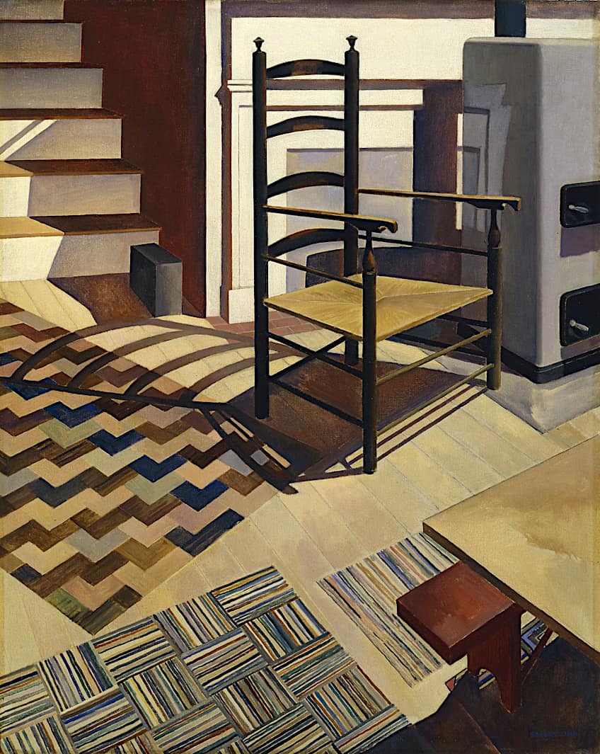 Home Sweet Home by Charles Sheeler (1931); Charles Sheeler, Public domain, via Wikimedia Commons
An artist can generate excitement and tension in a painting by utilizing shapes that are in opposition to one another, such as diagonal lines and curving shapes.
An example of this in a landscape painting would be the rigid lines of a farmhouse in the foreground against the organic shapes of the trees, clouds, or mountains in the background. You could also create a sense of space and distance by placing detailed shapes in the foreground of your painting and simpler, less-defined shapes in the background.
Edge Contrast in Art
You may also notice that certain elements of a painting have hard edges and others have softer edges, and by adding contrast to the two you can add emphasis to certain aspects, making them stand out. A portrait, for example, might make use of defined and hard edges for the main subject and softer edges for elements in the background.
It is essential to try to get a balance of both hard and soft edges to effectively add contrast to your work. Too much application of hard edges can make a work look almost cartoonish, whereas a painting with only soft edges will look undefined and hazy.
When a good balance is reached between a contrast in the edges of the foreground subject and background, the picture gains another dimension of depth.
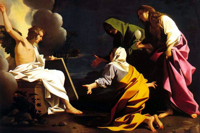
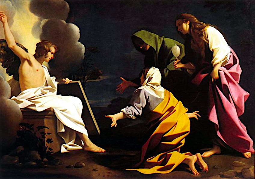 The Three Marys at the Tomb by Bartolomeo Schedoni (1613); Bartolomeo Schedoni, Public domain, via Wikimedia Commons
Detail Contrast in Art
Another great way to add interest and definition to your work is by contrasting the amount of detail in the various elements of a painting. If every part of the work is equally detailed, it can appear flat, as the eye is used to perceiving background elements in less detail in real life.
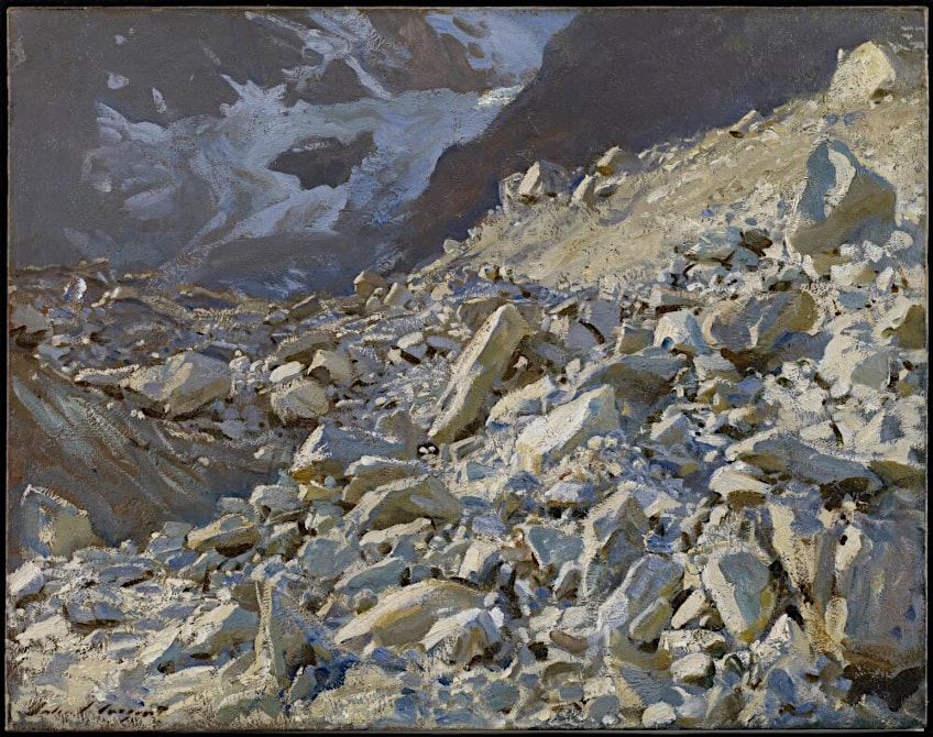 The Moraine by John Singer Sargent (1908); John Singer Sargent, Public domain, via Wikimedia Commons
By rendering certain elements in greater detail, artists are able to steer the attention of the audience toward specific areas within a composition.
As with the effective application of edge contrast, detail contrast can make objects appear closer or further to the viewer, adding to the sense of depth. Objects in motion are also less clearly defined, and by rendering certain objects in less detail, they can appear to be in motion.
Scale Contrast in Art
Differences in the scale of elements relative to one another can also create contrast. As artist can emphasize a focal point by either making it noticeably or disproportionately larger or smaller than other visual elements. This disruption of proportion can signal that within the composition, this element is highly significant, and deserves the viewer’s special attention.
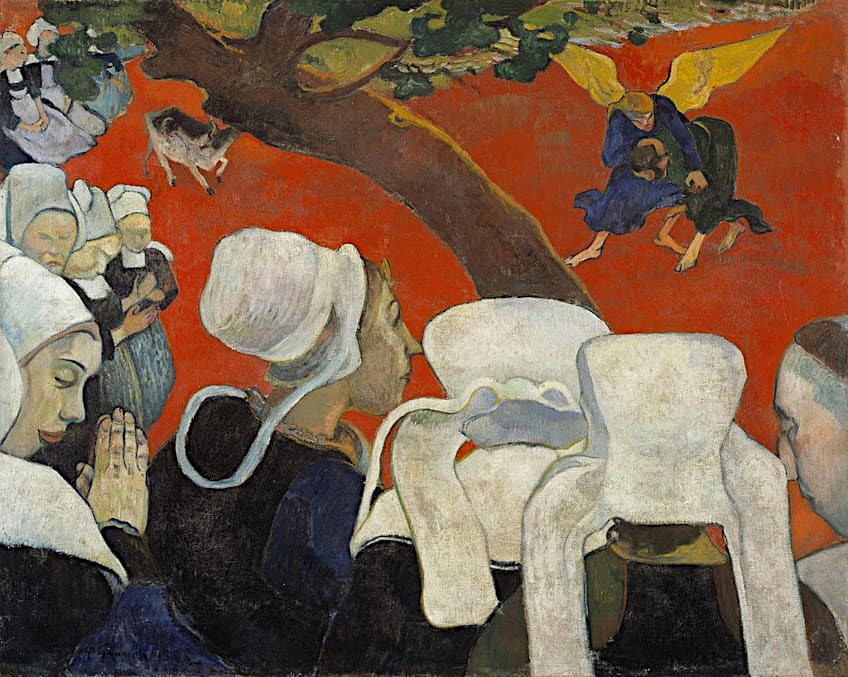 Vision after the Sermon by Paul Gauguin (1888); Paul Gauguin, Public domain, via Wikimedia Commons
Contrast in Art Techniques
There are also several techniques that artists regularly employ to create contrast in art. These techniques include chiaroscuro and tenebrism. Both of these techniques rely on the contrast of light and dark.
Chiaroscuro
Artists utilize extreme contrasts between dark and light tones to create a feeling of depth and dimension using the chiaroscuro technique. The approach is lighting some parts with intense light while leaving others in darkness. This adds drama and atmosphere to the artwork and can be used to produce a three-dimensional illusion in which the elements in the composition seem to burst out of the canvas.
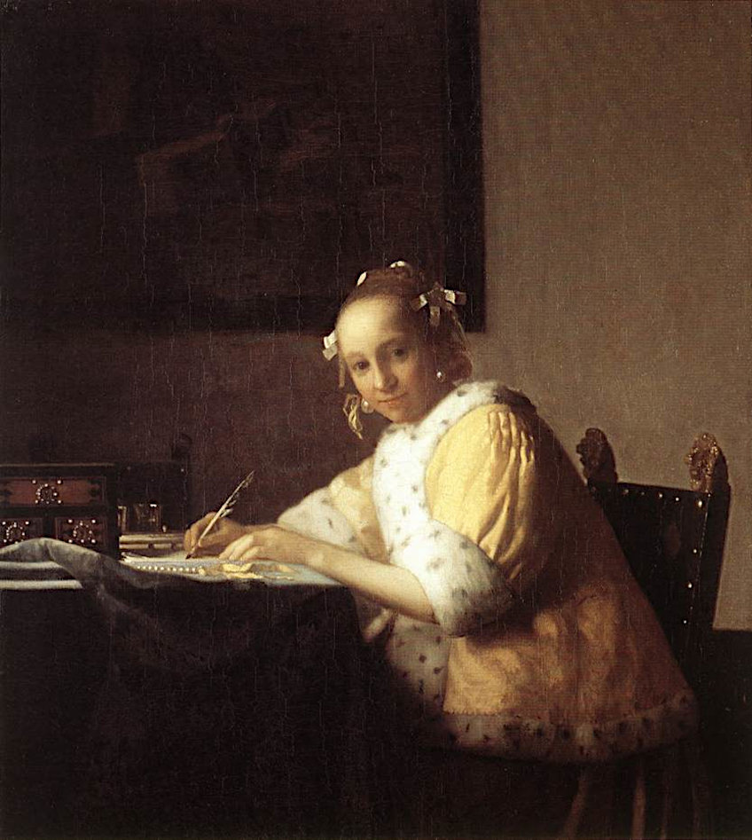 A Lady Writing by Johannes Vermeer (c. 1665); Johannes Vermeer, Public domain, via Wikimedia Commons
Chiaroscuro is typically associated with the paintings of well-known artists like Caravaggio, Leonardo da Vinci, Vermeer, and Rembrandt, who were acknowledged for using dramatic lighting effects to produce strong and emotive artworks.
It was prominent in Baroque painting after being popularized in Italy by Renaissance artists.
Tenebrism
Tenebrism is a technique that is similar to chiaroscuro but employs a more intense use of shadows and light. Tenebrism combines deep shadows and vivid highlights to produce a far more dramatic effect than chiaroscuro. It is widely employed in religious artworks to create a feeling of mystery or wonder through the juxtaposition of light and dark.
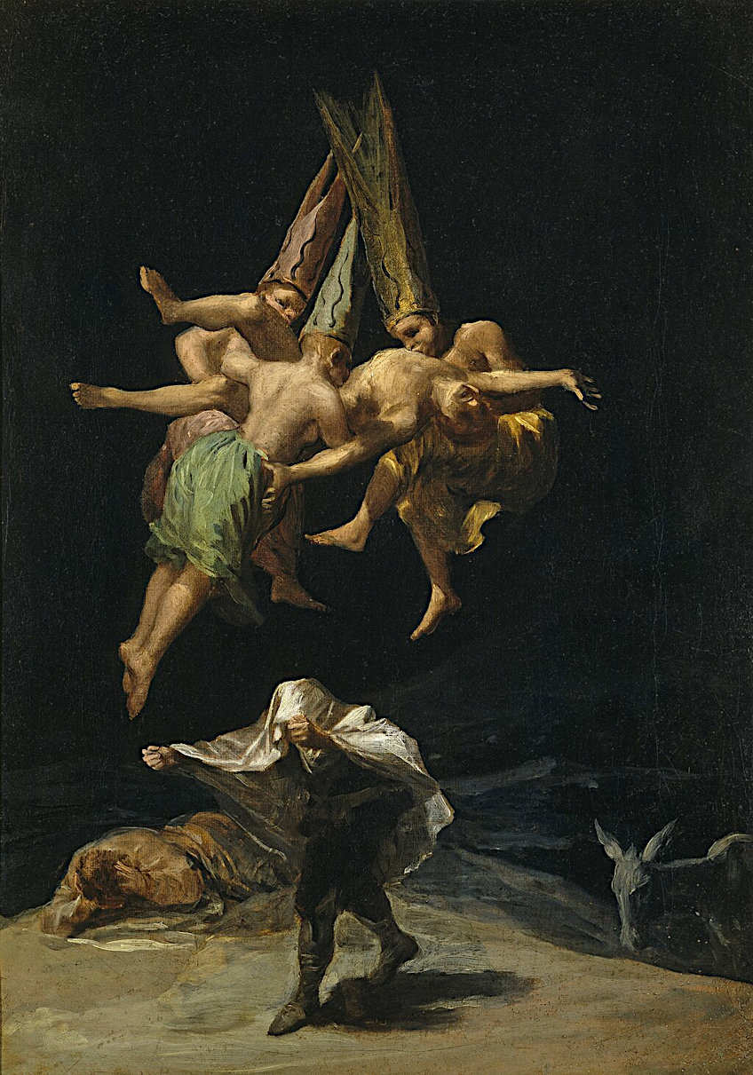 The Witches’ Flight by Francisco Goya (1798); Francisco Goya, Public domain, via Wikimedia Commons
The light source in tenebrism artworks is typically hidden or covered, with just some parts of the image lit by a light source. The remainder of the artwork is submerged in shadow, generating a feeling of mystique and tension.
Tenebrism creates a sharp contrast between illuminated sections and deep shadows, which can increase visual friction to establish a sense of drama and conflict.
Contrast Painting Examples
Since we now have a better understanding of how to use contrast in artwork, we can now look at a few examples of contrast paintings. This will enable us to observe how artists effectively used contrast in their own artworks. Very often, it is not one single type of contrast being applied, but several at once.
Saint Jerome Writing (1606) by Caravaggio
| Artist | Caravaggio (1571 – 1610) |
| Date Completed | 1606 |
| Medium | Oil on canvas |
| Dimensions (cm) | 112 x 157 |
| Location | Borghese Gallery and Museum, Rome, Italy |
Caravaggio’s famous painting portrays Saint Jerome, a key figure in Christian theology, preparing or translating sacred books. Caravaggio was well-known for his use of chiaroscuro in his paintings, which emphasized the contrast between light and dark parts. Caravaggio employs chiaroscuro in this artwork to create a feeling of drama, as well as to attract the audience’s eye to certain elements of the image.
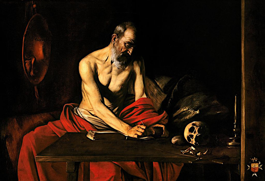 Saint Jerome Writing by Caravaggio (c. 1608); Caravaggio, Public domain, via Wikimedia Commons
The painting’s most visible application of contrast is between the bright light that shines on Saint Jerome’s face and the shadowy background that surrounds him.
This provides the impression of dramatic tension, as though the saint is deep in thought or meditation. The contrast of dark background and illuminated subjects in the foreground also provides a sense of depth, and the viewer’s eye is led around the canvas by the illuminated elements such as the saint’s head, arm, books, and skull. The restrained palette of brown, red, black, and white creates further contrast and adds to the artist’s desired impression of deep focus.
The Night Café (1888) by Vincent van Gogh
| Artist | Vincent van Gogh (1853 – 1890) |
| Date Completed | 1888 |
| Medium | Oil on canvas |
| Dimensions (cm) | 72 x 92 |
| Location | Yale University Art Gallery, Connecticut, United States |
This famous artwork by Van Gogh depicts a café interior at night, with a bright light source illuminating the room. Van Gogh creates depth and intensity by using a striking contrast between both cool and warm hues. Warm oranges and yellows contrast with cold greens and blues generating tension and intensity.
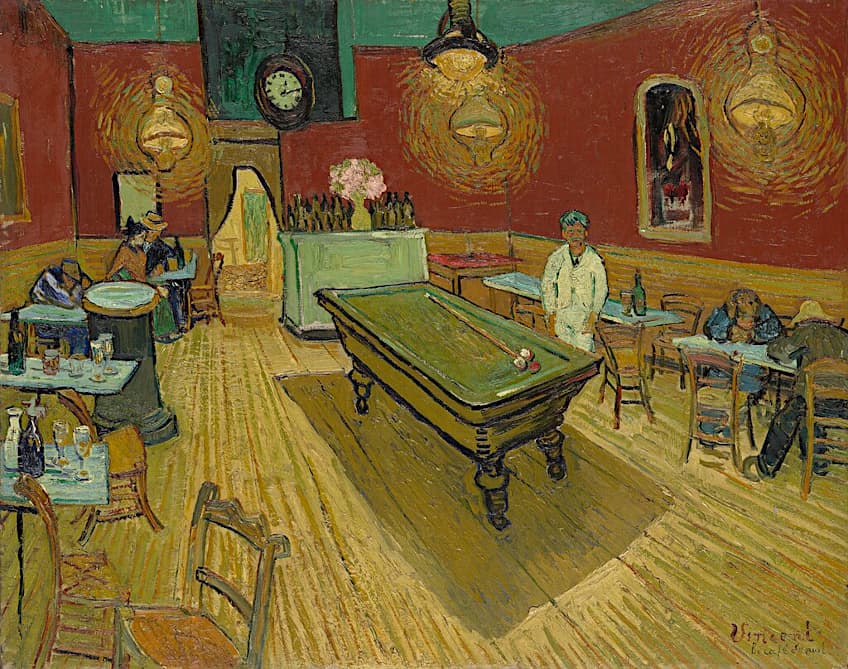 The Night Cafe by Vincent van Gogh (1888); Vincent van Gogh, Public domain, via Wikimedia Commons
Vincent van Gogh was well-known for his use of color and light contrast in his artworks. Contrasts, he felt, were vital for capturing the psychological and emotional qualities of a subject and establishing a feeling of tension and intrigue.
Van Gogh was especially interested in how light might be employed to highlight specific elements of an artwork and impart an impression of texture. He incorporated strong contrasts of light and dark in several of his paintings to produce dramatic, even theatrical effects.
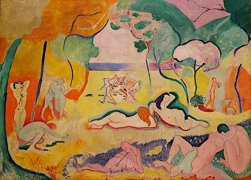
Le Bonheur de Vivre (1906) by Henri Matisse
| Artist | Henri Matisse (1869 – 1954) |
| Date Completed | 1906 |
| Medium | Oil on canvas |
| Dimensions (cm) | 176 x 240 |
| Location | Barnes Foundation, Philadelphia, United States |
In this artwork, Matisse utilized a variety of contrasting hues, including vibrant yellows, pinks, and greens, as well as more subdued blues and grays. These colors are placed in a way that gives the artwork a feeling of fluidity and vitality. Several of the figurines are outlined in black to add clarity and contrast to the vibrant background. Matisse’s Fauvist style, which accentuated vibrant colors and simple shapes, was typified by this technique.
Matisse also employed contrast in the painting’s composition. The figures in the artwork are positioned in such a manner that they produce a feeling of harmony and equilibrium, but there are also subtle differences in their angles and forms that provide intrigue and visual complexity.
Matisse produced a painting that embodies the essence of joy and energy by emphasizing vivid contrasting colors, simplistic forms, and dynamic composition.
 Le Bonheur de Vivre by Henri Matisse (1905-6); Regan Vercruysse from Phelps, New York, USA, CC BY 2.0, via Wikimedia Commons
Composition VIII (1932) by Wassily Kandinsky
| Artist | Wassily Kandinsky (1866 – 1944) |
| Date Completed | 1932 |
| Medium | Oil on canvas |
| Dimensions (cm) | 140 x 201 |
| Location | The Solomon R. Guggenheim Museum, New York City, United States |
Kandinsky wanted to develop an abstract language that would provoke intense feelings in the listeners in the same way as music does. Kandinsky was searching for a fundamental law of harmony in the visual arts that must be inherent at the core of each creation, and this mystical conviction was reinforced by the artist’s strong beliefs. This artwork represents Kandinsky’s abstract style, with a dynamic arrangement of vibrant colors and geometric shapes.
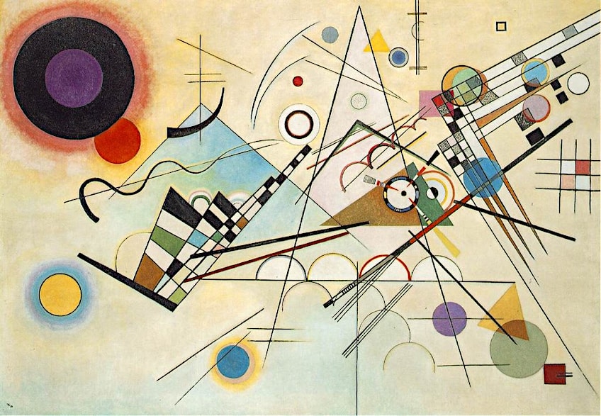 Composition VIII by Wassily Kandinsky (1923); Wassily Kandinsky, Public domain, via Wikimedia Commons
Kandinsky uses a number of contrasting hues in this artwork, such as yellow, red, blue, green, purple, and orange to give the impression of motion and dynamism.
To create a feeling of dimension and contrast, he also adjusts the saturation of these hues, employing highly saturated hues in certain sections and more subdued colors in others. The end result is a powerful and harmonious artwork, with each hue contrasting with the others to produce an exciting visual experience.
That concludes our list of contrast painting examples, as well as our article on the use of contrast in art. By adding contrast, paintings are more engaging and appealing. The variation in elements makes the artwork more complex and the opposites serve to make each other shine in comparison. The effective application of contrast in art is one of an artist’s best tools.
Frequently Asked Questions
Can Contrast Be Used to Generate Optical Illusions?
The Op Art style is arguably the most well-known area where numerous artists, such as M.C. Escher, experimented and worked with pattern designs and the realm of black-and-white contrast. Such stark contrasts regularly explored the concept of movement inside a static image, giving the still image the appearance of vibration. This sharp contrast, in addition to experimenting with vertical or horizontal lines and geometrical shapes, does not allow the eye to rest in one place for long.
What Is Chiaroscuro Used For?
In the hands of the renowned Renaissance artists of the 15th and 16th centuries, the dramatic contrasts between light and shadows, known as chiaroscuro, were used as a tool to differentiate between the main characters and the backdrop, establishing the depth of the image. Yet, more significantly, it assisted the artists in understanding the concept of darkness, allowing them to construct specific narratives. The contrast of dark and light is a great way to create a sense of drama in your own artwork. Besides using the contrast between light and dark, you can also use complementary colors. Colors can also be contrasted by their value or level of saturation.
Liam Davis is an experienced art historian with demonstrated experience in the industry. After graduating from the Academy of Art History with a bachelor’s degree, Liam worked for many years as a copywriter for various art magazines and online art galleries. He also worked as an art curator for an art gallery in Illinois before working now as editor-in-chief for artfilemagazine.com. Liam’s passion is, aside from sculptures from the Roman and Greek periods, cave paintings, and neolithic art.
Learn more about Liam Davis and about us.
Cite this Article
Liam, Davis, “Contrast in Art – Creating Emphasis Through Opposing Elements.” artfilemagazine – Your Online Art Source. August 31, 2023. URL: https://artfilemagazine.com/contrast-in-art/
Davis, L. (2023, 31 August). Contrast in Art – Creating Emphasis Through Opposing Elements. artfilemagazine – Your Online Art Source. https://artfilemagazine.com/contrast-in-art/
Davis, Liam. “Contrast in Art – Creating Emphasis Through Opposing Elements.” artfilemagazine – Your Online Art Source, August 31, 2023. https://artfilemagazine.com/contrast-in-art/.