Complementary Colors – Color Wheel Complementary Colors
When it comes to visual art, be it fine, commercial, or decorative, color will be a defining factor in determining the overall aesthetics of any piece of work. Designers, artists, and absolutely anybody else whose work involves the use of color must have an understanding of the concept of complementary colors. If you want to learn more about this, you have come to the right place.
What Are Complementary Colors?
If you have not studied art or color theory, you might think that the term “complementary colors” refers to colors that pair well with one another aesthetically. While this may be the case in some cases, this is nowhere near the precise definition. What are complementary colors, then? The term can be better understood when looking at the color wheel. Complementary colors are hues that sit diametrically opposite from one another on the color wheel. It is for this reason that these pairs of hues may be referred to as “opposite colors” too. There are two key aspects of the relationship between pairs of complementary colors that you need to understand.

Firstly, the combination of these two colors will create a color on the grayscale (somewhere in between black and white). Secondly, complementary pairs will make the strongest contrast achievable for either color involved. By blending complementary colors together, you can produce interesting shadowy elements. By pairing complementary colors next to each other, you can produce vibrant and bright contrasts. Here are the six primary colors and their corresponding color wheel complementary colors:
| Color | Name | Hex Code | Decimal Code (RGB) | Complementary Color |
| Red | #FF0000 | (255,0,0) | Green | |
| Blue | #0000FF | (0,0,255) | Orange | |
| Yellow | #FFFF00 | (255,255,0) | Purple | |
| Green | #008000 | (0,128,0) | Red | |
| Purple | #800080 | (128,0,128) | Yellow | |
| Orange | #FFA500 | (255,165,0) | Blue |
One thing you may notice when engaging with the color wheel complementary colors is the fact that every single pair of complementary colors is comprised of a mix between the three primary colors. For instance, in the pairing between blue and orange, blue is one primary color and orange is a mix between the remaining two primary colors yellow and red.
The reason why combining complementary colors examples generates grayscale colors is because they are, no matter the order, still derived from the three primary colors which, when they themselves are mixed together, form a dark neutral.
Color Terminology
Before we go any further, there are some color theory terms you will need to understand in order for the rest of this article to make sense. Knowing the definitions of these terms will also be of benefit to your general comprehension of the visual arts as well.
Hue
You might hear this term used by designers and artists in the place of the word “color”. In most cases, there is absolutely no harm in using these words interchangeably. However, when it comes to color theory, the term “hue” refers to something completely different. In color theory, a color’s hue is determined by the degree to which that color matches any of the color wheel’s six primary and secondary colors. These colors are yellow, red, blue, orange, violet, and green. A color’s hue is determined by its proximity to either of these colors on the color wheel.
For instance, you can say that a color’s hue is red because it sits closest to the color red on the wheel.
Shade
A shade is what you get when you mix the color black into a hue to create a darker color. The amount of black added can be determined by the artist based on their requirements. The addition of small amounts of black coloring will make a hue slightly darker whereas larger additions will create deeper black colors with a tinge of the original hue. A great way to conceptualize the application of shades is by looking at how shadows affect the hues of surfaces they are cast onto. The hue is still the same but the “shade” cast by the shadow makes the hue seem darker.
Tint
A tint can be thought of as the very opposite of a shade. A tint is what you get when you combine any color with the color white. By adding white to a color, the lightness of said color will increase as a result of the color white’s effect on relative saturation. It is important to understand that, while a tinted color might seem brighter than the original, it is actually just paler.
The tint of a hue can be scaled from subtle and barely noticeable to near complete whitewash with a small amount of color diffusion.
Tone
While shades involve the application of the color black and tints involve the application of the color white, tones have to do with the addition of the color gray to a hue. A popular usage of tones is to add a sense of sophistication to a color. An important thing to note is that the grays used in adding tone are derived exclusively from combinations of black and white.
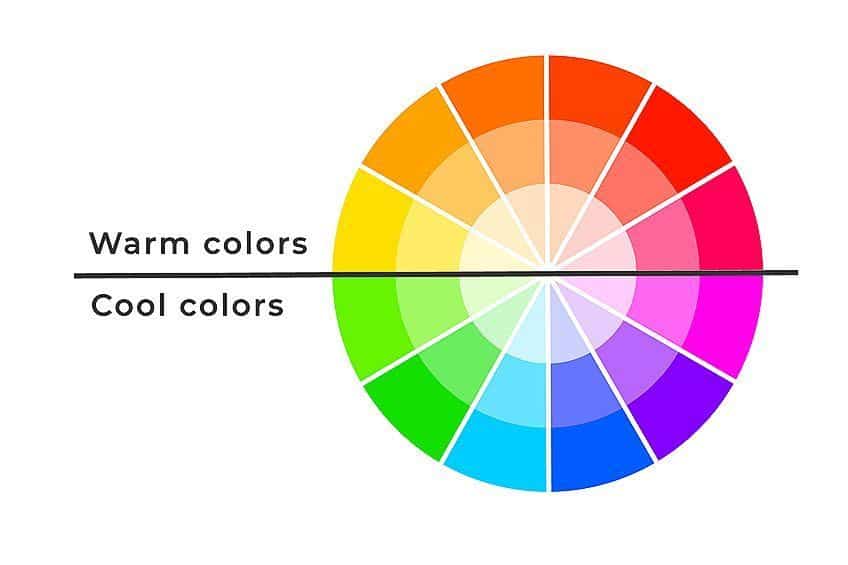
Warm and Cool Colors
Warm shades are colors and hues that resemble the colors found in nature that are representational of warmth (for example, the color of the sun, sunrise, and fire). Colors that symbolize warmth include red, yellow, and orange. would include colors that symbolize the colors in nature associated with the cold (such as water, ice, and the night sky).
Examples of cool colors include blue, green, and purple.
Complementary Color Theory
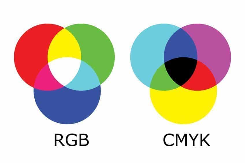
What is it exactly that makes the use of complementary colors so visually appealing to us? The answer is actually quite interesting as it has to do with some fundamental aspects of human physiology. More specifically, it has to do with the way our eyes work. Inside our eyes, we have several sets of photoreception cells (referred to as cones) that pick up light wavelengths reflecting off of objects. This information is sent to the brain where it is interpreted as sight and color.
To understand why we perceive the pairing of complementary colors as eye-catching and dynamic, there is a very simple exercise you can do. All you need to do is stare at a body of a single color for about a minute and then look straight towards a blank white wall. Upon gazing at the wall, you will be able to pick out tinges of another color. This color is actually an afterimage caused by staring at a single color for so long. But, more interestingly, the color in the afterimage is actually the corresponding complementary color for the one you have been staring at.
But how does this work? Well, by staring at a single color for so long, the cones in your eyes responsible for absorbing that color’s particular wavelength have gotten tired. At this point, the transmission rate of this color’s information to your brain has reduced and your mind has now automatically curbed its visual spectrum. Then, when you finally look over to a white surface, you are still observing the white spectrum of light but will see some additional color. This is because the color you have been staring at will have been removed from the white spectrum, showing instead the color’s opposing, complementary color.
Now, what the heck does this all mean? Fair question, allow us to explain. Through this experiment, we can deduce that there is a clear relationship between complementary colors, not only just on the color wheel but also in the human mind. The reason why complementary colors appear so lively when paired is that each color is stimulating opposite cones in the eye. This means that pairing complementary colors creates a sort of calming balance that our brains pick up on. In the case of complementary color theory, opposites definitely do attract.
In complementary color theory, we call this simultaneous contrast.
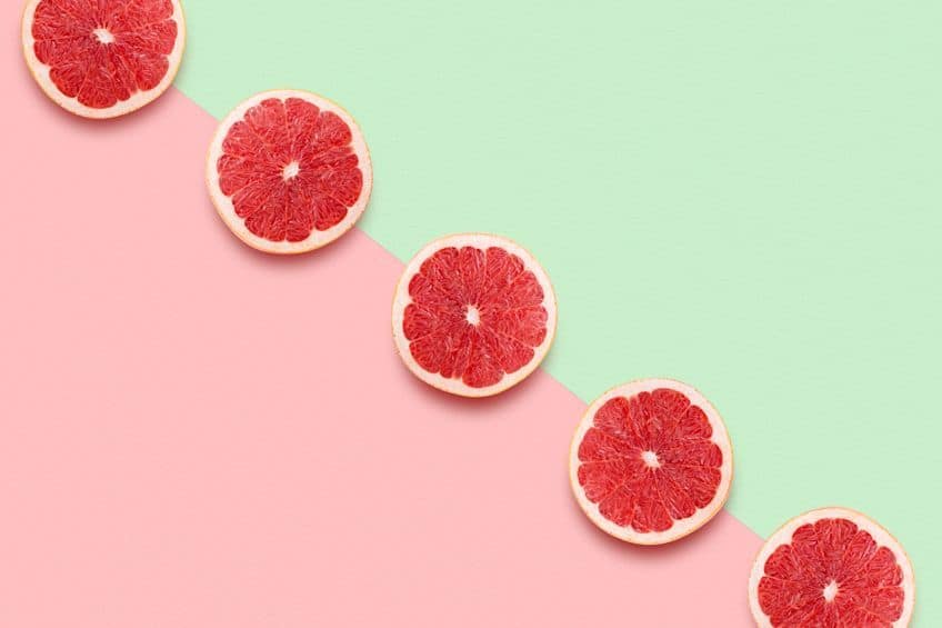
One of the best real-life complementary colors examples coming together to create stunningly intense imagery would be sunsets. Who doesn’t love a good sunset? A solid argument as to why we love sunsets so much is the fact that they are comprised of the complementary colors blue and orange, creating a dramatic contrast that catches the idea and appeals to the senses.
Interestingly, the concept of complementary colors sharing the highest contrast and harmony when placed side by side comes from the same man who theorized gravity; Mr. Isaac Newton himself. It was he who first brought forward the idea that complementary colors accented and intensified one another when paired. Newton’s take on complementary colors is considered to be the point of origin for color theory.
Famous Examples of Complementary Colors in Art
For a bit of further elaboration of the aforementioned point, we have compiled a list of examples depicting how complementary color theory is applied in art.
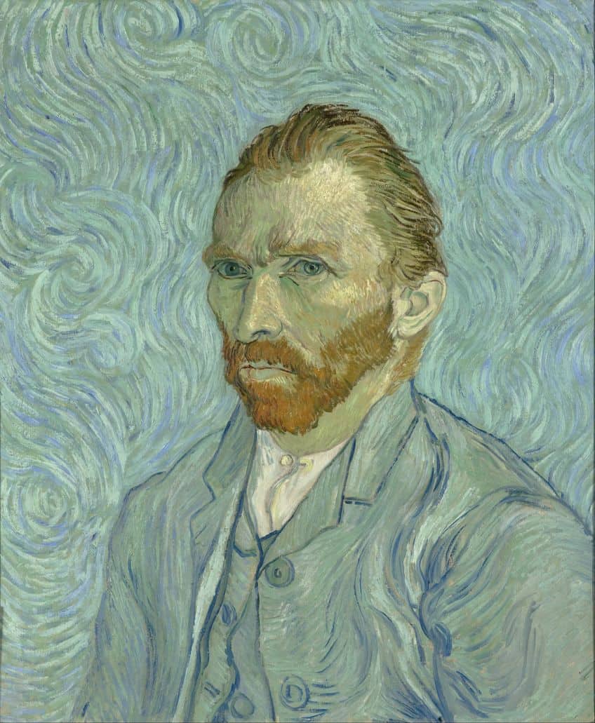 Self-Portrait (1889) by Vincent van Gogh; Vincent van Gogh, Public domain, via Wikimedia Commons
Self-Portrait (1889) by Vincent van Gogh
This painting created by the famous Dutch impressionist depicts the complementary colors orange and blue. The use of warm orange colors in the subject’s face is contrasted beautifully against the cool blue notes of his coat and jacket.
| Artist | Vincent van Gogh (1853 – 1890) |
| Title | Self-Portrait |
| Year | 1889 |
| Medium | Oil on canvas |
| Current Location | Musée d’Orsay |
Swaying Dancer (Dancer in Green) (1879) by Edgar Degas
This painting features a youthful girl doing ballet. The complementary colors paired here are green and red. These colors perfectly communicate the girl’s youthfulness. Tones, if you remember from earlier, are also used here to instill an air of sophistication despite the age of the subject.
| Artist | Edgar Degas (1834 – 1917) |
| Title | Swaying Dancer |
| Year | 1879 |
| Medium | Pastel |
| Current Location | Museo Nacional Thyssen-Bornemisza |
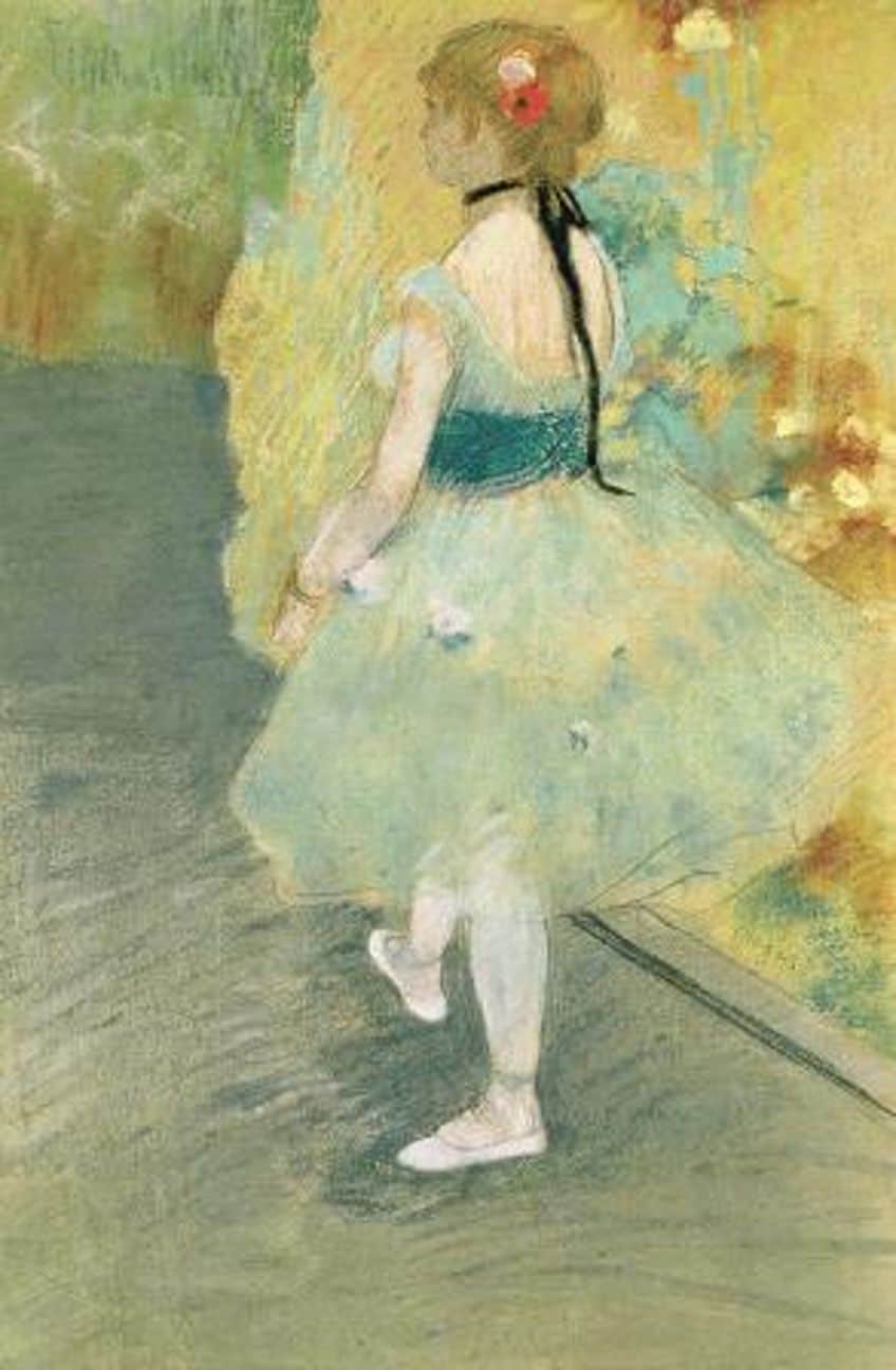 Dancer in Green (1879) by Edgar Degas; Edgar Degas, Public domain, via Wikimedia Commons
Lady in Violet (1874) by Pal Szinyei Merse
This is a stunning depiction of a seated woman in Victorian garb. The dress she is wearing is of a deep purple color, indicating to the viewer that the subject is wealthy and of high importance within society. Yellow, the complementary color to purple, is then applied in the background to alleviate the heaviness of the atmosphere.
In pairing the color of the dress, which is a cool and moody tone, with yellow which is bright and expressive, the overall atmosphere of the painting is elevated.
| Artist | Pal Szinyei Merse (1845 – 1920) |
| Title | Lady in Violet |
| Year | 1874 |
| Medium | Oil on Canvas |
| Current Location | Hungarian National Gallery, Budapest |
How to Use Complementary Colors
We need only look towards the color schemes we find within the natural world to see such color theory in practice. For example, think about the color of lavender and its stunning contrast with the soft green color of the surrounding shrubbery. Another great example is that of the warm oranges and yellows of coral life on the blue sea floor. In case you have not noticed yet, complementary pairs are always made up of one warm color and one cool color. This, of course, makes perfect sense when you consider again the fact that complementary colors are diametric opposites on the color spectrum.
In design, the pairing of complementary colors is a popular means through which to make images and text bolder and punchier. That being said, however, there is definitely a craft to it. It is not as simple as picking any two colors on opposing ends of the color wheel. While this will always produce a high contrast, it may not always result in an aesthetically pleasing result.
For anyone hoping to prevent their work from becoming a jarring mix of colors when working with complementary colors, what they should do is pick a main color between the two. You should use this main color predominantly and apply its complementary color more sparingly as a way to highlight areas of interest. Selecting a dominant color and applying its complementary color as an accent is an easy way to create a balanced piece without any color clashing. This way, the eye can travel unperturbed across the space.
Hopefully, you have enjoyed our breakdown of complementary colors. By now you should know a bit more about color theory and the important role played by complementary colors in art. Having a comprehensive understanding of how the color wheel works and, by extension, how colors work with one another will enable you to become a better artist no matter what your preferred medium is. Use this article as a guide to inform your future coloring decisions. However, it is difficult to fully encapsulate several centuries of art discourse into a single article so be sure to supplement the knowledge you have gained here with additional research.
Frequently Asked Questions
What Are Complementary Colors?
Complementary colors are hues that sit at opposing ends of the color wheel’s spectrum. These pairs of hues may be referred to as opposite colors too. The two colors that make up a complementary pair will have the highest possible contrast between them and any other color. Additionally, the mixing of a complementary pair will create a neutral gray.
What Is Color Theory?
Color theory is a set of guidelines dictating the most effective ways of applying and mixing colors according to the color wheel. This includes primary, secondary, and tertiary colors. Knowing how to pair colors according to color theory is essential for designers, artists, brands, and marketing specialists as it teaches you how best to communicate with people through the medium of color.
Who Discovered Color Theory?
Sir Isaac Newton is credited with being the first person to theorize modern color theory as he was the first to discover complementary colors. Some argue that Aristotle was the first to theorize color theory. However, Aristotle’s theories were inspired by his religious beliefs as opposed to research and the scientific method.

Megan is a writer and researcher who holds a degree in Social Sciences, with a specialization in Psychology and Environmental Science, from the University of Cape Town. Her dedication to acquiring knowledge and making a positive impact has driven her current work in promoting conscious and sustainable growth in Southern Africa. Megan’s interests encompass exploring the physical and psychological impacts of color in our environment on our mood and well-being. She is also passionate about the role of art and creativity, which has been an integral part of society since the beginning of human history. Since 2022, Megan has been contributing blog posts on painting and color theory at artfilemagazine.
Learn more about Megan van Schoor and about us.
Cite this Article
Megan, van Schoor, “Complementary Colors – Color Wheel Complementary Colors.” artfilemagazine – Your Online Art Source. October 5, 2022. URL: https://artfilemagazine.com/complementary-colors/
van Schoor, M. (2022, 5 October). Complementary Colors – Color Wheel Complementary Colors. artfilemagazine – Your Online Art Source. https://artfilemagazine.com/complementary-colors/
van Schoor, Megan. “Complementary Colors – Color Wheel Complementary Colors.” artfilemagazine – Your Online Art Source, October 5, 2022. https://artfilemagazine.com/complementary-colors/.