Negative Space in Painting – How Omission Can Add to Art
Space plays a crucial role in determining the outcome of an artwork and the success of its composition. By paying attention to the basic elements of art, you can enhance your art in a variety of ways to make it stand out. In this article, we will be looking at a basic definition of negative space in painting, as well as the importance of using negative space in art. We will also review different techniques for painting negative spaces in your artwork, as well as the benefits of negative space so that you can get the most out of the different techniques and enhance your artwork.
Negative Space in Art Theory
“Empty space is a story waiting to happen”- A famous quote by Contemporary artist Yoko Ono, who is one of many significant artists of our decade who leverages negative spaces to create outstanding and unforgettable works of art. You may have heard of the term “negative space” in the context of two-dimensional works or about “negative and positive spaces” when analyzing art, but what is negative space? Negative space in art is defined as the blank spaces that surround the main subject of artwork and is also referred to as empty or white spaces. Negative space as seen in art is used as a tool to highlight the focal point of the artwork and is not necessarily the main subject.
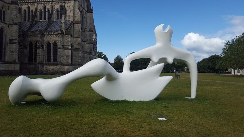 Large Reclining Figure (1983) by Henry Moore; Richard Avery, CC BY-SA 4.0, via Wikimedia Commons
Aside from emphasizing the focal point of artwork, negative space can be used to create a sense of harmony in a composition. Additionally, negative space is also used to create a sense of contrast and provide a level of depth to the subject. Below, we will dive into an in-depth definition of negative space as outlined by a few negative space artworks found in paintings, including important concepts, how negative space can enhance a painting and emphasize its subject, as well as a few different techniques for incorporating negative space into your artwork.
Understanding the Principles and Uses of Negative Space
To understand the principles of negative space in art theory, it is useful to explore the history of negative space artwork and its value beyond aesthetics. While it is difficult to determine who were the first artists to employ negative space in art, one can conclude that the concept was utilized throughout the history of art and appeared in different forms. Many scholars credit the use of negative space to the Greek sculptor Myron, who is considered an early pioneer of negative space as seen in sculpture and with the famous statue Discobolus (c. 5th century CE).
The statue of the discus thrower is one of the most famous statues that effectively uses negative space to display the dynamic motion of the figure.
The term “negative space” itself was first used in the 20th century within the context of art, design, photography, and filmmaking. The use of negative space to provide a sense of balance, harmony, and artistic tension in an artwork is a product of the 20th century and has been attributed to other pioneering artists who created paintings with negative space such as M. C. Escher, Henry Moore, Barbara Hepworth, and El Lissitzky. In a general sense, across the multiple disciplines of photography, filmmaking, art, and design, the term “negative space” refers to spaces that are unoccupied by people or objects. As such, the role of negative space in art plays more than just an aesthetic role. Negative space can be used to create a sense of movement, contrast, depth, and tension, and enhance other elements of a design.
Negative spaces can be found in almost any artwork and are also notably used in garden design as demonstrated by the Japanese word “ma”, which is a concept for negative space. Traditionally, in a composition, a positive space would occupy a more visual weight while the surrounding space or “empty spaces” are regarded as less visually critical to the composition. However, in Modern art, negative space is one of the most clever artistic techniques one can leverage to enhance the composition. Negative spaces in a competition can be carefully controlled to either give the composition the impression that it is a vast landscape or make an object appear to float in space. Artists can also create a sense of unity and continuity in artwork by repeating similar designs in both positive and negative spaces, such that the composition is more harmonious and balanced.
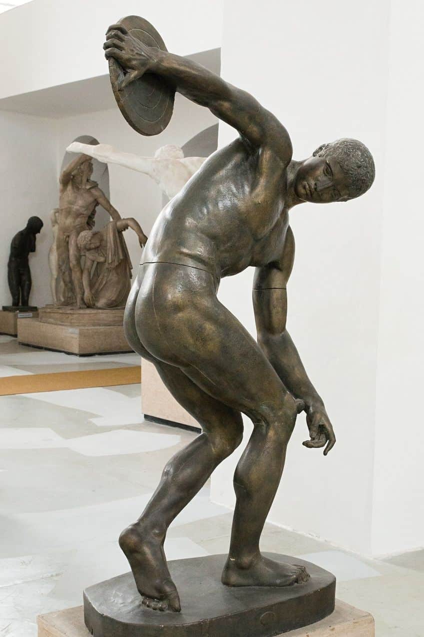 Discobolus (c. 5th century CE) by Myron; Zde, CC BY-SA 4.0, via Wikimedia Commons
Negative space can also be used to guide the viewer’s eye and curate a powerful emotional experience. Negative space is a fundamental element of design and art that is essential for artists to create a sense of balance and tension in artwork and is also crucial to creating powerful sculptures as noted in Myron’s Discobolus. Sculptures that effectively use negative space demonstrate a sense of motion, drama, tension, or weightlessness, such that the viewer can perceive the sculpture’s mass concerning the negative space around it. Below, we will discuss the key concepts of negative space and its benefits to painting that will help cement your understanding of the effectiveness of negative space.
Examples of Negative Space in Painting
Negative space plays a crucial role in creating harmony, balance, and unity in a painting. Many painters have to consider the use of negative space when deciding on the amount of movement, contrast, and depth in their artwork, which are all important factors to ensure a successful painting.
To best understand the role of negative space in painting, let us explore a few examples of negative space in painting!
Arrangement in Grey and Black No. 1 (1871) by James Abbott McNeill Whistler
| Artist Name | James Abbott McNeill Whistler (1834 – 1903) |
| Date | 1871 |
| Medium | Oil on canvas |
| Dimensions (cm) | 144 x 162 |
| Where It Is Housed | Musée d’Orsay, Paris, France |
Arrangement in Grey and Black No. 1, commonly identified as Whistler’s Mother, is a famous 19th-century painting by James Abbott McNeill Whistler, who was considered one of the most prolific painters of Tonalism. Whistler’s use of negative space in the painting was accentuated by his use of a tonal variation of a single color to portray the side profile of his mother, Anna McNeill Whistler, against a neutral gray wall. There is more to the composition and use of negative space in this painting than meets the eye. Whistler’s decision to cast his mother against an empty, simple backdrop was aimed at highlighting the simplicity and stillness of the scene contrasted by the figure of his mother.
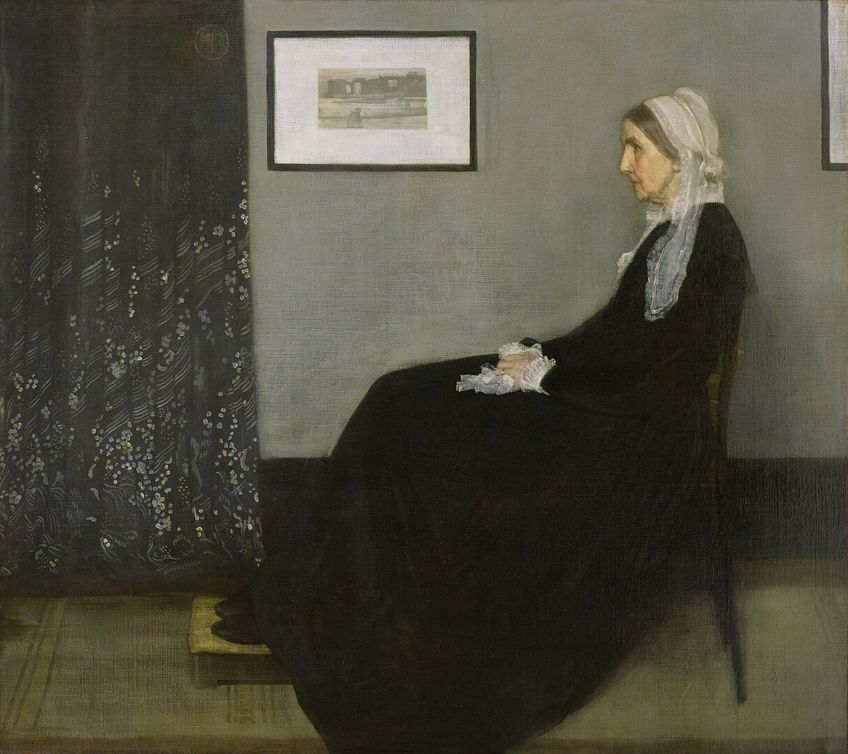 Arrangement in Grey and Black No. 1 (1871) by James Abbott McNeill Whistler; James McNeill Whistler, Public domain, via Wikimedia Commons
In the painting, the negative space is defined by the empty floor and gray wall, which creates a sense of quietness across the composition since the majority of the space is occupied by neutral colors. By creating room for more negative space, Whistler enables the viewer to focus on the portrait of his mother and directs the viewer’s gaze to his mother’s peaceful expression as well as the details on her clothing. His mastery over tonality by using a limited color palette of gray and black also enhances the effect of the composition. The monochromatic color palette also adds a sense of unity and helps the viewer understand the effect of light and shadow on enhancing the focus on his mother.
The painting is also admired for its skillful composition where Whistler emphasizes the simplicity of the scene by creating a sense of symmetry and balance using the chair and positioning of his mother’s figure.
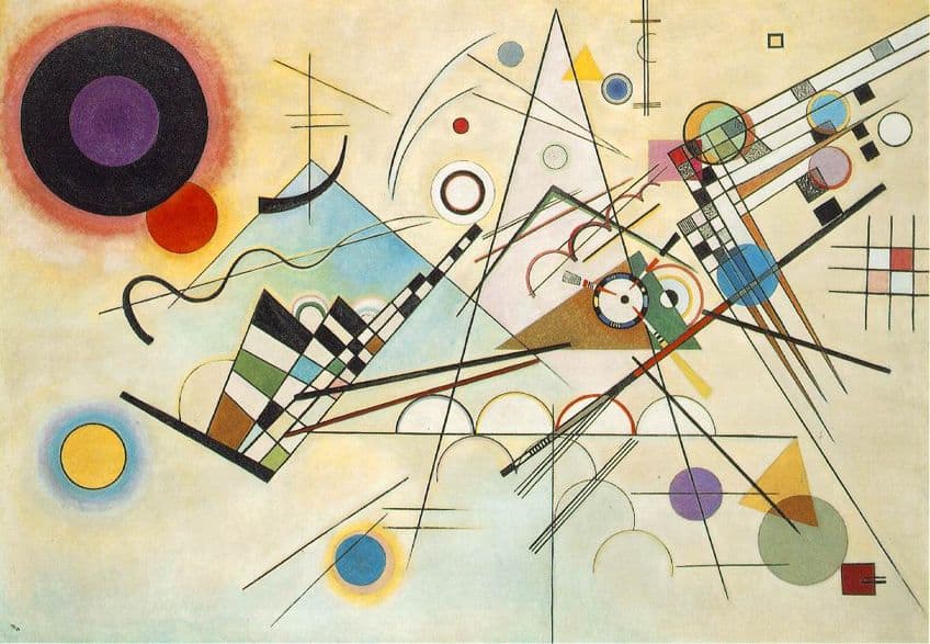
Composition 8 (1923) by Wassily Kandinsky
| Artist Name | Wassily Wassilyevich Kandinsky (1866 – 1954) |
| Date | 1923 |
| Medium | Oil on canvas |
| Dimensions (cm) | 140 x 201 |
| Where It Is Housed | Solomon R. Guggenheim Museum, New York City, United States |
Wassily Kandinsky was one of the most interesting Modern painters who created many paintings with negative space to enhance his compositions. Kandinsky included geometric shapes and lines at the forefront of his approach but also prioritized color and its relationship with negative space to create many striking and unusual compositions. Kandinsky was believed to have experienced the neurological condition known as synesthesia, which resulted in his playful and vibrant geometric paintings. His approach to color was also fueled by his belief that colors caused the human soul to vibrate and were crucial to influencing human beings and their nervous systems.
 Composition 8 (1923) by Wassily Kandinsky; Wassily Kandinsky, Public domain, via Wikimedia Commons
Additionally, shapes such as the circle represented symmetry and balance for Kandinsky, which is also featured in Composition 8. What makes the use of negative space effective in Composition 8 is the presence of movement, balance, depth, and visual tension. The main feature of the painting is the large black circle that appears to float on the canvas while other smaller shapes such as rectangles and triangles are scattered across the composition in different colors. Here, Kandinsky leveraged negative space to create depth by making the shapes recede into the distance.
This also provides a sense of order and visual tension that the shapes, in relation to the negative “blank space” in the background and color contrasts, help guide the viewer’s perception of detail.
Dark Room (2013) by José Ignacio Iturburu
| Artist Name | José Ignacio Lora Iturburu (1981 – Present) |
| Date | 2013 |
| Medium | Acrylic on canvas |
| Dimensions (cm) | 110 x 160 |
| Where It Is Housed | Museo de Arte Contemporáneo, Lima, Peru |
Peruvian artist José Ignacio Iturburu created this masterful Dark Room painting, which effectively demonstrates one of the many uses of negative space in art. The painting is an illustration of negative space itself, presented as a three-dimensional room using black and white to create an illusion of space. Iturburu uses negative space to construct an architectural space using imagined structures cast in white with subtle changes in gradation from the black spaces to the white spaces to add a sense of three-dimensionality to the composition.
Traditionally, negative spaces were defined by their emptiness and as such characterized by the color white. In Dark Room, Iturburu shifts the perception of negative space to black and uses the white spaces as sites of occupation for the geometrical shapes and structures. The subtle addition of gray tints to the black spaces negates the impression that there are any “real” negative spaces since it establishes the black spaces as the walls of a room.
The high contrast in the painting also guides the viewer’s eye into the room as the geometric shapes and lines help carve the perspective of the room.
The Figure-Ground Perception and Rubin’s Vase
From the paintings above and their different uses of negative space in art, one can see how negative space plays an important role in defining the balance, harmony, and unity of composition. As such, negative spaces help define the positive space or subject of a painting. In portrait artworks such as Whistler’s Mother, negative space was used to define the subject’s face and finer details on her clothing. In collaboration with contrast, color, and shape, negative space can also be used to create a sense of atmosphere. Artists can choose to leave large portions of negative space on a painting to provide a sense of emptiness or calm.
 A Reproduction of Rubin’s Vase (c. 1915) by Edgar Rubin; Creative Commons Attribution-Share Alike 3.0 Unported, via Wikimedia Commons
Alternatively, one can also occupy the negative space by including intricate details to provide a sense of energy and visual tension. There is another concept called figure-ground perception, which is a form of perceptual grouping that is commonly found in monochromatic artworks aimed at the visual recognition of objects. In Gestalt psychology, it is also recognized as identifying an object from the background and is a process of perception that affects the way that we view and interpret artworks. The figure-ground perception principle is what helps us perceive negative space and recognize the difference between space that is occupied and space that is empty. Visually, it is the method of perception that helps us identify the subject from the background. A popular visual example of the figure-ground relationship is seen in Rubin’s Vase (c. 1915), a famous bi-staple two-dimensional drawing of two vases created by psychologist Edgar Rubin.
The figure-ground perception in Rubin’s Vase showcases the importance of edge assignment and its effect on the perception of the shape of the vases, which ambiguously represent faces. The perception of the shapes also depends on the direction in which the edges between the white and black regions are assigned. If the edges between the white and black areas face inward, then the central white area would be viewed as a vase with a black background. This perception negates the appearance of a face and as such, the vase becomes the focal point. On the other hand, if the edges face outward, then the black profile showing the faces are perceived to stand against a white background, thus negating the vases.
The duality of this interpretation is known as multistable perception as defined by the perception of visual stimuli and the reversibility of the image is known as a figure-ground reversal.
The Benefits of Using Negative Space in Painting
Since figure-ground perception helps our brain separate objects from their background, negative space is beneficial to the process since it helps our understanding of depth and contrast in the spaces between the object and the background. When applied to painting, negative space, and figure-ground perception work together to stimulate visual interest and ensure a harmonious composition. Negative spaces are also used to highlight silhouettes and create ephemeral shadows, which are often employed in photography.
 Study of Hands (1474) by Leonardo da Vinci; Leonardo da Vinci, Public domain, via Wikimedia Commons
Artists can edit the negative space to either enhance the perception of the object or create dynamism for added focus. Negative space can also encompass smaller objects in the background of a painting for added depth. The placement of negative space can alter the painting’s sense of rhythm and harmony with its relationship to positive shapes. Below, we will explore a few additional examples of how negative space has been used in painting to enhance the mood and meaning of the artwork and subject.
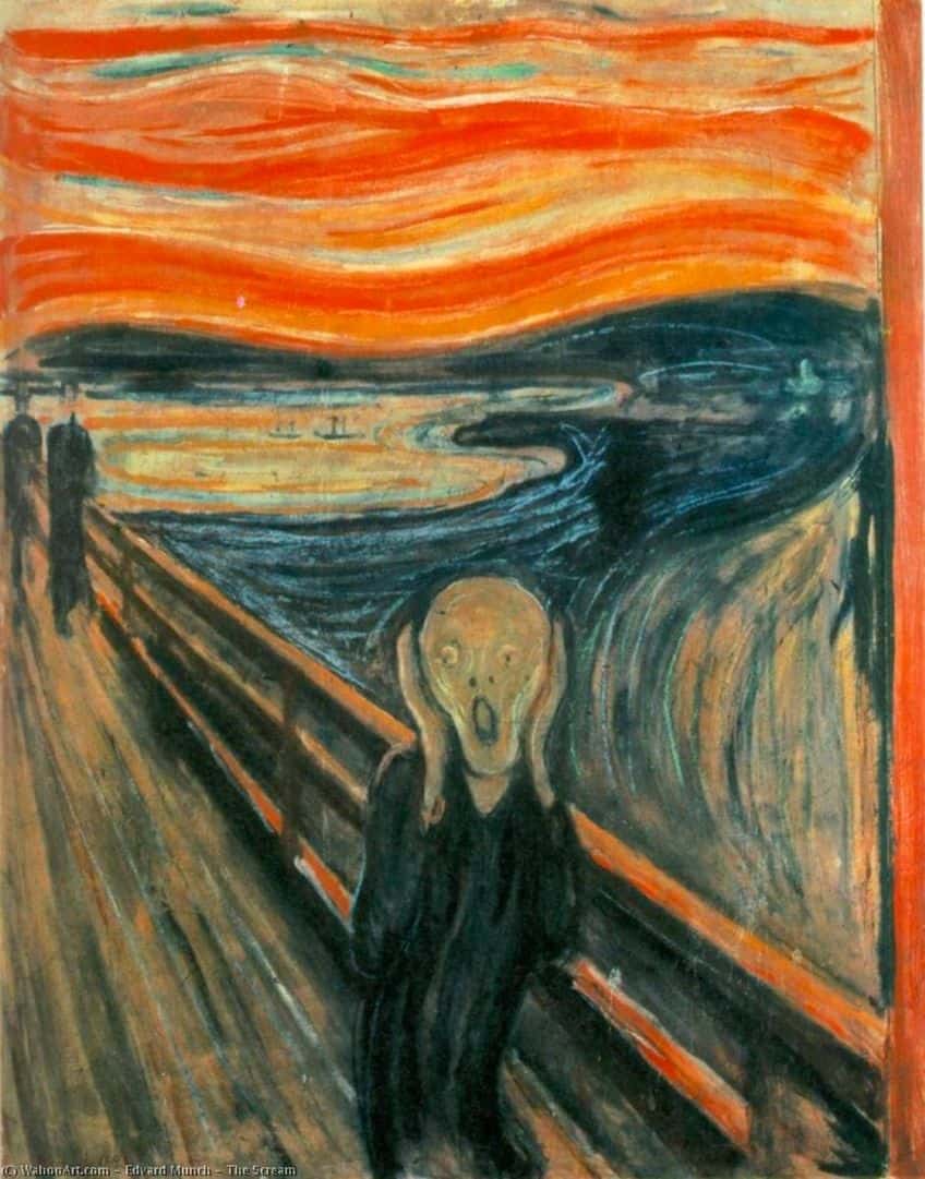
The Scream (1893) by Edvard Munch
| Artist Name | Edvard Munch (1863 – 1944) |
| Date | 1893 |
| Medium | Oil on canvas |
| Dimensions (cm) | 91 x 73.5 |
| Where It Is Housed | National Gallery and Munch Museum, Oslo, Norway |
The Scream is a prime example of how negative space is used to express mood in a painting. Created by Edvard Munch in 1893, the iconic image of a screaming figure was a masterpiece of the proto-Expressionist period and is one of Munch’s most recognizable paintings to date. In The Scream, Munch uses negative space portrayed by the sky and color to create a mood of despair and isolation, which was fitting for the theme of the painting, believed to be an imagined scene during a volcanic eruption. The negative space is occupied by a backdrop of abstract swirling colors and spots of empty space in between to create a sense of emptiness.
The negative space also helps emphasize the figures while creating a dramatic contrast using vivid colors and ominous tones in the background to create anxiety.
 The Scream (1893) by Edvard Munch; Multiple Authors, CC0, via Wikimedia Commons
No. 61 (Rust and Blue) (1953) by Mark Rothko
| Artist Name | Mark Rothko |
| Date | 1953 |
| Medium | Oil on canvas |
| Dimensions (cm) | 292.74 x 233.68 |
| Where It Is Housed | Museum of Contemporary Art, Los Angeles, United States |
No. 61 (Rust and Blue) is another great example showing the use of negative space to create a sense of introspection and outline the overall mood of the painting. No. 61 (Rust and Blue) was created by Mark Rothko, a pioneering Contemporary Abstract artist whose use of negative space can be seen in many of his large color block paintings. Rothko is also known for his focus on spiritual contemplation and as such, uses negative space to alter the luminosity and depth of colors to influence the mood and perception of his works.
No. 61 (Rust and Blue) illustrates a sense of vastness and is composed of two rectangles with respective colors: blue and rust separated by a thin line of negative space.
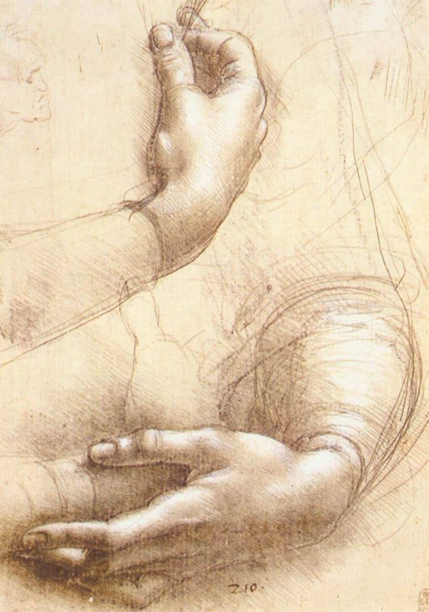
The edges of the rectangles are where Rothko blurs the colors to make the blocks appear as though they are hovering. The limitless space provided by the use of negative space evokes a spiritual experience of introspection and calm reflection that extends beyond the surface of the canvas. Negative space can thus be used to create sublime visual expressions that provide powerful experiences for viewers. Other notable examples of negative space drawings include works such as Study of Hands (1474 – 1490) by Leonardo da Vinci and Eight Heads (1922) by MC Escher.
Techniques and Tips for Using Negative Space in Painting
Viewing and interpreting negative space in art is one job, however, practicing the use of negative space in painting is another story. Below, we have compiled some practical tips on the best techniques for incorporating negative space into your paintings as well as how you can use color and negative space to create a sense of depth.
- Incorporate overlapping objects and forms in your composition: This will create negative space that adds a sense of depth to your painting. Overlapping lines or shapes can be seen in famous negative space drawings such as Leonardo da Vinci’s Vitruvian Man where the figure’s limbs overlap to create negative spaces representing the shapes of a circle and square to outline Da Vinci’s theory of ideal human proportions.
- Use contrasting values: By using contrasting values or hues that are opposite to each other on the tonal scale or color wheel, you can create a strong distinction between the positive and negative spaces. This demonstration of negative space can be seen in a painting by Franz Kline called Black, White, and Gray (1959).
- Apply Gestalt principles: As discussed in the figure-ground perception principle, artists can also refer to how the human mind perceives visual information to create negative space. Techniques such as figure-ground reversal and figure-ground closure are Gestalt principles that are used to understand how we organize visual information. Figure-ground closure is another technique used by the brain that automatically fills in the missing visual information of an image based on past knowledge and encounters with similar images or shapes. This fascinating ability is part of our visual system that helps us distinguish an object from a background and determine it to be a complete shape, regardless of whether the shape is fully formed. One can see the use of Gestalt principles in visual art in paintings such as The Face of Mae West Which May Be Used as an Apartment (1935) by Salvador Dali.
- Use a unifying color or pattern: When painting negative spaces, try adopting a consistent color palette or pattern to unify the painting. When using consistent colors or patterns, the negative spaces start to play an active role in the composition as opposed to serving as blank spaces. An example of how unifying color was used in painting is The Dessert: Harmony in Red (1908) by Henri Matisse.
- Simplify shapes: Using the Minimalism approach to creating simple shapes and objects in your composition will help create room for negative space such that it dominates the painting.
- Try alternative painting styles: There are a few painting styles and genres that you can adopt to make the most out of painting negative space and enhance your composition. These include Minimalism, Impressionism, Abstraction, Surrealism, ink painting styles, and calligraphic approaches. These art styles often lack representational elements and allow one to focus on simplicity, harmony, and ambiguity while conveying strong moods.
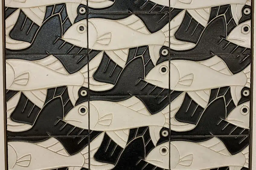
 Birds and Fish (1960) by Maurits Escher; HenkvD, CC BY-SA 4.0, via Wikimedia Commons
There are a multitude of examples of negative space in art that you can reference when attempting to use negative space as a strategy to create more balanced and cohesive compositions. We hope that these tips and art examples help inform your practical approaches to incorporating negative space in art. Other prolific artists who have successfully leveraged negative space in painting include figures such as Donald Judd, Kazimir Malevich, Salvador Dalí, Rene Magritte, Piet Mondrian, and Agnes Martin.
Frequently Asked Questions
What Is Negative Space in Art?
The space between objects, as well as the space between the subject and background is referred to as negative space. In the visual arts, negative space encompasses shapes with edges or the space outside the outline of an object and is more than just a space. Negative space is also understood in contrast to positive space, which refers to the occupied space of the composition. Negative space can be used in conjunction with color, and other art elements to create different visual effects that change the way a composition is perceived.
What Are the Benefits of Using Negative Space in Art?
There are many benefits to incorporating negative space in art. The best advantages include the ability to create compositions that are not only unified but also balanced, since negative spaces can also shape the way that artwork is read. Negative space in art is important because it helps the viewer identify the focal point while providing a space for the viewer’s eye to rest. Incorporating negative space into an artwork also avoids the inclusion of too many distracting elements. By striking a balance between positive and negative spaces, you ensure that you follow the concept of good design and allow for a sense of duality to emerge through the relationship between negative and positive spaces.
Which Famous Artists Are Known for Using Negative Space?
Popular artists such as Mark Rothko, Salvador Dalí, Piet Mondrian, Wassily Kandinsky, Coles Phillips, M. C. Escher, and Henry Moore are known for using negative space in their art.

Liam Davis is an experienced art historian with demonstrated experience in the industry. After graduating from the Academy of Art History with a bachelor’s degree, Liam worked for many years as a copywriter for various art magazines and online art galleries. He also worked as an art curator for an art gallery in Illinois before working now as editor-in-chief for artfilemagazine.com. Liam’s passion is, aside from sculptures from the Roman and Greek periods, cave paintings, and neolithic art.
Learn more about Liam Davis and about us.
Cite this Article
Liam, Davis, “Negative Space in Painting – How Omission Can Add to Art.” artfilemagazine – Your Online Art Source. August 10, 2023. URL: https://artfilemagazine.com/negative-space-in-painting/
Davis, L. (2023, 10 August). Negative Space in Painting – How Omission Can Add to Art. artfilemagazine – Your Online Art Source. https://artfilemagazine.com/negative-space-in-painting/
Davis, Liam. “Negative Space in Painting – How Omission Can Add to Art.” artfilemagazine – Your Online Art Source, August 10, 2023. https://artfilemagazine.com/negative-space-in-painting/.