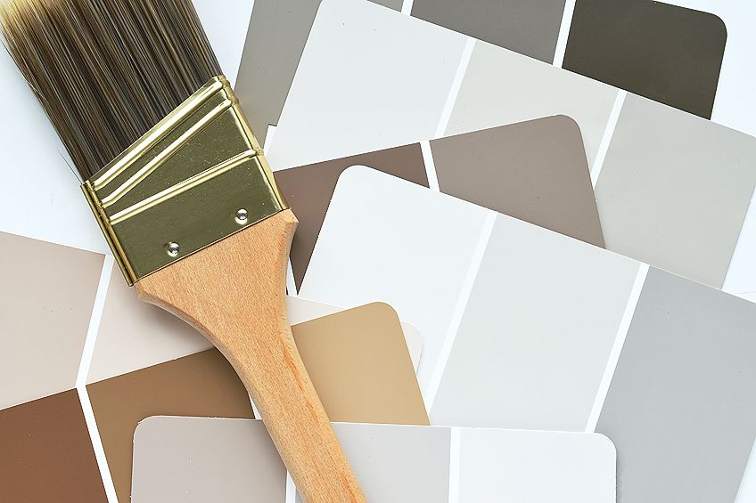
Neutral Colors – Exploring the Possibilities of Neutral Shades
Given the numerous advantages of using neutrals in your house for decoration or for pieces of artwork, it’s no wonder that they serve as the foundation for the majority of home improvement initiatives. Many rooms in your home will look beautiful when colored in neutral hues, and there are a wide variety of alternatives available to fit any type of home.
Neutral Colors Definition
So, what are neutral colors? Neutral colors are generally subdued tones that seem to be devoid of color, but which frequently include underlying colors that shift depending on the lighting conditions. You will not find these neutral colors on the color spectrum and they do not clash with main and secondary colors, but rather, they serve to enhance their appearance and help in complimenting them.
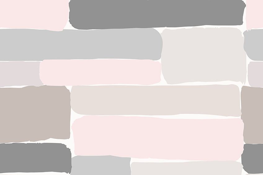
Several neutral colors are available. The most common examples of these colors are black, cream, beige, white, brown, and taupe, just to mention a few. Even though these colors are not represented on the color spectrum, they are complementary to primary and secondary hues.
You may mix different shades, such as red, white, and blue, to create a variety of additional colors by blending them. Generally, a secondary color is created by combining two different primary colors. For example, green is created by combining yellow and blue. While orange can be created by combining yellow and red. On the other hand, you may create purple by combining red with blue.
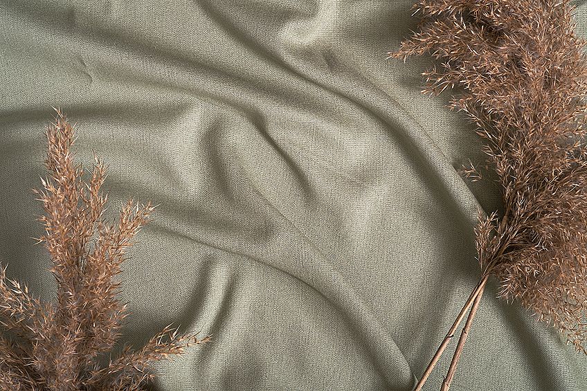
Neutral colors may have a diverse range of tones because blending various colors results in distinct tints. For example, combining light gray with beige will give you greige which is a color that has yellow undertones when lit by natural light such as the sun, but will have gray undertones when fluorescent lighting is used.
Applications of Neutral Colors
Since several neutral colors seem to be devoid of color, they are visually pleasing. Consequently, they are often used as a backdrop in interior decoration, where they may be used to complement the other colors in a design while also allowing the eye to smoothly transition between each point of focus.
Furthermore, these colors are also used in a lot of artworks.
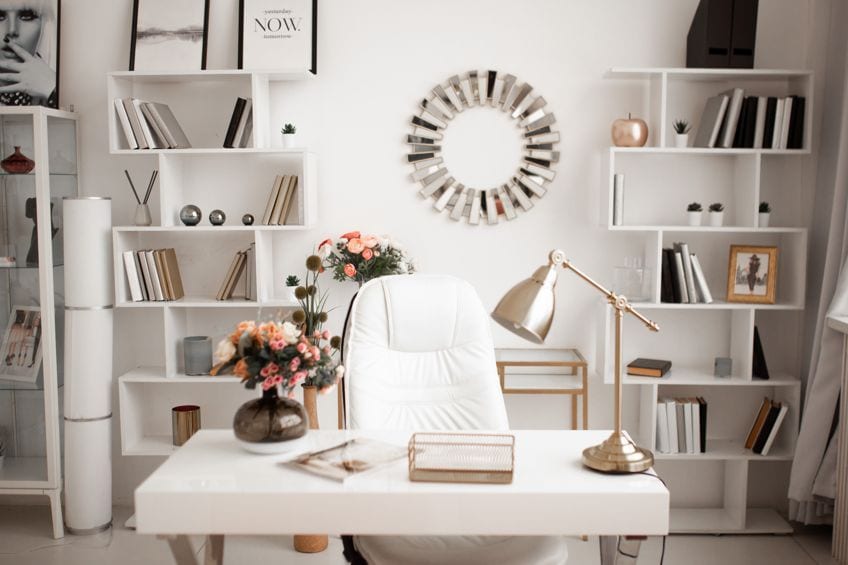
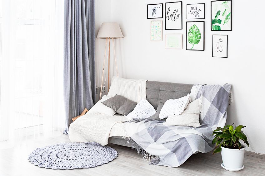
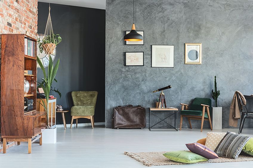
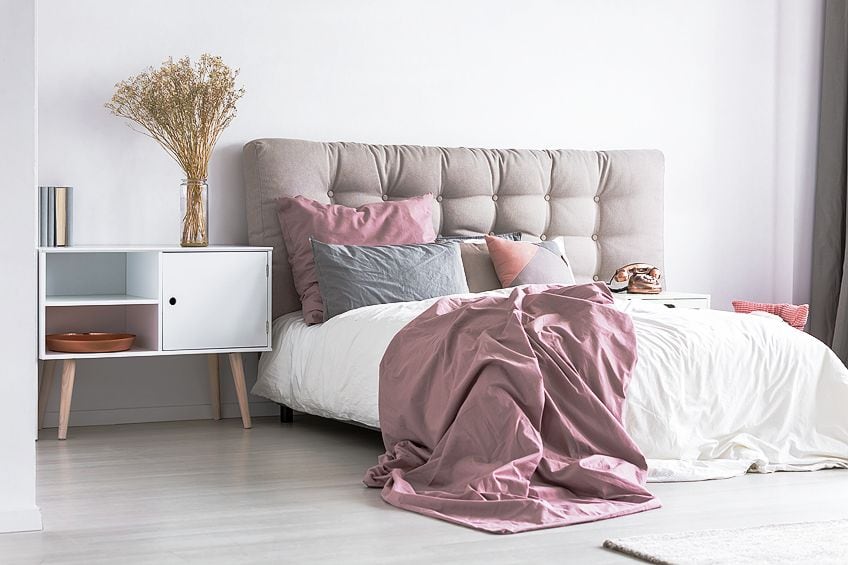
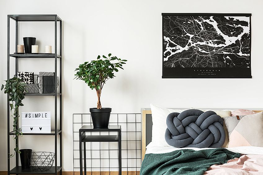
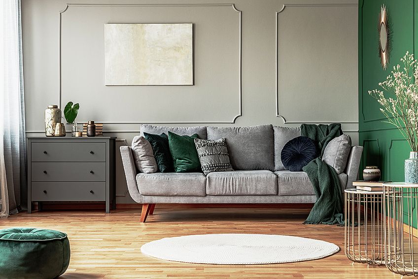
Used in Interior Design
Generally, most people love to use neutral colors in interior design. One common color used is olive green. As this is said to be a neutral color, it is therefore used sparingly. The main reason why such colors are used is that they are especially effective in complementing and highlighting other colors in a space.
When neutral colors are used in conjunction with brighter colors, the neutral color will appear dull while the brighter color seems more brilliant. The human eye is naturally drawn to colors with greater intensity because they are more vivid. When an artwork has an excessive number of intense hues, however, the eye is overloaded and viewers are unsure where to look. This might cause an artwork to seem unattractive, unnatural, or uncomfortable to the viewer as a result.
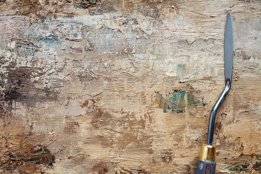
Can Be Used for Artworks
Neutrals may be used to attract emphasis to the differences in the artwork while also generating visual appeal in your work. This lessens the overall brilliance of the work and directs the attention to certain points in your artworks.
Neutral colors may also be used to create a range of different visual effects. The use of darker or brighter neutral colors helps to ensure that the lighting effects generated are as accurate as possible. Neutrals may be utilized to create several various appearances by combining them. For example, if you are seeing a painting of a certain item from a distance, you may notice that the saturation is less intense than if you are viewing it up close.
Using neutral colors in defining the differences in artwork helps in creating depth in your work.
Benefits of Using Neutral Colors
Neutral colors are used by a lot of people, including artists and interior designers. These neutral colors are used to produce a variety of visual effects by manipulating the depth, highlights, focus points as well as saturation to improve the overall look of a room or the piece of art being worked on. Using neutral color palettes has several benefits which are explained below.
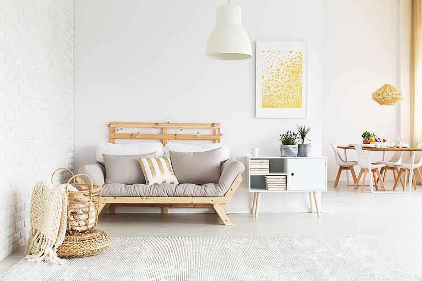
Neutral Tones May Serve as a Foundation
By starting with neutral paint colors when painting or decorating a room, you may expand on that foundation by integrating highlight colors or striking designs. Excessive use of bright colors may make a place seem overpowering and disturbing to the eye.
Neutral paint colors serve to create a sense of equilibrium in space, allowing you to experiment with various accessories as well as patterns.
Neutrals Go Nicely with a Wide Variety of Colors
Using neutral paint colors allows you to work with a wide range of colors. For example, if you are thinking of changing the colors of your décor or thinking of adding a new set of curtains, it will be much easier with neutral shades.
This is because they are adaptable and can mix very well with a variety of color palettes as well as design components. For instance, you can easily change your pillows on your sofa and your décor may completely be transformed without any clashing of colors.
Neutral Colors May Have a Relaxing Impact on the Mind
Colors that are bold, vibrant, and vivid, contrast very well with neutral colors that are peaceful and visually pleasant. Neutral colors provide a smooth transition from one hue to the next because of their low saturation.
The majority of neutral palettes also mirror naturally produced hues, transforming a living room into a tranquil, nature-inspired environment.
Neutrals Do Not Detract From Design Style and Preferences
No matter what your design aesthetic, preferences or tastes are, neutral colors have a spot in your home’s interior decor. This is because neutral colors serve as an excellent decorative base or backdrop, allowing you to mix in tones and/or splashes of colors. The purpose of doing this is that it brings depth to your environment as desired. As a bonus, primary and secondary colors stand out more when put among natural colors.
Neutrals Are Versatile and May Be Used with Any Décor Style
There are several styles you may use to decorate your home, ranging from modernist to rustic to decorative art. These design styles include neutral hues in their schemes. Regardless of the kind of décor you choose, neutrals will almost certainly play an essential part in your overall success.
You may also want to include neutrals if you are designing geometric patterns to create an appeal that is both classic and current at the same time.
You Can Mix Patterns and Texture Without Creating a Cluttered Look
With neutral colors, you are able to use any patterns as well as textures in your home without worrying about creating a look that is cluttered or one that will cause your eyes to hurt. It is important to remember that the higher the contrast between your neutral colors, the busier a room seems. As a result, designs with blacks and whites will have much more vitality when compared to patterns with beige and tan.
Neutrals May Be Used with Just About Any Color Scheme
When using a neutral color scheme, you should be able to achieve any color tone, whether a warm tone or a cool tone. As a result, neutrals have become more widely available, making them easier to work with overall. Essentially, you just need to determine the amount of warmth or coolness that your area requires and then pick your favorite neutral colors appropriately.
The shine and tone should be varied to create an atmosphere that is full of artistic pleasure.
Changing the Color Scheme of a Room Is Simple When Using Neutrals
When neutrals are used as the color foundations for the rooms in your home, you can easily change your furniture and even decoration style without the need to do a complete redo of the entire room from scratch. In other terms, designing using neutrals as a base saves both time and effort since they are easy to work with.
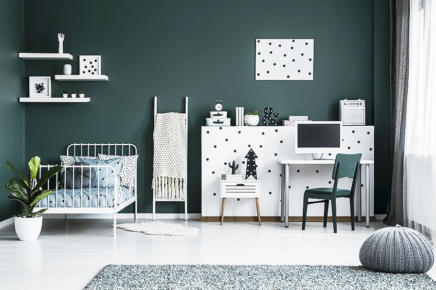
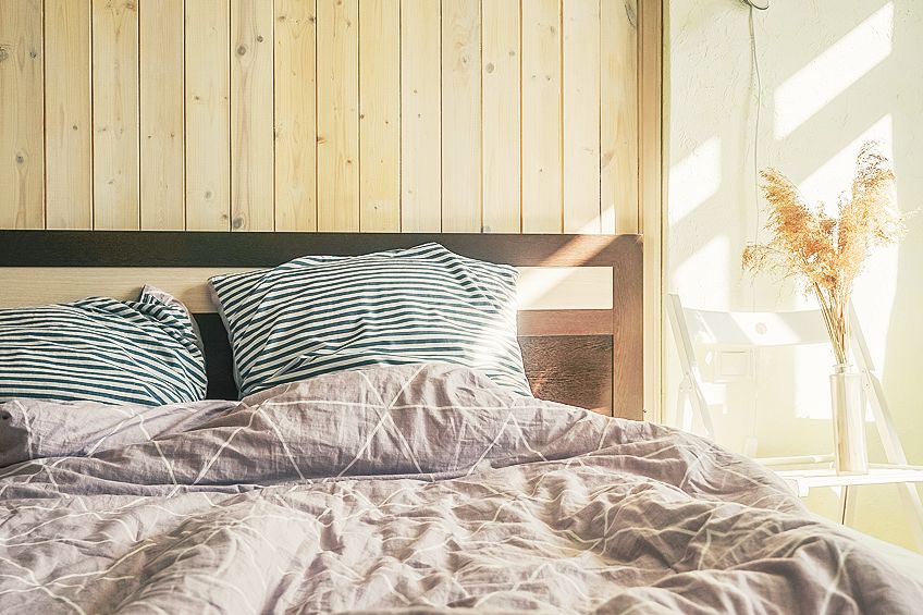
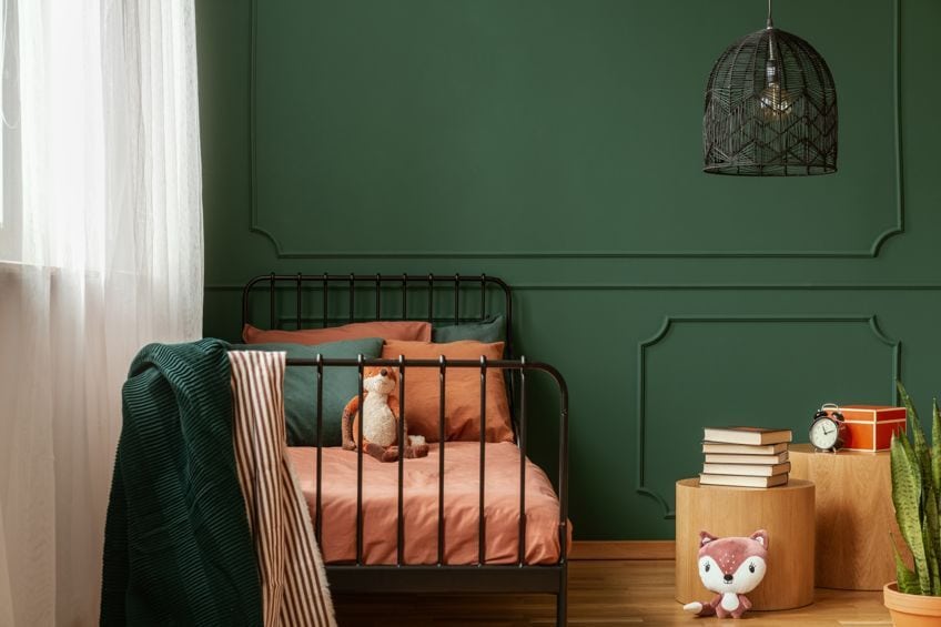
Neutrals Are Great for Kids’ Rooms
When designing kids’ rooms, neutral colors are recommended. Using these colors allows you to easily update and change the look of their rooms as they grow older by adding new decorations, rather than having to invest so much time and money into painting the walls every time.
Neutrals are timeless in their appeal, making them ideal for use as a foundation in any space of your house.
You will want to consider this in every location in your house, since constantly changing a room may cost you a great deal of money. Painting the rooms with a white or creamy white allows you to stay up to date with the latest trends in home decor without having to spend a fortune on new furnishings.
Neutrals Can Help in Boosting the Resale Value of a Home
Not everyone likes bright colors. To some people, bright colors may be the cause of eyesores and headaches. Neutral colors, on the other hand, are not too bright and are usually eye-catching to most people.
It is more likely that using neutral tones in your architectural spaces will draw more prospective buyers in if and when you plan on selling your home, as opposed to vibrant or specific colors. In other terms, neutrals are universally appealing regardless of one’s style, taste, as well as preferences.
Neutrals Provide a Good Basis for Any Design Scheme
Neutrals provide a good basis for any design scheme. Using neutral colors ensures that you are not restricted to a single color or design aesthetic. Neutrals allow you to increase the creative choices and capabilities of your spaces.
Neutrals, on the other hand, will unlock the door to a plethora of alternatives and options throughout every color aspect.
The Challenges of Using Neutral Colors in Interior Design
When it comes to decorating your house with neutral hues, there are a variety of issues that you may encounter. Some of the difficulties you may encounter while utilizing neutral colors to design your house are listed and explained below.
It Might Be Difficult to Incorporate Neutral Hues into Certain Spaces
Because each room in your house is unique, you may discover that incorporating neutral colors into some areas in your home is more difficult than incorporating neutral colors into other rooms. Furthermore, the colors that you use in the rooms will not be the same for each one of them.
When it comes to your kitchen, for example, using neutral colors like white is not a good option since the space is often used for cooking, and this hue may make it difficult for you to keep up with the upkeep. Instead, you will want to utilize darker neutrals, since they are easier to keep up with and maintain.
As an example, consider what colors to use in your child’s bedroom. You may want to try going with light neutral colors. Furthermore, the size and shape of your rooms might have an impact on the kind of neutral color scheme that you should choose in your home decor.
If Neutrals Are Used Incorrectly, They May Look Unpleasant
Using neutral colors in the wrong manner might make them look uninteresting, so be careful how you utilize them. If you’re decorating with neutral hues, you must not match your carpeting to your walls since it will seem unfinished. Make certain that your neutral hues do not end up looking drab.
This should be accomplished via the use of bold colors, as well as intriguing patterns and designs.
You Need to Think Strategically When Using Neutral Colors
When it comes to dark or light neutral colors, having a plan and considering the colors are essential in ensuring that your design is both appealing and functional. Each neutral hue is composed of a variety of colors, tones, and tints that complement one another. For each color, you will find warm tones as well as cool tones.
All of them will be regarded as being of the same color but with different neutral shades. It is necessary, however, for you to understand the kind of color that complements the design of your room, the amount of available space, the lighting in your room, as well as your furniture and other design components.
Make sure that the undertones of your neutrals and color scheme are constant throughout the whole project.
Neutrals Are Still Colors, and As Such, They Must Be Utilized with Care
Neutrals are still distinguished by their many colors, tints, and tones. It is critical to be mindful of these underlying tones when matching or harmonizing colors, as well as when choosing neutral paint colors. Colors like beige and ivory might contain pink or golden undertones, but the undertones of white can be ivory, blue, or even peach. These specialty contemporary pendants, for example, are available in a variety of neutral colors that, due to their gentle, warm undertones, blend well.
Using Neutral Colors: Some Tips
It is important to follow certain tips when using neutral colors in your home design to achieve a variety of distinct visual effects. These guidelines will guarantee that you can correctly improve the depths, saturation, highlights, as well as focal points in your home decor. The following are some tips to keep in mind while choosing neutral hues for your home’s interior design scheme.
Make Use of a Variety of Tints
With tonal color palettes, you can simply include additional highlights and accents into the neutrals to make certain sections of your living space stand out more. Using various sorts of tints and neutrals may help to make your home look more dynamic and appealing.
Pairing pink colors with neutral colors, such as beige and gold, for example, is a good idea.
Take the Lighting Into Consideration
The lighting in the room has a significant impact on how well your eyes can see color. Because artificial lighting contains warmer hues, the intensity of the warmer colors is increased when artificial lighting is used. Because of the blue hue of natural light, however, colors will seem to be less intense and darker when compared to artificial light. This is where you will want to consider several aspects when selecting color schemes to utilize, such as the season, a certain time of day, where the sun faces, as well as where your room is located in regards to the sun.
When designing a space that will get a lot of natural light, the direction where the room faces should be considered. If artificial light is used, make sure to check the temperature of your fluorescent lamp. Fluorescent bulbs with a color temperature greater than 3500K have a colder cast. Because the temperature is being lowered, the light it produces becomes warm and cozy.
Colors Should Be Selected with Care
There are many different types of neutral colors to choose from. Some colors are pure neutrals, but others are colors that are near neutrals. The effects that each of these colors have on your space are different. For example, a dark color may create a warm and welcoming atmosphere in a space. A lighter neutral color, on the other hand, has the effect of making the space seem bigger.
It is important to pick neutrals in a color that complements the style and atmosphere of your house.
Accessorize with Bright Colors to Make a Statement
The kind of accessories that you use in your rooms may help you to achieve a variety of different effects. For example, if your room is painted in a neutral color, you may want to consider adding neutrally colored furniture to create a calming effect. This does not imply, however, that you should forego color altogether.
Rather, you should incorporate the colors into your room’s accessories, such as your drapes, artwork, and even cushions to help make your room lively. Color-coordinated accessories make it simple to switch up the appearance and feel of your home area without having to redecorate the whole room to accommodate your changing tastes and preferences.
Colors in the Neutral Palette
Among the colors that make up a neutral color palette are white, gray, back, and brown, among other colors. These are available in a variety of neutral shades. Colors that are considered neutral are divided into many categories.
Pure Neutrals
These are colors that are completely saturated and do not have any undertones to them. You will discover a variety of colors in the pure neutral color palette, including black, brown, white, and gray. By combining pure neutral colors with primary colors, you may enhance the color saturation as well as the brightness of other colors.
Near Neutral Colors
When compared to the pure neutrals, these are colors that have a significantly lower saturation than they do in the pure neutrals. When pure neutral colors are mixed with primary colors, the result is a color that is close to being neutral.
For instance, combining a primary color such as yellow with a pure neutral color such as brown will produce a tan that is very close to the natural color, hence why it is called a near neutral color Additionally, when neutral colors are combined with bright shades, the intensity of the neutral shades rises, which might draw the viewer’s attention to a specific region of color.
Warm and Cool Neutrals
When pure neutral colors are mixed with primary colors, the result is a new color. Either a warm neutral color or a cold neutral color will be created. An undertone that is pink, yellow, or even orange will be present in a warm neutral color. Colors like gold, brown, and beige are examples of such hues. Cool neutral hues, on the other hand, contain undertones that are either green, blue, or purple.
Colors such as white, gray, and taupe are examples of this kind of color.
How to Use Neutral Colors Effectively
To get the most out of neutral colors and ensure that your house has the greatest design possible, you must understand how to utilize them successfully in your home. Below, we will be discussing some neutral colors that you could potentially make use of.
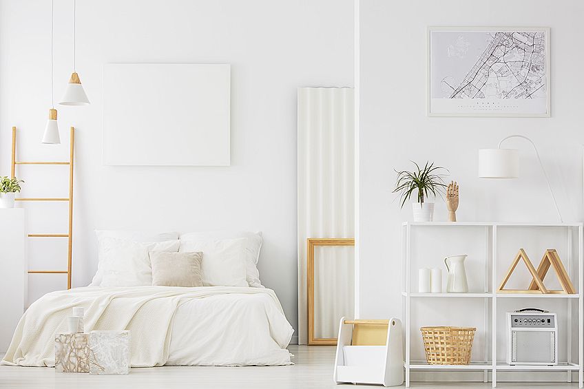
White
The room will look fantastic if it is well decorated with varied colors of comparable undertones, which will provide depth and make the room aesthetically intriguing while still being relaxing and comfortable. White is also a great neutral when used in two-toned décor and furniture designs.
| Color | Color Name | Hex Code (RGB) | Decimal Code |
| White | #ffffff | (255, 255, 255) |
Taupe
This is neutral with purple undertones. Because of the color’s undertones, it nicely complements items that have warm purple undertones. For example, you could choose to include glass lamps with purple accents in your home design.
As the deepest and also most color-absorptive color available, taupe is a very striking color. It is also the most expensive. The use of it elevates a place to an unrivaled level of refinement. An excellent method to incorporate taupe into your wardrobe without making it overpowering is to choose more delicate, detail-oriented taupe items.
| Color | Color Name | Hex Code (RGB) | Decimal Code |
| Taupe | #483c32 | (72, 60, 50) |
Brown
This is the neutral color that is most often utilized in the design of furniture. You may choose to decorate your house with brown tables or keratin displays to guarantee that you have a great shade of brown in your decor all of the time. Using a darker brown will have a more grounding influence on the overall tone of your area.
| Color | Color Name | Hex Code (RGB) | Decimal Code |
| Brown | #a52a2a | (255, 215, 0) |

Gray
Gray is a fantastic alternative to the all-white contemporary kitchen when you want something a little more saturated. Consider adding a piece of wood or another natural element to this trendy neutral tone to make it more attractive, since gray may seem cold and unwelcoming if used excessively.
| Color | Color Name | Hex Code (RGB) | Decimal Code |
| Gray | #808080 | (128, 128, 128) |
Gold
Gold is also classified as a neutral color because it goes with everything. When utilizing gold, pay close attention to the shine: excessive sheen reduces the neutral element’s effectiveness. Without enough radiance, you’ll be left with little more than a pretentious yellowy-tan.
| Color | Color Name | Hex Code (RGB) | Decimal Code |
| Gold | #ffd700 | (255, 215, 0) |
Beige
Though several people prefer white in the kitchen nowadays, beige may be a beautiful, creamy option that maintains the kitchen seeming warmer, welcoming, while yet being clean as well as light in appearance.
| Color | Color Name | Hex Code (RGB) | Decimal Code |
| Beige | #f5f5dc | (245, 245, 220) |
Ivory
With its delicate, velvety counterpart to beige but also a rich, deep option to white hues, ivory offers a variety of sophisticated neutrality options for each room in the house. Ivory is particularly effective in places with a lot of natural light because it captures that light and changes it into a much softer, but still vivid, reflection of itself.
| Color | Color Name | Hex Code (RGB) | Decimal Code |
| Ivory | #fffff0 | (255, 255, 240) |
A lot of people including designers and artists bow use neutral colors because they are easy to work with and can easily be mixed with many colors. There are many examples of neutral colors including black, white, beige, taupe, and brown just to mention a few. If you plan on decorating your home, you may want to consider using neutral colors.
Frequently Asked Questions
What Are Neutral Colors?
According to the definition of neutral colors, they are colors that are free from any other colors or tones. They do, however, possess underlying tones that change depending on the light levels.
What Colors Work Well with Neutral Colors?
Neutrals are by far the most adaptable and simple to work with of all the colors. Neutrals, in comparison to more intense primary and secondary colors, are seen by the human eye as being free of any color at all. Almost all colors, whether primary or secondary, go well with neutral colors. Neutral colors are classic and unobtrusive, making an excellent basis for almost any design style.
Can Neutral Colors Be Employed as a Design Element in Your Home?
Neutrals are very popular colors among interior designers. This is because they offer a lot of versatility when they are used within interior design. These neutrals are praised for their capacity to produce peaceful and calming environments, as well as providing the sense of cleanliness and spaciousness. They can be used in a variety of ways to create interiors that have depth and elegance.
Is It a Good Idea to Choose Neutral Colors?
Neutral colors are often considered to be extremely excellent colors for use when designing your home. However, whether you think them to be excellent or tedious, is determined by your tastes. When used with other colors in the right way, neutral colors may provide a splash of color to your design, while also drawing attention to specific prominent features.
What Is the Benefit of Using Neutral Colors in My Home Decor?
Neutral hues are excellent for home design in a variety of ways. In addition to helping you to show off your textures and furniture, they provide a variety of colorful options. Neutral hues go with any kind of decorating style, which is pretty awesome.
When It Comes to Neutral Colors, What Exactly Is the Difference Between Warm and Cool?
Colors with a high level of intensity and saturation are referred to as warm neutral colors. While cool colors do not have a high saturation, they do not have extreme intensity. Warm colors, such as gold, brown, and beige, as well as their combinations, infuse a feeling of vitality, optimism, and brightness into any space. Cool colors, such as white, gray, and taupe, are known to promote relaxation and serenity.
Does Lighting Have an Impact on Neutral Colors?
When it comes to colors, lighting is a very critical aspect. This is because light, whether artificial or natural, has an impact on how one sees the colors in a room. It may cause the neutral colors to lean towards warm or cool based on the kind of light. For example, artificial light makes the colors lean towards the warm neutral shades, while natural light makes colors lean more toward the cool shades.
Is It Possible to Combine Cool and Warm Neutrals in Your Home Decor?
You may use both warm and cool colors in your home’s interior design. The key, though, is in understanding how to do it. Once you understand how to combine the colors, they will be able to complement each other very well and your decor will look appealing.
What Neutral Colors Have the Effect of Making a Space Look Larger?
Colors that are lighter and brighter will reflect more light throughout a room, giving the impression that the space is bigger. Choose gray or light beige as your base color. You may also want to consider using the colors in their most neutral forms. Examples of colors that can make a place appear larger than it is includes white, lavender, and even blush pink.
Is Black a Neutral Color?
Yes, black is a neutral color. It is classified as a pure neutral color owing to its strong saturation and intensity.
Is White a Neutral Color?
White is a pure neutral color. It has a great degree of saturation and intensity. It may also be used with primary colors to achieve a near-neutral color.

Megan is a writer and researcher who holds a degree in Social Sciences, with a specialization in Psychology and Environmental Science, from the University of Cape Town. Her dedication to acquiring knowledge and making a positive impact has driven her current work in promoting conscious and sustainable growth in Southern Africa. Megan’s interests encompass exploring the physical and psychological impacts of color in our environment on our mood and well-being. She is also passionate about the role of art and creativity, which has been an integral part of society since the beginning of human history. Since 2022, Megan has been contributing blog posts on painting and color theory at artfilemagazine.
Learn more about Megan van Schoor and about us.
Cite this Article
Megan, van Schoor, “Neutral Colors – Exploring the Possibilities of Neutral Shades.” artfilemagazine – Your Online Art Source. February 1, 2022. URL: https://artfilemagazine.com/neutral-colors/
van Schoor, M. (2022, 1 February). Neutral Colors – Exploring the Possibilities of Neutral Shades. artfilemagazine – Your Online Art Source. https://artfilemagazine.com/neutral-colors/
van Schoor, Megan. “Neutral Colors – Exploring the Possibilities of Neutral Shades.” artfilemagazine – Your Online Art Source, February 1, 2022. https://artfilemagazine.com/neutral-colors/.