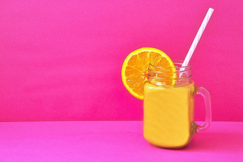
Warm Colors – Learn How Warm Colors Create Comfort
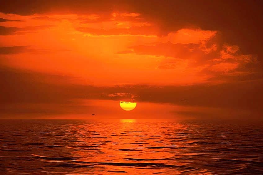
There is something undeniably comforting and captivating about warm colors. From the deep oranges of a sunset to the rich reds of a roaring fire, these hues evoke feelings of warmth, energy, and passion. But warm colors are far more than just aesthetically pleasing – they also have a profound psychological impact on our moods and emotions. Whether you are looking to create a cozy atmosphere in your home or make a bold statement with your fashion choices, warm colors offer endless possibilities for self-expression and creativity. So, join us as we journey through the world of warm colors and uncover the key to utilizing a warm color palette with both ease and style.
What Are Warm Colors?
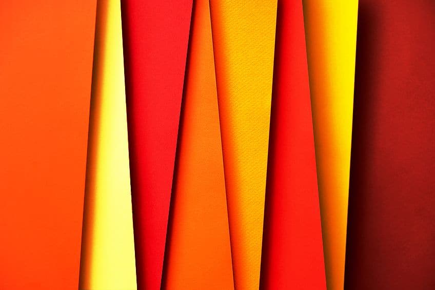
The warm color palette is made up of a variety of vibrant and captivating hues, which are often associated with physical objects and phenomena in nature such as fire, sunsets, and autumn leaves. They are typically found on the red, orange, and yellow side of the color spectrum, and are known for their ability to create a sense of warmth, energy, and passion. Red is a classic warm color that is often associated with love, desire, and power. It’s a bold and intense hue that can evoke strong emotions, from anger and aggression to love and passion. Red is a versatile color that can be used in a variety of settings, from creating a romantic atmosphere in the bedroom to adding a pop of color to your living room. Orange is a warm and playful hue that is often associated with creativity, enthusiasm, and optimism. It’s a color that can add a touch of fun and energy to any space, whether it is a child’s bedroom or a home office.
Orange is also a great color for creating contrast and visual interest when paired with other warm or cool hues.
Yellow is a bright and cheerfully warm shade with close ties to the sun, warmth, and joy. It is a color that can instantly raise one’s spirits, providing a much-needed sense of optimism and positivity. Yellow is a great choice for adding a touch of brightness to any space, whether it be your kitchen or even your living room. Despite its more neutral appearance, brown has become commonly associated with other warm colors. This is due to its close ties with earthy tones and natural materials, which can create a sense of warmth and coziness when used in any space. While these hues may make up the primary components of the warm color family, young and aspiring artists can venture towards similar hues and tones to find a wide variety of other warm colors. This will allow you to utilize these shades with complete accuracy, where your choice of colors can be highly specific to the context of your paintings or designs.
| Color Name | Color Hex Code | RGB | CMYK Color Code (%) | Shade of Color |
| Red | #ff0000 | 255,0,0 | 0, 100, 100, 0 | |
| Orange | #ffa500 | 255, 165, 0 | 0, 35, 100, 0 | |
| Yellow | #ffff00 | 255, 255, 0 | 0, 0, 100, 0 | |
| Brown | #a52a2a | 165, 42, 42 | 0, 75, 75, 35 | |
| Amour | #ee5851 | 238, 88, 81 | 0, 63, 66, 7 | |
| Untamed Red | #dd0022 | 221, 0, 34 | 0, 100, 85, 13 | |
| Electric Orange | #ff3503 | 255, 53, 3 | 0, 79, 99, 0 | |
| Amber | #ffbf00 | 255, 191, 0 | 0, 25, 100, 0 | |
| Red Bell Pepper | #dd3300 | 221, 51, 0 | 0, 77, 100, 13 | |
| Hot Chili | #b7513a | 183, 81, 58 | 0, 56, 68, 28 | |
| Magma | #ff4e01 | 255, 78, 1 | 0, 69, 100, 0 |
However, this journey may lead you to questions such as “Is pink a warm color?” and “Is green a warm or cool color?”’ The answer to these questions are fairly simple but require some creative input from the curious artist. While pink may be more closely linked to warm colors such as red, orange, and yellow, applying cooler undertones such as blue in subtle amounts can give your pink a slighter colder appearance. Likewise with green, which is more closely associated with cool tones, namely purple and blue. By adding in small amounts of orange or red into your green mixture, you can easily provide your green shade with a warmer lift, allowing you to tend to the needs of your paintings as you see fit.
Warm colors are often used in interior design to provide a cozy and welcoming atmosphere. They are also commonly used in fashion to make a bold statement or to add in a pop of color to an outfit. Whether you are looking to create a warm and welcoming home or add a touch of energy and passion to your wardrobe, warm colors may always remain the perfect choice.
How Warm Colors Affect Your Mood
Warm colors have the power to evoke a wide range of emotions and moods, from excitement and passion to comfort and coziness. This is because warm colors are associated with the sun, fire, and warmth, all of which are things that make us feel good and positive. For this article, we will only be covering the three primary warm colors that have been listed above, namely red, orange, and yellow.
Red, for instance, is known to increase one’s heart rate and stimulate the senses. It is a color that can evoke strong emotions, from love and passion, to anger and frustration.
Red is often used in restaurants and food packaging to stimulate the appetite and increase energy levels. However, by combining red with blue, it takes on a more regal and sophisticated tone, which can be used in corporate branding. Red and green on the other hand, create a striking contrast that can be as festive as it is intense, which can be seen in modern and contemporary designs to create a sense of drama and tension.
| Color Name | Color Hex Code | RGB | CMYK Color Code (%) | Shade of Color |
| Red | #ff0000 | 255,0,0 | 0, 100, 100, 0 | |
| Blue | #0000ff | 0, 0, 255 | 100, 100, 0, 0 | |
| Green | #008000 | 0, 128, 0 | 100, 0, 100, 50 |
Orange, on the other hand, is a color that is often associated with creativity, fun, and enthusiasm. It is a warm color that can create a sense of joy and excitement, making it a great choice for promoting a positive and playful atmosphere. Pairing orange with yellow can create a combination that is both bright and cheerful, evoking a sense of sunshine and happiness. Pairing orange with muted tones like gray or brown can create a sense of coziness and grounding, thanks to the more natural tones seen in such shades.
| Color Name | Color Hex Code | RGB | CMYK Color Code (%) | Shade of Color |
| Orange | #ffa500 | 255, 165, 0 | 0, 35, 100, 0 | |
| Yellow | #ffff00 | 255, 255, 0 | 0, 0, 100, 0 | |
| Gray | #808080 | 128, 128, 128 | 0, 0, 0, 50 | |
| Brown | #a52a2a | 165, 42, 42 | 0, 75, 75, 35 |
Yellow, however, is associated with sunshine, warmth, and happiness. It is a color that can instantly lift your mood and create a sense of optimism and positivity. Yellow is commonly used in hospitals and schools to create a sense of cheerfulness and to promote a positive attitude. To emphasize the cheerfulness of yellow, you can combine it with pink to evoke a sense of fun and lightheartedness. To create an inviting atmosphere, pairing yellow with beige can be a great fit to be used in home decor.
| Color Name | Color Hex Code | RGB | CMYK Color Code (%) | Shade of Color |
| Yellow | #ffff00 | 255, 255, 0 | 0, 0, 100, 0 | |
| Pink | #ffc0cb | 255, 192, 203 | 0, 25, 20, 0 | |
| Beige | #f5f5dc | 245, 245, 220 | 0, 0, 10, 4 |
What may surprise you the most, however, is that in spite of its seemingly subdued appearance, brown can have a significant impact on our mood and psychology. As a warm color with its roots nested deep within nature, brown may be able to evoke feelings of comfort, security, and stability like no other, making it an immensely popular choice in interior design and fashion. To accentuate the natural undertones that lie beneath brown, one can pair with green to create a calming atmosphere that resembles the foliage contrasted against some trees in a forest.
| Color Name | Color Hex Code | RGB | CMYK Color Code (%) | Shade of Color |
| Brown | #a52a2a | 165, 42, 42 | 0, 75, 75, 35 | |
| Green | #008000 | 0, 128, 0 | 100, 0, 100, 50 |
When you start mixing these colors with various undertones, or even with one another, these associations can help to complement one another, making it far easier for you to emphasize specific topics and take your designs to the next level. With this knowledge, it becomes easier to understand why warm colors are so effortlessly able to convey a sense of comfort and coziness, all thanks to their associations with fire, blankets, and hot drinks, all of which create a sense of warmth and comfort. This is why warm colors are often used in living rooms and bedrooms, as they can create a sense of relaxation and comfort. Warm colors have the power to affect our mood and emotions in a plethora of positive ways. Whether you are looking to create a sense of excitement, joy, or relaxation, warm colors can help you achieve the mood and atmosphere you desire.
So, why not start adding a touch of warmth and energy to your life with some help from warm colors? After all, they can have a profound impact on your mental health and well-being.
Using Warm Colors in Design
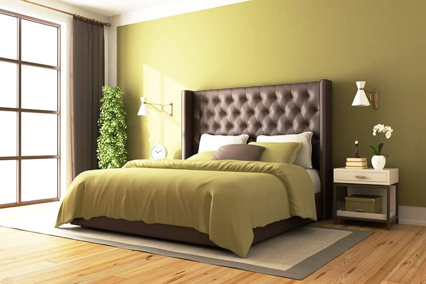
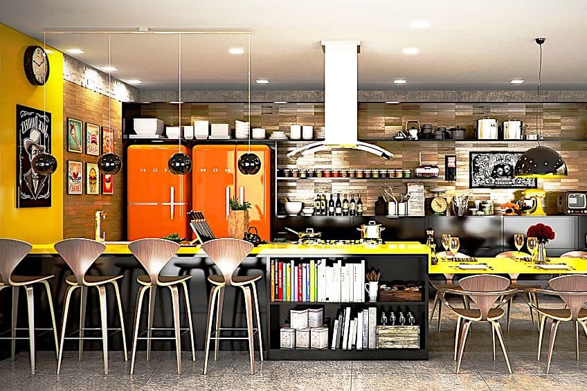
Using warm colors in design can create a sense of energy and passion, making any space feel significantly livelier and welcoming upon entering. Warm colors, such as red, oranges, yellows, and browns, can be used in a variety of different ways in order to achieve a myriad of different effects. For instance, one way to use warm colors in design is through accents and accessories. A pop of red in a throw pillow or a vase can create a sense of excitement and add visual interest to any room. Similarly, organizing a variety of warm-hued paintings or photographs across your walls and stands can help add depth and warmth to any space. Although, make sure to practice a subtle touch with these additions so as to not overwhelm your space.
Another way in which you can use warm colors in design is through the use of paint or wallpaper. A warm hue on your walls can create a sense of coziness and intimacy, making your space feel far more inviting.
For instance, a burnt orange accent wall can create a focal point in your room, adding a touch of warmth to what may otherwise be a neutral space. Warm colors can also be used to create a sense of balance and harmony in a space. Pairing warm colors with cooler hues, such as blues and greens, can create a sense of contrast and balance. For example, a warm orange rug paired with cool blue walls can help balance your room out while creating a playful harmony that remains easy on the eyes.
However, when you decide to use warm colors in your own designs, whether personally or professionally, it remains important to consider the mood and atmosphere that you want to create. Warm colors can create a sense of excitement and energy, but they can also be overwhelming if used in excess. Balancing your warmer tones with cool and neutral options can create a harmonious balance that makes your space even more inviting than you may have otherwise expected.
Let’s not forget, too much of a good thing may not always be so wonderful.
Warm Colors in Art History
It should come as no surprise that warm colors have played a rather significant role in art history, dating all the way back to ancient civilizations. From the fiery reds of cave paintings to the golden yellows of Renaissance paintings, warm colors have stood their ground as a tool to convey emotion, tell stories, and evoke a sense of energy and passion. In ancient art, warm colors were often used to depict the power and strength of any particular tribe or culture’s gods and warriors.
Red was a particularly popular color, as it would be used to represent blood, fire, and passion. Ancient Egyptian art, for instance, would commonly depict gods with red skin, while ancient Greek pottery featured warriors with red shields and helmets.
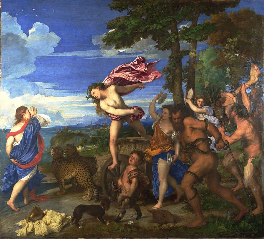
During the Renaissance, warm colors were used to create a sense of depth and richness in paintings. Artists like Titian and Rubens used warm colors to create a sense of warmth and vitality in their works, often using shades of red and gold to create a sense of richness and luxury. Warm colors were also used to create a sense of light and shadow, with golds and yellows often used to depict the warmth of the sun.
Bacchus and Ariadne (1523) by Titian
| Artist | Titian (Also known as Tiziano Vecelli) (1490 – 1576) |
| Date Completed | 1523 |
| Medium | Oil on canvas |
| Dimensions (m) | 1,75 x 1,9 |
| Current Location | National Gallery, London, United Kingdom |
Titian’s Bacchus and Ariadne is a famous painting that uses warm colors to create a sense of energy and movement. The warm oranges, yellows, and reds in the sky and clothing of the figure help create a sense of passion and excitement, highlighting the drama of the scene.
 Bacchus and Ariadne (1523) by Titian;Titian; Public domain, via Wikimedia Commons
The Fall of Phaeton (1605) by Peter Paul Rubens
| Artist | Peter Paul Rubens (1577 – 1640) |
| Date Completed | 1605 |
| Medium | Oil on canvas |
| Dimensions (cm) | 98.4 x 131.2 |
| Current Location | National Gallery of Art, Washington D.C., United States |
Peter Paul Rubens would frequently use warm colors in his works. His one painting, The Fall of Phaeton features a dramatic scene of Phaeton falling from the sky, with warm oranges and yellows creating a sense of intensity and heat. The warm colors add to the drama of the scene, emphasizing danger and chaos of the moment.
Bal du Moulin de la Galette (1876) by Pierre-Auguste Renoir
| Artist | Pierre-Auguste Renoir (1841 – 1919) |
| Date Completed | 1876 |
| Medium | Oil on canvas |
| Dimensions (m) | 1,31 x 1,75 |
| Current Location | Musée d’Orsay, Paris, France |
In Impressionism, warm colors were used to create a sense of light and atmosphere. Impressionist artists like Monet and Renoir would use warm colors to create a sense of sunlight and warmth in their paintings, often utilizing shades of orange and pink to depict the sun’s warmth. Warm colors were also used to create a sense of energy and movement, with bright oranges and reds being used to depict the hustle and bustle of city life. One of Pierre-Aguste Renoir’s paintings in particular, Bal du moulin de la Galette is a famous example of warm colors being used to create a sense of light and atmosphere. In this work, Renoir featured warm oranges, pinks, and yellows in the sunlight streaming through the trees.
The warm colors add a sense of heat and joy to the painting, creating a lively and celebratory atmosphere.
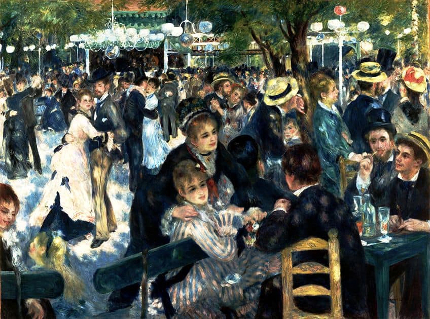 Bal du Moulin de la Galette (1523) by Pierre-Auguste Renoir;Pierre-Auguste Renoir, Public domain, via Wikimedia Commons
Composition VIII (1923) by Wassily Kandinsky
| Artist | Wassily Kandinsky (1866 – 1944) |
| Date Completed | 1923 |
| Medium | Oil on canvas |
| Dimensions (m) | 1,4 x 2,01 |
| Current Location | Mauritshuis, the Hague, Netherlands |
Wassily Kandinsky, however, is known for his use of warm colors to convey a sense of spirituality and harmony. In his painting Composition VIII, warm yellows and oranges are used alongside cool blues and greens to create a balanced and harmonious composition. The warm colors in the painting seem to radiate a certain light and energy, while still conveying a sense of tranquility and balance. It is clear to see that warm colors have been able to play a rather significant role in art history, from ancient civilizations all the way through to modern art and beyond. They have been used to convey emotions, create a sense of depth and atmosphere, and evoke a sense of energy and passion.
So, whether it is a vibrant red cave painting, or a golden yellow Renaissance masterpiece, warm colors have left their mark on the artwork for centuries past and will surely continue doing so for centuries to come.
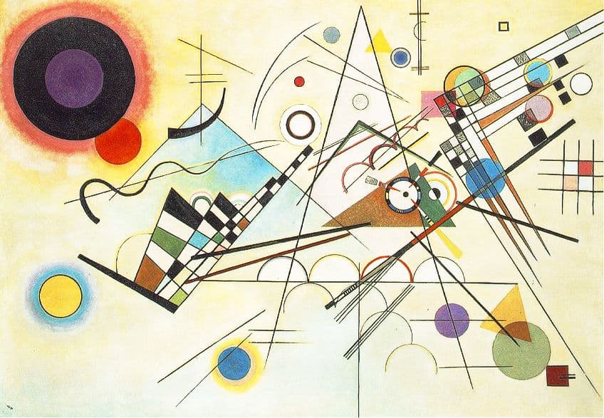 Composition VIII (1923) by Wassily Kandinsky;Wassily Kandinsky, Public domain, via Wikimedia Commons
Orange, Red, Yellow (1961) by Mark Rothko
| Artist | Mark Rothko (1903 – 1970) |
| Date Completed | 1961 |
| Medium | Acrylic on canvas |
| Dimensions (m) | 2,36 x 2,06 |
| Current Location | Private collection |
Throughout modern art, warm colors have been used to create a sense of emotion and passion. Artists like Rothko and Kandinsky used warm colors to create abstract works that were able to convey a sense of energy and emotion, often relying on shades of red, orange, and yellow to create a sense of movement and vitality.
Mark Rothko’s Orange, Red, Yellow is a well-known example of his signature style of abstract expressionism that uses practically all of the main hues in the warm color palette.
The painting features large blocks of warm orange, red, and yellow, which each seem to float and merge together in a unified composition. Rothko’s use of warm colors creates a sense of intense passion, while also conveying the warmth and radiance that these colors are known for.
In summary, warm colors stand as an essential tool, not only to any individual artist, but in the world of art and design as a whole. Their influence on our mood and psychology is undeniable. Whether you are designing a room or creating a piece of art, the use of warm colors can help you create a powerful and emotional experience that will stay with your audience long after they have left.
Take a look at our warm color palette webstory here!
Frequently Asked Questions
What Are Warm Colors?
Warm colors are typically found on the warmer side of the color wheel. This includes hues such as reds, oranges, yellows, browns, and certain shades of pink and purple.
Is Pink a Warm Color?
Pink is a color that can be either warm or cool, which depends entirely on its undertones. Generally, pink is considered to be a warm color, especially when it has red or orange undertones, while cooler pink hues have a blue or purple undertone.
Is Green a Warm or Cool Color?
Green can be both a warm or a cool color, as it merely comes down to the specific hue and undertones on display. Generally speaking, green with a yellow undertone is considered a warm color, while green with a blue undertone is considered a cool color.

Megan is a writer and researcher who holds a degree in Social Sciences, with a specialization in Psychology and Environmental Science, from the University of Cape Town. Her dedication to acquiring knowledge and making a positive impact has driven her current work in promoting conscious and sustainable growth in Southern Africa. Megan’s interests encompass exploring the physical and psychological impacts of color in our environment on our mood and well-being. She is also passionate about the role of art and creativity, which has been an integral part of society since the beginning of human history. Since 2022, Megan has been contributing blog posts on painting and color theory at artfilemagazine.
Learn more about Megan van Schoor and about us.
Cite this Article
Megan, van Schoor, “Warm Colors – Learn How Warm Colors Create Comfort.” artfilemagazine – Your Online Art Source. June 22, 2023. URL: https://artfilemagazine.com/warm-colors/
van Schoor, M. (2023, 22 June). Warm Colors – Learn How Warm Colors Create Comfort. artfilemagazine – Your Online Art Source. https://artfilemagazine.com/warm-colors/
van Schoor, Megan. “Warm Colors – Learn How Warm Colors Create Comfort.” artfilemagazine – Your Online Art Source, June 22, 2023. https://artfilemagazine.com/warm-colors/.