Principles of Art – Examples in Painting and Photography
Understanding the principles of art provides a vital foundation for anyone who would like to produce better art or learn to better appreciate art. Therefore, it is important to acquaint ourselves with the key art principles. From contrast to variety, each of these principles helps to create art that is impactful and memorable. In this article, we are going to look at the seven principles of art, discuss how they improve art, and explore some famous examples of paintings that employ these techniques perfectly.
Notes on the Principles of Art
These principles are simple tools that help articulate the composition of elements within an artwork. Many well-known artworks incorporate all the elements of art and principles of design, though some will appear more obvious than others.
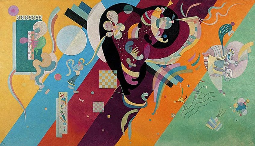
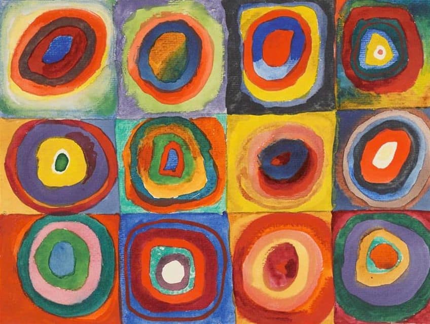 Color Study: Squares with Concentric Circles (1913) by Wassily Kandinsky, located in the Stadtische Galerie in Munich, Germany; Wassily Kandinsky, Public domain, via Wikimedia Commons
What Are the Seven Principles of Art?
When answering the question what are the principles of design it is just as important to understand both elements of art and principles of design. The elements of art are line, shape, form, value, space, color, light, and texture as it is to understand the principles of art. While the elements of art are what artists need to create art, the principles of art relate to the methodology used to assemble these elements. There are differing views on what the specific principles are, but we have compiled a list of the seven most popular principles of art. According to most sources, the seven principles of art are contrast, unity, balance, emphasis, variety, movement, and pattern.
Often when additional art principles such as proportion, harmony, and rhythm are cited, they are like the ones mentioned above.
Contrast
Contrast generally concerns obvious opposites. It refers to the amount of difference between elements. While there are too many types of contrast to mention here, they can include the contrast between shapes, lines, colors, values, textures, or the juxtaposition of dissimilar objects. Black and white are an obvious example of contrast, but colors on opposite sides of the color wheel such as red and green are also used to show contrast.
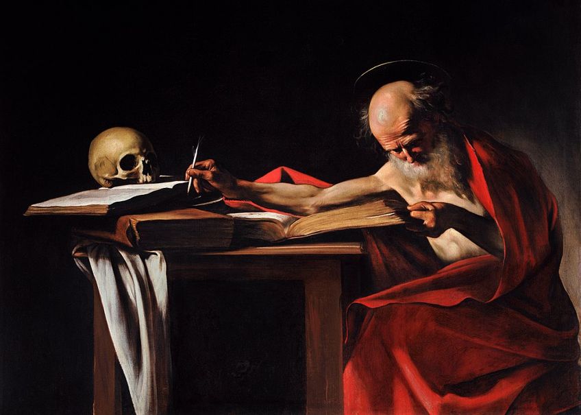 Saint Jerome Writing (c. 1605–1606) by Caravaggio; Caravaggio, Public domain, via Wikimedia Commons
Images can incorporate bright or dark colors to create value contrast. Value contrast refers to the distinction between values and refers to the lightness or darkness of an object. There are two main types of value contrasts, which are high and low contrast. The eye tends to be drawn to objects with a big difference between values. Low contrast has the opposite effect. When there is not much difference between light and dark values, the image appears more subtle.
Unity
Unity can help various art elements to appear complete, which can create a sense of order. Consistent use of lines, color, material, or textures indicates unity in an image, making elements look like they belong together. Unity is often referred to as harmony. Harmony allows all the elements of the artwork to complement each other. It pulls the elements of an artwork together. There are many ways to show unity in an artwork. The repetition of marks or colors creates consistency in an artwork. The consistent use of a certain color can unify an image, therefore monochromatic images appear unified.
Unity can also be expressed by showing elements in the same environment. For example, an underwater image shows all the elements unified by the water.
Balance
Balance speaks to the visual weight of an image. Through balance, the arrangement of the different elements of an artwork creates a sense of stability. Balance can be expressed in many forms. It could be seen in an image in which parts image are organized so that an artwork could be split in half and both sides would appear identical. This is called symmetry or formal balance. Though the line of symmetry would be horizontal, vertical balance means that the top and the bottom half are equal.
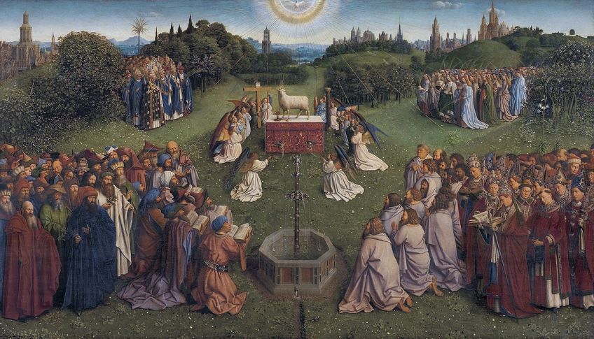 The Veneration of the Lamb with God the Father, the Holy Ghost, Christ, Mary, Adam and Eve (1432) by Jan van Eyck; Hubert van Eyck, Public domain, via Wikimedia Commons
Asymmetrical balance refers to images where one side of the composition is not a reflection of the other, though dissimilar objects carry a similar amount of visual weight. Another form of balance is radial balance, which refers to elements that radiate from the center such as an image that depicts a center with concentric circles going outward. The consistent use of pattern can also be used to create balance as the weight appears to be distributed evenly throughout the image. Positioning an element in the center of an image also balances it.
Emphasis
In an artwork emphasis, the use of refers to the focal point or the area that catches the viewer’s attention. It means making one element stand out more than the others, usually by making it the largest or most detailed area. Emphasis can be achieved through an increase in the object size, the use of lines, the addition of detail, or highlighting through color. Highlighting an element with color signifies the most common way to emphasize an object, which is by making it different from other objects. Where one element is different than the others, a point of emphasis is created.
Elements that are grouped also emphasize an image. If various elements point to one another, this gives that object visual emphasis.
Variety
Variety refers to the mixture of various elements within a composition. Then an image depicts three or more differences it is considered as showing variety. If there are more than three different colors, an artwork has a variety of colors. Should it only have two different colors, it can be considered as a contrast.
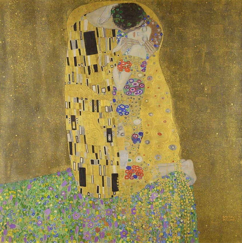 The Kiss (1908) by Gustave Klimt; Gustav Klimt, Public domain, via Wikimedia Commons
In addition to different kinds of colors, an image can show different sizes of stars, different sizes of people, different shapes and lines, or different kinds of patterns. Variety is considered the opposite of unity and prevents an image from becoming monotonous. While unity brings similar elements together, variety uses dissimilar elements to create interest, tension, or contrast in an artwork.
Movement
Movement can be incorporated through action in an artwork. An image can also incorporate suggested movement. Even in an image where nothing is depicted as moving, a sense of movement can be created through lines or edges. Movement can be implied through a subject looking or moving in a particular direction. Blurring is another way to incorporate a sense of movement. Importantly, movement can be directed along the path traveled by the viewer’s eye. Using various areas of focus, an artwork can direct the viewer’s eyes. For example, elements pointing in the same direction create a sense of movement. In a scene with a street with no cars, the viewer’s eyes are inclined to move down that road.
In the observation of such a scene, the eyes start from the foreground, moving to the middle ground and ending up in the background, creating a sense of movement.
Pattern
Pattern can be used to unify an image through repeated elements, which can create interest. It can be achieved through the continuous repetition of elements, such as alternating squares or circles. The two main kinds of patterns are predictable and unpredictable patterns. Predictable or mechanical patterns can include things like bricks, columns, or weaving. Unpredictable patterns, which are also called organic or natural patterns include things like waves, leaves, or stars in the sky.
 Composition 9 (1936) by Wassily Kandinsky; Wassily Kandinsky, Public domain, via Wikimedia Commons
Pattern is like rhythm in that it refers to the repetition of elements. They both include a repeated design, which creates a sense of movement or texture in an image. Repeating elements such as line, color, or shape produces several types of rhythm. The most recognizable is regular rhythm, which is defined by the repetition of an element at regular intervals. Random rhythm can include different shapes decorated with different colors giving the image a rhythmic irregularity.
Some Examples of Artworks Incorporating the Principles of Art
Most famous artworks include some or all the art principles. When observing artworks that incorporate the principles of design in art, it is important to understand that there can be relationships between the different elements and principles.
There should be a consideration of how well these various elements and principles interact with one another and which elements and principles stand out most.
Emphasis in Francisco Goya‘s Third of May 1808 (1814)
| Artist | Francisco Goya (1746 – 1828) |
| Created | 1814 |
| Medium | Oil paint |
| Dimensions (cm) | 268 x 347 |
| Genre | History painting |
| Associated Movement | Romanticism |
| Location | Museo Nacional del Prado, Madrid, Spain |
This painting by Francisco Goya is a veritable masterpiece and this is partly due to its sense of emphasis. Emphasis here rests on the focal point of the image, which means the area or objects that stands out above the rest. The main figure is clearly emphasized in this image and stands out as an important element. The viewer’s eyes are immediately drawn to the main figure because unlike the rest of the figures, he is dressed in light colors including a white shirt. This means he is highlighted in this painting through color, creating emphasis.
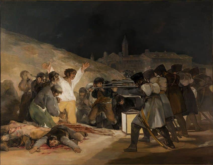 Third of May 1808 (1814) by Francisco Goya; Francisco Goya, Public domain, via Wikimedia Commons
The figure is further emphasized by the fact that the rest of the figures are all directing their gaze toward him. As the figures in the crowd are looking at him, none of them particularly stand out in the same way. Compared to the main figure, which has a majority of the emphasis, the rest of the figures do not create as much interest. all the lines, shapes, and shadows direct the gaze to the figure in the center of the painting.
This helps it stand out even more, giving the painting a clear highlight and therefore emphasis.
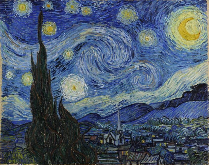
The Seven Principles of Art Seen in Vincent van Gogh’s Starry Night (1889)
Vincent van Gogh’s Starry Night is often referenced in discussions around the seven principles of art and design. It is common knowledge that the artist is regarded as one of the best artists of all time. But this painting in particular presents a seamless integration of the principles of art and therefore is the perfect illustration and educational source when attempting to inform people about the art principles.
| Artist | Vincent van Gogh (1853 – 1890) |
| Created | 1889 |
| Medium | Oil paint |
| Dimensions (cm) | 74 cm x 92 |
| Genre | Landscape painting |
| Associated Movement | Post-Impressionism, and Modern art |
| Location | The Museum of Modern Art, New York City, United States |
Vincent van Gogh’s painting, The Starry Night, is often cited as one that incorporates all the principles of art. This painting shows evidence of the use of contrast between darkness and brightness as well as a discrepancy between the colors of blue and orange.
 Starry Night (1889) by Vincent van Gogh; Vincent van Gogh, Public domain, via Wikimedia Commons
The use of color also creates a sense of unity with the consistent use of blue. The short and choppy brushstrokes create a swirling, flowing sensation throughout the painting, making the image seem like water, and adding to the sense of unity. At first, the image may not appear to be balanced as one side does not reflect the other. However, there is a sense of balanced asymmetry. The big tree on the left-hand side of the painting is balanced by houses and the looming mountains beyond the town. The painting depicts the moon as the brightest and largest object in the whole picture.
The sky appears to sweep and undulate in its direction, with the swirly yin-yang symbol placed in the center. Because of size, and centering, these elements are points of emphasis.
The painting also incorporates a range of colors, from white to blue and orange. It exhibits a variety of brushstrokes, leading in different directions. There is also a variety of objects from the tree, the town, the mountains, the stars, and the sky. Movement is strongly implied through various elements. The consistent repetition of elements such as the circular forms and the various curved lines results in a looping motion. The hills and swirls within the sky create a wave-like movement in the background. These wave-like brushstrokes also create an organic pattern throughout this painting. With their swooping configuration, the lights in the windows in the town, the stars in the sky, and the mountains in the background create a pattern that adds to the organic pattern.
Movement in Ansel Adams’ The Grand Tetons and the Snake River, Grand Teton National Park (1942)
| Artist | Ansel Adams (1902 – 1984) |
| Created | 1942 |
| Medium | Gelatin silver print |
| Dimensions (cm) | 39.2 x 48.7 |
| Genre | Photography |
| Associated Movement | American landscape photography |
| Location | Princeton University Art Museum, New Jersey, United States |
Ansel Adams’ record-setting print was commissioned by the Department of the Interior at a time when the photographer was constantly on the move, attempting to capture his iconic photographs. It seems only fitting then that the photographs should possess a sense of movement in their composition. Movement is expressed here by guiding the viewer’s eyes through the image.
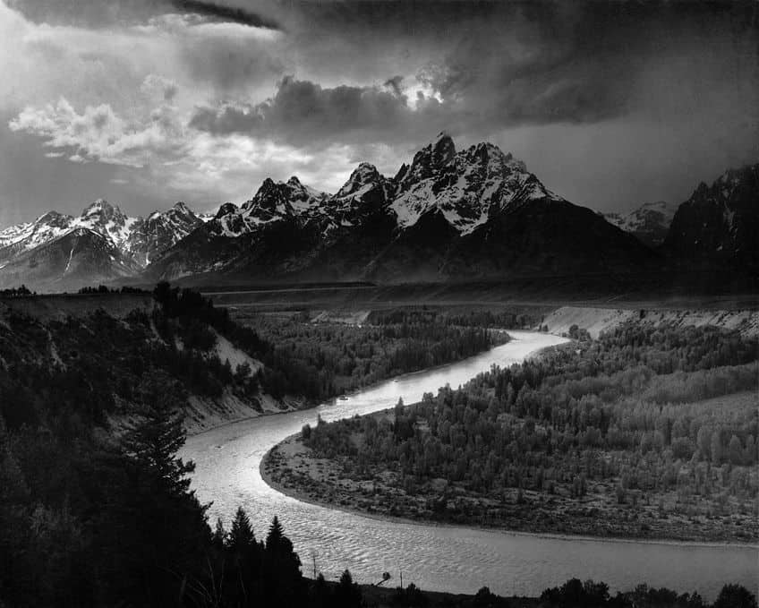 The Grand Tetons and the Snake River, Grand Teton National Park (1942) by Ansel Adams; Ansel Adams, Public domain, via Wikimedia Commons
As the eye flows up the river a sense of moving foreground is created, leading up to the bright area before the mountains. The comparison between the proportions of enormous mountains in the background and the tiny trees in the foreground creates visual drama, adding to the strong sense of movement.
This natural journey of the viewer’s eyes from the foreground to the middle ground and then to the background is a common method of incorporating the principle of movement, particularly in landscape images.
Unity in Romare Bearden’s The Dove (1964)
| Artist | Romare Bearden (1911 – 1988) |
| Created | 1964 |
| Medium | Cut-and-pasted printed paper, gouache, pencil, and colored pencil on board |
| Dimensions (cm) | 33.8 x 47.5 |
| Genre | Collage, photostat |
| Associated Movement | American Modernism |
| Location | The Museum of Modern Art, New York City, United States |
This painting by Romare Bearden appears quite chaotic at first glance. The collaged elements seem to have a random configuration. The artist has dismantled mass-produced images from newspapers and magazines and adhered these rearranged elements to a piece of cardboard. The figures are depicted in disproportional sizes, with large heads and hands, but tiny feet. Body parts mysteriously peer out from undefined openings in the buildings. Figures walk, sit, and smoke among roaming cats.
From all this, seemingly chaotic activity emerges a strange sense of order and unity. Through collage, Bearden incorporates unity in his choice of material and subject matter. The tonal values throughout the image are similar, with a significant amount of medium grey. There is also repetition through the different people depicted in the image.
Thus, Bearden uses a variety of elements with similar values and subject matter to achieve unity.
Contrast in Renee Magritte’s The Art of Living (1967)
| Artist | Rene Magritte (1898 – 1967) |
| Created | 1967 |
| Medium | Oil on canvas |
| Dimensions (cm) | 65 × 54 |
| Genre | Allegorical painting |
| Associated Movement | Surrealism |
| Location | Uncertain |
This painting by Magritte incorporates two sets of contrasts. The main figure in the center of the image is split into two parts. The figure’s body belongs is said to represent the artist himself. Quite conventionally, he is dressed in a formal suit with a red tie. However, the figure’s head appears to hover above the body, detached and floating in the air. The head itself is disproportionately large and unnaturally bright in color. The figure’s facial features are incomparably minute.
By detaching the head from the body and making it orange and spherical, Magritte contrasts the head and the body. The background depicts a range of rocky mountains while the foreground hints at a brick wall. Here the artist makes a comparison between the natural and the man-made environment in which this strange character finds himself. His presence in this recognizable world makes little logical sense. In this image, nothing seems to be a natural fit.
In this sense, Magritte’s The Art of Living uses contrast through juxtaposition.
Variety in Audrey Flack’s Wheel of Fortune (1978)
| Artist | Audrey Flack (1931 – Present) |
| Created | 1978 |
| Medium | Oil over acrylic on canvas |
| Dimensions (cm) | 61 × 50.8 |
| Genre | Still life |
| Associated Movement | Photorealism, and Pop art |
| Location | Whitney Museum of American Art, New York City, United States |
This hyperrealist painting takes its cue from the iconic Vanitas paintings, which were staples of Renaissance and 17th-century Dutch art. The classic Vanitas paintings were typically configured around religious themes and commonly included skulls as a reminder that human life is fleeting. They also often included the hourglass as a symbol of the inevitable passing of time. Both objects can be seen in this painting.
However, Flack added modern objects such as lipstick, which is a symbol of human vanity. She also adds dice, which symbolize chance, and other elements such as calendars, roses, and a tarot card depicting the wheel of fortune. The objects imbue the painting with a variety of colors such as red, yellow, green, and purple, nearly displaying the full spectrum of color.
Flack’s painting therefore incorporated differences in objects, their textures, and colors, creating a sense of variety.
Balance in Kerry James Marshall’s Untitled (Blot) (2015)
| Artist | Kerry James Marshall (1955 – Present) |
| Created | 2015 |
| Medium | Acrylic on PVC panel |
| Dimensions (cm) | 213.4 × 304.8 |
| Genre | Abstract painting |
| Associated Movement | Contemporary art |
| Location | Metropolitan Museum of Art, New York City, United States |
This painting is essentially an ink blot and resembles a giant Rorschach test. At first, the blots appear to be nothing more than abstract experimentations. But they are meticulously rendered through their ambiguous reference to the tradition of modernist abstraction, particularly in painting. Just like the Rorschach tests used in the field of psychology, this painting represents a considered reflection on abstraction itself and therefore reflects itself.
Despite its mastery, it is reminiscent of playful experimentation, akin to placing paint on a sheet, folding it in half, and pulling it apart again. Though the painting is not precisely symmetrical, it does appear similar on both sides, creating a symmetrical balance. The visual weight of both sides makes the image appear stable. But this stability does not make the image boring.
It is not lopsided, but it is well-composed and compelling.
Pattern in Lina Iris Viktor’s Constellations II (2016)
| Artist | Lina Iris Viktor (1987 – Present) |
| Created | 2016 |
| Medium | Pure 24k gold, acrylic, gouache, print on matte canvas |
| Dimensions (cm) | 152.4 x 213.4 |
| Genre | Painting |
| Associated Movement | Contemporary art |
| Location | Uncertain |
Lena Iris Victor is known for her luxurious patterned paintings. This painting is made of pure 24k gold, gouache, and acrylic paint, and print on canvas, all of which are elements that work together to create various patterns throughout this abstract painting. This extensive use of pattern creates balance, rhythm, and various points of interest. The painting uses repetition of shapes such as dots, triangles, squares, circles, squiggles, and checkers.
There are areas with similar same shapes, but different sizes. There are shapes within shapes and overlapping shapes. There are examples of radial rhythm which is where similar shapes are arranged concentrically. The repetition of concentric shapes and designs resembles the patterns observed in the stars in the sky. This unpredictable pattern is reinforced by the artist’s use of materials, with the gold unifying the painting. In this sense, this artwork incorporates both predictable and unpredictable pattern.
The principles of art are fundamental tools for making and appreciating art. Having a grasp of the principles of art helps articulate implied and explicit meanings in art. Something as simple as a line and how it is configured can spell the difference between an insignificant image and a masterpiece.
Take a look at our art principles webstory here!
Frequently Asked Questions
What Is Cube Vamp?
Cube Vamp is an acronym. It is an easy way to memorize the art principles. Cube Vamp stands for Contrast, Unity, Balance, Emphasis, Variety, and Movement, plus Pattern.
What Is the Difference Between the Principles of Art and the Principles of Design In Art?
If you want to know what are the principles of design all you need to know is the principles of art. In terms of composition, there is no difference between the principles of design in art and the principles of art except that one is used in graphic design and the other in visual art respectively.
What Is the Difference Between the Elements of Art and the Principles of Design In Art?
The difference between the elements of art and the principles of design is simple. The elements of art are like the basic parts of an artwork and the principles of design are a way of organizing the elements of art in the form of a composition.
Liam Davis is an experienced art historian with demonstrated experience in the industry. After graduating from the Academy of Art History with a bachelor’s degree, Liam worked for many years as a copywriter for various art magazines and online art galleries. He also worked as an art curator for an art gallery in Illinois before working now as editor-in-chief for artfilemagazine.com. Liam’s passion is, aside from sculptures from the Roman and Greek periods, cave paintings, and neolithic art.
Learn more about Liam Davis and about us.
Cite this Article
Liam, Davis, “Principles of Art – Examples in Painting and Photography.” artfilemagazine – Your Online Art Source. August 22, 2023. URL: https://artfilemagazine.com/principles-of-art/
Davis, L. (2023, 22 August). Principles of Art – Examples in Painting and Photography. artfilemagazine – Your Online Art Source. https://artfilemagazine.com/principles-of-art/
Davis, Liam. “Principles of Art – Examples in Painting and Photography.” artfilemagazine – Your Online Art Source, August 22, 2023. https://artfilemagazine.com/principles-of-art/.