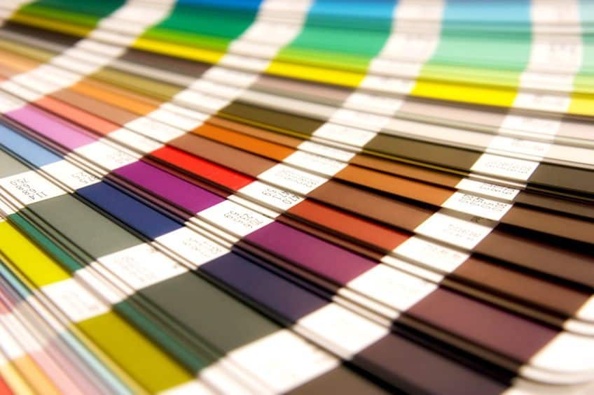
Ugliest Colors in the World – A Detailed List of Very Ugly Colors
While beauty is often considered to be in the eye of the beholder, there are certain colors that are widely regarded as unappealing or downright ugly. Ranging from murky greens or drab dark browns to sickly yellows, these colors have the power to evoke feelings of disgust, revulsion, and even nausea when used correctly… if that is even possible? Nevertheless, despite their less-than-pleasant reputation, these hues have found a place in art, fashion, and design, challenging our preconceived notions of what constitutes beauty. Join us on a journey through the world of ugly colors, where we will be asking the question, “What is the ugliest color?”, while exploring the science, psychology, and cultural significance behind these divisive shades.
Contents
What Are Some of the Ugliest Colors in the World?
Some of the ugliest colors in the world can be found lurking in the depths of a murky swamp or hiding in a moldy refrigerator. These colors, such as Pantone 448 c, which comes in the form of a drab dark brown, also known as opaque couché, have a way of evoking an immediate and visceral reaction in most observers. These are colors that represent decay, disease, and discomfort, reminding us of the many unpleasant realities that are littered throughout the world around us.

Yet, despite their unsavory connotations, these colors possess a certain fascination that draws us in, tempting us to instead explore the dark and unsettling aspects of our human experience. Whether in the realm of fashion, art, or even design, these colors challenge our perceptions of what is beautiful and compel us to look beyond the surface to uncover the deeper meanings and emotions that they evoke.
| Color Name | Color Hex Code | RGB | CMYK Color Code (%) | Shade of Color |
| Pantone 448 C | #4a412a | 74, 65, 42 | 0, 12, 43, 71 | |
| Mustard Yellow | #eaaa00 | 234, 170, 0 | 0, 29, 100, 1 | |
| Pickle Green | #93934a | 147, 147, 74 | 0, 0, 50, 42 | |
| Rust | #b7410e | 183, 64, 14 | 0, 64, 92, 28 | |
| Light Olive | #bdbc70 | 189, 188, 112 | 0, 1, 41, 26 | |
| Bright Magenta | #ff00cd | 255, 0, 205 | 0, 100, 20, 0 | |
| Faded Salmon | #fac0ac | 250, 192, 172 | 0, 23, 31, 2 | |
| Puce | #cc8899 | 204, 136, 153 | 4, 2, 0, 37 | |
| Seaweed | #354a21 | 53, 74, 33 | 28, 0, 55, 71 | |
| Dark Gray | #a9a9a9 | 169, 169, 169 | 0, 0, 0, 34 |
As mentioned previously, one of the ugliest colors in the world would undoubtedly have to be a shade of brown green, commonly referred to as pantone 448 c. However, it appears that this color has been mentioned to death throughout the art scene, so let us rather turn our attention to a few other unsightly underdogs in the color wheel. For instance, we have light olive, which is a muted and unassuming hue that can easily be overlooked and dismissed. This is due in large part to its bland and unremarkable appearance, one that seems to lack any vibrancy and depth. In turn, it seems to evoke a sense of lifelessness and monotony. With its murky undertones, light olive can be found in a number of unpleasant forms such as bile, newborn feces, and many more we would care to not mention.
Despite this, light olive has managed to find itself a place in both fashion and design, often being used in military attire and outdoor gear due to its practicality and ability to blend into natural environments. Light olive may not be the most striking or eye-catching color, but it is still able to possess a quiet charm and understated elegance that speaks to the simplicity and authenticity of the natural world.
On the other hand, however, we have bright magenta, which is a rather intense and overpowering hue that demands attention and apparently refuses to be ignored. This is a shade that seems to assault the sense, evoking a sense of aggression and urgency that can be overwhelming in nearly any composition. Its garishness and lack of subtlety make it a color that is often considered one of the ugliest in the world, with some even describing it as “eye-searing” or even “vomit-inducing.” Against the odds, bright magenta has found a place in art and design, often being used to convey a sense of boldness and confidence. Its vivid energy can be harnessed to create dynamic and impactful designs. In turn, this is a shade that also serves as a reminder of the importance of balance and moderation in our lives. Its overwhelming nature can be exhausting and even harmful in excess, but its power and intensity cannot be denied as it continues to fascinate and inspire us even in its unapologetic presentation.
Works of Art That Incorporate These Ugly Colors
Although the use of bright, vibrant colors is often associated with beauty and creativity in the world of art, some of the most famous and historically significant paintings have employed some of the ugliest colors in the world to convey their meaning. The works of our ancestral greats, such as Rembrandt and Caravaggio, often utilized dark and muted tones to capture the solemnity and gravity of their subject matter.
| Artist | Rembrandt (Rembrandt Harmenszoon van Rijn) (1606 – 1669) |
| Date Completed | 1632 |
| Medium | Oil on canvas |
| Dimensions (m) | 1,7 x 2,16 |
| Current Location | Mauritshuis, the Hague, Netherlands |
 The Anatomy Lesson of Dr. Nicolaes Tulp (1632) by Rembrandt; Rembrandt, Public domain, via Wikimedia Commons
For instance, in “The Anatomy Lesson of Dr. Nicolaes Tulp,” Rembrandt uses shades of brown and green to depict the dissected cadaver and the somber expressions of the doctors in attendance. The use of muted olive greens and dark grays, depicted in the cadaver’s skin tone and the doctor’s clothing and wall respectively, is able to evoke a sense of morbidity and death that is both unsettling and captivating.
The use of muted olive greens and dark grays is depicted in the cadaver’s skin tone and the doctor’s clothing and wall respectively.
| Artist | Vincent van Gogh (1853 – 1890) |
| Date Completed | 1885 |
| Medium | Oil on canvas |
| Dimensions (m) | 0,82 x 1,14 |
| Current Location | Van Gogh Museum, Amsterdam, Netherlands |
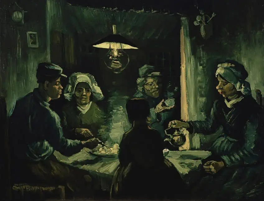 The Potato Eaters (1885) by Vincent van Gogh; Vincent van Gogh, Public domain, via Wikimedia Commons
Similarly, many of Vincent Van Gogh’s works are known for their bold and expressive use of garish yet entrancing colors. However, his famous painting, “The Potato Eaters” is dominated by muddy browns and yellows, conveying a sense of the poverty and hardships of the rural peasant class he was depicting at the time.
The unremarkable colors serve to highlight the bleakness of the scene and the harsh realities of life for these laborers.
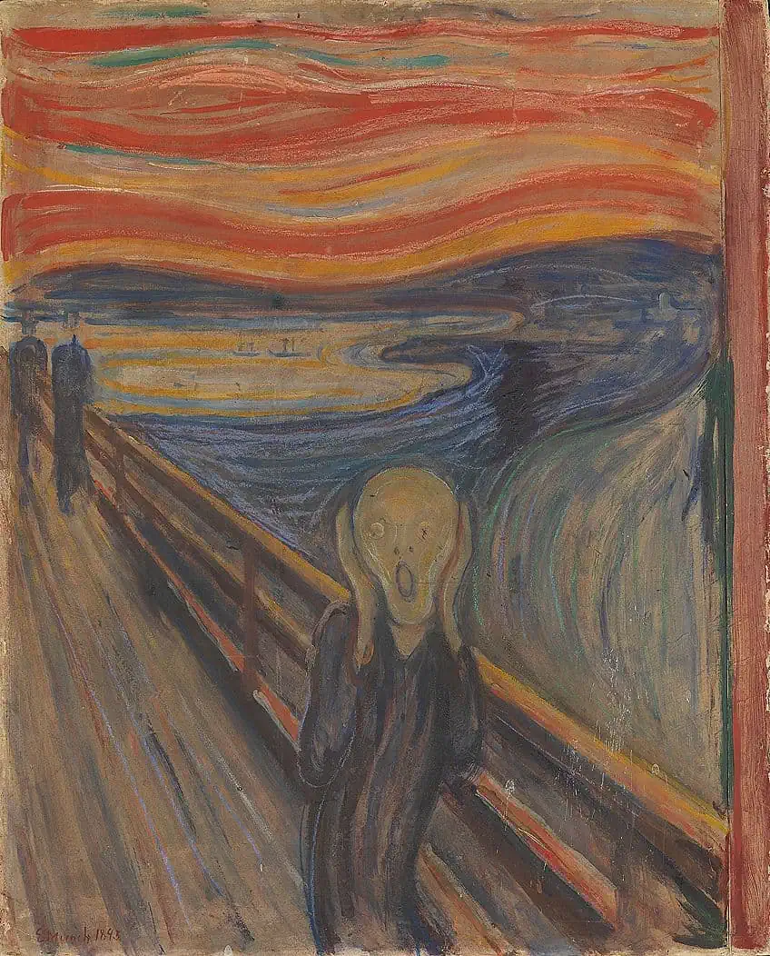
| Artist | Edvard Munch (1863 – 1944) |
| Date Completed | 1893 |
| Medium | Oil on cardboard |
| Dimensions (cm) | 91 x 73.5 |
| Current Location | Munch Museum, Oslo, Norway |
 The Scream (1893) by Edvard Munch; Edvard Munch, Public domain, via Wikimedia Commons
Even the modernist movements of the 20th century, such as the Fauvists and the Expressionists, incorporated a wide array of ugly colors to push the boundaries of what was considered acceptable in art. In “The Scream” by Edvard Munch, the vivid, almost fluorescent shades of orange and green are jarring and almost disorientating, evoking a sense of anxiety and existential dread. While the use of ugly colors may seem counterintuitive in the creation of beautiful and meaningful art, it is a testament to the power of the artist to evoke emotion and convey their message even through the most unlikely and challenging of hues.
These historically famous paintings serve as a reminder that beauty is not limited to what is conventionally appealing, and that the ugliest colors in the world can still be harnessed to create works of art that leave a lasting impact and remain of high importance.
The Psychology of Ugly Colors
Color is an integral part of the human experience, shaping our environment, our emotions, and our behavior. While we often associate bright and vibrant colors with positivity and happiness, unappealing colors can have a profound impact on our psyche, triggering negative emotions and affecting our cognitive and behavioral responses.
| Color Name | Hex Code | RGB | CMYK Color Code (%) | Shade of Color |
| Opaque Couché | #4a412a | 74, 65, 42 | 0, 12, 43, 71 | |
| Blue | #0000ff | 0, 0, 255 | 100, 100, 0, 0 | |
| Green | #00ff00 | 0, 255, 0 | 100, 0, 100, 0 |
For example, the color opaque couché is often associated with dullness and sadness, evoking a sense of stagnation and a lack of energy. In contrast, the color blue is commonly associated with calmness and relaxation, leading many hospitals and healthcare facilities to use blue in their décor to help patients feel more at ease. Similarly, the color green is often associated with nature and growth, evoking a sense of renewal and freshness.
| Color Name | Hex Code | RGB | CMYK Color Code (%) | Shade of Color |
| Mustard Yellow | #eaaa00 | 234, 170, 0 | 0, 29, 100, 1 | |
| Dark Gray | #a9a9a9 | 169, 169, 169 | 0, 0, 0, 34 |

However, when we encounter unappealing colors, our response can be quite different. The color mustard, for example, is often associated with nausea and discomfort, and can trigger feelings of disgust and revulsion. The color gray is often associated with boredom and monotony, evoking a sense of ennui and listlessness.These negative emotional responses to unappealing colors can have a significant impact on our behavior as well. For example, a study found that students in a classroom with blue walls performed better on tests than those in a classroom with red walls, as blue is associated with calmness and focus, while red is associated with anxiety and distraction.
| Color Name | Hex Code | RGB | CMYK Color Code (%) | Shade of Color |
| Yellow | #ffff00 | 255, 255, 0 | 0, 0, 100, 0 | |
| Black | #000000 | 0, 0, 0 | 0, 0, 0, 100 | |
| Red | #ff0000 | 255,0,0 | 0, 100, 100, 0 |
In marketing and advertising, however, the use of color is often carefully calibrated to trigger specific emotional responses and behaviors in consumers. For example, the color yellow is often used to convey a sense of happiness and optimism, while black is often used to convey sophistication and elegance. Famously, companies such as McDonald’s and KFC have specifically opted to use red as a prominent part of their branding, as the shade has been known to entice one’s appetite when observed. While the Impact of color on our emotions and behavior may seem subtle, it is a powerful force that shapes our perceptions of the world around us.
By understanding the emotional and behavioral responses ugly colors may trigger, we can better control the impact that color has on our lives, and harness the power of color to create more positive and enriching experiences.
The Cultural Significance of Ugly Colors in Our Past and Present
It should come as no surprise that color has played a significant role in human culture for thousands of years, shaping our art, architecture, fashion, and our traditions. While some colors are universally regarded as beautiful, others have been considered unappealing or even repulsive, yet they still hold a significant cultural significance in both our ancient and modern times.
| Color Name | Hex Code | RGB | CMYK Color Code (%) | Shade of Color |
| Green | #00ff00 | 0, 255, 0 | 100, 0, 100, 0 | |
| Putrid Green | #8ca674 | 137, 165, 114 | 16, 0, 30, 35 | |
| Yellow | #ffff00 | 255, 255, 0 | 0, 0, 100, 0 |
In ancient cultures, unappealing colors often held deep symbolic meaning. For example, the ancient Egyptians would associate the color green with new life and rebirth, but they would associate muted alternatives to green with death and decay. Similarly, in ancient Greece, the color yellow was associated with decay and disease.
| Color Name | Hex Code | RGB | CMYK Color Code (%) | Shade of Color |
| Brown | #a52a2a | 165, 42, 42 | 0, 75, 75, 35 | |
| White | #ffffff | 255, 255, 255 | 0, 0, 0, 0 | |
| Black | #000000 | 0, 0, 0 | 0, 0, 0, 100 |
Moving into our modern times, we still see the cultural significance of ugly colors. For example, various shades of brown have been associated with the earth and the natural world, yet it has also been associated with poverty and lack of education in some cultures. In some Asian cultures, the color white is associated with mourning and death, while these concepts are rather associated with black in Western cultures.
| Color Name | Hex Code | RGB | CMYK Color Code (%) | Shade of Color |
| Neon Green | #39ff14 | 57, 255, 20 | 78, 0, 92, 0 | |
| Vivid Pink | #ff14af | 255, 20, 175 | 0, 92, 31, 0 |
Ugly colors have also played a significant role in contemporary art and design. For instance, the use of neon green and vivid pink has become a popular trend in recent years, with artists and designers embracing these garishly bright colors to challenge our conventional beauty standards to create bold and daring works. The cultural significance of these ugly colors in both ancient and modern times should stand as a testament to the power of colors’ ability to shape our perceptions and view of the world.
By understanding the cultural significance of these colors, we can gain a deeper appreciation for the rich history and cultural traditions that have shaped our society, and we can continue to push the boundaries of art and design by exploring new and conventional uses of color.
The Future of Ugly Color Trends
As our world continues to evolve and change, so too do our tastes and preferences when it comes to color. While some colors may have been considered unappealing and even repulsive in the past, we are now seeing a growing resurgence towards the use of these so-called “ugly” colors in fashion, design, and other creative and artistic fields. One reason for this trend is the desire for something new and different. After years of bright and bold colors dominating the fashion and design worlds, many people are now seeking out more subdued and muted tones, such as mustard, mauve, and olive green. These colors may not be traditionally considered as beautiful, but they offer a refreshing change from the bright and garish hues that have dominated in the past.
Another reason for the trend toward unappealing colors is a growing awareness of sustainability and eco-friendliness. Many of these colors, such as rust and mustard, are inspired by nature and evoke a sense of earthiness and our connection to the natural world. As consumers become more conscious of the impact that their choices have on the environment, they are looking for ways to incorporate more natural and sustainable elements into their lives, including the colors they choose to wear and surround themselves with.
The future of color trends that use ugly colors is a dynamic and ever-evolving field, as designers and artists continue to experiment with new and unconventional uses of color. We can expect to see more muted and subdued tones, as well as a growing trend towards the use of earthy and natural hues. Whether it is in fashion, design, or art, the use of unappealing colors is sure to remain a prominent trend for years to come, offering a unique and unconventional way to express ourselves and stand out from the crowd.
Frequently Asked Questions
What Is the Ugliest Color in the World?
While this is a subjective matter, the specific shade of brown-green, known as either Pantone 448 C or Opaque Couché, has widely been considered as the ugliest color in the world. In fact, the Australian government even went so far as to use the color as part of their anti-smoking campaign.
Are Ugly Colors Always Considered Bad?
Not necessarily. While some colors may be seen as unattractive to many, they can still have aesthetic or symbolic value in certain contexts. For example, some colors that may be seen as unattractive on their own may be used effectively in a specific design or artistic composition.

Megan is a writer and researcher who holds a degree in Social Sciences, with a specialization in Psychology and Environmental Science, from the University of Cape Town. Her dedication to acquiring knowledge and making a positive impact has driven her current work in promoting conscious and sustainable growth in Southern Africa. Megan’s interests encompass exploring the physical and psychological impacts of color in our environment on our mood and well-being. She is also passionate about the role of art and creativity, which has been an integral part of society since the beginning of human history. Since 2022, Megan has been contributing blog posts on painting and color theory at artfilemagazine.
Learn more about Megan van Schoor and about us.
Cite this Article
Megan, van Schoor, “Ugliest Colors in the World – A Detailed List of Very Ugly Colors.” artfilemagazine – Your Online Art Source. March 23, 2023. URL: https://artfilemagazine.com/ugliest-colors-in-the-world/
van Schoor, M. (2023, 23 March). Ugliest Colors in the World – A Detailed List of Very Ugly Colors. artfilemagazine – Your Online Art Source. https://artfilemagazine.com/ugliest-colors-in-the-world/
van Schoor, Megan. “Ugliest Colors in the World – A Detailed List of Very Ugly Colors.” artfilemagazine – Your Online Art Source, March 23, 2023. https://artfilemagazine.com/ugliest-colors-in-the-world/.