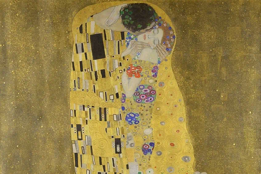
Unity and Variety in Art – The Principles of Variety and Unity Artwork
As confusing as it may be to always hear of unity and variety in art being discussed simultaneously, this classic pairing makes perfect sense. While they are ultimately opposites these principles complement each other well. Striking a balance between the two is vital in the construction of a successful work of art.
Striking a Balance Between Unity and Variety in Art
The dynamic between the principles of variety and unity brings visual interest to any image. While unity makes a composition feel complete and cohesive, variety infuses it with a sense of dynamism. Creating new and unexpected combinations of the elements of art, variety invites viewers to linger in front of a work of art, indulging in its radical rhythm.
What Is Unity in Art?
The unity art definition refers to the visual quality of oneness achieved through the effective incorporation of the elements and principles of art. With unity, the elements of a composition work together emphasizing their similarity. In a unified artwork, the elements look like they belong together.
There are several methods of creating unity in a work of art with the five main methods being proximity, repetition, alignment, continuation, and color.
Proximity
Proximity is a visual device that can be used to create unity. It refers to the closeness of objects or figures in a composition. When similar elements in a composition are positioned close to one another, they appear as a group. However, even the placement of dissimilar elements enhances the sense of unity in an artwork.
Repetition
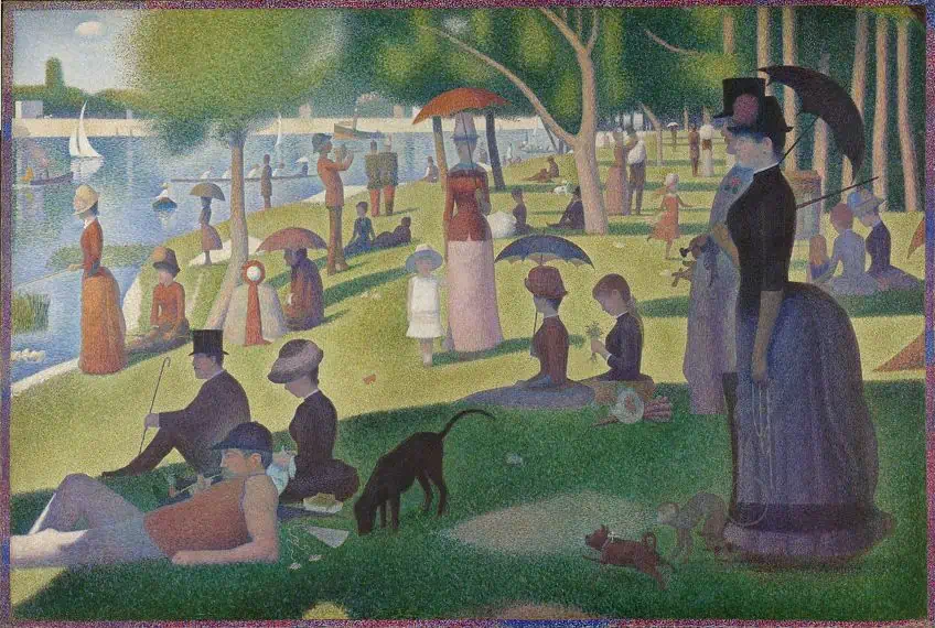
Repetition refers to the repetition of similar or continuing elements in various parts of the composition. These repetitive elements can be positioned in a consistent manner or a particular style, creating patterns and rhythm. For example, color can be used to create rhythm in an artwork. When similar colors are repeated sequentially, the viewer’s attention is directed around the work, creating a sense of movement and therefore visual harmony.
Alignment
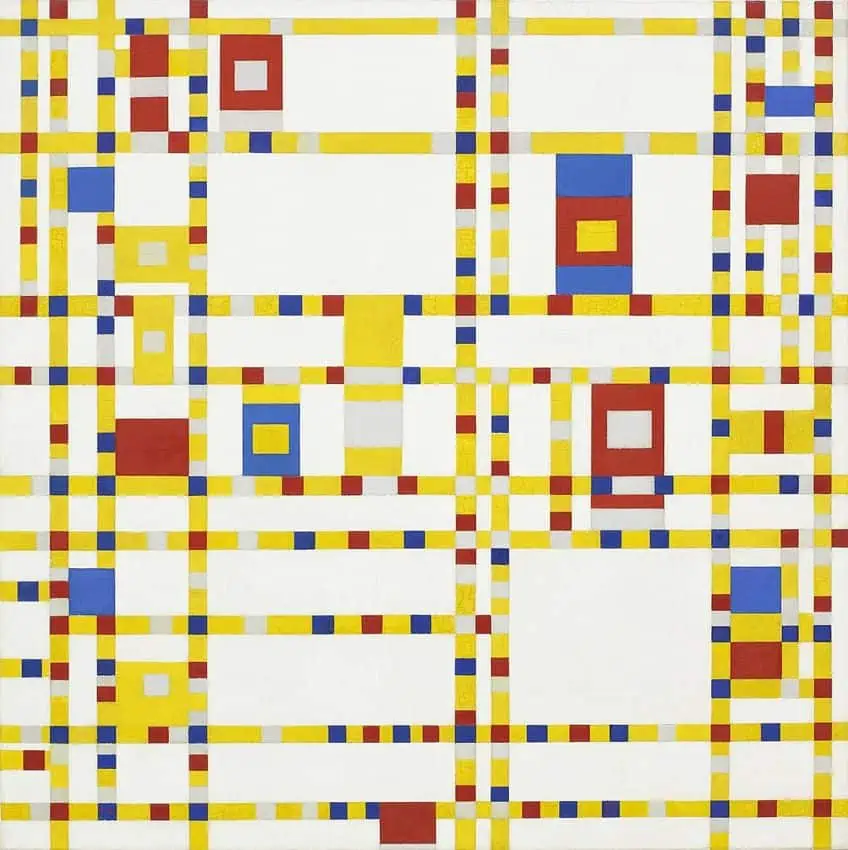
How elements appear in a composition is as paramount as where they are placed. The very same element can have a different effect based on its alignment. Elements can be aligned vertically, horizontally, diagonally, in a straight row, left to right, or top to bottom, in a column.
When elements are in alignment, meaning that they are lined up or organized according to specific configurations, unity is created in those sections of a composition.
Continuation
Continuation refers to cases where elements of art such as line or shape are used to connect one section of an artwork to another. Continuation can also connect the two separate elements of an artwork. They do not have to be literally connected, sometimes continuation can be achieved through implication. Even when these connections, which are often in the background, are subtle, continuation can create a strong sense of unity.
Color
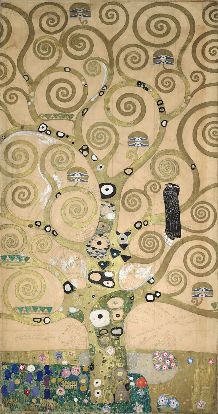
Unity through color can be achieved in many ways. On the one hand, colors that are adjacent on the color wheel are referred to as analogous colors and can easily create harmony. On the other hand, complementary colors are in opposition to each other on the color wheel, but can still help create a sense of harmony.
Paying attention to color temperature can help convey a certain concept, while tonal value can unify elements using a single color.
What Is Variety in Art?
Understanding what is variety in art, involves seeing visual elements as keys to avoiding sameness and creating visual interest. The quality of variety can be achieved through an assortment of lines, shapes, values, textures, or color schemes. It can involve lines that are different widths, lengths, straightness, or curvatures, which create more visual interest than lines that are all the same.
Examples of Unity in Art
Artists can use linework, color schemes, organic or geometric shapes, or a variety of textures to create examples of unity in art. Unity artwork can be subtle, but the achievement of unity can be dramatic, especially when used in conjunction with variety. Unity artwork is identifiable through its look of pleasing completeness.
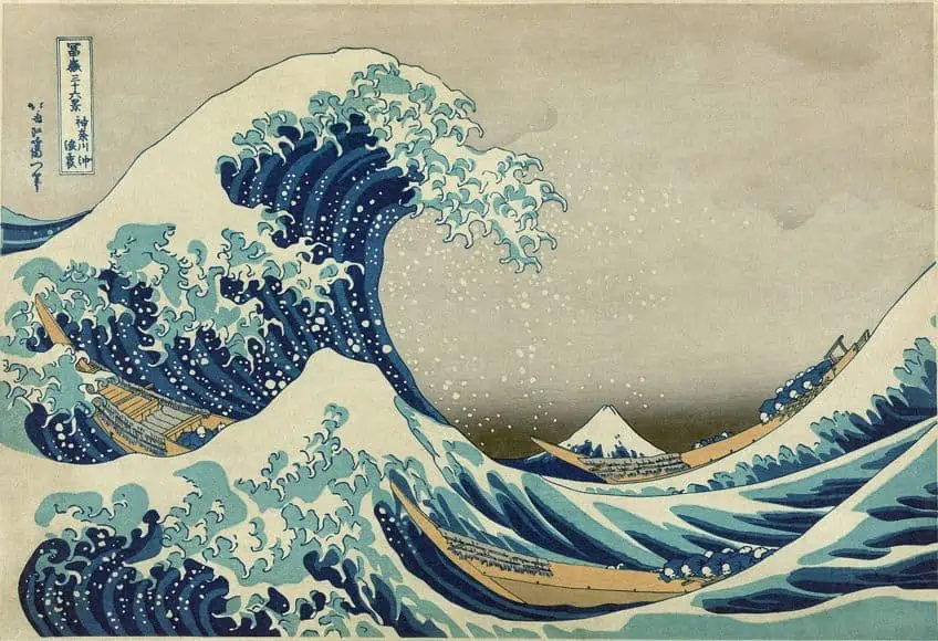
Katsushika Hokusai’s The Great Wave (1830)
| Date | 1830 |
| Medium | Woodblock print |
| Dimensions (cm) | 25.7 x 37.9 |
| Genre | Printmaking |
| Style | Ukiyo-e |
The Great Wave by Katsushika Hokusai is famous for incorporating visual techniques such as perspective and the rule of thirds to achieve unity. The image is also unified through its use of analogous colors like blues and greens which are found throughout. A sense of rhythm is rendered by the overlapping repetition of elements. The consistent pattern in elements like the grass and the trees permeate across the composition in a grid-like fashion. Being in the foreground, the ominous great wave breaks, threatening the fishermen attempting to make it to shore, and dwarfing the distant Mount Fuji. It is the suggestion of motion and time that grants this work its sense of unity.
From the grass and trees blowing in the wind to the papers scattered within its grip, while the figures below attempt to hold on to their belongings, this repetition of elements reinforces the idea of movement and creates compositional unity.
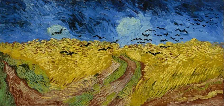
Vincent van Gogh’s Wheatfield with Crows (1890)
| Date | 1890 |
| Medium | Oil Paint |
| Dimensions (cm) | 50.2 x 10³ |
| Genre | Painting |
| Style | Impressionism |
Vincent van Gogh’s Wheatfield with Crows achieves unity through harmonious color combinations as it features both analogous and complementary colors. The contrast between lightness and darkness is demonstrated by the unique blue of the sky, the green bands of grass, the reddish brown of the diverging path, and the orange-yellow hilly field covered in pulsating lots of growing wheat bushes. All these elements complement each other with dramatic turbulence. Black crows flock toward the precarious foreground, while a distinct horizon line clarifies the vastness of the deep sky and the vibrant ground below. The clarity of form imposed by the repetitive curved shapes is caused by the artist’s impasto painting style. Van Gogh’s brushstrokes result in a consistent texture, adding to the painting’s sense of unity.
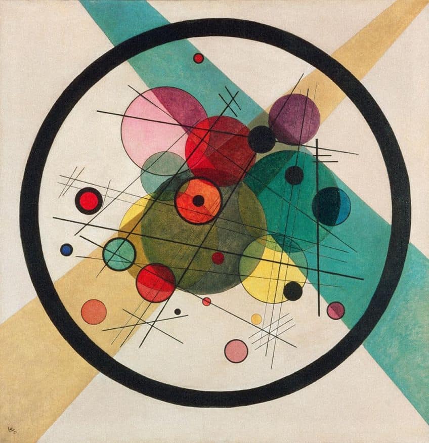
Wassily Kandinsky’s Circles in a Circle (1923)
| Date | 1923 |
| Medium | Oil on canvas |
| Dimensions (cm) | 98.7 x 95.6 |
| Genre | Painting |
| Style | Geometric abstraction |
Circles in a Circle by Wassily Kandinsky uses basic elements of art such as line, color, and shape to create a significant amount of unity. This unity is achieved through the artwork’s consistent use of similar geometric forms. Subtle color harmonies result in an effervescent composition. The artwork does feel chaotic to some degree, but the meticulous artist uses the elements to manage the balance between variety and unity. Jutting from the corners of the painting are two bright greenish, blue, and yellow strobes, intercepting one another diagonally. These draw focus back toward the center of the artwork where twenty-six overlapping circles of varying sizes and colors can be found, surrounded by a thick black circle.
To further enhance the effect of unity, the artist adds a series of sharp intersecting diagonal stripes, crisscrossing in different directions.
Examples of Variety in Art
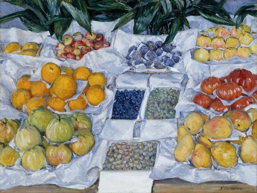
Variety can establish a focal point in an artwork and add visual interest. But too much variety results in chaotic compositions, making it challenging for the viewer to focus their attention on anything specific. Below are two intriguing examples of variety in art. While they share subject matter, these examples fall on opposite ends of the variety spectrum.
Andy Warhol’s Marilyn Diptych (1962)
| Date | 1962 |
| Medium | Acrylic paint on canvas |
| Dimensions (cm) | 205.44 x 289.56 |
| Genre | Silkscreen painting |
| Style | Pop Art |
The Marilyn Diptych is a monumental silkscreen painting by Andy Warhol consisting of 50 images of the glamour icon and movie star from the 1950s and 60s, taken from a publicity photo for the film Niagara (1953). This famous image uses elements of art such as color and shape to create a collaboration between variety and unity. The color and tonal variations of Warhol’s Marilyn Diptych are the basis for its inclusion as one of the examples of variety in art. Half of the composition is monotone, while the other is heavily pigmented.
Each repetition of the image changes the colors, contrasts, and values, but unity is maintained through the consistent proportions of Monroe’s face and the square frames.
Audrey Flack’s Marilyn (1977)
| Date | 1977 |
| Medium | Oil and acrylic on canvas |
| Dimensions (cm) | 243.8 x 243.8 |
| Genre | Painting |
| Style | Hyperrealism |
Andy Warhol is not the only artist who has been inspired by Marilyn Monroe. Audrey Flack’s Marilyn from her Vanitas series (1976-78), drew from 17th-century Dutch painting traditions which emphasized the fleeting nature of life. Flack’s Marilyn depicts material objects endowed with symbolic meaning. The sheer amount of variety in this composition is unified by its conceptual theme. There is variety in the size, shape, and form of the different objects. There are organic and geometric shapes. There is a diverse combination of smooth, matte textures, and metallic surfaces that shine where the light strikes them. There is fruit, textiles, picture frames, make-up, perfume, a burning candle, lipstick, mirrors, and an hourglass. Most significantly, a calendar that falls on the date that Monroe died, and a clock set to the time she was found lifeless in her apartment.
Keith Haring’s We The Youth (1987)
| Date | 1987 |
| Medium | Paint |
| Dimensions (cm) | Unknown |
| Genre | Mural |
| Style | Pop Art |
Keith Haring’s collaborative public mural We the Youth can be seen at 22nd and Ellsworth Streets in Philadelphia. This is the artist’s only mural still intact at its original location. Using his signature cartoon-like figures, Haring blends bold, bright, colors on his solid urban background. The abstract figures connect to and contrast one another, creating an intricate pattern of rhythmic harmony. The balance of the shapes created by his figures is also in harmony with the physical action depicted in this electrifying composition. The interconnected figures are portrayed as attempting to connect and balance one another in the literal sense. While their individual forms and postures connote their uniqueness and agency, their similarities create a flow within the image.
This allows the viewer’s eye to follow these vibrations, resulting in a vibrantly harmonious quality.
The Perfect Blend
The principles of unity and variety can and should occur simultaneously in an artwork. Unity means that the elements in an artwork have the appearance of belonging. But that principle alone can easily become a bore. Conversely, variety provides points of interest, though too much variety can make artworks appear jarring and out of sync.
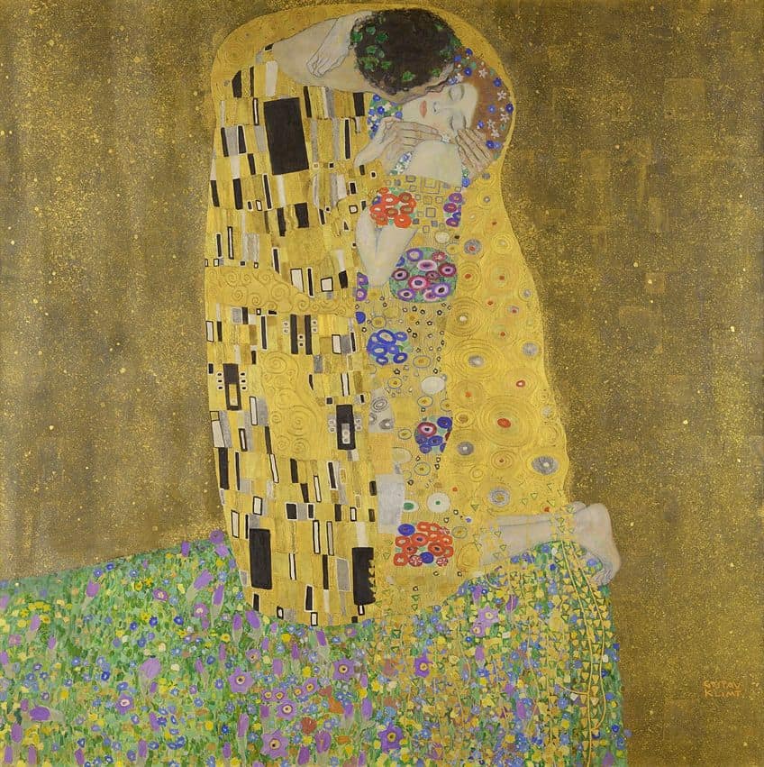
A successful artwork depends on a skillful balance between both unity and variety. Artists who are familiar with these principles are well suited to experiment with them, producing inventive explorations of their potential and limitations. It stands to reason that unity and variety are an invaluable pair in any attempt to create cohesive and convincing works of art.
Frequently Asked Questions
Does Variety Break Up Unity in a Design?
Ultimately, variety is the opposite of unity. Variety tends to disrupt the monotony of overly unified compositions. But variety can be achieved with the same elements required to achieve unity, such as line, shapes, or color.
What Is the Difference Between Harmony and the Unity Art Definition?
Harmony and unity are often used interchangeably as they both refer to the combination of different elements in an artwork. Unity is achieved when an artwork has a sense of oneness, while harmony is more indicative of cohesion and order.
How Is Variety Achieved in an Artwork?
Artists can use contrast and juxtaposition to create variety. Juxtaposing straight lines with curved lines, and geometric shapes with organic shapes creates contrast, which results in the appearance of variety.
Jordan Anthony is a Cape Town-based film photographer, curator, and arts writer. She holds a Bachelor of Art in Fine Arts from the University of the Witwatersrand, Johannesburg, where she explored themes like healing, identity, dreams, and intuitive creation in her Contemporary art practice. Jordan has collaborated with various local art institutions, including the KZNSA Gallery in Durban, the Turbine Art Fair, and the Wits Art Museum. Her photography focuses on abstract color manipulations, portraiture, candid shots, and urban landscapes. She’s intrigued by philosophy, memory, and esotericism, drawing inspiration from Surrealism, Fluxus, and ancient civilizations, as well as childhood influences and found objects. Jordan is working for artfilemagazine since 2022 and writes blog posts about art history and photography.
Learn more about Jordan Anthony and about us.
Cite this Article
Jordan, Anthony, “Unity and Variety in Art – The Principles of Variety and Unity Artwork.” artfilemagazine – Your Online Art Source. March 15, 2023. URL: https://artfilemagazine.com/unity-and-variety-in-art/
Anthony, J. (2023, 15 March). Unity and Variety in Art – The Principles of Variety and Unity Artwork. artfilemagazine – Your Online Art Source. https://artfilemagazine.com/unity-and-variety-in-art/
Anthony, Jordan. “Unity and Variety in Art – The Principles of Variety and Unity Artwork.” artfilemagazine – Your Online Art Source, March 15, 2023. https://artfilemagazine.com/unity-and-variety-in-art/.


