What Is Tone in Art? – Understanding This Essential Element of Art
What is tone in art? To create any visual composition, you will need to understand the basic art elements. Part of this includes tonality in art, which adds various effects and characteristics that will create a coherent composition, giving more visual meaning and vitality. This article will discuss tone in art.
What Is Tone in Art?
In the following section, we will explore the definition of tone in art, but before we discuss this further, it will be helpful to understand a broader context of where tone, or tonality in art, fits in, which is part of the several main elements of art. Let us look further.
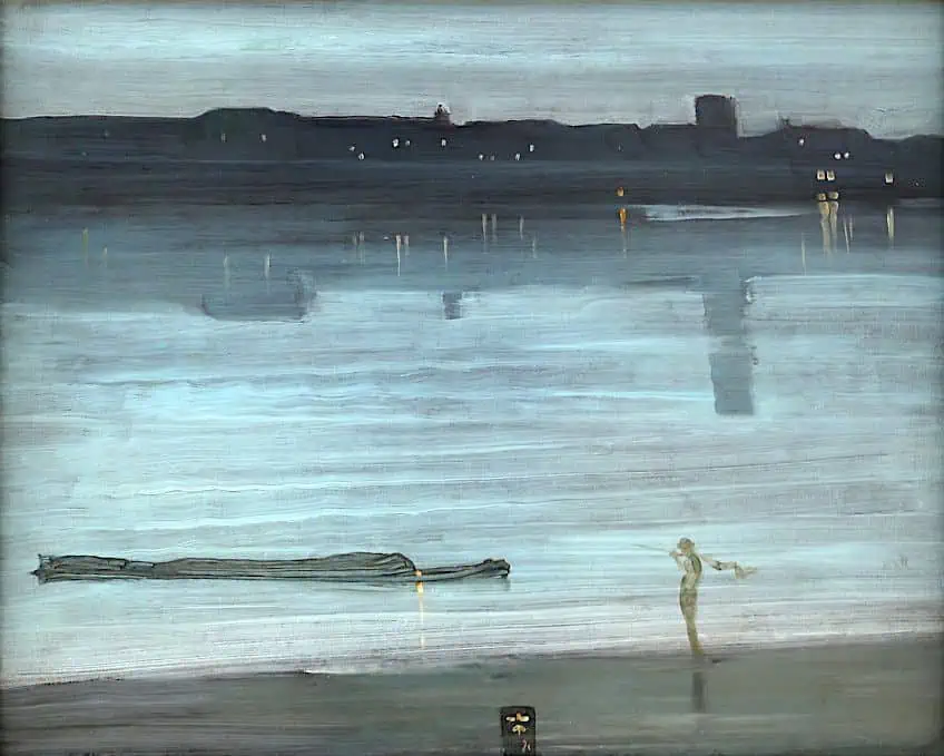 Nocturnal, blue and silver, Chelsea (1871) by James Abbott McNeill Whistler; Sailko, CC BY 3.0, via Wikimedia Commons
What Are the Elements of Art?
| Art Element | Characteristics |
| Color | This consists of primary, secondary, and tertiary colors, as well as the temperature and intensity. It can also include color schemes like complementary and analogous. |
| Value | This includes the lightness and darkness of a color, which is also sometimes referred to as tone in art. Colors can also have different tones and it is usually best illustrated by looking at a grayscale. |
| Texture | There are different types of textures, for example, tactile (physical touch) or implied (the appearance of something on a two-dimensional surface). |
| Line | There are different types of lines, from straight, curved, short, long, thin, and thick. It is also an important part in creating the outline of an object. |
| Shape | There are a variety of shapes that are dominantly two-dimensional, for example, the common shapes include squares, circles, or triangles. |
| Form | There are also a variety of forms that are dominantly three-dimensional, for example, the common forms include spheres, cubes, or pyramids. |
| Space | This consists of the compositional space, where the subject matter is depicted or the perspective utilized that will create a sense of depth or three-dimensionality. |
The elements of art are what compose a visual art piece and are often referred to as the “building blocks” of artworks. They also assist in providing a criterion in which to analyze any visual composition, from paintings, sculptures, and even graphic designs. There are commonly seven art elements, which include color, value, texture, line, shape, form, and space. Each of these deals with different stylistic aspects of how an art piece appears to us, the viewers.
It also provides the artwork with a specific visual quality depending on the goals and intentions of the artwork, and what its subject matter is, whether that is an abstract or more figurative, classical artwork.
Sometimes the subject matter can directly consist of an art element, for example, color. If you look at the Color Field paintings by Mark Rothko, like his Orange and Yellow (1956) you will notice it consists of two rectangles/squares of pure color; the top is yellow below it is orange. Another example includes the French artist Yves Klein who was famous for his ultramarine monochrome compositions. For example, Blue Monochrome from 1961, measures 195.1 x 140 centimeters and is nothing but blue on a canvas.
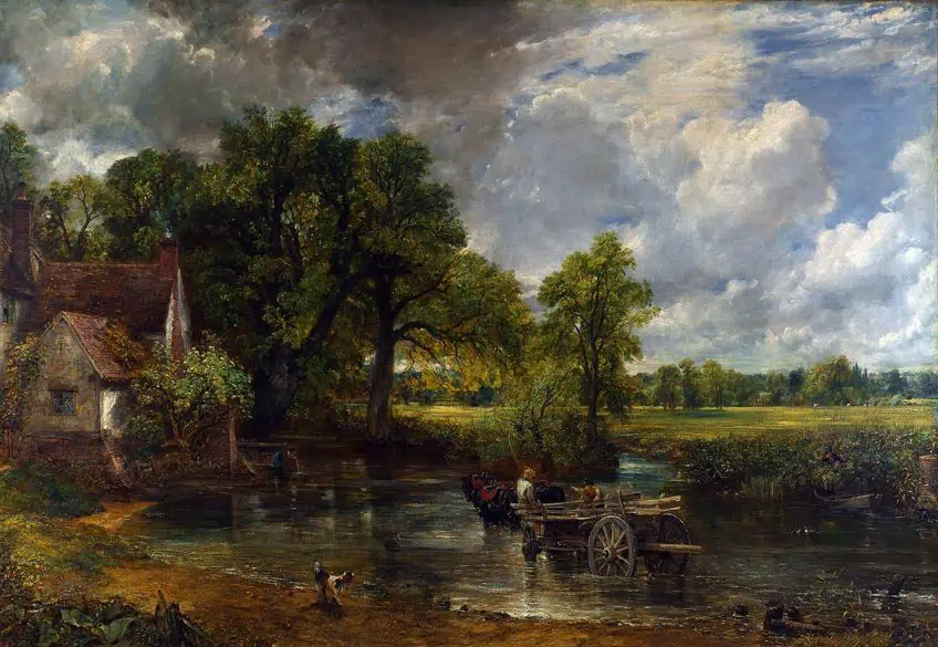 The Hay Wain (1821) by John Constable; John Constable, Public domain, via Wikimedia Commons
On the other hand, color can also be utilized to depict naturalism and realism like John Constable’s landscape paintings, for example, The Hay Wain (1821), which depicts naturalistic colors to echo the color that would have been found when looking at this scene in real life.
Definition of Tone in Art
Sometimes it can be confusing to understand what tone in art is, and it can easily be confused with the idea that it is a color. However, the tone in art is broadly defined as the “lightness” or “darkness” of something, and this usually relates to how light or dark a color is. For example, red can have several tones, especially if the subject matter is depicted in a source of light or if there is more of a shaded part. This is why tone can be seen when you look at how light also visually affects an object.
The term that describes more light on an object is referred to as “highlights” and where there is less light on an object, the term is referred to as “shadows”.
Value and the Grayscale
The term “tone” is also utilized interchangeably with the other term you may have heard, “value”. Value is another art element that relates to the similar concept of tonality in art. Grayscale is often utilized to perceive tonal variations, moving from white to gray to black, and will provide a better visual understanding of how to perceive the lightness or darkness of a color.
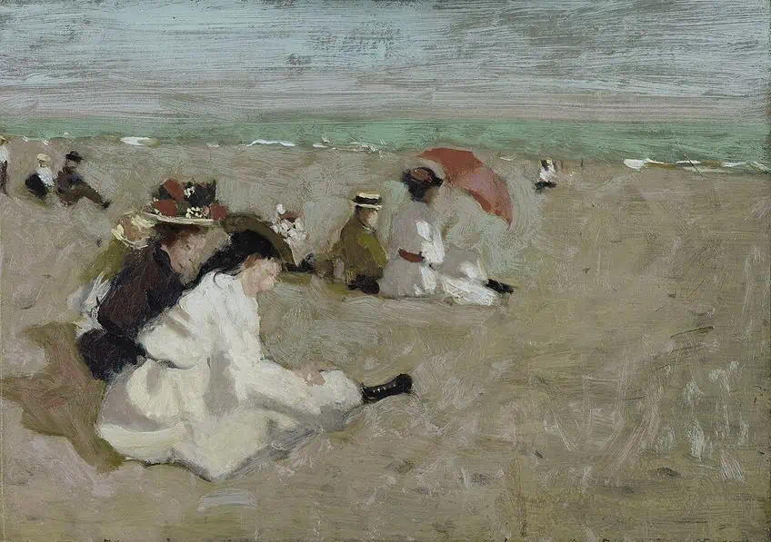 The Beach (1908) by Denman Waldo Ross; Denman Ross, Public domain, via Wikimedia Commons
What is the value grayscale exactly? This is typically viewed as a horizontal scale with different blocks of color, starting with white from the far left and moving to black at the far right, in between are blocks of light to dark gray. The grayscale was reportedly started in 1907 by Denman Waldo Ross. He was an artist and academic within the arts. His grayscale consists of what is termed the nine value “scales”.
These are namely white, high light, light, low light, middle, high dark, dark, low dark, and black.
What Are the Three Types of Tone in Art?
There are three primary types of tone in art. These are referred to as light tones, mid-tones, and dark tones. These are best understood as they appear on the above-mentioned value grayscale. We will discuss these in more detail below.
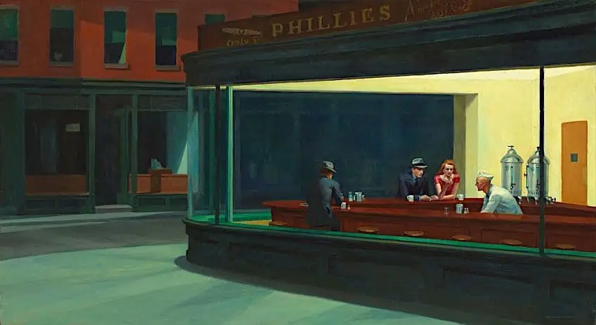 Nighthawks (1942) by Edward Hopper; Edward Hopper, Public domain, via Wikimedia Commons
Light Tones
Light tones refer to whites on the one end of the value grayscale. Whites will gradually become darker and move into the mid-tones. This can also apply to any other color and not strictly from white to gray to black. If whites are mixed with another color it is referred to as “tints”. Light tones will also provide highlighting effects that give the impression of light on the object.
Think of the popular example of an apple, the light tones will be where the light is reflected on the apple.
Mid-Tones
Mid-tones are between the two ends of the value grayscale spectrum, so to say, and their purpose is to enhance depth and three-dimensionality by providing more variety to extreme tones like too light or too dark. Additionally, mid-tones will also reveal more of the original hue of whatever color is utilized, which is referred to as the “local” color.
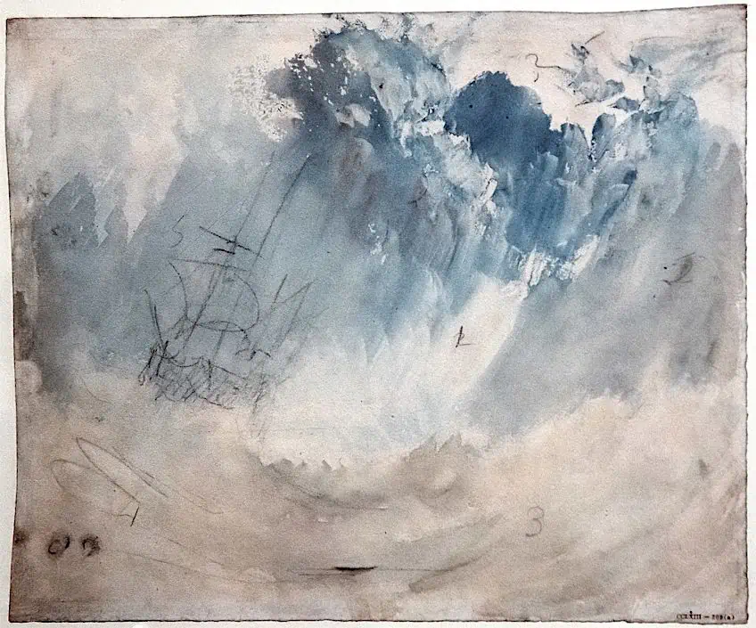 Ship in a Storm(1823) by J. M. W. Turner; J. M. W. Turner, Public domain, via Wikimedia Commons
Dark Tones
Dark tones refer to the other end of the value grayscale where it is black and the color leads up to pure black. This can also apply to all colors, for example, if blue is combined with black it will create what is known as a “shade”.
How Is Tone in Art Utilized?
Tone can be utilized and applied in a variety of methods to create different effects in a visual composition. Below are four of the most common visual effects that you can create depending on the goals of the artwork.
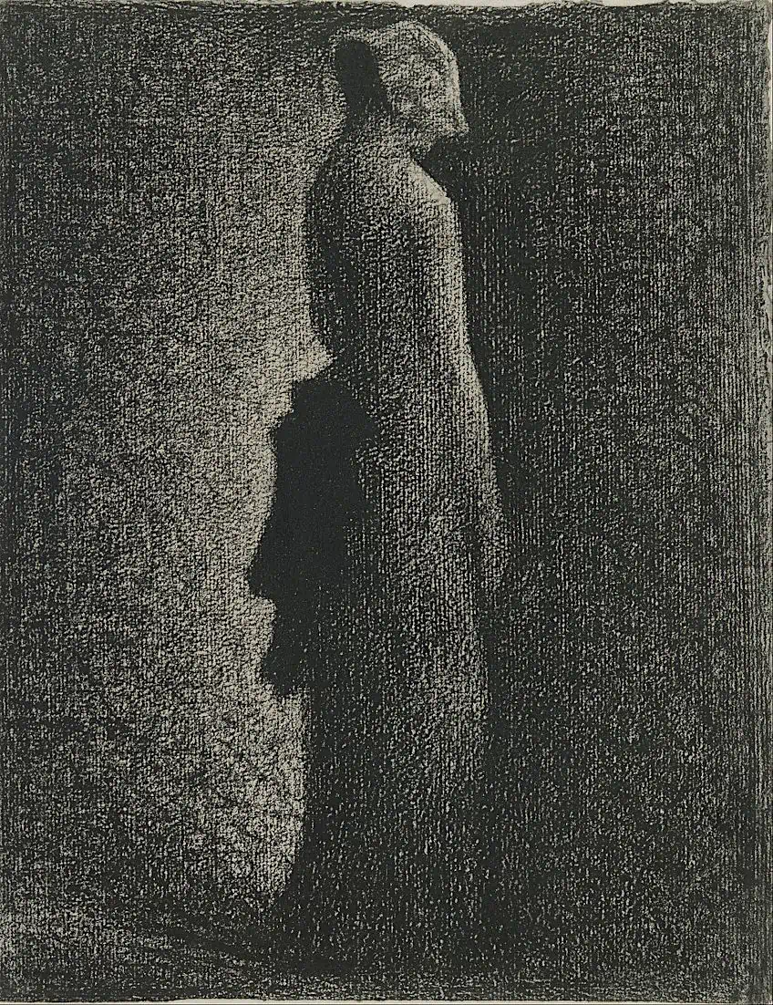 The Black Bow (1882) by Georges Seurat; Georges Seurat, Public domain, via Wikimedia Commons
Contrast
Varying the tones in a visual composition for contrast will create more attention on the main focal point. For example, dark and light contrast like a light object in the foreground against a dark background, which will emphasize the main subject in the foreground. This can also be vice versa, for example, a lighter background with a darker foreground.
Painting examples of this include the famous painting Girl with a Pearl Earring (1665) by Johannes Vermeer, which depicts a dark background with the famous pearly-eared portrait of a girl in the foreground, which draws our attention.
Depth
Depth, as well as a sense of distance, is also created through varying tonal contrasts. This can be from light to dark or dark to light and is referred to as a “progressive” tone. These will also provide the impression of space as the tones progress in their value. For example, a darker foreground can progress into a lighter background, which creates a sense of distance and receding space. An example that has been presented is the painting by Caspar David Friedrich, The Wanderer Above the Sea of Fog (1818), which depicts the background as lighter in comparison to the foreground, which is darker in contrast.
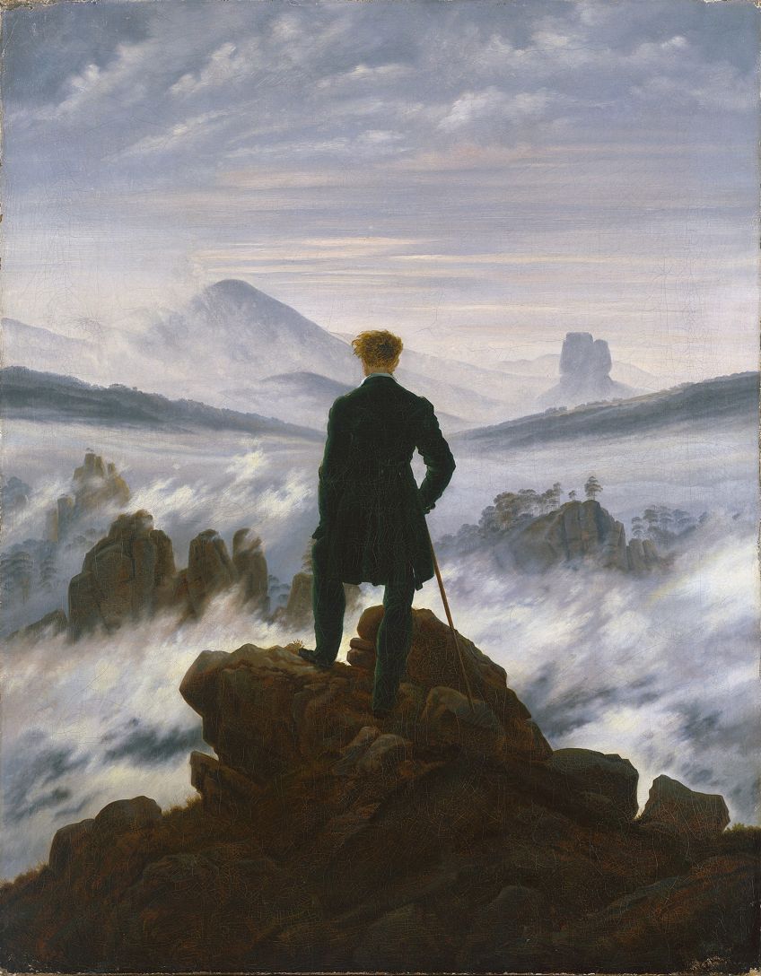 The Wanderer Above the Sea of Fog (1818) by Caspar David Friedrich; Caspar David Friedrich, Public domain, via Wikimedia Commons
Form
Tone can be applied to create an “illusion” of form, from a two-dimensional appearance to a more three-dimensional depiction. This is done by applying darker areas like shading and lighter areas like highlights. Furthermore, the lighter areas would suggest the areas where there is a possible light source on or around the subject, which will cause it to stand out more and enhance its flatness if it is on a two-dimensional canvas or piece of paper.
Tone can also be applied in different methods, for example, shading (as mentioned), and then also techniques like dots, which is referred to as stippling, or hatching, which will consist of drawing lines to create a fuller form.
The German Renaissance artist Albrecht Dürer’s composition titled Praying Hands (c. 1508) is an example of how tone is created through the types of lines utilized, for example, the overlapping of darker lines between the fingers and the two hands. The thicker white lines on the fingertips suggest reflected light.
Mood or Ambience
Tone can also suggest a specific type of mood, which depends on the intensity of the contrasting hues. It can set the mood, so to say, from relaxed, calming, and serene to more dynamic and even somber, evoking feelings of sadness or melancholy. Some examples include Summer Evening (1947) by the American artist Edward Hopper. This composition depicts contrasting tones that set a mood of not only possible romance but also an air of mystery. The two figures are lighter in tonality and stand out against the dark background, which appears black, further increasing the emotional depth of the scene.
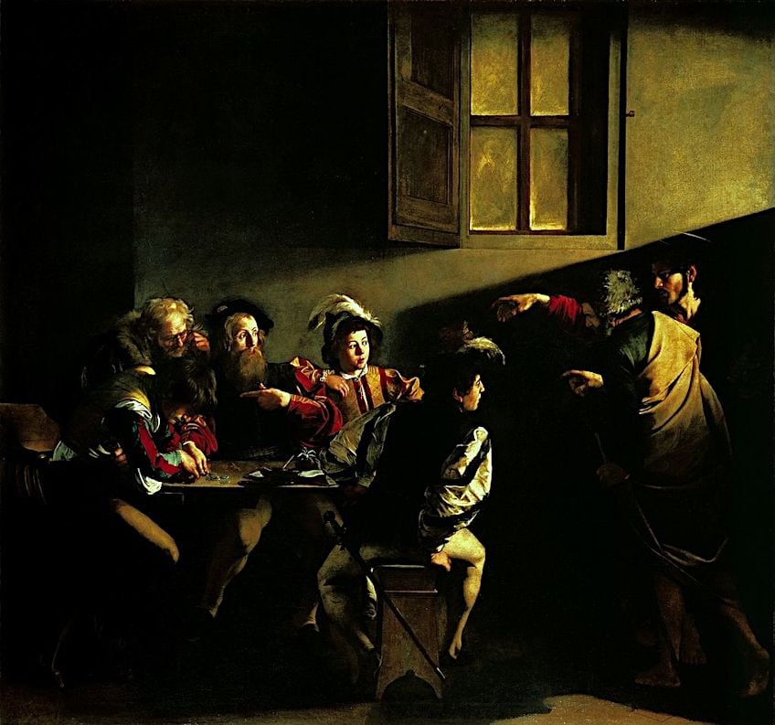 The Calling of Saint Matthew (1599 or 1600) by Caravaggio; Caravaggio, Public domain, via Wikimedia Commons
More Examples of Tone in Art
There are endless examples of how tone in art is utilized, from the classical Renaissance masters to modern avant-garde artists. Let us explore a few more who worked with tonality in art to achieve a beautiful and compelling visual composition. The Calling of St. Matthew (1599 – 1600) by the renowned Italian painter Caravaggio is a beautiful example of how the artist utilized dark and light tones to create dramatism of the scene. The light source near the window to the right creates a lighter tone alongside the wall that somehow leads our (the viewers’) gaze to the men seated at the table.
Equally, there are dark shadows, creating contrast, for example to the bottom right and upper left portions of the composition.
Another famous and beloved artist that has been utilized as an example of tonality in art is Claude Monet and how he depicted light. In Impression, Sunrise (1872), Monet utilizes light tones, which create an ambient effect of how the serene morning light rises over the Le Havre harbor. The French Post-Impressionist Georges Seurat’s oil on canvas Bathers at Asniѐres (1884) depicts light tones, which create a harmonious composition. Seurat was famously remembered for pioneering Pointillism, which consisted of applying paint in dots.
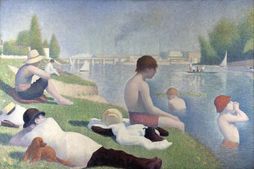 Bathers at Asniѐres (1884) by George Seurat; Georges Seurat, Public domain, via Wikimedia Commons
The techniques that Seurat utilized another technique to create tonal variations, for example in his painting A Sunday Afternoon on the Island of La Grande Jatte (1884 – 1886). Here dots are utilized to create the form of the subject matter in the composition. Additionally, the lighter area suggests a light source towards the background, and the foreground is depicted in more shadows, which creates a sense of depth and three-dimensionality.
Setting the Tone
Tone is an important part of all visual compositions as it provides character to visual composition and can be applied in a myriad of methods. Sometimes it can be confusing to understand as there can be several meanings for it in the art world, but mainly it relates to the lightness or darkness of any color.
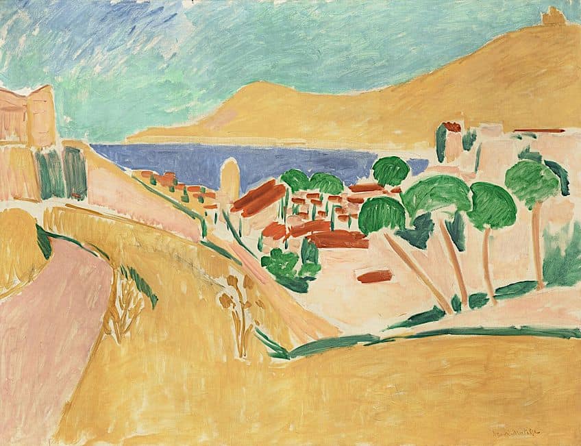 Collioure in August (c. 1911) by Henri Matisse; Henri Matisse, Public domain, via Wikimedia Commons
This article discussed the question, “what is tone in art?”, as well as the three tones in art. There are namely light, mid, and dark tones, including some of the more common types that can be applied to any visual composition like a drawing, watercolor, or oil painting.
Frequently Asked Questions
What Is Tone in Art?
Tone in art is about the lightness or darkness of a color and how it appears through the varying degrees of light and shadow.
What Are the Three Types of Tone in Art?
The three commonly known types of tone in art are, namely, light-tones, mid-tones, and dark tones. They can be understood when looking at a grayscale, which starts with white on one end, and ends with black on the other end. This can also apply to all the colors and how they change from tone to tone on the scale.
How to Use Tone in Art?
Tone in art can be utilized in visual compositions to create different visual effects, namely, to create contrast, a sense of depth or distance, the idea or illusion of form (which gives a sense of three-dimensionality), and mood or ambiance.
What Are the Art Elements?
The art elements are comprised of color, texture, line, form, shape, value, and space. These are the seven most common elements of art that are utilized to compose a visual artwork, whether that is a painting, drawing, graphic art, or sculpture.

Jordan Anthony is a Cape Town-based film photographer, curator, and arts writer. She holds a Bachelor of Art in Fine Arts from the University of the Witwatersrand, Johannesburg, where she explored themes like healing, identity, dreams, and intuitive creation in her Contemporary art practice. Jordan has collaborated with various local art institutions, including the KZNSA Gallery in Durban, the Turbine Art Fair, and the Wits Art Museum. Her photography focuses on abstract color manipulations, portraiture, candid shots, and urban landscapes. She’s intrigued by philosophy, memory, and esotericism, drawing inspiration from Surrealism, Fluxus, and ancient civilizations, as well as childhood influences and found objects. Jordan is working for artfilemagazine since 2022 and writes blog posts about art history and photography.
Learn more about Jordan Anthony and about us.
Cite this Article
Jordan, Anthony, “What Is Tone in Art? – Understanding This Essential Element of Art.” artfilemagazine – Your Online Art Source. October 13, 2023. URL: https://artfilemagazine.com/what-is-tone-in-art/
Anthony, J. (2023, 13 October). What Is Tone in Art? – Understanding This Essential Element of Art. artfilemagazine – Your Online Art Source. https://artfilemagazine.com/what-is-tone-in-art/
Anthony, Jordan. “What Is Tone in Art? – Understanding This Essential Element of Art.” artfilemagazine – Your Online Art Source, October 13, 2023. https://artfilemagazine.com/what-is-tone-in-art/.