
Tertiary Colors – Understanding the Tertiary Colors Definition
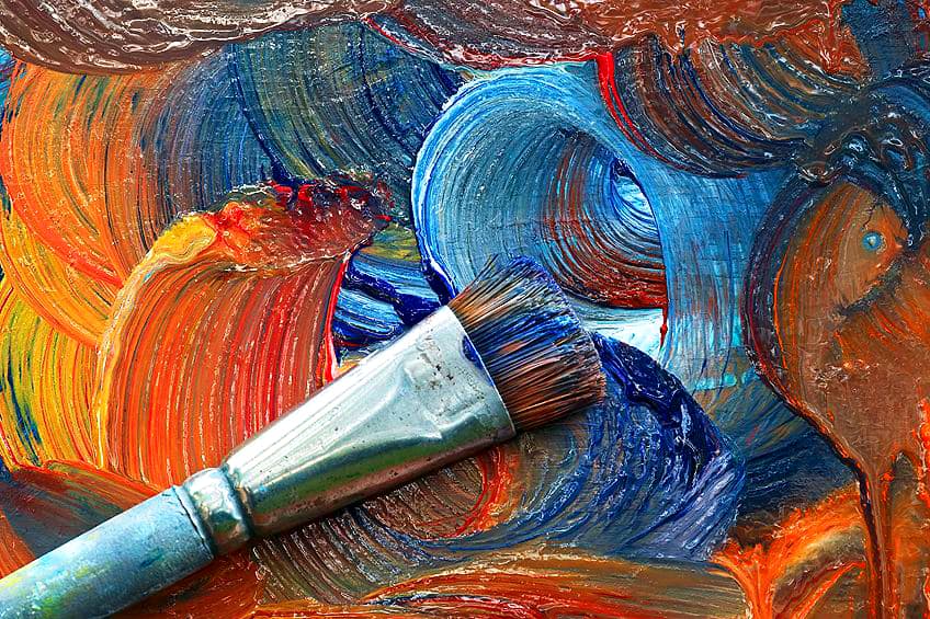
Color theory provides artists with the tools and skills to create striking and vibrant pieces. Often when you paint, you do not only use colors directly from the tube. Rather, a few colors are combined in various ways to create the perfect hues that you need. Understanding tertiary colors is important for creating lively neutrals, as well as adding subtle shading and dimension to your work. If you want to know what tertiary colors are, we have made this handy guide exploring this and how to mix and use them successfully.
Tertiary Colors Definition
The first thing that we will delve into is what are tertiary colors exactly as well as the meanings behind them. There are two sets of tertiary colors based on which color model you choose to use. In the traditional Red Yellow Blue (RYB) color model, your tertiary colors are olive green, burnt sienna, and steel blue while the Red Green Blue (RGB) model has chartreuse, spring green, azure, violet, rose, and orange as its tertiary colors. We will delve more into these color models and how their tertiary colors are created later.
| Tertiary Color Name | Tertiary Color Hex Code | Tertiary RGB Color Code | CMYK Tertiary Color Code (%) | Tertiary Color Hue |
| Olive Green | #6D712E | 109, 113, 46 | 4, 0, 59, 56 | |
| Burnt Sienna | #AB4C27 | 171, 76, 39 | 0, 56, 77, 33 | |
| Steel Blue | #5E738A | 94, 115, 138 | 32, 17, 0, 46 | |
| Chartreuse | #7FFF00 | 128, 255, 0 | 50, 0, 100, 0 | |
| Spring Green | #00FF7F | 0, 255, 127 | 100, 0, 50, 0 | |
| Azure | #007FFF | 0, 127, 255 | 100, 50, 0, 0 | |
| Violet | #7F00FF | 127, 0, 255 | 50, 100, 0, 0 | |
| Rose | #FF007F | 255, 0, 128 | 0, 100, 50, 0 | |
| Orange | #FF8000 | 255, 128, 0 | 0, 50, 100, 0 |
Meaning and Psychology of Tertiary Colors
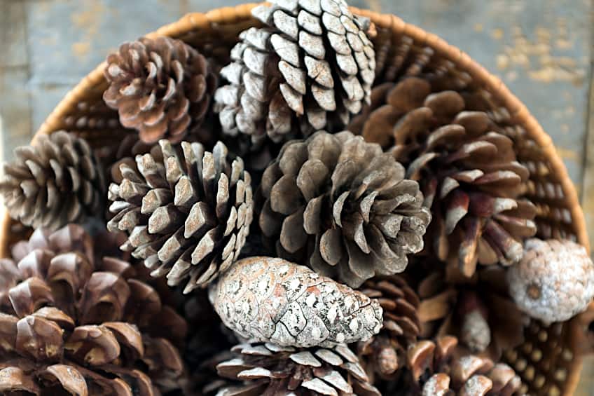
The traditional tertiary colors have many meanings behind them. Olive green is known to symbolize sophistication, harmony, and peace. This yellowish-green is also associated with feelings of empathy, compassion as well as wisdom, and perception. Burnt sienna is an exciting color that gives feelings of both security and passion. This spicy brown color symbolizes comfort, loyalty, independence, and a zest for life.
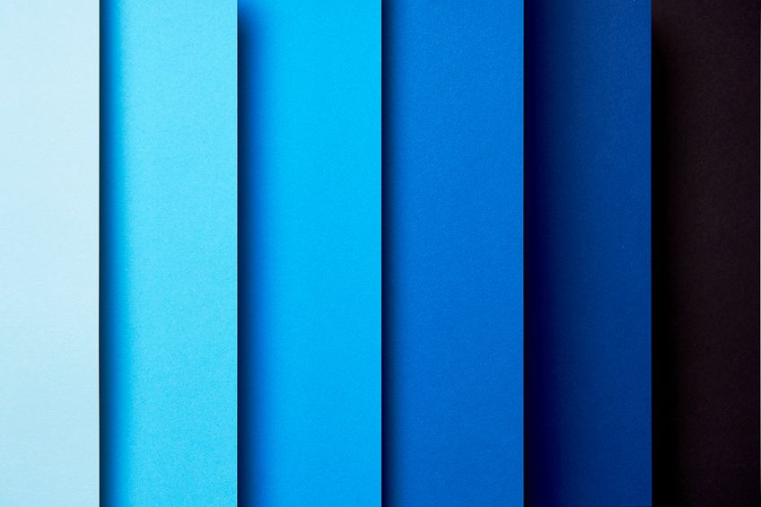
Steel blue is the last of the RYB tertiary colors. This color represents strength and evokes a sense of power, reliability, and stability.
Chartreuse is a sunny color that symbolizes growth and youthfulness and creates feelings of happiness and enthusiasm. While softer than chartreuse, spring green also brings a positive and hopeful feeling to those around it. This color is often used to represent the “green movement,” which is concerned with environmental conservation and awareness.
Azure is said to represent the color of the sky on a clear and bright day. Because of this, azure creates a sense of calm, security, stability, and confidence. Violet shares its name and color with a flower. It is often used to symbolize royalty, power, and magic and is associated with feelings of pride, devotion, ambition, and mystery. Rose, like the flower, is often associated with love and romance, however, it is also known to be connected to femininity and feelings of desire and optimism. Orange is the final color on our tertiary color wheel, and like rose, emits an optimistic energy.
Orange draws your attention, whether good or bad, which can be warm and welcoming or make you wary and vigilant.
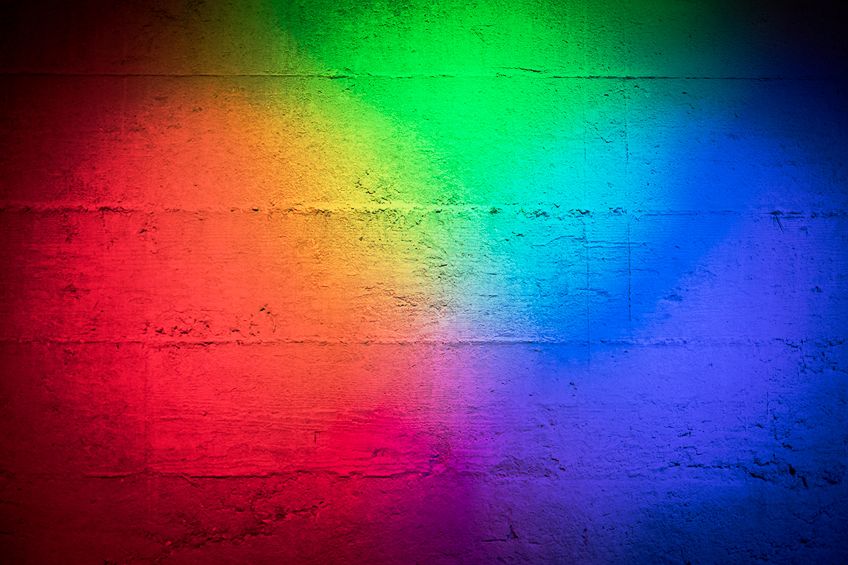
Introduction to Color Theory and the Color Wheel
Before delving into how to mix these colors, it is handy to understand the basics of color theory. Color theory is a set of guidelines that many artists use to not only mix different colors but combine them in a way that is balanced, visually interesting, and with good contrast to create pieces that are aesthetically pleasing. The color wheel is a fundamental tool used in color theory for visualizing the different colors and how they relate to one another. The color wheel was originally conceived by Isaac Newton in 1666 and has been refined and expanded over the years. Today there are a variety of color wheel models, and some have even expanded to include the tones, tints, or shades of the various hues as well.
The Traditional Color Wheel
If you are using traditional art mediums such as paints, pencils, or inks then you may be familiar with the RYB color wheel, which uses red, yellow, and blue as the primary colors from which all the others are made. This is why the traditional color model is also known as the RYB color model.
By mixing these three colors you produce your secondary hues of green, orange, and purple.
Just as secondary colors are made by mixing two primaries, tertiary hues in the RYB color wheel are the product of mixing two secondary colors. As mentioned earlier, these colors are olive green, burnt sienna, and steel blue. This color wheel is a subtractive color model because you are removing colors from black to achieve your chosen hue. For example, subtracting red leaves you with yellow and blue, which mix together to create green. This is why mixing these colors together will consistently produce a darker color and mixing all three primaries will result in black.
Tertiary vs. Intermediate Colors in the RYB Color Model
Intermediate colors are often incorrectly called tertiary colors in the RYB model. Intermediate colors are the hues that are found in the middle of primary and secondary colors on the color wheel. These colors are red-orange, red-violet, yellow-orange, yellow-green, blue-green, and blue-violet. They are called intermediate colors because they are an intermediary, or link, between the two colors, and sit halfway between them.
| Intermediate Color Name | Intermediate Color Hex Code | Intermediate RGB Color Code | CMYK Intermediate Color Code (%) | Intermediate Color Hue |
| Blue-Violet | #8A2BE2 | 138, 43, 226 | 39, 81, 0, 11 | |
| Blue-Green | #088F8F | 8, 143, 143 | 94, 0, 0, 44 | |
| Yellow-Green | #9ACD32 | 153, 205, 50 | 25, 0, 76, 20 | |
| Yellow-Orange | #FFAE42 | 255, 173, 66 | 0, 32, 74, 0 | |
| Red-Orange | #FF5349 | 255, 82, 73 | 0, 68, 71, 0 | |
| Red-Violet | #C71585 | 199, 21, 134 | 0, 89, 33, 22 |
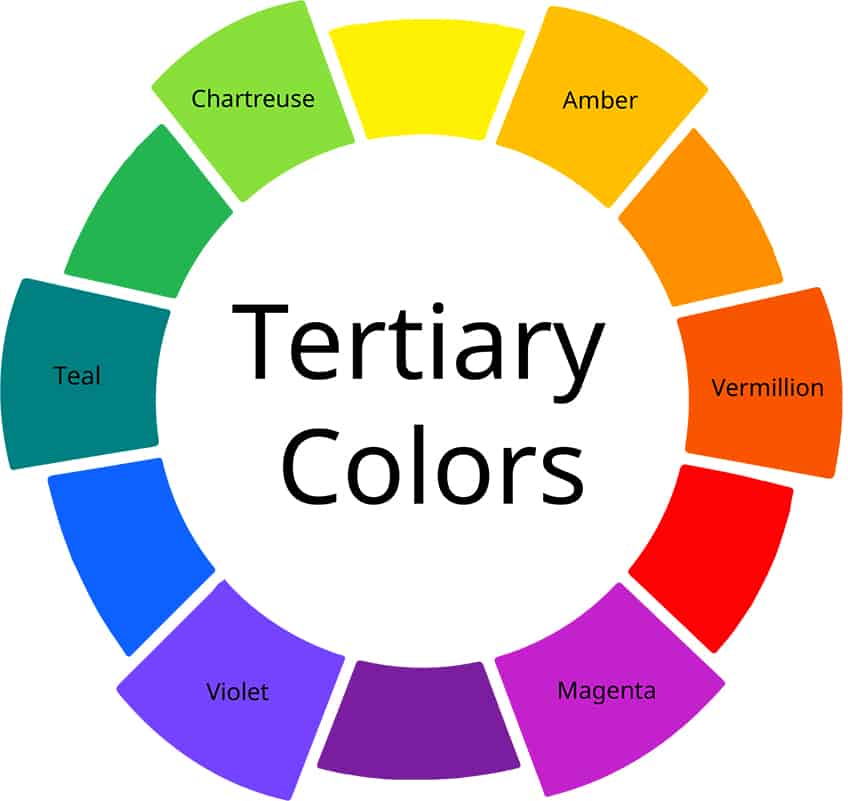
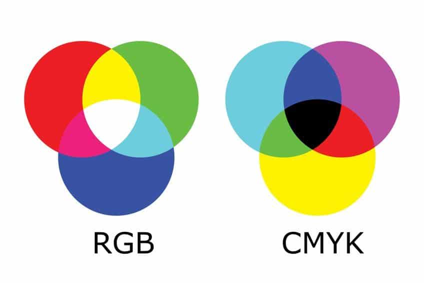
The RGB Color Wheel
For digital art, which mixes color using light instead of pigment, the RGB color wheel is more useful. The RGB color wheel is an additive model, which creates colors by adding light to black, and all the primary colors mixed together will produce white. The primaries in this model are red, green, and blue and create the secondaries of cyan, magenta, and yellow. These colors are used for computer and television screens.
Unlike in the RYB color wheel, the terms intermediate colors and tertiary colors are used interchangeably, and these colors are the hues between the primary and secondary colors.
As mentioned, the six tertiary colors in this model are chartreuse, spring green, azure, violet, rose, and orange. Unlike with the traditional color model, you can easily create a tertiary color wheel for the RGB color model by placing these tertiary colors between their primary and secondary hues on the color wheel.
Goethe’s Triangles
There is a third, lesser-known, tertiary color definition that is based on Goethe’s Triangle color theory. In this model, the primary colors – yellow, red, and blue – are each placed in a corner of a triangle with white at the center. The secondary colors are then placed midway, along the edge, between the two primaries that create them. Tertiary colors in this model are created by mixing a primary with the secondary hue that lies opposite it instead of adjacent to it as in the traditional color model. Because this method combines all the primary colors together, the resulting tertiary colors were various brown hues.
Today these colors are not often considered tertiary colors but instead have come to form part of neutral colors, alongside black, white, and gray.
Color Codes
The table above lists the different color codes of each hue. These color codes are very handy to see the proportion of colors used to make each specific hue. This is great as it gives you insight into how these colors are mixed when you are attempting to create your own colors.
RGB and Hex Color Codes
The most well-known color codes are the RGB color codes and hex color codes. These color codes are based on the RGB color model and show the amount of red, green, and blue in each color. The RGB code has three values each between zero and 255. Zero indicates that none of the color is present while 255 means that the color is at full potency.
The hex code is a more condensed version of the RGB color code.

This code has three pairs of values representing the three numbers in the RGB code. Each value consists of a number between zero and nine or a letter between a and f. In this code “00” would indicate that none of the color is present while “ff” means that the color is at full strength. For example, chartreuse has a hex code of #7FFF00, which indicates a good amount of red, green at full strength, and absolutely no blue has been used to make this color. These proportions are also reflected in the RGB code, which is 128, 255, 0.
CMYK Color Codes
The CMYK color code, like the RGB and hex codes, shows the proportion of colors used to create a hue. This code shows the percentage strength of cyan, magenta, and yellow, as well as a “key” color, which is usually black, present within a color. Taking another look at chartreuse, this color has a CMYK code of 50%, 0%, 100%, and 0%. This tells you that cyan is at 50 percent strength, yellow is at full strength, and there is no magenta or black within this color.
How To Create Tertiary Colors
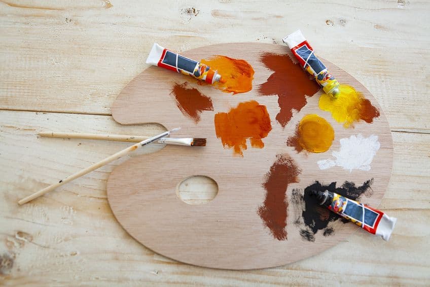
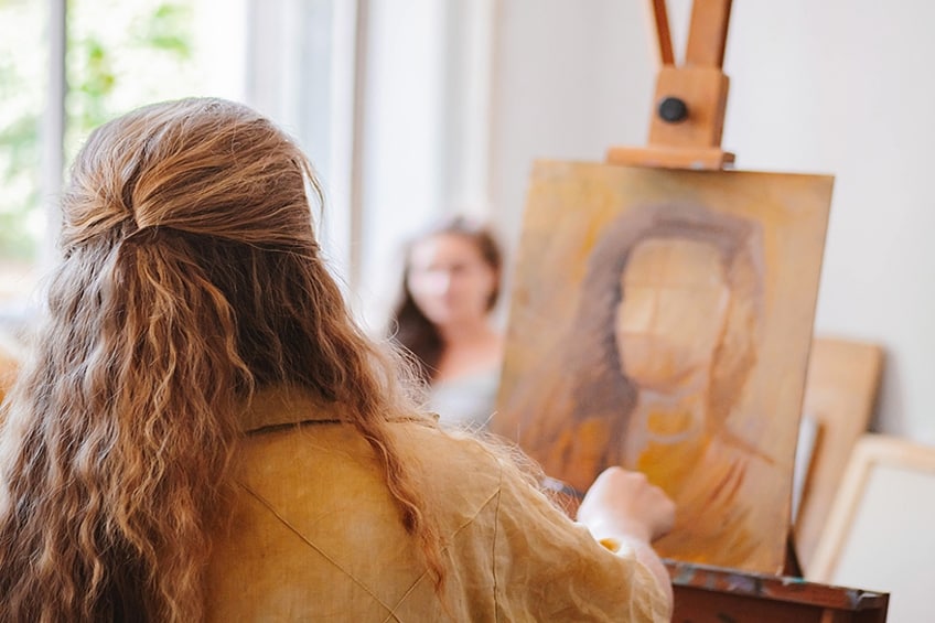
Now that the basics of color theory have been covered, we will delve into mixing these various tertiary colors. Understanding how to mix tertiary colors can save you both time and money as you do not need to find and buy the perfect hue each time you paint. Knowing how to mix different tertiary colors can also help you avoid creating muddy colors in your pieces.
Mixing Basic Tertiary Colors
The tertiary colors in the traditional color model can be created by mixing two secondary colors in equal parts. By mixing the secondary colors green and orange, you create the tertiary color olive green. Burnt sienna can be mixed by combining orange with purple. Lastly, green and purple mix together to create a blue-gray steel blue.
In the RGB color wheel, chartreuse is a mixture of green and yellow, spring green combines green and cyan, azure is made from blue and cyan, violet is mixed from blue and magenta, red and magenta combine to form rose, and finally orange is made from red and yellow. While the basic tertiary hues are created by mixing equal portions of two secondaries or one primary and one secondary, you can get an even wider array of colors by adjusting their proportions.
Steel blue that is made with more purple will be a bluish-purple, while one with more green will be a bluish-green.
This is an example of color bias, which describes the hue that your color leans toward on the color wheel. The colors themselves that are used to mix these tertiaries will also impact their final look. Mixing a deeper purple with green will create a darker steel blue similar to navy blue, while using a lighter purple will produce a more pastel steel blue. This allows you to create many different tertiary colors that are subtly different and gives you more flexibility in your art.
Mixing Cool and Warm Tertiary Colors
Mixing colors can also produce unexpected effects, particularly muddy colors, if you do not understand the theory behind color bias and color temperature. By changing the proportions of your secondary and primary colors, you can alter the color temperature of your tertiary colors. Traditionally, warm colors contain reds, oranges, and yellows while cool colors consist of blues, greens, and purples. However, a color’s temperature is relative and can be perceived differently based on any other colors that surround it.
Olive can appear warmer when viewed next to a cool green but can also look cooler alongside a vibrant orange.
When two colors of different color biases are mixed together, they tend to appear muddy. This is because you are actually combining near equal proportions of the primary colors together, which in the subtractive model produces black. If you were to use a reddish-orange and a bluish-purple, instead of creating a beautiful sienna, you would mix a dark muddy gray-brown. To avoid mixing muddy tertiary colors use colors with the same color bias such as a reddish-orange with a reddish-purple to create a warm burnt sienna.
Analogous vs. Complementary Tertiary Colors
Analogous colors sit near or alongside each other on the color wheel. These colors are harmonious and produce more intense colors when mixed together. Complementary colors are colors that are furthest away from one another and therefore sit opposite each other on the color wheel. These colors are contrasting and produce more desaturated colors when mixed together. The two colors mixed to create tertiary colors are more analogous than complementary, so they do not completely neutralize or cancel each other out as is the case in Goethe’s Triangles.
The tertiaries are, however, a more muted tone than the colors used to make them.
Instead of mixing them, using complementary colors alongside one another actually works to enhance both of the colors making them seem more vibrant and eye-catching. In the RGB model complementary colors of tertiary color are other tertiaries. So, the complementary color of azure is orange, spring green is rose and chartreuse is violet. Their analogous colors are the primary and secondary colors that lie adjacent to them. In the RYB model, the complementary colors of tertiaries are the other secondary color that was not used to make it. Therefore, the complementary color of olive green is purple, burnt sienna is green, and steel blue is orange.
The analogous colors of these tertiaries are the two secondary colors that were used to make them.
Adding Neutrals
Changing the temperature of your tertiary colors is not the only method of altering their look. Neutrals are a powerful tool that can be used in various ways to adjust the brightness and saturation of your tertiary colors. Neutrals are not true colors and include black, white, gray, and earth tones. When white is added to a color, it tints the color which makes it appear lighter and brighter, while also slightly cooling it.
Adding black to a tertiary color creates a shade of that hue that warms and darkens it.
Caution should be taken when using black to darken paints, however, as black paint often has red or green undertones that will change the final look of your color. It may be better to use a dark brown earth tone with the same color bias to darken your paints, as this will make them appear more dark, dramatic, and bold without introducing unexpected colors. Lastly adding gray to a tertiary hue will create a tone of that color. This tone is less vibrant and saturated than the original color, resulting in a much softer and muted hue. The best way to understand how all these factors impact your final color is to experiment.
Keep a record of the different mixtures you create with a swatch of the color next to it, so you can easily refer to it later.
Using Tertiary Colors in Art
So, what are tertiary colors used for in art? Your knowledge of tertiary colors can be used in many ways to add a subtle contrast and realism to your pieces, while still highlighting their vibrancy and intensity. By mixing your own tertiary colors from other colors used in your piece, you can achieve a softer and more harmonious look that still retains great contrast. This creates a more homogenous feeling than if you had used a similar color out of the tube because all the colors share similar saturation, color bias, and intensity.
The pointillism art style tends to make great use of tertiary colors. Instead of mixing different hues of paint, artists place small dots of tertiary colors that, when viewed from a distance, colors meld together to produce different hues, tints, and tones. This method allows these artists to achieve a richness, texture, and subtle shading that would be very difficult to achieve otherwise.
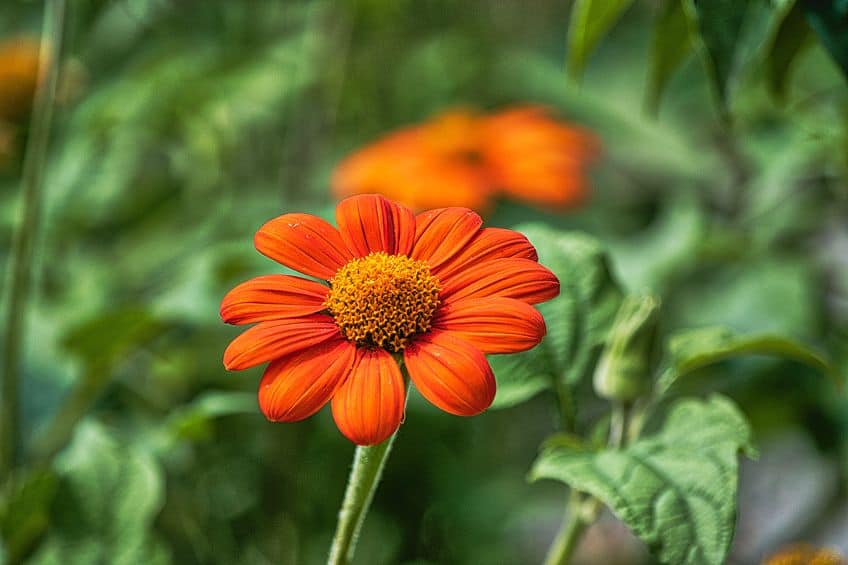
Olive green hues are perfect for highlights on plants and greenery as the orange warms the green, mimicking the effect of sunlight.
The combination of orange and purple can be used to make an array of rich browns, not just sienna. This is because browns are just dark reds or oranges that have been desaturated and had their intensity and value lowered, which is what is achieved when mixing tertiary colors. Colors in real life and nature are often not as vibrant as those straight out of the tube.
Tertiary colors can be a great tool to achieve more realistic tones in your painting. For example, when painting a pumpkin purple can be used to soften and dull the vibrancy of oranges when adding the color blue complementary would completely wash it out.
Purple and green are Both cool colors so when steel blue is used in the background, it can make things feel further away. This adds depth to your paintings and is particularly great for distant mountain ranges. In these ways, tertiary colors can be used to gray down or mute a color’s strength, allowing you to really draw attention to the more intense colors of your piece.
There are an endless number of tertiary colors, all with their different tones, tints, and shades. Using color theory, you can easily change the temperature, saturation, and brightness of your tertiary colors to mix your own perfect hues. Experimentation is key to understanding how to mix different colors, so we recommend you play around with combinations and have fun exploring the world of tertiary colors!
Frequently Asked Questions
What Is a Tertiary Colors Definition?
Tertiary colors within the RYB color model are a mixture of two secondary hues. These colors are olive green, burnt sienna, and steel blue. The tertiary colors in the RGB color model are an equal combination of a primary color and a secondary color and are chartreuse, spring green, azure, violet, rose, and orange. These colors are also known as intermediate colors in this color model.
Are Tertiary Colors and Intermediate Colors the Same?
While the RGB color model considers tertiary colors and intermediate colors to be the same, the RYB color model classifies them as two different groups of colors. In the RYB model, tertiary colors are created by combining two secondary hues in equal parts, while intermediate colors are created by combining a primary and secondary hue. The tertiary colors in this model are steel blue, olive green, and burnt sienna, while the intermediate colors are red-orange, red-violet, yellow-orange, yellow-green, blue-green, and blue-violet.

Megan is a writer and researcher who holds a degree in Social Sciences, with a specialization in Psychology and Environmental Science, from the University of Cape Town. Her dedication to acquiring knowledge and making a positive impact has driven her current work in promoting conscious and sustainable growth in Southern Africa. Megan’s interests encompass exploring the physical and psychological impacts of color in our environment on our mood and well-being. She is also passionate about the role of art and creativity, which has been an integral part of society since the beginning of human history. Since 2022, Megan has been contributing blog posts on painting and color theory at artfilemagazine.
Learn more about Megan van Schoor and about us.
Cite this Article
Megan, van Schoor, “Tertiary Colors – Understanding the Tertiary Colors Definition.” artfilemagazine – Your Online Art Source. April 20, 2023. URL: https://artfilemagazine.com/tertiary-colors/
van Schoor, M. (2023, 20 April). Tertiary Colors – Understanding the Tertiary Colors Definition. artfilemagazine – Your Online Art Source. https://artfilemagazine.com/tertiary-colors/
van Schoor, Megan. “Tertiary Colors – Understanding the Tertiary Colors Definition.” artfilemagazine – Your Online Art Source, April 20, 2023. https://artfilemagazine.com/tertiary-colors/.