Balance in Art – A Look at One of the Basic Principles of Art
Visual balance is one of the most intuitive principles of art. Balance is fundamental to human existence and the environment. When the balance in the composition of an image is off, viewers can often detect this through their own natural sense of balance. Even the most untrained eye can decipher the presence or lack of balance. Such images can feel tense, awkward, uncomfortable, and even wrong.
The Intuitive Inclinations of Balance in Art
Much of human technology is founded on the principle of balance. Printed materials such as posters or travel brochures use symmetry, which is a prominent organizational concept in nature, human technology, and the principles of art.
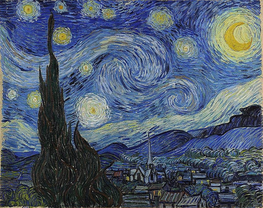
What Is Balance in Art?
Balance is one of the principles of art and refers to the use of the elements of art in an artwork to create visual stability. The elements include line, shape, value, color, space, and texture. Balance is engaged through arranging these elements so that one part of the artwork appears either equal, lighter, or heavier than the other.
Visual balance means the visual weight is even across an artwork.
The art elements are not weighted too heavily on one side or the other. Visual weight refers to the weight an element holds within an image. It is not a principle or rule, but rather a guideline. It helps us articulate situations where some elements in an artwork appear lighter or heavier.
The Three Main Types of Balance in Art
While it is possible to achieve balance with merely one element, there are various types and combinations of balance in art. Experimenting with the configuration of the elements of art changes the way balance or lack of balance affects an artwork. The three most common types of balance are symmetry, asymmetry, and radial symmetry. How the elements of art are used to achieve balance in an image depends on the mood or concept an artist wishes to communicate.

Symmetrical Balance in Art
The most basic type of balance is symmetrical balance. It is also called formal balance or bilateral symmetry. Symmetrical balance in art essentially operates like a mirror image. The elements are arranged so that they are evenly distributed, resulting in two matching halves within an image. True, pure, or perfect symmetry often refers to cases where the axis lines are oriented left to right and top to bottom. Cases, where there are slight variations on the mirroring sides of a composition, are referred to as approximate symmetry. Artists and viewers gravitate towards symmetry, because humans themselves are fundamentally symmetrical creatures, with two eyes, two ears, two arms, two legs, and so forth.
Many other creatures share our bilateral symmetry, but so do man-made objects like chairs and tables. Symmetrical balance is popular because it appears organized, and has a strong sense of unity.
Asymmetrical Balance in Art
Asymmetrical balance in art is also called informal balance. This is the opposite of symmetrical balance so it can be defined as meaning without symmetry or not symmetrical. When one half of the image does not mirror the other, this can be seen as an asymmetrical image. However, asymmetry can still be used to achieve compositional balance. Negative space is often used to achieve both balance and tension as emptiness creates visual interest. The overuse of perfect symmetry can result in boring and stagnant imagery. Asymmetrical balance disrupts absolute balance, often strengthening the impact of an artwork. The tension of asymmetrical balance in art is often engaged through contrast, variety, and movement. Throwing a composition out of balance activates it in ways that perfect symmetry never could.
Radial Balance in Art
Radial balance in art refers to images where the elements of art are organized around a focal point in an image. Radial balance incorporates symmetry in several directions, beginning from a point in the center of the composition. The elements then radiate from that center, moving outwards and creating an often-circular spiral or pattern. Naturally, radially symmetrical images are also bilateral as they can be mirrored and have several parts that can rotate to match. Radial balance is prevalent in nature as seen in snowflakes, flowers, and spider webs. Radial balance is also common in human shapes such as squares, hexagons, octagons, and stars.
It makes sense then that human technologies like the spokes on a bicycle or car wheels, clocks, compasses, and architectural domes incorporate radial balance.
Balance in Art Examples
As important as balance is in life and art, missing the mark can mean the difference between a successful artwork and one that falls short. When a composition is not balanced, it feels uneasy to the viewer, who can naturally sense that something is wrong with the image, even if they cannot articulate what it is. A balanced artwork can create mood, or convey meaning. Below are some specific balance in art examples.
Symmetry in Frida Kahlo’s Self-Portrait with Thorn Necklace and Hummingbird (1940)
| Artwork | Self-Portrait with Thorn Necklace and Hummingbird |
| Artist | Frida Kahlo (1907 – 1954) |
| Medium | Oil on canvas on masonite |
| Dimensions (cm) | 47 x 61 |
| Current Location | Harry Ransom Center, University of Texas, Austin, Texas, United States |
Frida Kahlo’s Self-Portrait with Thorn Necklace and Hummingbird is a small painting, but it draws great interest. The symbolic visual elements of this image seem to leap out at the viewer, with a frenzied degree of control. Kahlo boldly faces the viewer, establishing herself as the dominant focal point of this self-portrait. There are thick piercing thorns perched around her neck like a necklace, causing her to bleed. Despite this Kahlo depicts herself with a solemn expression, calmly enduring the pain.
On the thorns knotting around the artist’s throat hangs a hummingbird. The background is shrouded in large green and yellow leaves. Behind her shoulder on the right is a threatening black cat and, on the left, a familiar black spider monkey. The monkey and the cat on either side of her shoulders are both black and relatively the same size.
The similar scale, shape, color, and value result in an evenness on either side of the artist’s shoulders.
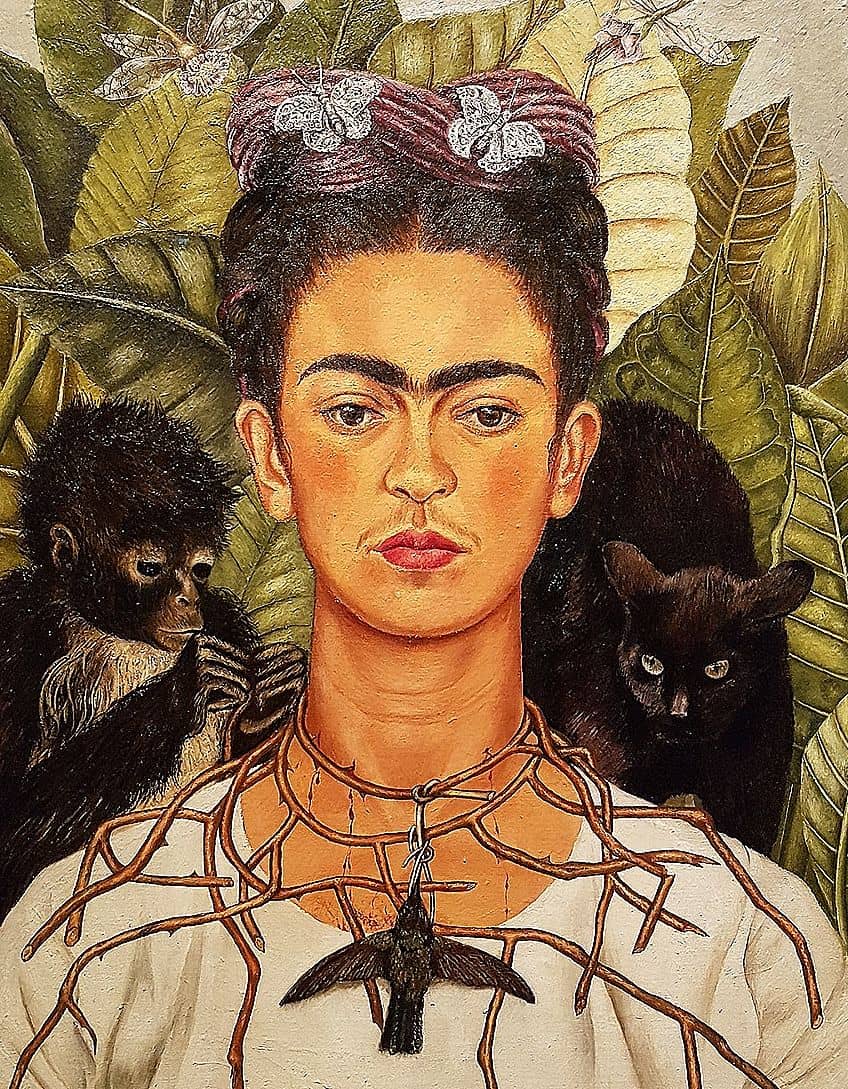
Naturally, Kahlo’s face has an eye on both sides creating further harmony between the subjects in the middle ground and the foreground. Behind her, the environment of leaves fills the background with an even green. The various creatures and bugs flying behind her add to this sense of harmony.
It is not difficult to see why this artwork is a good choice for balance in art examples. But while this is a symmetrical composition, splitting it down the middle shows that it is not perfectly symmetrical.
The monkey and the cat are different, and there are other variations. Still, no part seems heavier than the other and the elements balance out. Hence Kahlo’s self-portrait falls under the specific type of balance called approximate symmetry. This means both sides of the painting are not exactly alike, but they are relatively close.
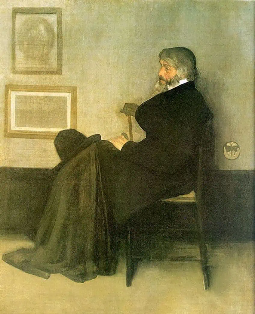
Asymmetry in James Whistler’s Arrangement in Grey and Black No. 1. or Whistler’s Mother (1871)
| Artwork | Arrangement in Grey and Black No. 1. |
| Artist | James Abbott McNeill Whistler (1834 – 1903) |
| Medium | Oil on canvas |
| Dimensions (cm) | 144 m x 162 |
| Current Location | Musée d’Orsay, Paris, France |
Arrangement in Grey and Black No. 1, otherwise known as Whistler’s Mother is one of the painter’s best-known works. As the title suggests, the subject of the painting is Whistler’s mother. The simplified composition of the painting is rather conventional at first glance. The lines are uncomplicated and the color palette is neutral. Because of its calmness, it seems natural to attribute it to some type of balance. This painting can be considered an example of balance artwork through asymmetry because it is balanced, but it lacks visual symmetry. The painting features thin washes of paint, in a somber palette. Whistler’s strokes are smooth, soft, and slow, imbuing tonal harmony and thus balance to the image.
With this painting, Whistler was responding to the technical challenge of the gray and black palette, conveying his unique talent for using tonal harmony to achieve balance in his work.
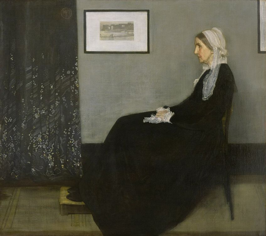
Despite the soft implications of Whistler’s painterly process, there is also hardness to this image. The painting is dominated by a dull, gray, hard wall. The curtain on the left-hand side continues this sense of grayness, only offset by a rectangular, white-framed print on the wall. Not to mention, there is a great deal of black in this painting, primarily in Whistler’s mother’s dress which evokes a sense of mourning.
This adds a sense of heaviness in the lower right-hand section of the image and the overall image can be described as heavy.
Its simplicity intentionally and successfully conveys the psychological depth of the portrait. Besides the balance between the elements of art and the contrast between geometric structure and realism, Whistler points us toward an evocation of strong emotions – a balance between strength and fragility.
Radial Balance in Edvard Munch’s The Sun (1911)
| Artwork | The Sun |
| Artist | Edvard Munch (1863 – 1944) |
| Medium | Oil on canvas |
| Dimensions (cm) | 455 x 780 |
| Current Location | University of Oslo, Oslo, Norway |
The enormous mural painting The Sun by Edvard Munch features a supreme example of an asymmetrical radial composition. With the bold frontality of this image, one would be forgiven for deducing that it is merely symmetrically structured, but this balance artwork is not limited to the bounds of basic symmetry.
The composition has a clear, strong central focal point from which elements radiate, resulting in the dominance of radial symmetry.
As evidenced by this painting, artworks can incorporate symmetrical and asymmetrical radial designs, which are similar as they both radiate from a central point, with radial asymmetry being more dynamic. As the name suggests, the sun is the focal point of this painting. Compositionally, it is pervasive, with the lines of its rays spreading outward. The sunlight shines out onto the landscape. A bright center in the high heavens radiating its light onto land and sea, and filling the whole frame.
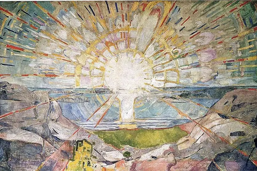 The Sun (1911) by Edvard Munch; Edvard Munch, Public domain, via Wikimedia Commons
Illuminated by the rays of sunlight, elements of art such as line, color, and shape are used to depict the bare rocks, the water of the sea, and the shoreline of a Northern landscape. A thin strip of green separates the land from the ocean, and a clean, horizon line divides the water from the sky. With a clear focal point, the approximate symmetry of this radial composition maintains a visually harmonious balance in the painting.
A Balancing Act
While the use of most principles of art can be improved upon with practice and experience, the advantage of balance in art is that it is intuitive. It is part of nature and therefore part of us. Therefore, even with the simplest tools and elements, artists can produce work that appeals to a viewer’s intrinsic sense of balance. However, these elements may be as basic as they are complex. Experienced artists are adept at using and combining some or all forms of symmetry, thus creating and exploring the exciting visual effects of such combinations.
Balance in art is not just about making a pretty picture. Other than enhancing design skills, understanding balance enables artists to become more effective communicators. The placement and manipulation of the elements of art help better communicate an artistic concept and evokes mood or feeling. With this in mind, learning to use balance provides artists with infinite possibilities.
Frequently Asked Questions
What Is Balance in Art History?
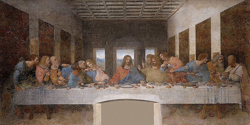
One of the most iconic examples of balance in art is the Last Supper (1498) by Leonardo da Vinci. In it, Jesus stands out as the focal point. The table and the architectural forms are symmetrical. Christ’s disciples are seated on either side. Everything from their poses to their attire works towards a strong sense of balance in this Renaissance composition.
What Is an Example of Balance in Filmmaking?
Filmmakers often incorporate balance in their shots, according to rules of composition such as the rule of thirds. Film characters are often centered, looking straight ahead into the camera. The use of balance and symmetry in film can communicate emotion and character dynamics. There are several examples of this visual device in Stanley Kubrick’s 2001: A Space Odyssey (1968).
What Is an Example of Balance in Architecture?
From the ancient Egyptian pyramids to the Greek Parthenon, architecture has always engaged with the organizational principle of perfect symmetry. Designed by David Lowery, the Taj Mahal (1632) is a popular example of perfect symmetry in architecture. The exquisite structure is perfectly symmetrical on both sides.
What Does a Puffer Fish Have to Do with Radial Symmetry?
The puffer fish is known for creating radially symmetrical art on the ocean floor. There are mind-blowing videos on YouTube, which show the artistic fish in action.
Jordan Anthony is a Cape Town-based film photographer, curator, and arts writer. She holds a Bachelor of Art in Fine Arts from the University of the Witwatersrand, Johannesburg, where she explored themes like healing, identity, dreams, and intuitive creation in her Contemporary art practice. Jordan has collaborated with various local art institutions, including the KZNSA Gallery in Durban, the Turbine Art Fair, and the Wits Art Museum. Her photography focuses on abstract color manipulations, portraiture, candid shots, and urban landscapes. She’s intrigued by philosophy, memory, and esotericism, drawing inspiration from Surrealism, Fluxus, and ancient civilizations, as well as childhood influences and found objects. Jordan is working for artfilemagazine since 2022 and writes blog posts about art history and photography.
Learn more about Jordan Anthony and about us.
Cite this Article
Jordan, Anthony, “Balance in Art – A Look at One of the Basic Principles of Art.” artfilemagazine – Your Online Art Source. February 21, 2023. URL: https://artfilemagazine.com/balance-in-art/
Anthony, J. (2023, 21 February). Balance in Art – A Look at One of the Basic Principles of Art. artfilemagazine – Your Online Art Source. https://artfilemagazine.com/balance-in-art/
Anthony, Jordan. “Balance in Art – A Look at One of the Basic Principles of Art.” artfilemagazine – Your Online Art Source, February 21, 2023. https://artfilemagazine.com/balance-in-art/.


