Famous Picasso Paintings – Descriptions, Insights, and Analyses
In this article, we will share 14 famous Picasso paintings. This artist is known for pioneering the Cubist movement but also created works in multiple mediums throughout his career. We will, therefore, discuss early Picasso works, Picasso drawings, Picasso portraits, paintings by Picasso, and Pablo Picasso’s last painting before his death. For each of these works, we will provide a brief discussion of the composition, a short visual analysis, and touch on the reception of the work when it was first exhibited. This way we will discover what makes Picasso such a significant artist until this day.
Artist Abstract: Who Was Pablo Picasso?
Pablo Picasso was a Spanish painter, sculptor, and printmaker who is considered one of the most influential artists of the 20th century. He is known for co-founding the Cubist movement and for the wide variety of styles that he helped develop and explore. Born in Malaga, Spain, in 1881, Picasso showed a natural talent for art from an early age and studied at the School of Fine Arts in Barcelona.
Throughout his long career, he produced an enormous and profoundly influential body of work, including more than 50,000 paintings, prints, and sculptures. He was 91 years old when he died in 1973.
Famous Picasso Paintings
Pablo Picasso was influential to art history because he was a pioneering artist who helped to develop and shape many of the major art movements of the 20th century.
He was a key figure in the development of Cubism, which revolutionized the way that artists depicted space, form, and perspective in their work. He was also an innovator in the use of color, and his work paved the way for the development of new styles and techniques in painting and sculpture.
Furthermore, Picasso’s vast body of work and his relentless experimentation with different styles and mediums had a profound impact on the art world, inspiring generations of artists to push the boundaries of what was possible in their work.
Le Petit Picador Jaune (1889): Early Picasso Works
| Date | 1889 |
| Medium | Oil on wood |
| Dimensions (cm) | 24 x 19 |
| Genre | History painting |
| Art Movement | Post-Impressionism |
| Location | Private collection of Claude Picasso, Paris, France |
Compositional Overview of Le Petit Picador Jaune
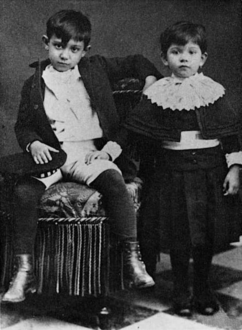
Le Petit Picador Jaune (The Little Yellow Picador) is a very early Picasso work, painted while he was only eight years old. The painting depicts a scene from a bullfight, with a small figure of a picador (a bullfighter who uses a lance) in the center of the composition.
The picador is shown in profile, wearing a yellow suit and a red hat. He is holding a lance in his right hand and is leaning forward as if preparing to engage with the bull. Behind him, a large, menacing bull is charging towards him, its head lowered and its horns pointed forward.
The background of the painting is relatively simple, with a blue sky and a few wispy clouds.
Reception of Le Petit Picador Jaune
This early painting has received mixed reviews from both the public and art critics. Some people were impressed by Picasso’s bold use of color and his ability to capture the drama of the bullfighting scene, while others have found the painting to be too chaotic and confusing. Among art critics, the response to the painting remains divided. Some have praised the painting for its expressive brushwork and its sense of movement, while others criticized it for its lack of composition and its seemingly chaotic arrangement of forms.
While the critic John Berger (1926-2017) wrote that the painting was “a jumble of poorly drawn figures” and that it lacked the coherence and elegance of Picasso’s earlier works, Robert Hughes (1938-2012) describes the painting as a “tour de force” showing Picasso already at the height of his powers.
A Short Analysis of Le Petit Picador Jaune
The composition of the painting is dynamic and chaotic, with the figures of the picador and the bull arranged in a diagonal line across the canvas. The subject matter of the painting is the bullfight, a traditional Spanish spectacle that combines elements of sport, theater, and ritual. The painting captures the tension and drama of the bullfight, as the picador prepares to face the charging bull. However, the painting also hints at the violence and cruelty of the bullfight, as the picador and the bull are locked in a deadly struggle.
In terms of color, Picasso uses a bold and vibrant palette in Le Petit Picador Jaune. The picador is depicted in a bright yellow suit, which contrasts sharply with the deep red of the background. The use of color in the painting is striking and dynamic and helps to create a sense of movement and excitement.
The texture of the painting is relatively rough, with the figures and the background depicted in a series of broad brushstrokes. Picasso uses a combination of short, choppy strokes and longer, more fluid ones to create a sense of texture and depth. The brushwork is expressive and gestural and gives the painting a sense of immediacy and vitality. In terms of perspective and form, Picasso uses a flattened, abstract style in Le Petit Picador Jaune. The figures of the picador and spectators are simplified and reduced to their essential forms.
This early Picasso work already starts to hint at the artist’s Cubist style to come later in his career.
The Blue Room (1901): Early Picasso Works
| Date Painted | 1901 |
| Medium | Oil on canvas |
| Dimensions (cm) | 50.4 x 61.5 |
| Location | The Phillips Collection, Washington, D.C., United States |
Compositional Overview of The Blue Room
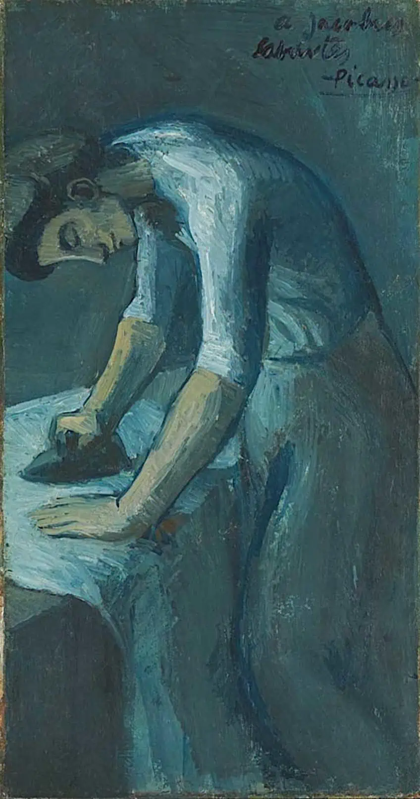
In The Blue Room, a naked figure is depicted bending over a bathtub. The setting could be the artist’s studio in Paris or his bedroom in the apartment he shared with other people at the time.
Behind the woman, a poster of May Milton by Toulouse-Lautrec is stuck against the wall, an acknowledgment of the artist who had recently died at the time the painting was created.
Under the poster, there is a bed that is not made, indicating the woman had risen from there to wash.
Reception of The Blue Room
The Blue Room is considered to be an early example of Picasso’s Blue Period. In 1900, he moved to Paris and was inspired by the Impressionists and Post-Impressionists. The following year, he exhibited his work for the first time in a solo exhibition in Paris, showcasing a painting portraying the joys of Montmartre at night. The Blue Room was created soon after this exhibition and is connected to the works in that collection, as well as the other blue paintings that would follow.
It was considered a shocking painting at the time because it so clearly depicts the morning after a night of pleasure. It was common for artists to paint nude women when they were a representation of a goddess or biblical figure.
A Short Analysis of The Blue Room
In The Blue Room, Picasso creates a sense of tranquility and serenity, even though the woman’s face is not visible. This contrasts his later Blue Period paintings, which often depicted bleak and sorrowful scenes. The use of blue, combined with the vibrant reds and ochres in the rest of the room, and the woman’s comfortable pose, contribute to the sentiment of bliss.
It has been suspected since the 1950s that The Blue Room contains a hidden painting beneath its surface. Picasso often scraped off the paint while he worked, revealing the forms underneath, or using previous compositions to add to the final image.
In the early 2000s, infrared reflectography technology was used to study the composition of The Blue Room. It exposed a portrait of a man that Picasso had painted before the start of his Blue Period. The man, wearing a bowtie and touching his cheek, is seated. Researchers confirmed that both paintings were created in the summer of 1901.
La Vie (1903): Early Picasso Works
| Date | 1903 |
| Medium | Oil on canvas |
| Dimensions (cm) | 196.5 x 129.2 |
| Art Movement | Picasso’s Blue Period |
| Location | Cleveland Museum of Art, Cleveland, United States |
Compositional Overview of La Vie
La Vie portrays a naked couple embracing each other on the left side of the composition. The woman is standing with her arms resting on the man’s left shoulder, while the man is looking at a mother holding her child.
The man’s arm is slightly outstretched and his hand is pointing at the mother in a notable gesture. The man and his mother seem to be looking at one another without saying anything. The woman hugging the man is looking down and away.
In the middle of the picture, behind the figures, two paintings add a layer of meaning to the artwork. The top painting features a woman holding a man who appears to be in grief or pain. There is one painting on the floor depicting a person squatting in a miserable way with numerous previous versions of the composition visible around her on the canvas. All of the figures in these paintings within La Vie’s painting are naked.
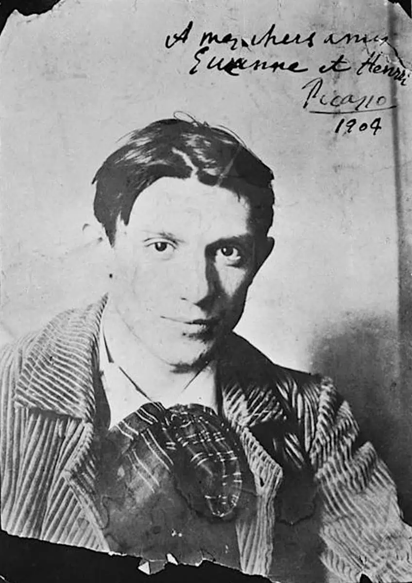
Reception of La Vie
The painting La Vie by Pablo Picasso was first exhibited in 1903 at the Salon des Indépendants in Paris. It is an early Picasso work, which he created at only 22 years old. The painting depicts a group of figures in a dreamlike, surreal setting, with bright colors and bold, expressive brushstrokes. It is an example of Picasso’s Blue Period, named for the predominant use of blue tones in his paintings from this time.
The painting was well-received by critics and audiences alike and helped establish Picasso as a rising star in the art world.
A Short Analysis of La Vie
The subject matter of the painting is enigmatic and surreal. The figures are depicted in a dreamlike setting, that seems to be an artist’s studio. The color palette of La Vie is dominated by blues and greens, giving the painting a cool, ethereal quality. Picasso uses bold brushstrokes and strong contrasts to create a sense of depth and movement within the painting.
The light source is unclear, but the figures are evenly illuminated, creating a sense of mystery and uncertainty.
Mother and Child Study (1904): Famous Picasso Drawings
| Date | 1904 |
| Medium | Graphite on paper |
| Dimensions (cm) | N/V |
| Art Movement | Impressionism; Post-Impressionism |
| Location | Private collection |
Compositional Overview of Mother and Child Study
This Picasso drawing depicts a mother holding her baby, with the child reaching up to touch the mother’s face. The standout feature of the work is the multiple renditions of the mother’s right hand, including the final depiction as well as four other attempts at capturing the hand. Three of these attempts are similar, while the fourth has a more animalistic appearance and is placed at the bottom of the picture.
Process and Reception of Mother and Child Study
It was drawn by Picasso in 1904, during a transition period in which he began incorporating brighter tones and styles into his art, moving away from the darker themes of his Blue Period. A rough draft of the mother’s head and shoulders can be seen in the top right corner of the sketch, implying that it is a work in progress rather than a finished piece.
While he is well-known for his innovative and striking images from the Cubist and Surrealist periods, these earlier Picasso drawings demonstrate that Picasso was also capable of creating classical, beautiful artwork.
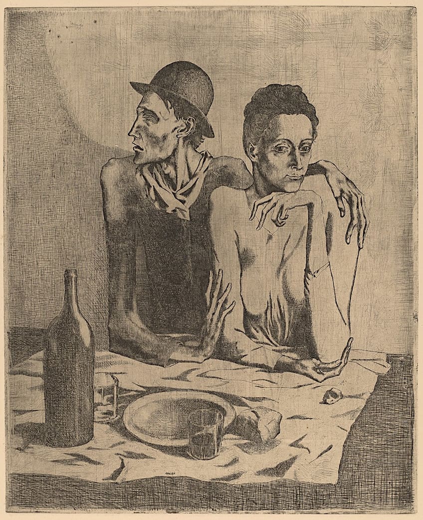
A Short Analysis of Mother and Child Study
Mother and Child Study or A Mother and Child and Four Studies of Her Right Hand is a sketch created with black crayon and ink on tan woven paper. The mother’s right shoulder is disproportionately elongated and twisted as she cradles the child, and she is shown gazing affectionately at the infant. The theme of a mother and child is common in Picasso’s art and appears across various artistic periods, depicted in various styles.
The pose of the mother nestling with her baby in this sketch is comparable to other works by Picasso.
Garçon à la Pipe (1905): Early Picasso Works
| Date | 1905 |
| Medium | Oil paint |
| Dimensions (cm) | 100 x 82 |
| Art Movement | Impressionism |
| Location | National Gallery of Art, Washington, D.C., United States |
Compositional Overview of Garçon à la Pipe
This painting by Picasso shows a young Parisian with a pipe in his left hand and a flower crown on his head. The composition of the painting is fairly simple, with the boy’s figure occupying a central position and taking up a large portion of the canvas. The figure is positioned slightly off-center. By placing him not in the center of the artwork, Picasso creates optical interest and harmony in the composition.
The boy is depicted in a seated position, with his head turned to the side and his arm resting on his bent knee. This pose creates a sense of movement and dynamism as if the boy is in the process of turning or shifting his position.
Picasso was living at Le Bateau-Lavoir in Montmartre at the time he created the painting and often used local residents, including those in the entertainment industry, as models in his artwork. Little is known about the specific identity of the boy depicted in the painting, though it is believed that he was a teenager who frequently visited Picasso’s studio and volunteered to pose for the piece. Picasso remarked that the boy was one of the “most beautiful models” he had ever worked with.
Process of Garçon à la Pipe
In 1904, his love for Fernande Olivier (1881-1966), an artist model that lived in Paris at the time, changed Picasso’s art in two significant ways. First, he moved away from the mournful themes and blue color palette of his Blue Period, adopting the more joyful tones of his Rose Period. Second, he began to depict the human form in a more stylized way, rather than striving for realistic accuracy. A notable work from this time is Garçon à la Pipe (Boy with a Pipe).
The artist experimented with various poses for the boy, ultimately settling on a seated position and carefully considering the placement of his arm. Initially, the painting only featured the pipe, but Picasso later added a flower crown to the subject’s head after taking a break from the work for about a month.
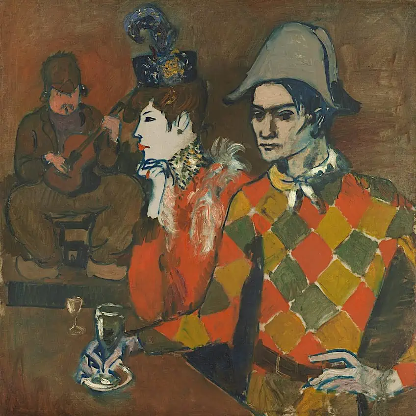
A Short Analysis of Garçon à la Pipe
In Garçon à la pipe, Picasso uses a limited color palette, primarily consisting of muted earth tones such as browns, greens, and grays. The boy’s skin is painted with a pale, almost ghostly, white hue, which contrasts with the darker colors of his clothing and the background.
The use of these pale, muted colors gives the painting a somber, melancholic atmosphere.
Picasso’s brushwork in the painting is expressive and gestural, with visible brushstrokes and loose, fluid handling of the paint. The artist has applied the paint thickly in some areas, creating a sense of texture and depth, while in other areas it is thin and transparent, allowing the canvas to show through.
Gertrude Stein (1905 – 1906): Picasso Portraits
| Date | 1905 – 1906 |
| Medium | Oil on canvas |
| Dimensions (cm) | 100 x 81 |
| Art Movement | Impressionism |
| Location | Metropolitan Museum of Art, New York, United States |
Compositional Overview of Gertrude Stein
The composition of this Picasso portrait is fairly symmetrical, with Stein’s figure occupying a central position and her head and upper body filling most of the canvas.
Picasso used strong lines and geometric shapes to define Stein’s features and clothing, including the sharp angles of her jawline and the rectangular shape of her glasses.
The artist has also used areas of negative space, such as the white background around Stein’s head, to create visual interest and balance in the composition.
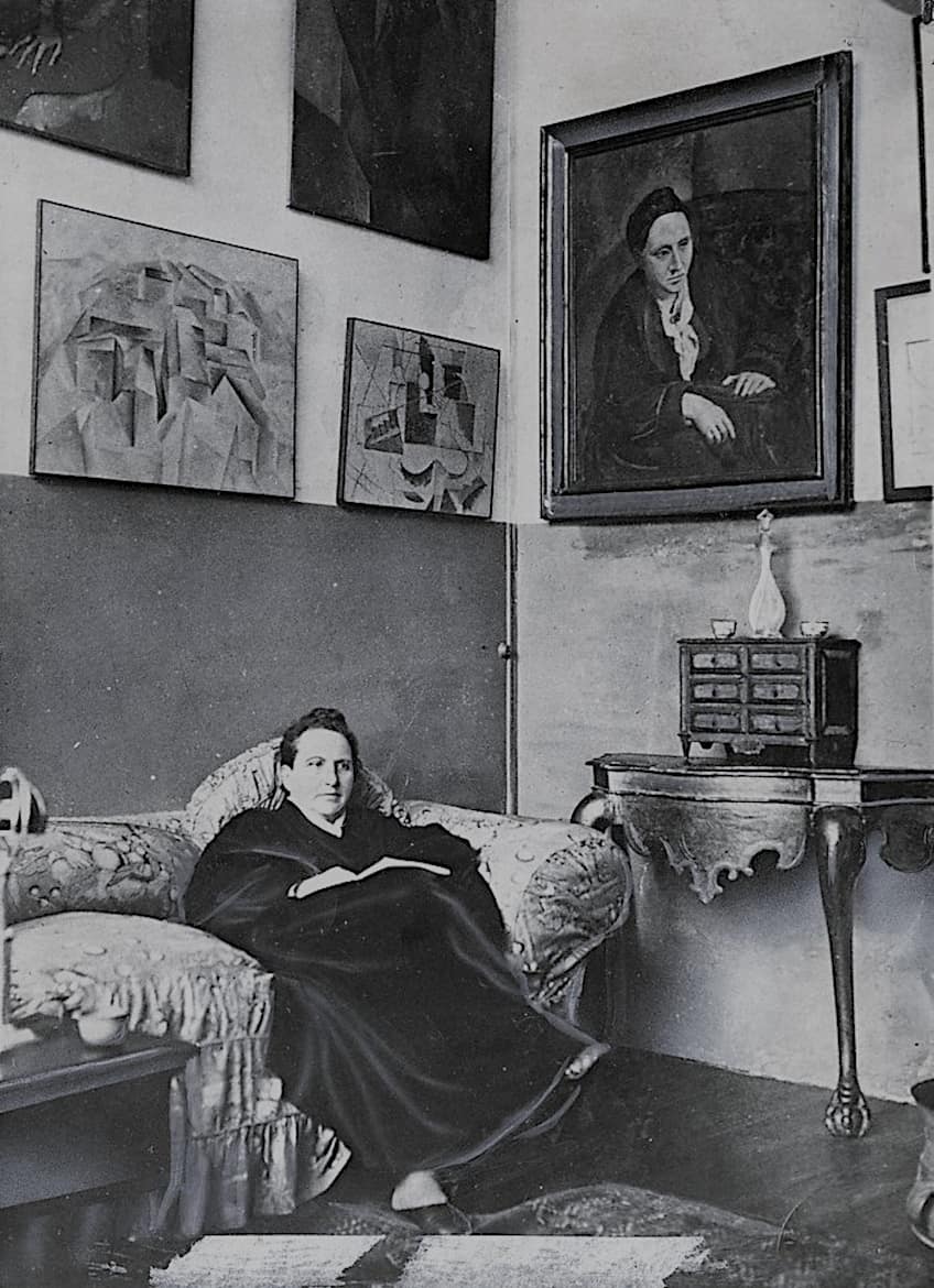
Process of Gertrude Stein
Picasso and Stein became friends quickly after the artist moved to Paris. Stein, a writer that was known for hosting literary salons, was also an influential art collector and being part of her inner circle could greatly benefit an artist’s career. While the portrait of Stein is not a Cubist work, art experts see hints of the movement in the use of simple shapes to depict the body.
Upon close examination, it is clear that Stein’s face is more detailed and finished than the rest of the portrait. This is because Picasso was dissatisfied with his initial attempts and decided to take a trip to Spain before returning to France to complete the face. Stein later donated the portrait to the MET in 1946.
A Short Analysis of Gertrude Stein
In Gertrude Stein, Picasso has used a vibrant and varied color palette, incorporating bright hues such as reds, greens, and yellows alongside more muted tones of brown and gray. The artist has employed a range of paint application techniques, including thick impasto brushstrokes, thin washes of color, and smooth, blended areas of paint.
Overall, the paint texture in Gertrude Stein is varied and layered, with thick brushstrokes and areas of impasto creating a sense of depth and texture. The combination of expressive brushwork and varied paint texture adds to the overall mood and emotion of the portrait, conveying a sense of intensity and intelligence.
Les Demoiselles d’Avignon (1907): A Painting by Picasso That Changed Art History
| Date | 1907 |
| Medium | Oil on canvas |
| Dimensions (cm) | 243.9 × 233.7 |
| Art Movement | Cubism |
| Location | Museum of Modern Art, New York, United States |
Compositional Overview of Les Demoiselles d’Avignon
Les Demoiselles d’Avignon is a big oil on canvas piece that depicts five women in a brothel. The composition of the painting is fairly complex, with the figures arranged in a diagonal line across the canvas. The women are shown in varying poses, with some standing and others seated.
The central figure, a nude woman, is placed at the center of the composition and is the most prominently featured. The other figures are depicted in a more fragmented and abstract way, with their bodies broken up into geometric shapes and planes.
Picasso used strong lines and vivid colors to create a sense of tension and energy in the composition. The overall effect is one of dynamism and movement as if the figures are in the process of interacting with one another.
Process and Reception of Les Demoiselles d’Avignon
Picasso’s process for creating Les Demoiselles d’Avignon was marked by intense experimentation and a willingness to challenge artistic conventions. He began working on the painting in 1907, and it took him several years to complete. During this time, he made numerous studies and sketches, trying out different compositions and ideas.
He also drew inspiration from a wide range of sources, including African masks, ancient Greek and Roman art, and the paintings of Paul Cézanne.
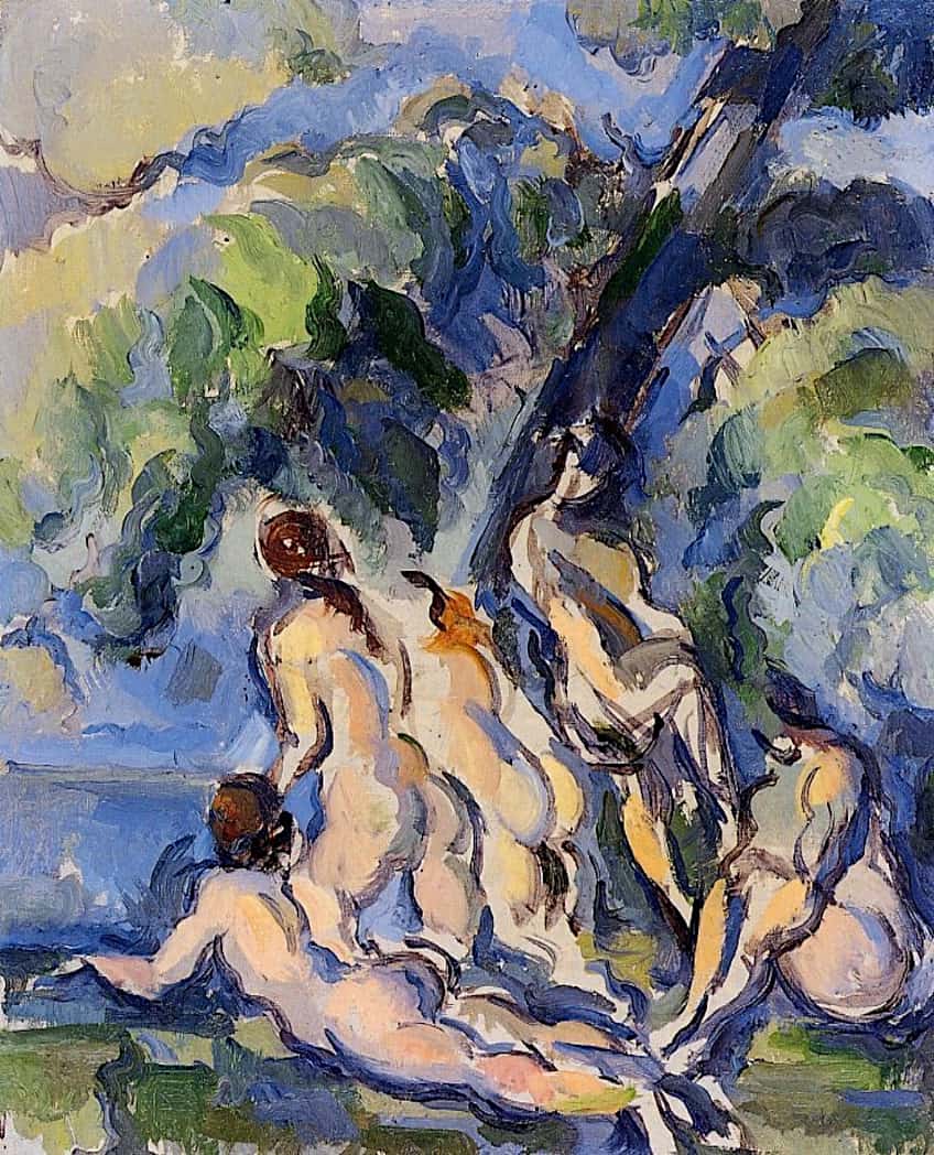
Overall, Picasso’s process for creating Les Demoiselles d’Avignon was characterized by a deep engagement with the formal elements of painting and a willingness to push the boundaries of what was considered acceptable in art.
When it was finally exhibited in 1916, Les Demoiselles d’Avignon caused a sensation in the art world. Henri Matisse, a contemporary of Picasso, was particularly offended by the painting and saw it as a threat to the status of modern art.
However, despite (or perhaps because of) the outrage it provoked, Les Demoiselles d’Avignon went on to become one of Picasso’s most famous and recognizable works.
A Short Analysis of Les Demoiselles d’Avignon
In terms of color and light, Picasso has used a vibrant and varied palette, incorporating bright hues such as reds, greens, and yellows alongside more muted tones of brown and gray. The artist has employed a range of paint application techniques, including thick impasto brushstrokes, thin washes of color, and smooth, blended areas of paint. The overall effect is one of vividness and energy, with the strong colors contributing to the sense of tension and movement in the composition.
The paint texture in Les Demoiselles d’Avignon is varied and layered, with thick brushstrokes and areas of impasto creating a sense of depth and texture. The combination of expressive brushwork and varied paint texture adds to the overall mood and emotion of the painting, conveying a sense of intensity and drama.
In terms of perspective, Picasso used a Cubist style to depict the figures in a fragmented and abstract way, breaking up their bodies into geometric shapes and planes. This gives the painting a sense of dynamism and movement, as if the figures are in the process of interacting with one another.
In terms of form, the figures in the painting are depicted in a simplified and abstract way, with their bodies broken up into geometric shapes and planes. This gives the painting a sense of flatness and stylization, and helps to create a sense of tension and movement in the composition.
In terms of symbolism, Les Demoiselles d’Avignon can be seen as a commentary on the sexual and social norms of the time, as well as a critique of the commodification of the female body. The central figure, a nude woman, can be seen as a symbol of the objectification and exploitation of women. The other figures, depicted in a more fragmented and abstract way, can be seen as representing the dehumanization and marginalization of women in society.
Still Life with Chair Caning (1912)
| Date | 1912 |
| Medium | Oil and cloth on canvas rimmed with rope |
| Dimensions (cm) | 29 x 37 |
| Art Movement | Cubism |
| Location | Musée Picasso, Paris, France |
Compositional Overview of Still Life with Chair Caning
Still Life with Chair Caning is a Cubist painting by Pablo Picasso. The painting depicts a still-life scene of a chair with a piece of fabric draped over it, with a can of paint and a paintbrush nearby. The chair and objects are depicted in a fragmented and abstract manner, with the chair broken down into geometric shapes and the objects rearranged in a seemingly chaotic fashion.
Process of Still Life with Chair Caning
Cubism was a revolutionary movement in the history of abstract art, and Picasso is credited with developing the style, which involves combining two-dimensional elements with multiple perspectives and reducing forms to geometric shapes.
In addition to creating analytic Cubism, Picasso and Georges Braques (1882-1963) and Juan Gris (1887–1927) also experimented with adding found objects such as paper, string, and fabric to their paintings. One of Picasso’s most famous works from this period, Still Life with Chair Caning, is considered a key Cubist painting and also marks the invention of the collage medium and the Synthetic stage of Cubism.
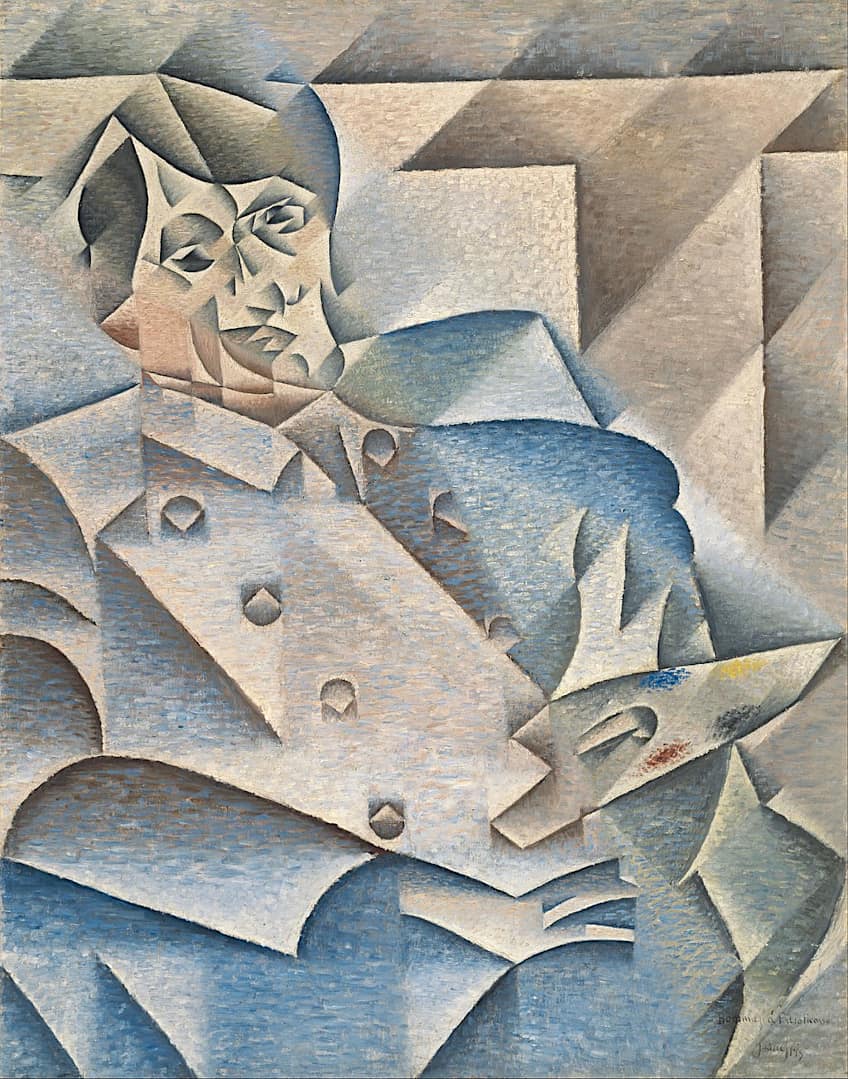
A Short Analysis of Still Life with Chair Caning
In Still Life with Chair Caning, Picasso uses a limited color palette, primarily consisting of shades of blue and brown. The blue tones are used to depict the chair and its fabric, while the brown tones are used for the can of paint and the paintbrush. The use of a limited color range helps to create a sense of unity and cohesion within the composition.
The perspective in the painting is highly distorted, with the chair and objects depicted from multiple angles at once. This fragmentation and rearrangement of objects is a key feature of Cubist art and serves to create a sense of dynamism and movement within the composition.The brushwork in the painting is loose and expressive, with thick, gestural brushstrokes used to define the shapes and forms of the objects. This rough, textured brushwork adds to the sense of energy and movement within the composition.
Symbolically, the chair and its caning may be seen as representing the traditional, ornate forms of the past, while the paint and paintbrush may symbolize the artistic expression and innovation of the present. The fragmentation and rearrangement of the objects in the composition may also be seen as a metaphor for the breaking down and reconstruction of traditional forms in the pursuit of artistic progress.
Portrait d’Olga Dans un Fauteuil (Portrait of Olga in an Armchair) (1918): A Picasso Portrait
| Date | 1918 |
| Medium | Oil on canvas |
| Dimensions (cm) | 130 x 88.8 |
| Art Movement | Neoclassism |
| Location | Musée Picasso Paris, Paris, France |
Compositional Overview of Portrait of Olga in an Armchair
Portrait of Olga in an Armchair is a painting by Pablo Picasso created in 1918, shortly after he married his first wife, Olga Khokhlova. The painting depicts Olga seated in an armchair, with her body turned towards the viewer and her head turned to the side. The composition is relatively simple, with Olga occupying the majority of the canvas and the armchair serving as a supportive element in the background.
Process of Portrait of Olga in an Armchair
In 1918, near the end of World War I, Pablo Picasso married Olga Khokhlova, a ballet dancer he had met while working on a production of Parade.
Their social circles after the war led Picasso to shift away from Cubism and towards a more classical approach to painting, as seen in his portrait of Olga from that same year.
However, he did continue to incorporate Cubist elements in his work for the remainder of his career.
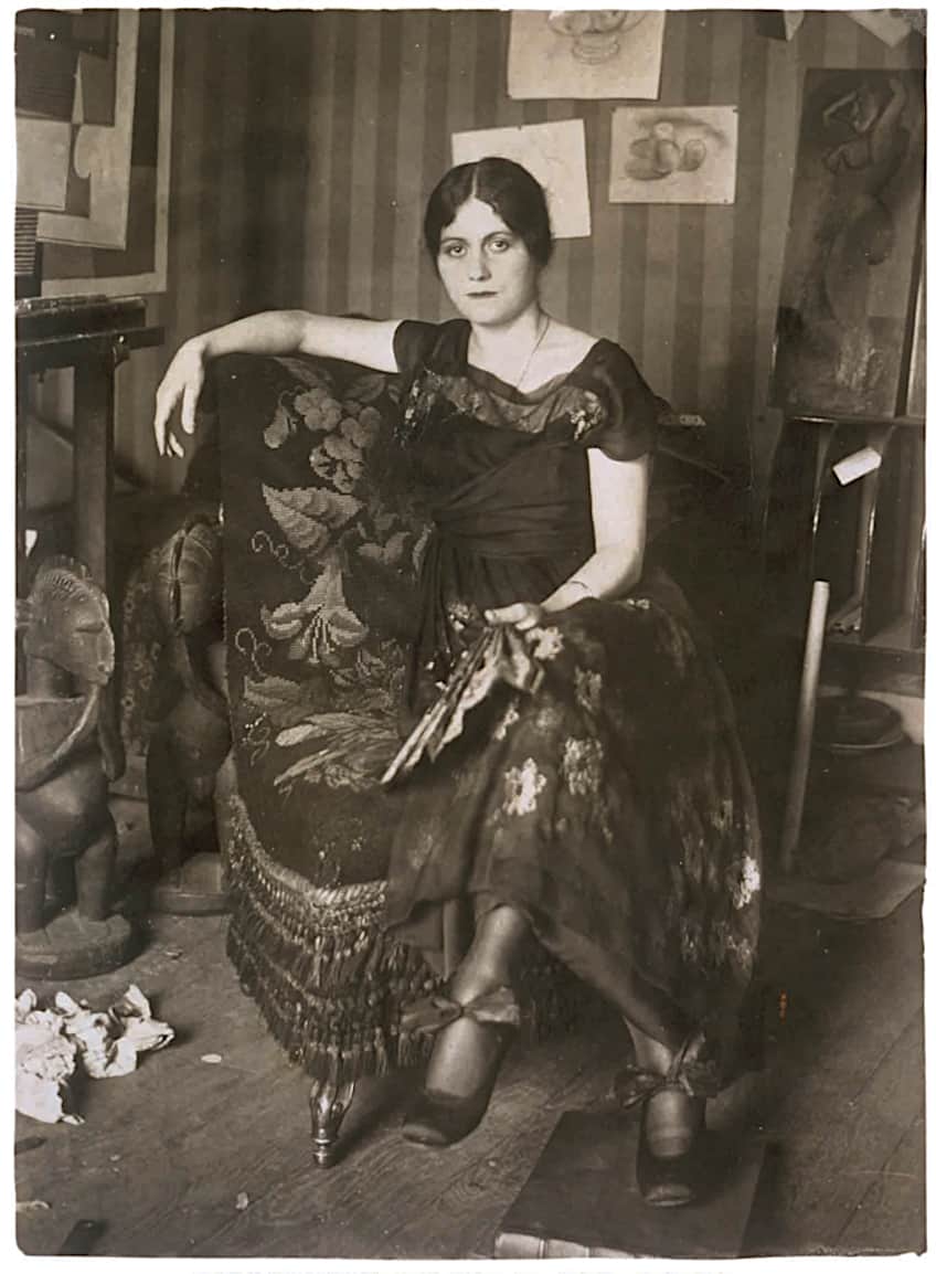
A Short Analysis of Portrait of Olga in an Armchair
In Portrait of Olga in an Armchair, Picasso uses a subdued color palette, consisting primarily of earth tones such as brown, beige, and green. The limited range of colors helps to create a sense of unity and coherence within the composition.
The perspective in the painting is fairly traditional, with Olga depicted from a relatively frontal viewpoint. The armchair is depicted in a slightly more recessed manner, with the backrest and armrests partially hidden behind Olga’s figure.The brushwork in the painting is smooth and controlled, with a more naturalistic approach to rendering form and volume. The brushstrokes are relatively thin and precise, with a greater emphasis on detail and accuracy.
Symbolically, the armchair may be seen as representing the domestic sphere and the comfort and security of home. Olga’s pose, with her body turned towards the viewer and her head turned to the side, may suggest a sense of introspection and contemplation. Overall, the portrait may be seen as a celebration of the bond between the artist and his wife and their shared domestic life.
Figures at the Seaside (1931)
| Date | 1931 |
| Medium | Oil on canvas |
| Dimensions (cm) | 195 × 130 |
| Art Movement | Neoclassicist; Surrealist Period |
| Location | Musée Picasso, Paris, France |
Compositional Overview of Figures at the Seaside
The painting depicts two figures on the shoreline, with the sea and sky in the background. The figures are rendered in a simplified, abstract style, with geometric shapes and bold lines forming their bodies and features. Their bodies are tangled in each other, and it seems they are both naked and kissing.
It is difficult to make out which body part belongs to which individual, as Picasso used a mix of Surrealism and Cubism in this painting.
Process of Figures at the Seaside
In the early 1920s, Surrealism emerged as a significant movement in the arts. Many artists, including Picasso, were drawn to Surrealist ideas, which aimed to unite the unconscious mind with reality.
Picasso’s early Surrealist works, including those from his so-called “Bone Period,” often depicted human figures as grotesque assemblages of bone.
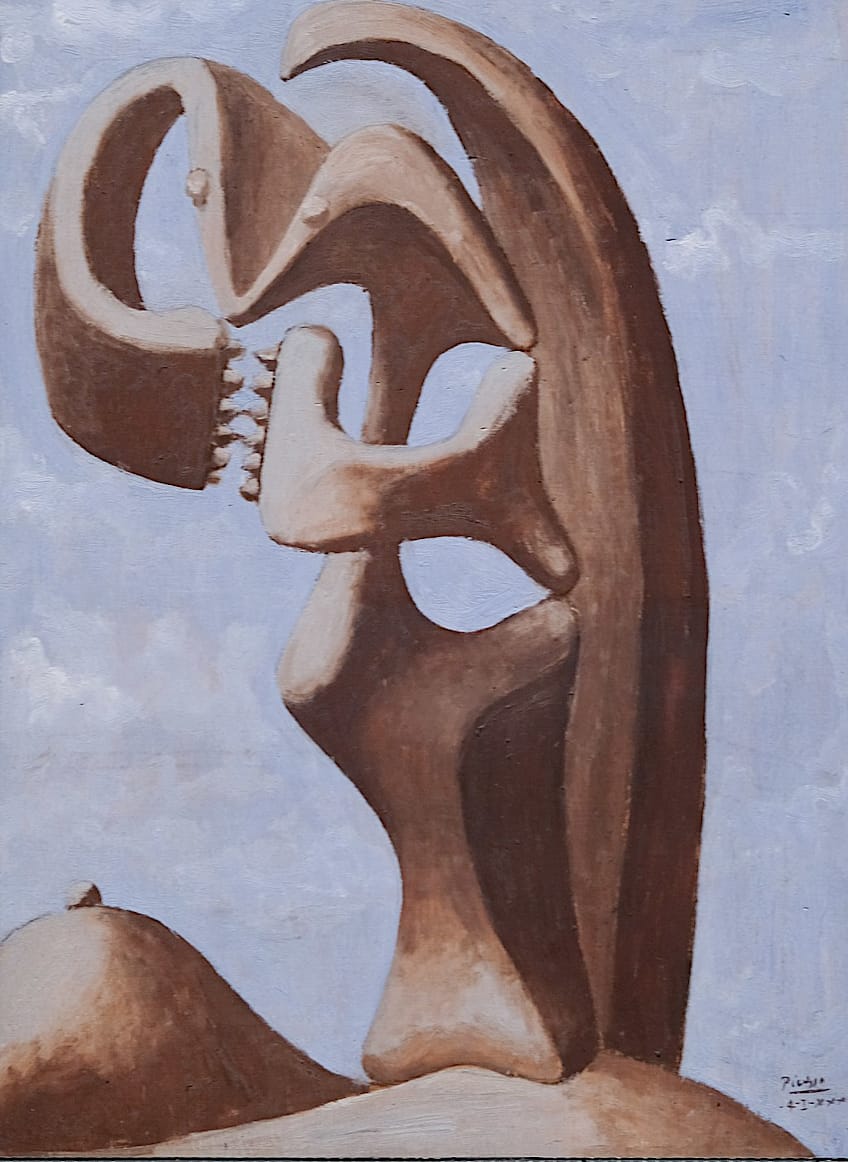
A Short Analysis of Figures at the Seaside
The brushwork in the painting is loose and expressive, with thick, gestural brushstrokes used to define the shapes and forms of the figures.
The color palette is relatively limited, with a range of blue, green, and brown tones used to depict the figures and their surroundings. The use of diagonal lines and curved forms adds to the sense of movement and dynamism in the composition.
Overall, Figures at the Seaside is a lively and energetic painting, with a strong emphasis on the expressive potential of brushwork and color.
Girl Before a Mirror (1932): A Picasso Portrait
| Date | 1932 |
| Medium | Oil on canvas |
| Dimensions (cm) | 162 x 130 |
| Art Movement | Cubism |
| Location | Museum of Modern Art, New York, United States |
Compositional Overview of Girl Before a Mirror
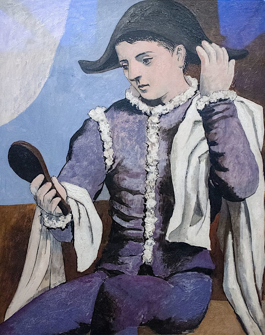
Girl Before a Mirror depicts a young woman standing in front of a mirror, with the reflection of her face and body visible in the glass. One of the most striking aspects of Girl Before a Mirror is how Picasso rendered the figure of the woman.
Her body is depicted in a simplified, abstract style, with bold lines and geometric shapes used to define her features and form. The reflection in the mirror, on the other hand, is more realistic and detailed, with subtle gradations of color and softer lines used to depict the woman’s face and features.
This contrast between the abstract and the realistic creates a sense of tension and ambiguity in the composition, drawing the viewer’s eye back and forth between the two images.
Process of Girl Before a Mirror
Pablo Picasso’s painting process was known to be highly spontaneous and intuitive, and he often worked in a series of rapid, gestural brushstrokes that conveyed a sense of movement and energy. When creating Girl Before a Mirror, Picasso likely began by sketching out the basic composition of the painting, mapping out the placement of the figure and the mirror, and the overall layout of the work.
From there, he likely began blocking in the basic forms and shapes of the figure, using broad brushstrokes and bold lines to define the contours of the woman’s body.
A Short Analysis of Girl Before a Mirror
Another notable aspect of Girl Before a Mirror is its use of color. Picasso has used a limited palette of bright, bold hues, with the woman’s dress and the background both rendered in shades of red. This creates a sense of drama and intensity in the painting, further emphasizing the sense of tension and emotion conveyed by the composition.
Overall, Girl Before a Mirror is a powerful and evocative work that showcases Picasso’s signature style and his ability to convey meaning and emotion through abstract forms and colors. It is a testament to his innovative approach to composition and his enduring influence on the art world.
Guernica (1937): A Painting by Picasso That Changed Art History
| Date | 1937 |
| Medium | Oil on canvas |
| Dimensions (cm) | 349 x 777 |
| Art Movement | Cubism |
| Location | Museo Reina Sofía, Madrid, Spain |
Compositional Overview of Guernica
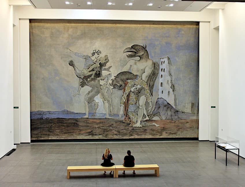
Guernica by Pablo Picasso is one of the most famous and influential of all of Picasso’s art. The painting is a large, mural-sized work that depicts the bombing of the Spanish town of Guernica during the Spanish Civil War. One of the most notable aspects of Guernica is its size and scale.
The painting is over 11 feet tall and almost 25 feet wide, and its size and grandeur are intended to convey the magnitude and significance of the event it depicts. Picasso used a range of compositional devices to create a sense of dynamism and movement in the painting, including the placement of the figures in a diagonal composition and the use of diagonal lines and shapes to convey the sense of chaos and destruction.
Process and Reception of Guernica
The work was originally commissioned for the Paris Exhibition of 1937, but upon learning about the bombing, Picasso abandoned his original concept and began working on Guernica instead. The painting was commissioned by the Republican government of Spain and marked a departure from the artist’s previous lack of inspiration for the project.
A Short Analysis of Guernica
One of the most striking aspects of the painting is the use of light and shadow. The figures and objects are painted in bold, black lines, with white highlights and shadows used to create a sense of volume and depth. This use of light and shadow also serves to emphasize the agony and suffering of the figures, as their contorted and twisted bodies are cast in harsh, dramatic light.
Another notable aspect of the painting is its use of symbolism. The central figure of a woman with outstretched arms and a look of anguish on her face is a symbol of the universal suffering of all those affected by the bombing. The horse and bull, traditional symbols of Spain, are also depicted in the painting, further tying the work to the specific event and place it commemorates.
The Weeping Woman (1937): A Picasso Portrait
| Date | 1937 |
| Medium | Oil on canvas |
| Dimensions (cm) | 60 x 49 |
| Art Movement | Cubism |
| Series | Weeping Women |
| Location | Tate Modern, London, United Kingdom |
Compositional Overview of The Weeping Woman
The Weeping Woman portrays a woman amid crying, with her face twisted in agony and eyes shut tight. Despite appearing to be depicted in profile, the painting includes the Cubist perspective distortion characteristic of Picasso’s style, indicating that the face was depicted from various angles.
The woman is depicted holding a handkerchief to her face, as if attempting to wipe away her tears, and is shown wearing a hat. The painting focuses on the woman’s face, with bold lines used to outline it, while the background, chair, and funeral dress are rendered with less detail.
Process of The Weeping Woman
To create the painting, Pablo Picasso used a range of techniques and materials. The canvas was first primed with a layer of white paint, upon which the artist began sketching out the composition using a pencil. Once the composition was finalized, Picasso began painting the figure using a combination of thick, expressive brushstrokes and more detailed, refined lines.
Picasso created many iterations of The Weeping Woman including a few more oil paintings, but also some sketches in graphite and crayon.
A Short Analysis of The Weeping Woman
The subject matter of The Weeping Woman goes beyond the portrayal of a crying woman in a black dress. Picasso created this and other paintings in the series in response to the bombing occurring in Spain at the time, resulting in the painting’s subject matter being about human sorrow, loss, and personal and collective tragedy.
Additionally, the series reflects the social and political climate in France during this period, conveying a shared sense of grief amid the struggles with war and the rise of fascism leading up to World War II.
In terms of color and light, a somber palette is utilized, with the woman’s face mainly rendered in shades of gray and hints of red and blue highlighting her eyes and mouth, giving the impression that the color has been drained from her face due to grief and horror. The light in the painting is subdued, further enhancing the feeling of sadness and despair. However, the woman appears apart from her more colorful surroundings, creating the sense of being trapped in her despair and disconnecting from the realities of her environment.
The movement and texture in the painting are expressive, with bold brushstrokes and exaggerated forms conveying dynamism and energy. The woman’s face is fragmented and disjointed, with sharp angles and curves representing movement and tension, and the rough, impasto texture adds to the sense of emotional intensity.
The perspective in the painting is distorted, with techniques such as foreshortening and spatial compression creating a feeling of disorientation. The lines and forms in the painting also contribute to the overall sense of discomfort, with jagged, irregular lines and disorganized, overlapping forms.
Self Portrait Facing Death (1972): Pablo Picasso’s Last Painting
| Date | 1972 |
| Medium | Pencil and crayon on paper |
| Dimensions (cm) | 65.7 x 50.5 |
| Art Movement | Cubism |
| Location | Fuji Television Gallery, Tokyo, Japan |
Compositional Overview of Self Portrait Facing Death
In the composition of Self Portrait Facing Death by Pablo Picasso, the artist’s face is depicted in the center of the piece, with his gaze fixed directly ahead.
The lines and forms in the painting are jagged and irregular, conveying a sense of tension and discomfort.
Overall, the composition conveys a sense of the artist staring death in the face and grappling with his mortality.
Process of Self Portrait Facing Death
Pablo Picasso created art until he died in 1972 – he was painting hours before he passed away. Pablo Picasso’s last painting took him several months to create. According to a friend of Picasso, Pierre Daix, during a visit to Picasso, the artist held the drawing up next to his face to demonstrate that the expression of fear was a deliberate creation.
Upon visiting again three months later, Daix remembered that the harsh colored lines had become even more pronounced, leading to the sudden impression that Picasso was staring his death in the face, like a brave Spaniard.
A Short Analysis of Self Portrait Facing Death
The color palette is somber, with the artist’s face rendered primarily in shades of gray and hints of red and blue highlighting his eyes and mouth. The background is dark and diffuse, adding to the overall feeling of sadness and despair.
The texture of the painting is rough and impasto, further enhancing the sense of emotional intensity. The perspective is distorted, with elements of the artist’s face appearing to float in space and overlap chaotically.
Picasso’s art was revolutionary and changed the course of modern art history. We have given you short descriptions of some of his most famous works, which should illustrate just how versatile and skilled this artist was. Picasso’s art included multiple subject matters, styles, and mediums. He is still one of the most well-known artists in the world today.
Take a look at our Picasso paintings webstory here!
Frequently Asked Questions
What Are the Most Famous Picasso Paintings and Why?
Pablo Picasso’s (1881 – 1973) most famous paintings include Guernica (1937), The Weeping Woman (1937), and Les Demoiselles d’Avignon (1907). These paintings by Picasso became famous because of their revolutionary abandonment of traditional painting rules and the creation of new representational systems when they were created.
What Was Pablo Picasso’s Last Painting?
Titled Self Portrait Facing Death (1972), Pablo Picasso’s last painting was created over a few months just before he passed away in 1972. In the Picasso drawing, the artist is processing death by painting himself staring death right in the face.
What Was the Impact of Picasso’s Art on Art History?
Picasso is considered the father of Modern Art as his influences on the Cubist and Surrealist movements changed the course of art history forever. Picasso pioneered an approach to visual representation that relied on intellectual, formal, and procedural aspects of portraying the world, as opposed to the largely mimetic artistic traditions of Western art.
Nicolene Burger, a South African multimedia artist and creative consultant, specializes in oil painting and performance art. She earned her BA in Visual Arts from Stellenbosch University in 2017. Nicolene’s artistic journey includes exhibitions in South Korea, participation in the 2019 ICA Live Art Workshop, and solo exhibitions. She is currently pursuing a practice-based master’s degree in theater and performance. Nicolene focuses on fostering sustainable creative practices and offers coaching sessions for fellow artists, emphasizing the profound communicative power of art for healing and connection. Nicolene writes blog posts on art history for artfilemagazine with a focus on famous artists and contemporary art.
Learn more about Nicolene Burger and about us.
Cite this Article
Nicolene, Burger, “Famous Picasso Paintings – Descriptions, Insights, and Analyses.” artfilemagazine – Your Online Art Source. January 30, 2023. URL: https://artfilemagazine.com/famous-picasso-paintings/
Burger, N. (2023, 30 January). Famous Picasso Paintings – Descriptions, Insights, and Analyses. artfilemagazine – Your Online Art Source. https://artfilemagazine.com/famous-picasso-paintings/
Burger, Nicolene. “Famous Picasso Paintings – Descriptions, Insights, and Analyses.” artfilemagazine – Your Online Art Source, January 30, 2023. https://artfilemagazine.com/famous-picasso-paintings/.


