

Grunge Art: History, Visual Traits, and Key Works
A torn Seattle concert flyer and a densely layered magazine spread may look equally battered, but they do not tell the same story. One grew from inexpensive copying and local music culture; the other used editorial pacing, photographic manipulation, and digital type to make a page feel charged or unstable. Learning to see those choices reveals grunge art as more than a collection of scratches and stains.
What Grunge Art Actually Means
Grunge art, in graphic-design history, is a loose label for raw, distressed, and deliberately irregular visual communication associated with Seattle music graphics and experimental typography of the late 1980s and 1990s. It is not a formally organized fine-art movement with a manifesto, fixed membership, or universally accepted dates.
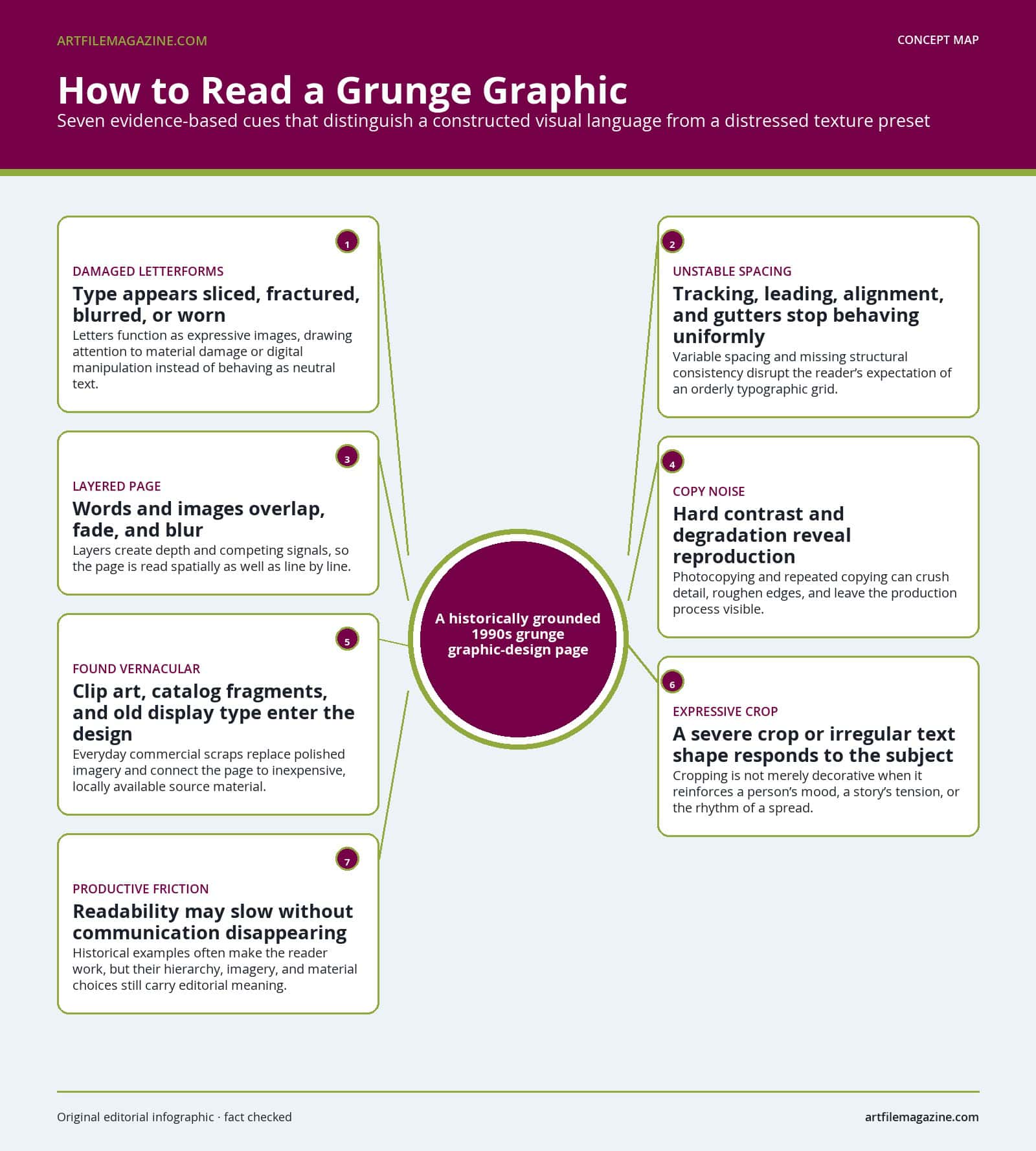
The term is useful because it identifies a real cluster of practices: damaged-looking type, found imagery, visible reproduction noise, disrupted layouts, and forms shaped by underground music or unconventional editorial content. Yet the label becomes misleading when it turns every rough surface into evidence of one unified style. Like many names used to organize art periods and movements, it describes overlapping tendencies rather than an exact box.
A Useful Definition, With Limits
Grunge design belongs within the wider history of postmodern art and design, which challenged the idea that visual communication should always follow one rational system. The International Typographic Style had favored consistent grids, clear hierarchy, and apparently neutral presentation. A grid is the underlying network that aligns columns, images, and text. Many postmodern designers bent or rejected that order, but they did so in varied ways.
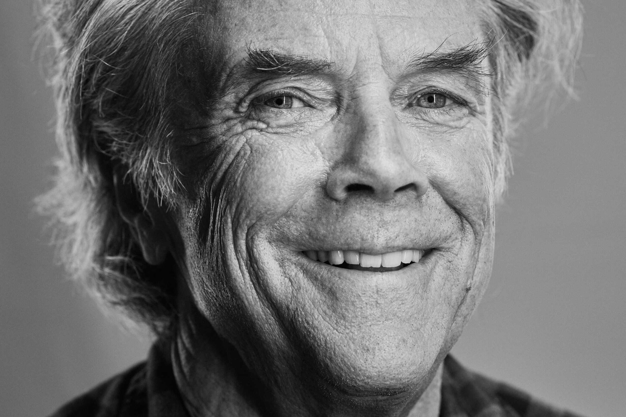 Graphic designer David Carson at Beyond Tellerrand Düsseldorf in 2019. Image by Norman Posselt via Wikimedia Commons, licensed under CC BY-SA 4.0, cropped.
Grunge was one part of this larger shift, not another name for postmodernism as a whole. Its boundaries remain especially fluid because “grunge” first carried strong musical and regional associations. Designers now use the word more broadly for certain typography and textures, sometimes applying it to work created far from Seattle and long after the 1990s.
A stronger definition therefore combines appearance with context. Historically grounded grunge design uses typography, hierarchy, imagery, and the marks of production to create meaning. A new poster does not become grunge merely because its designer places a cracked texture over clean type.
Two Connected Histories Rather Than One School
The first history developed around the independent music culture of Seattle and the Pacific Northwest. Fanzines, club notices, record sleeves, and posters had small budgets and short deadlines. Designers drew on available type, clip art, old commercial imagery, photographs, paste-up, and photocopying. Art Chantry became a central figure in this strand, using everyday commercial scraps in compositions that could look abrasive without losing their practical force.
The second history unfolded largely through experimental magazine design. David Carson’s work for Beach Culture, Surfer, and Ray Gun treated type and layout as expressive responses to editorial subjects. Words might fade, collide, drift between columns, or become difficult to decode. This work shared grunge music’s resistance to polish, but its geographic center, audience, and production setting were different.
The strands met through attitude and visual language rather than through an organization. Both distrusted impersonal finish, welcomed accidents or apparent damage, and allowed content to reshape composition. They also mixed physical and digital methods. Recognizing that mixture prevents the history from collapsing into a false choice between authentic handmade work and artificial computer effects.
How the Look Took Shape
No single designer invented grunge graphics on a particular day. The look emerged as older do-it-yourself print methods encountered a distinctive regional music network, affordable personal computing, independent type publishing, and a new appetite for expressive editorial design.
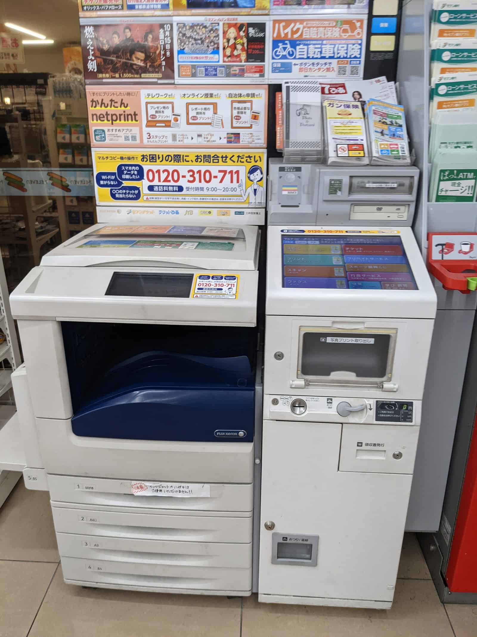 A Fuji Xerox multi-copy printer photographed in 2021. Image by Mr.ちゅらさん via Wikimedia Commons, licensed under CC BY-SA 4.0.
Punk Print Before the Grunge Label
Punk print culture supplied major precedents during its first decade, roughly 1976 to 1986. Zines and promotional pieces combined handwriting, mismatched typefaces, cut-and-paste collage, recycled pictures, found text, irregular alignment, and photocopy reproduction. These methods belonged to a wider countercultural field within the art of the 1970s, not to grunge alone.
The photocopier mattered because it was both accessible and transformative. It could flatten unrelated scraps into one surface, crush photographic detail into hard black and white, and roughen edges through repeated copying. What began as an economical process became a visual language. Production marks that conventional commercial design tried to hide could now signal immediacy, reuse, and distance from polished advertising.
Punk was never one uniform graphic style, and its influence did not pass to grunge in a straight line. It established a practical vocabulary that later Seattle designers could adapt to local venues, bands, publications, and record labels.
Seattle’s Fanzines, Venues, and Record-Label Identity
Seattle and nearby Olympia already possessed an independent print and music infrastructure before grunge became a global media label. OP magazine and Bruce Pavitt’s Subterranean Pop fanzine appeared in 1979. The Rocket and independent radio activity gathered momentum around 1980 and 1981, helping musicians, writers, photographers, and designers circulate work outside major-label channels. Sub Pop became a full-time record label in 1987.
Sub Pop did more than package individual releases. It repeated photographic and typographic choices so that separate records appeared to belong to a recognizable label world. That strategy gave inexpensive materials cumulative power: consistency could come from recurring tone and treatment rather than immaculate production.
The music term “grunge” eventually simplified a scene containing bands with different sounds and attitudes. Some musicians resisted the category even as the press expanded it. The graphic label inherits that same problem. Seattle is essential to the story, but it should not be treated as proof that every local alternative-music artifact shared one design system.
Macintosh Publishing and Experimental Type
The original Macintosh arrived in 1984 and helped open typesetting and image manipulation to a broader group of designers. Page-layout tools, scanners, and digital fonts made it easier to test scale, transparency, layering, and distortion directly. The computer did not automatically produce grunge, but it widened the range of forms that a small studio or independent publisher could attempt.
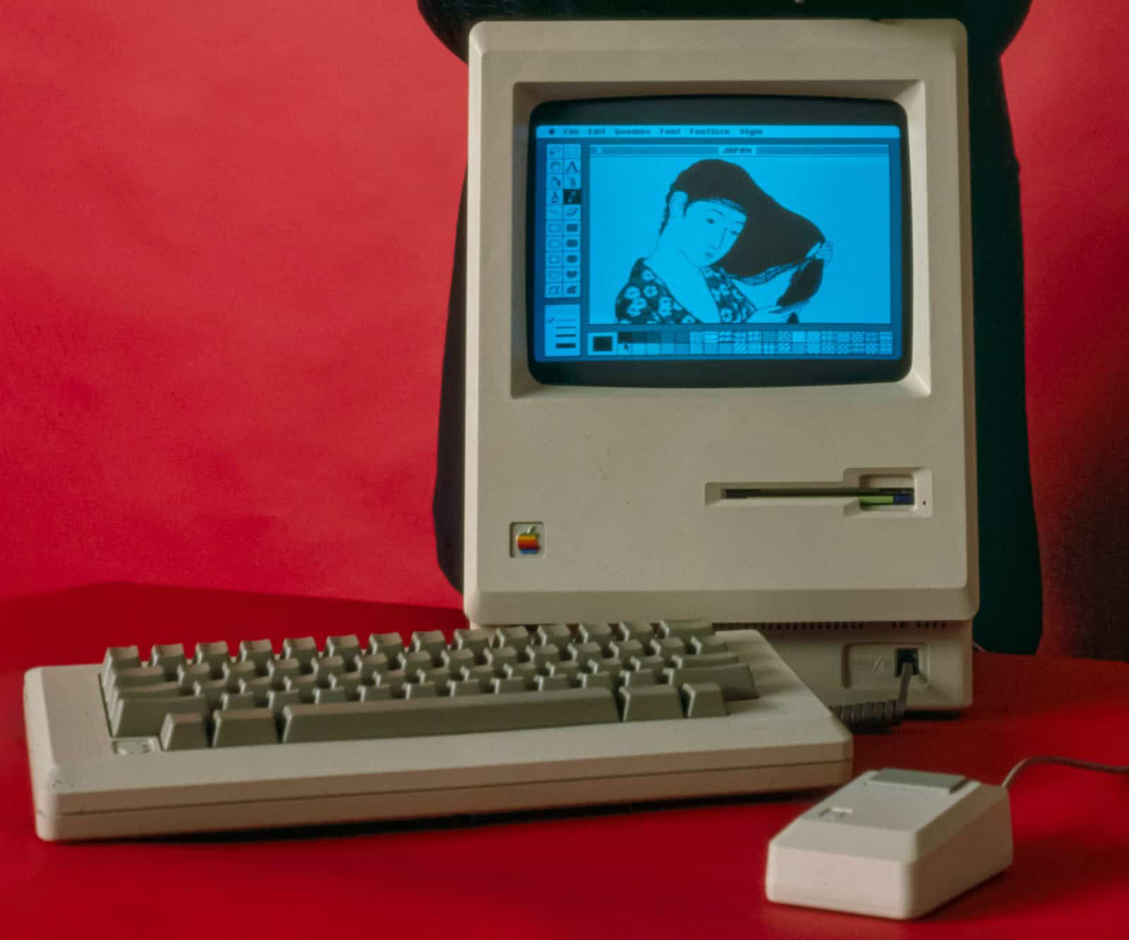 The original Macintosh computer photographed in January 1984. Image by Photo: Bernard Gotfryd – Edited from tif by Cart via Wikimedia Commons, licensed under Public domain.
Emigre also began in 1984 and became an important venue for early Macintosh layouts, digital typefaces, and independent font publishing. Experimental faces questioned the assumption that a letter had to appear mechanically stable. Template Gothic, designed in 1990 from the imperfect lettering of a laundromat sign, made irregular everyday lettering into a reproducible font. Beowolf introduced randomized variation, while Blur softened letters toward atmospheric shapes.
Analog and digital methods often occupied the same job. Early issues of Ray Gun included computer-generated elements assembled on camera-ready boards, the physical paste-up sheets used for final reproduction. Issue 14 was the first delivered as electronic files. The transition was therefore gradual: pixels, printouts, cutting, positioning, and photographic reproduction could all contribute to one page.
Eight Turning Points From 1976 to 2011
- From 1976 to 1986: punk zines and short-lived printed matter such as flyers establish collage, handwriting, found text, mixed type, and photocopying as adaptable tools for independent communication.
- 1979: OP and Subterranean Pop help build the Pacific Northwest network in which music, commentary, and low-budget print circulate together.
- 1980 to 1981: The Rocket and independent radio activity strengthen Seattle’s local infrastructure.
- 1984: the Macintosh and the launch of Emigre signal a new phase of desktop production and independent digital typography.
- 1987 to 1989: Sub Pop becomes a full-time label, while the Bleach package demonstrates how repeatable branding can emerge from practical constraints.
- 1989 to 1992: Carson’s sequence through Beach Culture and Surfer, alongside experiments such as Template Gothic, broadens the expressive possibilities of type.
- 1992 to 1996: Ray Gun turns editorial pages into conspicuous visual events as layered complexity and computer manipulation spread into mainstream design.
- 2011: the Museum of Modern Art adds 23 digital typefaces to its collection, including experimental designs once associated with disruptive new technology.
This chronology tracks changes in access, circulation, and reception. It does not assign the style a hard beginning or ending.
How to Recognize Grunge Graphic Design
Recognition begins with relationships, not decoration. Examine what the letters do, how the page directs attention, where its imagery comes from, and whether reproduction marks affect meaning. Several cues working together make a much stronger case than distressed texture alone.
Type Behaves Like an Image
In conventional informational typography, letters quietly deliver language. Grunge typography often makes their shape and condition conspicuous. A letter may be sliced, blurred, fractured, faded, or partially hidden. The reader sees damage, motion, and density before finishing the sentence.
Spacing becomes expressive as well. Tracking, the space distributed between letters, may tighten or open unpredictably. Leading, the vertical distance between lines, can reverse so lines collide. A headline may stretch far beyond its apparent importance, while a key detail appears small or faint. These choices interrupt effortless scanning and give the text an emotional temperature.
Difficulty is not always the objective. In the strongest examples, friction corresponds to content. A tense interview may receive compressed or unstable type; a story about hanging can prompt letterforms that seem physically suspended. When disruption has no relation to message or reading sequence, it is closer to surface styling.
Broken Grids, Layers, and Expressive Crops
A grunge page may retain an underlying grid while refusing to obey it consistently. Gutters, the spaces separating columns, can narrow or disappear. Text may form irregular blocks, overlap an image, drift into a margin, or continue across a spread. Hierarchy shifts as the reader moves, rather than remaining fixed by one headline, one image, and orderly supporting text.
Layering gives the page spatial depth. Words and pictures can overlap, fade, blur, or compete at different scales. Severe cropping removes expected visual information and forces attention toward a face, gesture, or texture. These techniques make layout an active interpretation rather than a neutral container.
Look for controlled consequences. If a crop intensifies mood, if a gap creates pacing, or if an overlap binds two ideas, disorder is doing editorial work. If every element is equally noisy, the design loses contrast and therefore loses direction.
Copy Noise and Found Commercial Imagery
Art Chantry often cut pictures from magazines or trade catalogs and copied them to produce hard graphic contrast. A photocopier could turn a shaded photograph into blunt masses, exaggerate dust and scratches, or erase delicate information. Recopying increased degradation, a process also used by Ed Fella to introduce visual entropy, meaning the gradual breakdown of a clean original.
Found imagery comes from ordinary commercial culture rather than a specially commissioned photo shoot. Clip art, catalog fragments, vintage display type, and outmoded illustrations carry traces of earlier uses. Rearranged on inexpensive paper or an unconventional printing material or surface, they can feel both familiar and estranged.
This visible process distinguishes historical work from a uniform digital noise layer. Real copying changes edges, tonal range, scale, and the relationship between sources. It does not merely add speckles on top.
Why Color Is Not a Fixed Rule
Brown, gray, black, and dirty-looking neutrals have become shortcuts for the contemporary grunge aesthetic, but they are unreliable historical tests. Sub Pop’s documented identity could be bold and clean. Carson built dramatic rhythms from changing areas of light and dark, while Chantry worked across varied materials and visual sources.
Color can support abrasion or low-budget immediacy, but it does not define the category. Typography, hierarchy, imagery, reproduction, and a composition’s response to its subject provide better evidence. A brightly colored design can share the history; a beige design with scratches may not.
Representative Works That Explain the Style
Specific artifacts show why grunge design cannot be reduced to a feature list. Each of the following examples uses disruption differently, according to its content, format, or production conditions.
Beach Culture: “Hanging at Carmine Street”
Carson’s 1991 Beach Culture spread for “Hanging at Carmine Street” turns the subject into a spatial event. The typography appears to hang, and the relationship between pages unsettles an ordinary reading order. Layout does not simply frame the article after the writing is complete; it acts out an idea contained in the story.
The result clarifies the difference between expressive construction and random distortion. Suspended text affects pace and orientation because “hanging” provides a reason for it. The page asks the reader to connect a verbal subject with a physical arrangement.
Ray Gun: Techno, Morrissey, and the Dingbats Episode
Three documented examples from 1994 show the range within Carson’s Ray Gun work. “Is Techno Dead?” combines computer-manipulated imagery with a pronounced rhythm of light and dark space. The spread’s technological treatment does not merely illustrate electronic music. It controls movement across the pages and creates alternating areas of intensity and pause.
A Morrissey feature uses severe cropping and a deconstructed headline. Removing expected portions of an image changes how the subject is encountered, while the broken headline makes personality and mood part of the reading process. The design still communicates, but it refuses to deliver every element through a conventional sequence.
The best-known provocation is Carson’s decision to render a Bryan Ferry interview in Zapf Dingbats, a font of symbols rather than readable alphabetic characters. It is revealing because it turns a judgment about the material into an editorial act. It is also atypical and should not define Carson’s entire practice. Grunge typography can slow, bend, or complicate reading; it does not have to replace language altogether.
Nirvana’s Bleach and Sub Pop’s Repeatable Identity
A KEXP history drawing on Museum of Pop Culture oral histories credits Lisa Orth with the layout for Nirvana’s 1989 Bleach package. It reports that Grant Alden set the title in Bodoni Extra Bold Condensed because that face was available at the typesetter. The detail matters: a design now treated as historically characteristic emerged partly from practical access, not from a prewritten style manual.
The cover also worked within Sub Pop’s effort to repeat recognizable photographic and typographic choices across releases. Its significance lies not only in an individual distressed or forceful element, but in how a local label made separate albums feel related. Repetition turned limited resources into identity.
Bleach therefore corrects two myths at once. Grunge design was not always a chaotic rejection of branding, and memorable typography did not always require a custom digital effect. Constraint, availability, and consistent direction could be as important as deliberate visual damage.
Art Chantry’s Posters: Low-Tech, Raw, and Controlled
Chantry’s posters combine fractured vintage type, found imagery, clip art, inexpensive production, and sometimes unconventional materials. Their roughness is visible, but practical clarity remains important. A poster still has to identify an event or create a strong enough image to command attention in a crowded environment.
Photocopied catalog pictures gain force when copying strips away middle shades between black and white and turns the pictures into bold shapes. Old display letters bring the memory of advertising, packaging, or local commerce into a new underground context. Because the sources do not match perfectly, their collision becomes part of the composition.
This control separates purposeful low-tech design from mere mess. Chantry could use degraded reproduction while preserving an emphatic silhouette, a dominant headline, or a clear route through the information. Raw material and visual hierarchy are partners, not opposites.
Grunge Design vs. Punk Design
Punk graphics and grunge design share so much material that a clean border would falsify their histories. Collage, found text, handwriting, irregular layouts, mixed type, photocopying, and resistance to commercial polish belong to both. A Seattle flyer can reasonably sit in both accounts.
Where the Two Histories Overlap
The strongest connection is practical. Both histories include people making communication with inexpensive, available tools and circulating it through independent networks. Cutting, pasting, copying, reusing, and writing by hand helped reduce dependence on professional production systems. Those processes also left visible marks that came to carry cultural meaning.
Attitude forms another bridge. A layout that rejects institutional smoothness can declare proximity to a local audience, urgency, or skepticism toward mass-market presentation. Yet an anti-commercial appearance can later become a marketable style, so roughness alone does not prove an artifact’s politics or origin.
A Reliable Comparison Without Rigid Borders
| Dimension | Punk graphics | Grunge design |
|---|---|---|
| Chronology | A broad countercultural print history with major precedents from the mid-1970s onward | A later label centered on the late 1980s and 1990s, without exact start or end dates |
| Cultural center | International punk scenes, zines, performances, and independent networks | Seattle music culture plus a distinct experimental magazine strand, especially on the American West Coast |
| Common formats | Zines, flyers, posters, and other short-lived movement print | Concert graphics and album packages, along with magazines and experimental typography |
| Production | Cut-and-paste assembly, handwriting, found material, and photocopying | The same analog vocabulary joined by scanners, page-layout software, digital fonts, and hybrid paste-up |
| Typography | Mixed sources and forceful irregularity often serve urgency and direct address | Type may also become atmospheric, spatial, fragmented, or deliberately difficult within an editorial sequence |
| Best identification test | Consider the artifact’s countercultural function, circulation, and punk context | Consider its Seattle or 1990s editorial context and how type, imagery, production, and subject work together |
The comparison describes tendencies, not membership requirements. Punk’s history is broader and begins earlier. Grunge adds a specific Seattle association and a prominent editorial-digital development, but individual works can cross the boundary.
What Grunge Changed
Grunge design did more than popularize rough surfaces. Its broader impact came from bringing layered complexity and expressive computer manipulation into mainstream design while showing that visible friction could carry editorial meaning.
From Subculture to Mainstream Design
By the mid-1990s, layered complexity and computer manipulation had moved beyond experimental publishing into mainstream design. Carson received major commercial commissions, and his approach continued to earn professional recognition.
This success created a paradox. Wider acceptance confirmed that expressive typography could communicate through mood, rhythm, and material presence. It also made the look easy to imitate without its original connections to content, local culture, or restricted production. What had developed through photocopy degradation, available type, editorial judgment, and early digital experimentation could be packaged as a ready-made effect.
The Legacy Beyond Distressed Effects
Grunge design’s durable contribution is not permission to make everything look dirty. It is permission to let friction communicate. A damaged edge can expose reproduction, an unstable column can alter pacing, and an aggressive crop can change a reader’s encounter with a subject.
For contemporary work, the practical question is whether the disruption has a job. Does it establish hierarchy, respond to content, reveal process, or connect to a specific cultural setting? When the answer is yes, roughness can carry meaning. When every surface receives the same wear, the result preserves a costume while losing the historical method.
Institutional recognition has also changed how the period is viewed. MoMA’s 2011 acquisition of experimental digital typefaces placed early computer typography within design history rather than treating it as a temporary technological novelty. Grunge now reads most clearly as a meeting point: everyday commercial scraps, underground distribution, editorial interpretation, and imperfect digital tools all helped expand what graphic communication could look like.
Frequently Asked Questions
Four recurring questions clarify the label’s boundaries, the people who shaped it, the purpose of difficult typography, and the relationship between physical and digital production.
Is Grunge Art a Formal Art Movement?
No. It is a retrospective and sometimes disputed label for overlapping graphic practices, not an organized movement with fixed members or a manifesto. Its most useful scope covers Seattle music graphics and related experimental typography of the late 1980s and 1990s.
Did David Carson Invent Grunge Graphic Design?
No. Carson was central to the experimental editorial strand, but punk print, Pacific Northwest fanzines, Sub Pop, Art Chantry, digital type designers, and other postmodern practices all contributed to the history. No single person invented a unified style.
Why Was Some Grunge Typography Intentionally Difficult to Read?
Designers sometimes used reading friction to reinforce a story’s mood, voice, or tension. Difficulty could prompt a slower, more visual encounter with the page. The Dingbats interview was an extreme editorial gesture, not a rule that grunge communication had to become unreadable.
Was 1990s Grunge Design Handmade or Digital?
It was often both. Designers combined photocopies, found pictures, paste-up boards, and available typesetting with scanners, software, digital fonts, and computer-generated imagery. Early Ray Gun production demonstrates how digital elements could enter a still partly physical workflow.

Jordan Anthony is a Cape Town-based film photographer, curator, and arts writer. She holds a Bachelor of Art in Fine Arts from the University of the Witwatersrand, Johannesburg, where she explored themes like healing, identity, dreams, and intuitive creation in her Contemporary art practice. Jordan has collaborated with various local art institutions, including the KZNSA Gallery in Durban, the Turbine Art Fair, and the Wits Art Museum. Her photography focuses on abstract color manipulations, portraiture, candid shots, and urban landscapes. She’s intrigued by philosophy, memory, and esotericism, drawing inspiration from Surrealism, Fluxus, and ancient civilizations, as well as childhood influences and found objects. Jordan is working for artfilemagazine since 2022 and writes blog posts about art history and photography.
Learn more about Jordan Anthony and about us.
Cite this Article
Jordan, Anthony, “Grunge Art: History, Visual Traits, and Key Works.” artfilemagazine – Your Online Art Source. September 10, 2026. URL: https://artfilemagazine.com/grunge-art/
Anthony, J. (2026, 10 September). Grunge Art: History, Visual Traits, and Key Works. artfilemagazine – Your Online Art Source. https://artfilemagazine.com/grunge-art/
Anthony, Jordan. “Grunge Art: History, Visual Traits, and Key Works.” artfilemagazine – Your Online Art Source, September 10, 2026. https://artfilemagazine.com/grunge-art/.