Harmony in Art – Exploring Various Examples of Harmony in Art
The bright yellow sun in the clear blue sky feels effortlessly harmonious to the human eye. Indeed, our very conception of reality is founded on our intrinsic sense of the oneness of all things. Anything which is out of the ordinary disturbs our sense of harmony. Whether they know it or not, creative professionals from graphic designers to fashion stylists, and interior decorators are practitioners of the principle of harmony that is so prevalent in nature.
Achieving Oneness Through Harmony in Art
It is common knowledge that harmony can be observed in music from all corners of the globe and across time. Concurrently, harmony is one of the fundamental principles of art. For hundreds of years, many of the greatest visual artists have used similar and compatible elements of art to achieve harmony in their artworks.
What Is Harmony in Art?
When understanding what is harmony in art, it is important to understand the elements of art. The elements of art are the ingredients of a visual text and the principles of art are the methods artists apply to these elements. To explain what is harmony in art, we must differentiate it from harmony in music and other fields.
The harmony in art definition refers to cases where the principle of harmony connects the elements of art to achieve coherence and unity in a composition.
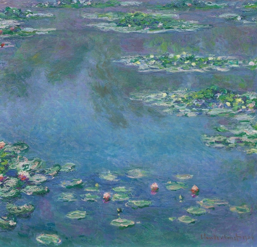 Water Lilies (1906) by Claude Monet; Claude Monet, Public domain, via Wikimedia Commons
Coherence and unity are intricately connected to the principle of harmony. Visual coherence is achieved using similar or compatible elements in an artwork. Unity can achieve coherence because it also means that the elements of an image appear to belong together. There are as many types of harmony as there are methods of using them.
This principle of art can be achieved using harmonious lines, shapes, values, or colors.
Color Harmony
Color theory concerns the scientific principles of color. The color wheel consists of primary, secondary, or tertiary colors. Understanding how these colors complement and contrast each other on the color wheel can provide a great understanding of color harmony. For instance, repeating analogous colors creates a harmonious feeling.
That is why many paintings use monotone color schemes to achieve color harmony. But monochromatic artworks can lack vitality, which is why some artists prefer to use color contrast.
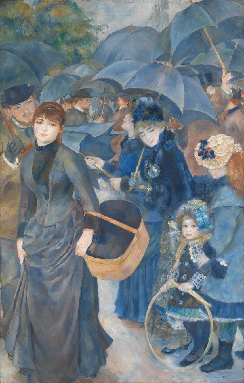 The Umbrellas (c. 1881 – 1886) by Pierre-Auguste Renoir; Pierre-Auguste Renoir, Public domain, via Wikimedia Commons
While analogous colors tend to harmonize, colors on opposite ends of the color wheel tend to clash. However, these color pairings which create the highest contrast are called complementary colors as they harmonize when used together. The focus drawn by the clashing colors creates combinations that are pleasing to the viewer’s eye.
Color harmony is about finding the beautiful balance between using unified colors and retaining the dynamic variety brought by color contrast.
Picasso’s Periods Are Among the Best Examples of Harmony in Art
It is no surprise that the master artist Pablo Picasso provides some of the best examples of harmony in art. The paintings he produced in the Blue Period (1901-1904) and the Rose Period (1904-1906) are prime examples of how artists may use similar colors to create harmonious effects as well as deliberately create high contrast to create alternative harmonious effects.
The Blue Period
During his Post-Impressionist Blue Period, Pablo Picasso produced The Tragedy (1903). Picasso’s Blue Period was recognized for its consistent use of dark, dull, gloomy, cool, and somber tones like blues and dark greens. While most of the paintings had occasional warm tone highlights, they were primarily monochromatic. The Tragedy is no exception.
This painting depicts a family, which consists of a man, a woman, and a child huddled closely on the seashore.
Their dejected postures and expressions indicate that they have suffered some terrible fate. They may be grieving the loss of a family member, or they could be destitute and starved. This is suggested by their bare feet and the child’s extension of an open palm. The figures seem cold and tense, which is intensified by the artist’s use of color.
Though the clothing draped over the focal figures is characteristically dark and gloomy, the group stands out as a point of emphasis.
The cheeks, hands, and feet of the three figures provide the primary luminosity in the artwork, but even their flesh tones appear to be bathed in soft, blue light. The delicate yet decisive use of color achieves unity and makes The Tragedy an iconic harmony painting.
The Rose Period
During the Rose Period, Pablo Picasso’s painterly style used brighter, warmer, more cheerful colors. Moving on from the Blue Period, the Rose Period was seen as a dynamic progression of harmony painting. The color palette of the oil-on-canvas painting Boy with A Pipe (1905) is typical of this period. Boy With a Pipe is a depiction of Louis, a local boy who frequented Picasso’s Montmartre studio.
The painting highlights the teenager’s beauty. His well-modeled features and unblemished skin create a harmonious impression.
In contrast, Louis is dressed in worn, dirty overalls in the signature blue of Picasso’s Blue Period. With his left hand, he holds a pipe and there is a garland of roses on his head. Painted on the rosy wall behind him are two circular bouquets, in green, yellow, blue, red, pink, and white. There is also an orange underpainting, which gives the artwork a certain glow. Despite the prominence of the blue overalls, this harmony painting feels warm.
This is a masterful use of a complementary palette or color contrast to create harmony in art.
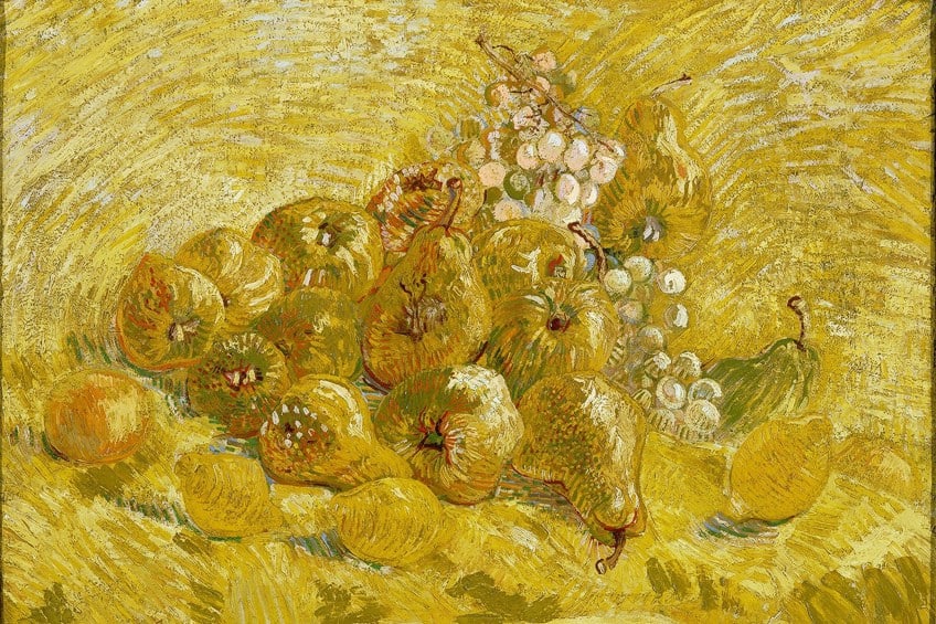
Better Together
Creating a sense of visual harmony in an artwork is both intuitive and formulaic. While it is a useful principle, creating unity in artworks can rob them of dynamism or drama. It is movement and contrast which draws the viewers’ attention.
Therefore, these contradicting principles of art work well in conjunction with harmony.
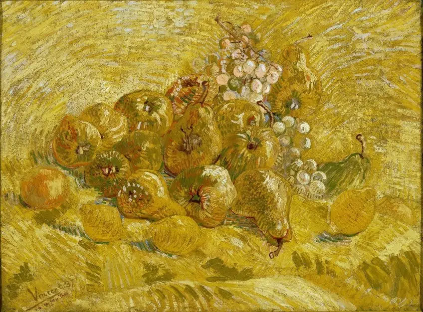 Quinces, lemons, pears, and grapes (1887 – 1888) by Vincent van Gogh; Vincent van Gogh, Public domain, via Wikimedia Commons
Of course, there is no hard and fast rule for achieving harmony in an artwork and there are exceptions to its implications. But even when harmony is not the aim, artists would do well to understand the oft-overlooked principle. Artists can choose to use their art either to evoke unity or create conversations about the confines of coherence.
Frequently Asked Questions
How Does Harmony in Art Relate to Music?
Outside of the harmony in art definition, the principle of harmony is common in music. Harmony can be found in all kinds of music from classical to gospel, to RnB music. To create harmony, musicians use various musical notes to blend together in song.
What Is a Good Example of Color Harmony in Art?
Mark Rothko’s Untitled (1965) is an example of the achievement of unity through color harmony. This painting has a minimal contrast and warm color scheme, making the various fields of color appear as if they belong.
How Did Claude Monet Use Harmony in Art?
Claude Monet’s Water Lilies (1908) is a famous example of harmony in art. The large-scale artwork has an analogous color scheme, meaning the artist used colors that fall on similar sections of the color wheel to create harmony in his composition.
What Is the Definition of Analogous Colors?
In color theory, analogous colors are found near one another on the color wheel. On the color wheel, blue and green are adjacent to one another. Therefore, they are considered analogous colors.
What Is One of the Ancient Examples of Harmony in Art?
The Terracotta Army (210 – 209 BCE) is a funerary artwork constructed for the first emperor of China – Qin Shi Huang. The tomb consists of over 7000 individual sculptures of warriors. While they are all similar, each is unique. As the three-dimensional forms are similar and compatible, their consistent repetition creates a strong sense of harmony.

Jordan Anthony is a Cape Town-based film photographer, curator, and arts writer. She holds a Bachelor of Art in Fine Arts from the University of the Witwatersrand, Johannesburg, where she explored themes like healing, identity, dreams, and intuitive creation in her Contemporary art practice. Jordan has collaborated with various local art institutions, including the KZNSA Gallery in Durban, the Turbine Art Fair, and the Wits Art Museum. Her photography focuses on abstract color manipulations, portraiture, candid shots, and urban landscapes. She’s intrigued by philosophy, memory, and esotericism, drawing inspiration from Surrealism, Fluxus, and ancient civilizations, as well as childhood influences and found objects. Jordan is working for artfilemagazine since 2022 and writes blog posts about art history and photography.
Learn more about Jordan Anthony and about us.
Cite this Article
Jordan, Anthony, “Harmony in Art – Exploring Various Examples of Harmony in Art.” artfilemagazine – Your Online Art Source. December 27, 2022. URL: https://artfilemagazine.com/harmony-in-art/
Anthony, J. (2022, 27 December). Harmony in Art – Exploring Various Examples of Harmony in Art. artfilemagazine – Your Online Art Source. https://artfilemagazine.com/harmony-in-art/
Anthony, Jordan. “Harmony in Art – Exploring Various Examples of Harmony in Art.” artfilemagazine – Your Online Art Source, December 27, 2022. https://artfilemagazine.com/harmony-in-art/.