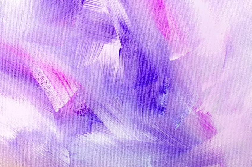
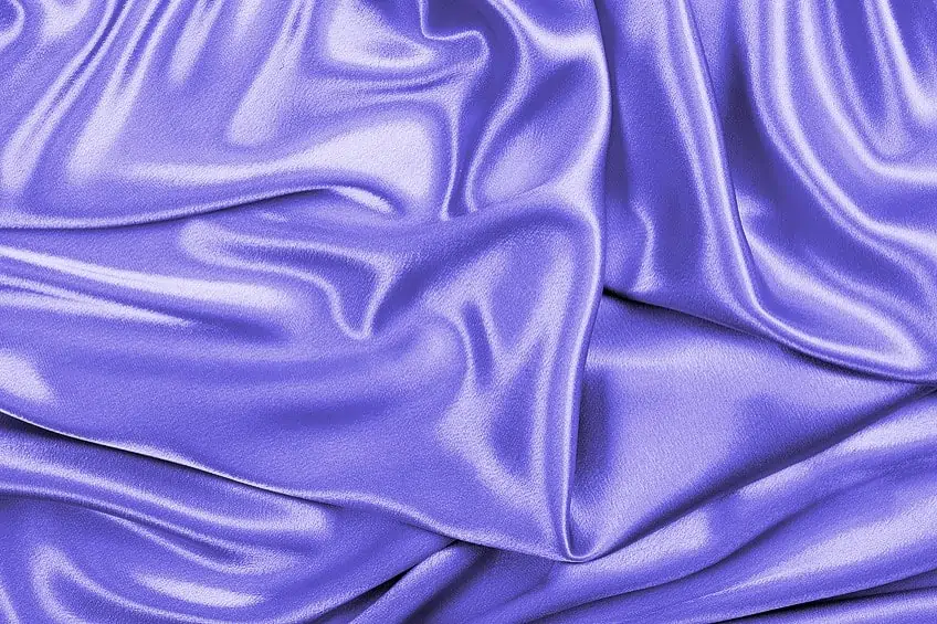
Shades of Purple – Learn About the Various Types of Purple
If you love the color purple and want to learn a bit more about some of its different shades and how to use them, you have come to the right place. In this article, we are going to be discussing the history of the color purple as well as several of its most popular shades. We will also be covering what color theory and psychology research have to say about purple as well. Whether you are looking for palette inspiration for interior decorating, painting, or digital art projects, you are bound to find some useful information here.
Contents
An Introduction to the Color Purple
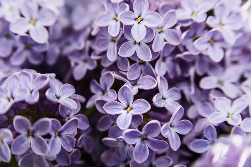
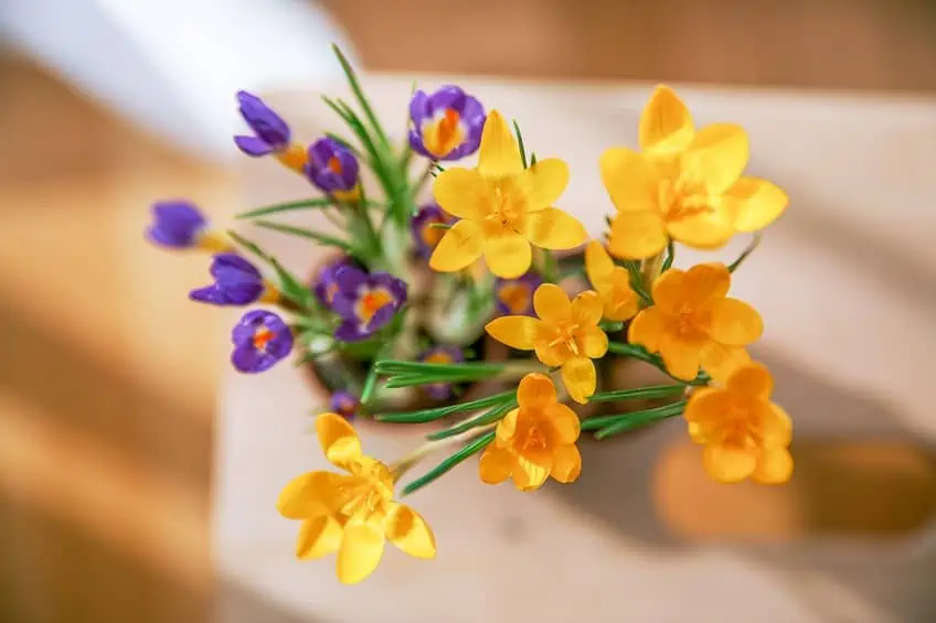
Purple is the word we use to describe several colors whose hues rest between blue and red. In semiotics, purple has long-standing associations with royalty, wisdom, and creativity. Although it is relatively rare in nature, this color nevertheless occurs naturally among a variety of fauna and flora, most notably the lavender herb.
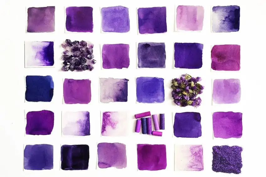
There are over 110 shades of purple, ranging from light and saturated to deep and dark. With so many shades to choose from, you are likely to find one you love.
History of the Purple Color
| Purple Color | Hex Codes | RGB | CMYK (%) | Shade of Purple |
| Tyrian Purple | #66023C | 99, 3, 48 | 0, 97, 52, 61 | |
| Han Purple | #5218FA | 82, 24, 250 | 67, 90, 0, 2 | |
| Royal Purple | #7851A9 | 86, 29, 94 | 9, 69, 0, 63 | |
| Mauveine Purple | #8D029B | 141, 2, 155 | 9, 99, 0, 39 | |
| Red-Violet | #C71585 | 199, 21, 133 | 0, 89.4, 33.2 | |
| Electric Purple | #BF00FF | 191, 0, 255 | 25, 100, 0, 0 |
As aforementioned, the purple color occurs rarely in nature. This means that, before we found ways to affordably or synthetically produce purple pigments, the color’s scarcity and subsequent high prices contributed to its adoption as a color denoting royalty, wealth, and education. We first started experimenting with purple shades in art by crushing similarly colored grapes and berries to extract their pigments and create dyes.
It is believed that the first shade of purple ever produced was Tyrian purple, originating from the ancient Tyre City that resided in modern-day Lebanon.
But this shade of purple did not come from berries. Instead, the dye used to color things in the shade of Tyrian purple was extracted from the mucous produced by a species of Mediterranean mollusks called dye-murex snails. Between the farming of snails, the extraction of the dye, and the process through which it was prepared, Tyrian purple was notoriously expensive. Thus, the color purple was typically only worn by wealthy members of noble families.
It did not take long, however, for us to invent synthetic types of purple. It would be between 400 to 500 BC that the Chinese would develop the purple color we know to this day as Han purple. It was used widely as a means to add color to all sorts of fine art, clothing, and other objects. These included ceramics, beads, paintings, statues, and figurines. Most notably, Han purple is the color used to decorate the famous Terracotta Army.
Although it has existed in art since the neolithic period, the color’s namesake only entered the English lexicon during the 17th century when the shade known as royal purple was created.
Another synthetic version of purple called mauvine was created during the 1850s by the English entrepreneurial chemist, William Henry Perkin, who allegedly discovered the pigment by accident. To this day, mauveine remains a popular color in fine art. Queen Victoria herself took an immense liking to mauveine, even going so far as to wear a mauveine-colored silk gown when she visited the Royal Exhibition
Over the many years following the renaissance period, we would come to discover dozens more shades of purple, including the red-violet color. This may confuse some readers given that purple is typically more associated with the color blue than red. However, based on the cultural perceptions of regions such as those in North America as well as the Munsell system of colors, a purple that leans closer to red may be considered more suitable. Red-purple is very often considered “the artist’s purple”.
The red-violet color generated through the RGB color wheel used by screened digital devices is an example of a purple that leans more so to red than blue.
You may notice that it is starkly brighter than most other shades of purple. That being said, your cellphone and computer screen can register a wealth of different purples, each with its classifications and identifiable hex codes. Here are the hex codes of all the purple shades we have discussed thus far.
The Colour Theory of Purple
As artists, when we work with colors, we ought to have an understanding of how best to create, mix, and pair them effectively. To come up with the best color scheme for any project, it is also helpful to know the semiotic values of your colors too. You can apply the rules of color theory as a guide to creating palettes that not only look aesthetically pleasing but also contribute to the emotional themes and atmosphere that you are trying to convey in your artwork.
Beyond contributing to the feelings expressed through pieces of art, colors help portray dimension and depth.
This is especially true in the fine art of painting. When working with color combinations in any capacity, it is always beneficial to consult the color wheel. It is an excellent visual aid that can assist artists in deciding upon the most suitable palette for any specific project. The same thing goes for anyone working with colors, really, even homeowners who may be trying to figure out how best to decorate their households.
Purple Color Temperature
In color theory, we use the word “temperature” to describe the aesthetic qualities of colors about real-world atmospheric conditions. As artists, we can describe a color as being either warm or cool in temperature based on how closely associated they are with the natural phenomena they represent.
For instance, red, yellow, and orange are considered to be warm colors, which makes sense given that they occur throughout nature in the form of warm things like fires, lava, and sunrises. Blues, on the other hand, are considered to have a cool temperature given their aesthetic similarities to things in nature that are associated with the cold, such as water, ice, and the night sky.
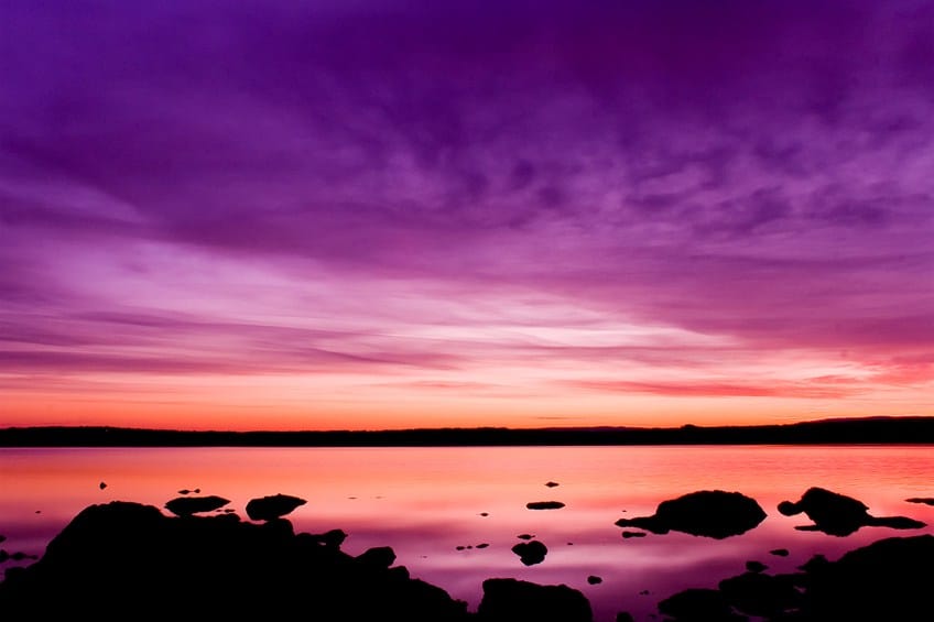
With this in mind, we must then consider purple which is a color produced through a combination of blue and red – two colors on opposite ends of the color temperature spectrum.
What decides the temperature of a purple color produced through the mixing of blue and red, then, is the ratio. If you mix in more red than blue, you should expect to produce a warm shade of purple. This would be a great choice if your idea is to make a lively purple with a stimulating vibrancy. Mixing more blue than red, on the other hand, will produce a cool shade of purple with a more relaxed hue.
Complementary Colors
If you do not know what complementary colors are, they refer to any two hues positioned diametrically opposite from each other on the color wheel. Given their relative positions on the wheel, they are often referred to as opposite colors as well. Now, there are two important things to note about any pair of complementary colors. First of all, these two colors will always cancel each other out when mixed.
Whatever hue is produced by a mixture of complementary colors will always be somewhere between white and black on the grayscale.
Secondly, the pairing of any complementary colors in a palette will generate the strongest visual contrast possible for both colors. Mixing complementary colors creates strange but potentially creative grays that artists may find a use for while pairing them in a palette is an easy way to create bright contrasts and vibrancy.
Now that you know how to find a color’s complementary match on the color wheel and understand the relationship between the pair, we can discuss how the concept pertains to types of purple. Firstly, if we look at the color wheel, we can see that purple’s complementary color is yellow. We know, therefore, that pairing purple with yellow will create the strongest contrast achievable for these two colors. But why is this useful?
To the traditional artist, it informs one’s decisions on how to create vibrant, eye-catching contrasts of color that can steer the attention and emotional responses of the audience in an intended direction. For the commercial artist, however, this idea is taken a step further.
When art is used to advertise and promote products and services, designers and illustrators will apply aspects of color theory such as those concerning complementary pairs to draw the attention of consumers.
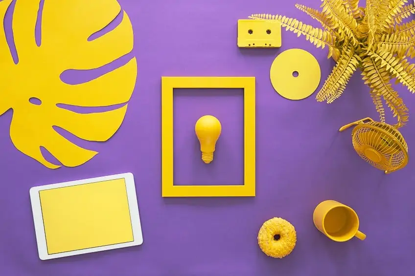
Commercial artists will often work with a palette of complementary colors to design eye-catching visual art to stimulate interest in their business’s products or services. A great example of purple and yellow being paired to create attention-grabbing branding would be the Cadbury logo. Another popular case would be the iconic purple and yellow Taco Bell logo. In sports, a notable example would be the Los Angeles Lakers. Even the Hallmark manufacturing franchise sports yellow text on a purple.
But why purple and yellow, specifically? You may be wondering what exactly it is about this exact complementary pair that makes it so appealing in brand design. Interestingly, it is on account of the compatibility of each color’s semiotic values.
In other words, the cultural and psychological associations that we make with both yellow and purple work well for branding. Certain types of purple, such as the purple shades used by the aforementioned brands, denote a degree of prestige and professionalism. One might easily describe these colors as classy, even. Then you throw in its complementary, yellow, which brings with it a stimulating warm tone that contrasts well against the purple. The yellow charges the palette with a punchy vigor that stimulates consumer interest. Several studies support the notion that warm colors like yellow and red stimulate the parts of our brains that say “spend, spend, spend!”
Purple Color and Violet Color: Know the Difference
The interchangeable use of the words violet and purple is common practice but incorrect. Purple and violet color are not the same, even as far as physics is concerned. The color purple can only become visible to us when we combine colors such as blue and red.
In physics, we say that the wavelength for purple only becomes visible when the wavelengths of other colors are combined.
Violet, on the other hand, is what we refer to as a spectral color. If you ever want to know which colors these are, just think about the colors visible in a rainbow. As a spectral color, violet is a color that can be seen in a singular wavelength. On the color wheel, violet and purple can be found right next to each other, with the former leaning towards a blue bias while the latter leans towards red.
Shades of Purple Names
There are 110 different shades of purple that we have discovered and put names to thus far. As we are sure you can understand, there is no chance that we will be able to go over all of them in this article alone, and there are lots more that you can research!
What we can and will do, however, is talk about some of the more popular purple names that remain prominent in art.
You will notice in the tables that follow that we are classifying each shade’s properties according to the settings used to designate and generate them in printing and digital graphics. We have attached the hex codes for you should you find a need for them. You will find information on each shade’s RGB percentiles as they would appear in graphics and their CMYK values for printer settings.
Pure Purple
The color purple in its pure form looks very similar to a darkened magenta which is considered to be a shade of violet. That being said, as we have previously discussed, purple and violet are not the same even though they have similar shades.
Hugo Boss has an incredibly syndicated fragrance that has taken inspiration from the color of pure purple. We also see this color used a lot in dye products for hair.
| Name | Hex Code | RGB | CMYK (%) | Shade |
| Pure Purple | #751973 | 45.9, 9.8, 45.1 | 0, 79, 2, 54 |
Amethyst
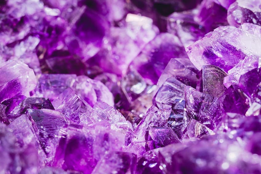
If you want a calm yet broody color that fits perfectly in tranquil spaces, here is a dark purple that ought to do you well. Although named after a crystal mineral that can have various shades of purple ranging to pale colors like lilac, amethyst is a deep purple color.
| Name | Hex Code | RGB | CMYK (%) | Shade |
| Amethyst | #562f7e | 33.7, 18.4, 49.4 | 32, 63, 0, 51 |
Dark Purple
This is an incredibly dark purple that is oftentimes used as a buffer to tone down palettes whose orange and yellow elements are delivering too much brightness. Given how close this shade is to the color black, it can be used to shade reds and blues.
| Name | Hex Code | RGB | CMYK (%) | Shade |
| Dark Purple | #301934 | 18.8, 9.8, 20.4 | 8, 52, 0, 80 |
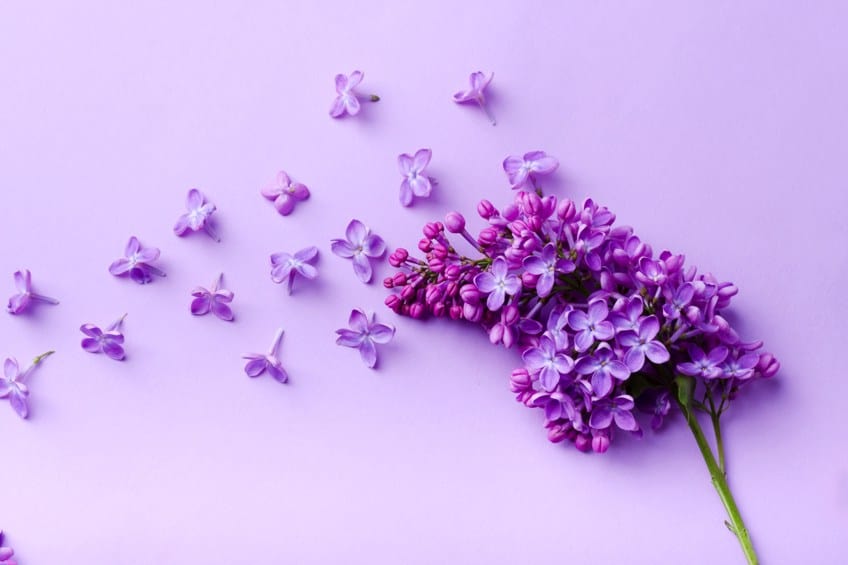
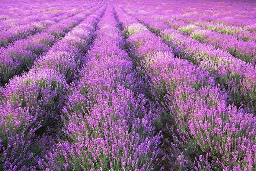
Lavender Field Purple
Among the many shades of purple names are often derived from elements of nature where said shades occur naturally and the same can be said for lavender field purple. As you can guess, the shade gets its name from the aromatic herb of the same name and color. This classy shade of purple is used often to decorate wedding venues, homes, and nails.
| Name | Hex Code | RGB | CMYK (%) | Shade |
| Lavender Field | #754C78 | 45.9, 29.8, 47.1 | 3, 37, 0, 53 |
Aubergine
In the States, we refer to aubergines as eggplants. But no matter the moniker, the purple colors associated with this fruit are unmistakable. The shade can be described as a brownish purple with powerful notes of red. Although the fruit has held its name for centuries, we only first started making pigments of its color in the late 1990s when it was introduced by the Crayola company.
The color works well in an autumnal palette given its warm temperature and compatibility with orange.
| Name | Hex Code | RGB | CMYK (%) | Shades of purple |
| Aubergine | #693b58 | 41.2, 23.1, 34.5 | 0, 44, 16, 59 |
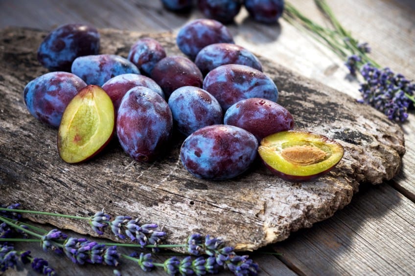
Plum
This purple shade has a strong color bias towards red, so much so that it is often described as a brownish shade of purple. But however you choose to describe it, you cannot deny its kinship in color to the fruit from whom it borrows its namesake. We first started using this color in art in 1805. Romance and luxury are the themes most commonly associated with plum purple shades. If you are trying to add depth to a space, this color works well on walls.
| Name | Hex Code | RGB | CMYK (%) | Shades of purple |
| Plum | #580f41 | 34.5, 5.9, 25.5 | 0, 83, 26, 65 |
Bright Purple
Bright purple is an excellent choice of shade if you are looking for a bit of vibrancy in your palette. An interesting thing to note about this shade of purple is that it is made using twice as much magenta as cyan in printing. It may be bright but do not get it confused for neon purple.
Bright purple can nevertheless be used for similar purposes, bringing an electric energy to any space in which it is used.
| Name | Hex Code | RGB | CMYK (%) | Shade |
| Bright Purple | #bf40bf | 74.9, 25.1, 74.9 | 0, 66, 0, 25 |
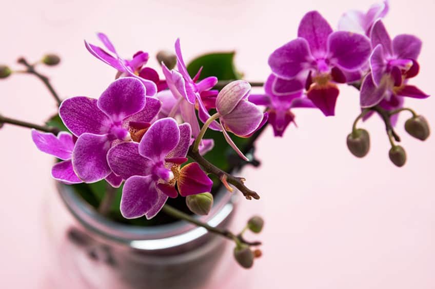
Orchid Purple
This shade gets its name from the bright and vibrant purple colors that occur naturally among orchids. It does not account for the great multitude of shades of purple found in orchids but, as of 1915, the color was added to the wheel.
| Name | Hex Code | RGB | CMYK (%) | Shades of Purple |
| Orchid | #da70d6 | 85.5, 43.9, 83.9 | 0, 49, 2, 15 |
Grape
Purple is, of course, not the only color that you can find grapes in but this is a shade that takes its color from those that are. This is a fairly muted purple that accents gray incredibly well, especially in the field of interior decoration.
| Name | Hex Code | RGB | CMYK (%) | Shade |
| Grape | #5d1451 | 36.5, 7.8, 31.8 | 0, 78, 13, 64 |
Mulberry
Keeping with the theme of the prior two shades of purple, this shade gets its name from the fruit whose color it represents. Crayola began introducing the shade in 1958 but people have been using it since as far back as 1776.
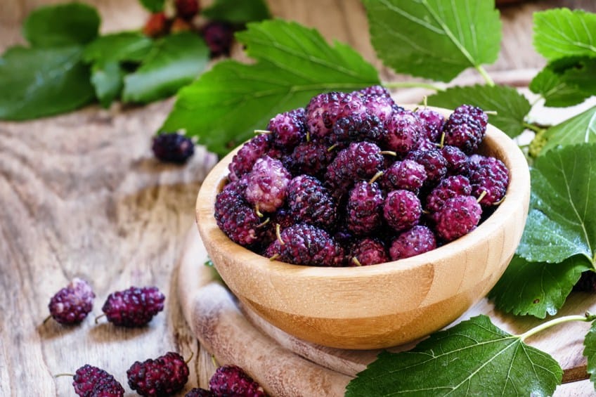
| Name | Hex Code | RGB | CMYK % | Shade |
| Mulberry | #493c62 | 28.6, 23.5, 38.4 | 26, 39, 0, 62 |
Tyrian Purple – The Most Expensive Purple Shade in the World
| Shade | Hex Code | RGB | CMYK (%) | Shade |
| Tyrian Purple | #66023C | 99, 3, 48 | 0, 97, 52, 61 |
If we are going to have any discussions surrounding the most notable and iconic purple names and shades, we would be remiss to bring up Tyrian purple. Valued at over $100 000 per ounce, Tyrian purple is, among its 109 other contenders, the most expensive shade of purple in the entire world. The idea of the color purple being associated with royalty dates back to the era of antiquity where, in Ancient Greece, color was commonly used as a means to denote one’s social status and position within society – as would be the case with the Romans who followed.
The color purple, whose name is actually derived from the Latin term “purpura”, was one of several colors frequently used for this purpose.
In the case of purple, the color was seen as emblematic of a higher social class. It was thus commonly adorned by the members of affluent houses, merchants, and those with a powerful social standing. However, there were many different shades of purple in Ancient Greece. And behind these different shades was a different source of pigment and production process.
This meant different costs for different purples, which meant certain shades of purple indicated higher levels of social status than others. On account of its incredibly labor-intensive production process and scarcity causing it to be the most valuable purple pigment, Tyrian purple was the most coveted of them all. There is a fairly reasonable explanation for its absurd cost, however.
The pigment for Tyrian purple is produced by harvesting the reddish-dark purple secretions of tiny mollusk creatures referred to as murex snails.
Besides emitting a blindingly noxious odor, these saltwater gastropods boast glands designed for hypo-branchial activities, which release the dye that would be used to produce Tyrian purple. The thing is, murex snails only secrete this precious die upon death. More so, they only secrete a droplet amount of the dye. On account of this, tens of thousands of murex snails had to be harvested at a time to produce enough dye to produce garments in the color of Tyrian purple.
It is for this reason that Tyrian purple remains, to this day, the costliest shade of purple. Near the turn of the last century, experiments with murex snails were conducted to determine exactly how many of these mollusks were required to produce just a gram of pigment. The median number these experiments settled on nested at around 8 000 murex snails per gram.
If you have made it this far into the article, pat yourself on the back. It has been a long ride and we can only hope that you found some useful or otherwise helpful information along the way. By now, you should have a decent understanding of the color purple and some of its more notable shades. In addition, you should be able to take away some knowledge pertaining to the history of the color purple, the color theory surrounding it, and its relationship with its complementary color. Thank you for taking the time to read through our coverage of the color purple and its numerous shades.
Frequently Asked Questions
What Is the Most Expensive Shade of Purple?
The most highly valued shade of purple is called Tyrian purple. Produced through the extraction of the excretions of mollusks called murex snails that exist naturally along the Mediterranean Coast, a single ounce of this shade’s pigment costs over $100,000. The high price is on account of how laborious the process of harvesting these mollusks can be.
What Color Is Complementary to Purple?
The complementary color to purple is yellow and we know this because they sit on opposite ends of the color wheel. The two main aspects that define the relationship between purple and yellow are, as is the case with any pair of complementary colors, the fact that pairing them together in a palette creates the strongest possible contrast between the colors and that mixing these two colors will generate a dull gray color.

Megan is a writer and researcher who holds a degree in Social Sciences, with a specialization in Psychology and Environmental Science, from the University of Cape Town. Her dedication to acquiring knowledge and making a positive impact has driven her current work in promoting conscious and sustainable growth in Southern Africa. Megan’s interests encompass exploring the physical and psychological impacts of color in our environment on our mood and well-being. She is also passionate about the role of art and creativity, which has been an integral part of society since the beginning of human history. Since 2022, Megan has been contributing blog posts on painting and color theory at artfilemagazine.
Learn more about Megan van Schoor and about us.
Cite this Article
Megan, van Schoor, “Shades of Purple – Learn About the Various Types of Purple.” artfilemagazine – Your Online Art Source. November 24, 2022. URL: https://artfilemagazine.com/shades-of-purple/
van Schoor, M. (2022, 24 November). Shades of Purple – Learn About the Various Types of Purple. artfilemagazine – Your Online Art Source. https://artfilemagazine.com/shades-of-purple/
van Schoor, Megan. “Shades of Purple – Learn About the Various Types of Purple.” artfilemagazine – Your Online Art Source, November 24, 2022. https://artfilemagazine.com/shades-of-purple/.