
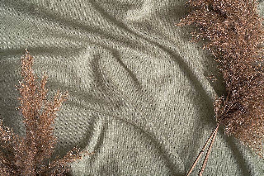
Earth-Tone Color Palette – A Look at the Earth-Tone Color Scheme
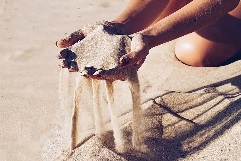
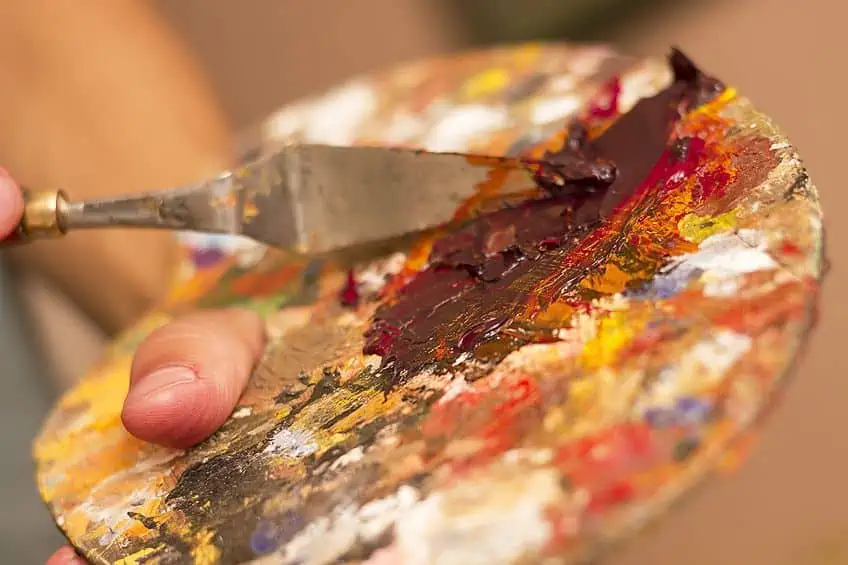
Behold – one of the most influential and popular color palettes in the art world. Earth tones are a set of shades reflective of, as the name would suggest, the earthier elements present in nature. This would include both dirt and clay as two examples. More broadly, earth tones are described as colors containing brown. However, the degree of brown present can vary greatly. What is certain is that earth tones are cozy, warm colors that fit perfectly in interior design where the purpose is to create a natural aesthetic for their households. If you want to learn more about the earth-tone color palette, look no further than here. We are about to dive into a deep overview of this stunning spectrum of natural colors.
What Are the Earth Colors?
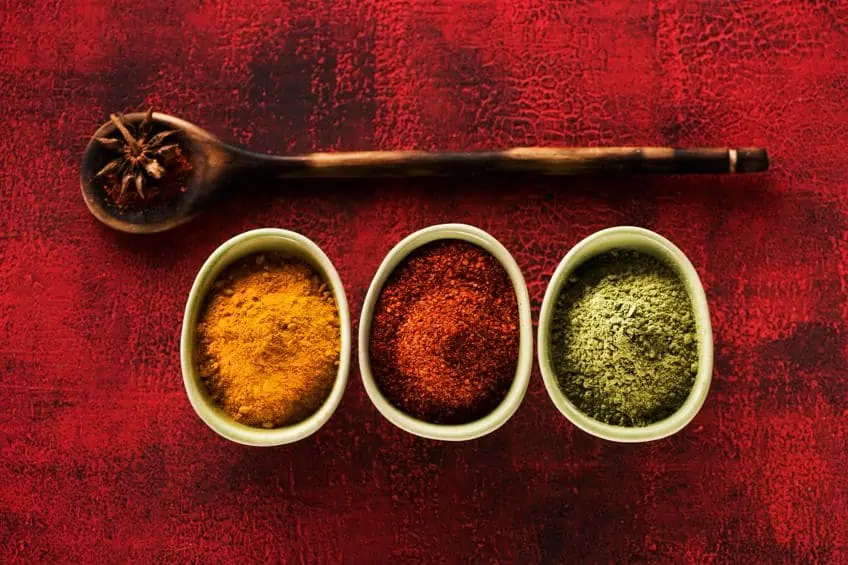
Most people’s immediate association with the earth-tone color palette is with shades of the color brown. With this in mind, it is then easy to get a clear picture of just how frequently our eyes interact with this color palette regularly. Earth tones are present not only in nature, but in our food, fashion, and media as well. The earth-tone color scheme also sees extensive use in cosmetics.
The earth-tone color palette is primarily concerned with colors present in the natural world, so can sometimes be defined in such a way as to include certain sky colors and even the colors of leaves and other non-brown elements in nature.
However, earth tones are most typically categorized as warm colors with elements of brown. Earthy colors provide a timeless style with attractive and warm tones that invite the beauty of nature indoors. In this article, we will be discussing earth tones based on this definition. Common examples of earth colors would include sienna, ochre, and umber.
| Shade | Hex Code | RGB | CMYK (%) | Color |
| Umber | #635147 | 99, 81, 71 | 0, 18, 28, 61 | |
| Sienna | #882d17 | 136, 45, 23 | 0, 67, 83, 47 | |
| Ochre | #cc7722 | 204, 119, 34 | 0, 42, 83, 20 | |
| Brown | #a52a2a | 165, 42, 42 | 0, 75, 75, 35 |
Neutral colors such as white, black, cream, beige, gray, tan, taupe, and brown can all fall under the umbrella of earthy colors based on their tones. These are what we would call muted earth tones. Then again, the argument still stands that other colors found in nature apply to the blanket definition. And while we may not be discussing colors such as green and blue in this breakdown of earth colors, what we can tell you is that the strong thematic elements of nature shared between these colors and brown earth colors are echoed in how well they pair together.
While many artists and art theorists would agree that brown is the definitive basis on which the earth-tone color scheme is built, there are plenty of artists who would insist that grays mixed with any natural color would produce earthy colors.
This argument is supported by the understanding that tones are produced based on a ratio of white and black. This argument, however, removes the potential for vibrant and warm colors such as red to be counted among the earth tones.
Where you stand with this discourse should be influenced by your personal understanding of what constitutes an earth tone.
But then we bring color theory into the mix, where we find a division between warm and cool colors. On the color wheel, it is easy to see that one side contains the warmest hues (like red, yellow, and orange) while the other contains cooler colors (gray, blue, and green). Since earth tones are most commonly associated with warmth, you may need to exercise a degree of flexibility with your definition of earth tones should you wish to include colors that rest within the gray spectrum.
What Are Earth Colors Meant to Represent?
In color theory, there is a subdivision of the field called color psychology, which is a school of thought centered around the concept of colors having a direct and indirect effect on subconscious thought. In interior decorating, the guiding principles of color psychology are exercised to produce certain color palettes that, when paired, create an intended atmosphere.
Color psychology even goes a step further, detailing the potential for specific color palettes to provoke strong emotional and physical responses.
For instance, the color red is used often in restaurants on account of the understanding that it stimulates appetite. The theory of color psychology reminds us, however, that certain color pairs and shades can elicit negative responses as well. The reasoning is twofold; firstly, we have an inherent repulsion to certain colors based on our collective associations with them in nature. Secondly, many of us share unique cultural associations with certain colors as well. This understanding of how we may be influenced by colors is utilized universally within media, marketing, art, and interior design.
By using the right color for the right thing, you can modulate and mold the moods and behavioral patterns of individuals. For instance, pharmacies use the color green to promote their services on account of our association with green to nature, health, and vitality. In terms of the earth-tone color palette, our most common associations are with warmth, nature, comfort, friendliness, and acceptance.
Muted earth tones are interesting because their tame grayness makes the colors in this spectrum incredibly gentle on the eyes, lending to their ability to produce calming atmospheres.
In terms of versatility, it is understood that earthy colors are flexible and capable of adapting to pairings with any sort of color. Remember, however, that the baseline definition of earth tones we are working with pertains to the warmer shades such as reds, oranges, and yellows that lean towards having a brown undertone. This applies vice versa in terms of browns with undertones of either of these warm colors.
Popular Shades on the Earth-Tone Color Palette
Let us now discuss some of the more popular and commonly found earth-tone shades. For this discussion, as mentioned prior, we are going to pay closer attention to warm earthy tones that belong to the family of brown shades. This being said; however, we have included a few additional examples of tones considered earthy besides those containing brown. Some of the tones we will be discussing here you should already know by name, such as khaki, terracotta, and chocolate brown.
Dirt Brown
Now, this is a name that speaks for itself, dirt brown does indeed derive its moniker from the color of dirt. To be more specific, dirt brown is a darkened moderate orange. Despite what its namesake may imply, dirt brown can be an incredibly charming color when paired with certain blue shades. This is because orange and blue are complementary colors.
You can tell what a color’s complement is by looking at the color wheel, where complementary colors sit on opposing sides from one another at a 180° angle.
| Shade | Hex Code | RGB | CMYK (%) | Color |
| Dirt Brown | #836539 | 131, 101, 57 | 0, 23, 56, 49 |
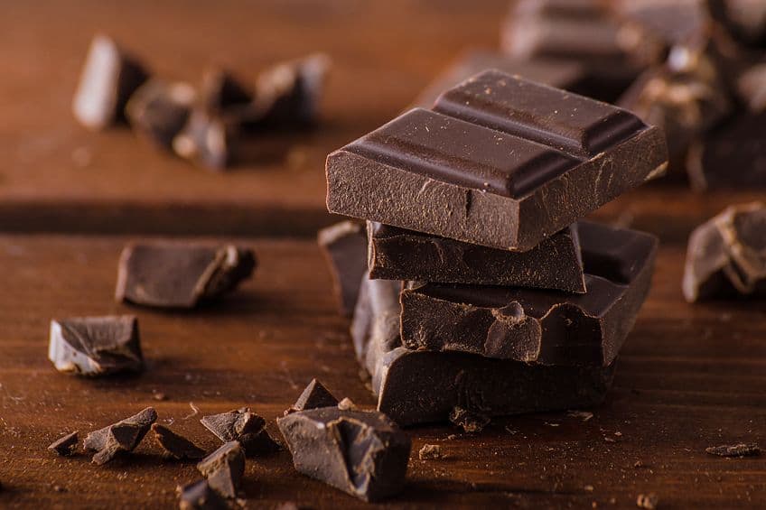
Chocolate Brown
Chocolate brown can refer to several brown shades. These can be lighter, darker, or somewhere in the middle. The three primary categorizations for chocolate brown are middle, dark, and white. The difference in color between these options is determined by the ratio of cocoa solids present in the mix.
| Shade | Hex Code | RGB | CMYK (%) | Color |
| Chocolate | #7b3f00 | 123, 63, 0 | 0, 49, 100, 52 | |
| Dark Chocolate | #490206 | 73, 2, 6 | 0, 97, 92, 71 |
Terracotta
This is a deeper-toned version of burnt orange and an incredibly prolific color choice in both art and design. That being said, there is still a ton of variety in terms of shades that still count as terracotta. Shades of terracotta can range between having undertones of tan, peach, red, gray, or pink.
Here is a soft red example of terracotta.
| Shade | Hex Code | RGB | CMYK (%) | Color |
| Terracotta | #e2725b | 226, 114, 91 | 0, 50, 60, 11 |
Espresso
Named after the deeply blackish brown of ground coffee, espresso is a member of the earth-tone color palette that is often considered by many artists to be a cool color. This is even though the color has undertones of red, the de facto warm color. This is on account of how apparent the contrast in temperature can be when espresso is paired with one of the more vibrant examples from the warm color spectrum.

| Shade | Hex Code | RGB | CMYK (%) | Color |
| Espresso | #3c2218 | 60, 34, 24 | 0, 43, 60, 76 |
Clay
When it comes to the color of clay, there is quite a variety. Some examples veer towards gray while others are dominantly brown. Either way, they are still considered earth tones. Here are two examples of the clay color scheme, one of which is gray and another being potter’s clay, a dark, orangey brown.
| Shade | Hex Code | RGB | CMYK (%) | Color |
| Clay | #6b6867 | 107, 104, 103 | 0,00, 0,03, 0,04, 0,58 | |
| Potter’s Clay | #875632 | 135, 86, 50 | 0, 36, 63, 47 |
Khaki Color
You could choose to define the color khaki as an orange-brown that has been desaturated. The first ever known use of the word khaki itself dates back to as far as 1848. Needless to say, our relationship with this color runs deep. From way back when until modern times, khaki was and still is used extensively in fashion and clothing for both its aesthetic and utilitarian values.
| Shade | Hex Code | RGB | CMYK (%) | Color |
| Khaki | #c3b091 | 195, 176, 145 | 0, 10, 26, 24 |
Taupe
Light taupe and dark taupe are the clear results of combinations between brown and gray. While this color can often be conflated with other colors like tan or beige, it is in actuality a shade best described as a browned gray. Light taupe is derived from a lighter, more significantly desaturated orange shade.
| Shade | Hex Code | RGB | CMYK (%) | Color |
| Dark Taupe | #483c32 | 72, 60, 50 | 0, 17, 31, 72 | |
| Light Taupe | #b38B6d | 179, 139, 109 | 0, 22, 39, 30 |
Brown-Gray
With brown-gray, we can begin to see why greens are sometimes considered to be a part of the earth-tone color palette. This color, however, is another example of a combination between brown and gray. With warm, yellow undertones. Being both natural and neutral, grey colors fit the bill as being part of the earth colors.
| Shade | Hex Code | RGB | CMYK (%) | Color |
| Brown-Gray | #8d8468 | 141, 132, 104 | 0, 6, 26, 45 |
Drab Green
Now, what are earth the colors supposed to mean if they are not inclusive of some greens? Especially because the color is most synonymous with the color of the earth’s flora, it is only fair that we discuss green’s role in the earth-tone color spectrum.
If you are looking for themes of vitality, comfort, and relaxation, look no further than drab green.
| Shade | Hex Code | RGB | CMYK (%) | Color |
| Drab Green | #749551 | 116, 149, 81 | 22, 0, 46, 42 |
Rust Color
The color synonymous with oxidized metals and the surface of Mars, rust can be described either as a strong orange or as a very reddish brown. There are some varieties of the rust shade that are more akin to reddish yellow. However, this is the version most commonly understood by us as being.

| Shade | Hex Code | RGB | CMYK (%) | Color |
| Rust | #b7410e | 183, 65, 14 | 0, 64, 92, 28 |
Combining Colors with the Earth-Tone Color Palette
The color wheel should be anyone’s primary guide when determining combinations of colors that will go well together. The color wheel is an excellent visual aid that can be studied to provide quick answers to any questions regarding the construction of an aesthetically pleasing palette.
This being said, you will not actually be able to find brown on most color wheels used by artists who paint with colors derived from pigments.

The color brown is the resultant product of blending primary and secondary colors. If you inspect a modern color wheel, you may find the color brown depicted as a deep orange shade or as a dark red. Also absent from the color wheel is the color gray.
However, the undertones of blue or red that grays may have will assist you in finding their complementary pairs on the color wheel.
If you want a good color combination when working with earth tones, one thing to note is that most tones within this bracket (such as browns, whites, grays, and blacks) will pair well with each other. This typically includes the colors from the broader definition of earth colors such as green and blue too.
Complementary Colors
The color wheel displays both the primary and secondary colors in the visible light spectrum. But, the sequence in which they are displayed helps elaborate on the details of how these colors appear about each other. For instance, as aforementioned, we can find a color’s complementary pair by inspecting what color rests diametrically opposite from it on the color wheel.
This applies to all colors, including those belonging to the earth-tone color palette.
But what is the importance of complementary colors? Well, these color pairs produce the strongest degree of contrast possibly achievable by either shade. This is useful to know for several reasons, especially when it comes to creating impactful and striking visuals in either art or design. Strong contrasts, such as those produced by the pairing of complementary colors, can make something pop out and catch the human eye.
One thing to understand, however, is that your pairing of complementary colors should be moderate and sparing to prevent the colors from overwhelming viewers as they compete with one another. If you want something to stand out while still keeping it easy to look at, you should pick one color out of a pair to use primarily while you use the other as an accenting feature. Here is an example of a shade from the earth-tone color scheme and its corresponding complementary color.
| Shade | Hex Code | RGB | CMYK (%) | Color |
| Brown | #a52a2a | 165, 42, 42 | 0, 75, 75, 35 | |
| Cyan | #2aa5a5 | 42, 165, 165 | 75, 0, 0, 35 |
Analogous Colors
Unlike complementary colors, analogous colors are colors situated close by one another on the color wheel. Their position indicates their similarities in hues, which is echoed in their harmonious aesthetic qualities. When used side by side, we can see that analogous colors produce a beautiful gradient.
Analogous color schemes typically come in groups of three, of which here is an example of such within the earth-tone color palette.
| Shade | Hex Code | RGB | CMYK (%) | Color |
| Dark Pink | #a52a68 | 165, 42, 104 | 0, 75, 37, 35 | |
| Brown | #a52a2a | 165, 42, 42 | 0, 75, 75, 35 | |
| Dark Orange | #a5682a | 165, 104, 42 | 0, 37, 75, 35 |
Monochromatic Colors
If you are looking for another type of color combination that allows for easy viewing for the eyes, monochromatic colors are another example of harmonious color scheming. Just as with analogous colors, there is no conflict between the colors when it comes to grabbing the attention of the eye. To produce a monochromatic gradient, you can combine various similar hues of a single color. Here is an example of a monochromatic combination within the earth-tone color scheme.
| Shade | Hex Code | RGB | CMYK (%) | Color |
| Very Dark Red | #681a1a | 104, 26, 26 | 0, 75, 75, 59 | |
| Brown | #a52a2a | 165, 42, 42 | 0, 75, 75, 35 | |
| Moderate Red | #d14a4a | 209, 74, 74 | 0, 65, 65, 18 |
Triadic Colors
Complementary colors are not the only pairings useful should you be looking to produce a color scheme with powerful contrasts. As the name suggests, triadic color schemes involve three different colors. Using a color wheel, you can easily figure out what three colors produce a triadic scheme by selecting three colors that are evenly spaced apart from one another, starting of course with the main color you wish to work with. I
f you were to draw lines between where these colors are located on the color wheel, you would find yourself with a triangle. Here is an example of a triadic color scheme featuring an earth tone.
| Shade | Hex Code | RGB | CMYK (%) | Color |
| Dark Blue | #2a2aa5 | 42, 42, 165 | 75, 75, 0, 35 | |
| Brown | #a52a2a | 165, 42, 42 | 0, 75, 75, 35 | |
| Dark Lime Green | #2aa52a | 42, 165, 42 | 75, 0, 75, 35 |
Muted Earth Tones
If you want to create a warm and inviting space while maintaining an aesthetic that rings of classiness, you will want to take a look at muted earth tones. Grays typically fall into this category and pair well with the colors of wooden furniture. They pair well with warmer colors as well. Often, muted earth tones will be used to complement warm colors with something cool to balance things out. Here is an example of a muted earth tone, cool gray, making a beautiful pair with the much warmer burnt orange.
| Shade | Hex Code | RGB | CMYK (%) | Color |
| Cool Gray | #b8bccc | 184, 188, 204 | 10, 8, 0, 20 | |
| Burnt Orange | #a35015 | 163, 80, 21 | 0, 51, 87, 36 |
Clay Colors
Clay has got to be an all-time favorite among artists and designers worldwide, with its distinctively warm hues functioning as a hearty, comforting, and welcoming addition to any applicable palette. Although often used to add a dash of spice to a setting, clays are typically considered to be muted earth tones. Although some can be regarded as bright, they do not compare to the vibrancy of oranges and reds.
Rust and terracotta, two shades of earthy colors we have discussed prior, can both fall under the category of clay colors.
Often associated with the Mediterranean and Spanish proclivity for clay tiling, clay colors are often implemented as a means to draw the atmosphere of these locations into spaces elsewhere, be this at home, in a hotel, a vineyard, or anywhere else. When it comes to painting walls, you can seldom go wrong with a clay color provided that it is balanced by other elements of color in the room or exterior.
If you had something else in mind for your walls but would still prefer the involvement of clay colors, you can use them as an accenting detail using pottery, furniture, tiling, or rugs. In terms of what works well with clay, we need only look towards nature where we see this color pairing beautifully with blues. The combination of clay and blue colors can be rather fitting in the household, especially in the bathroom. Here is an example of a clay color pairing well with a blue.
| Shade | Hex Code | RGB | CMYK (%) | Color |
| Terracotta | #e2725b | 0, 50, 60, 11 | 226, 114, 91 | |
| Muted Blue-Gray | #83a1cd | 36, 21, 0, 20 | 131, 161, 205 |
Taupe
Taupe is a color derived from a combination of the properties of both brown and gray and is another popular example of a color fit for use in the painting of walls. As a base color, taupe can be used to generate magical and meditative palettes. These palettes can include anything from greens to whites, blues, and even other neutral earth colors.
Taupe pairs exceptionally well with elements of nature, making it suitable for the painting of exterior walls surrounded by greenery. Here is an example of a taupe pairing well with a blue.
| Shade | Hex Code | RGB | CMYK (%) | Color |
| Taupe | #a08a77 | 160, 138, 119 | 0, 14, 26, 37 | |
| Soft Blue | #778da0 | 119, 141, 160 | 26, 12, 0, 37 |
Homeowner’s Guide for Working with the Earth-Tone Color Palette
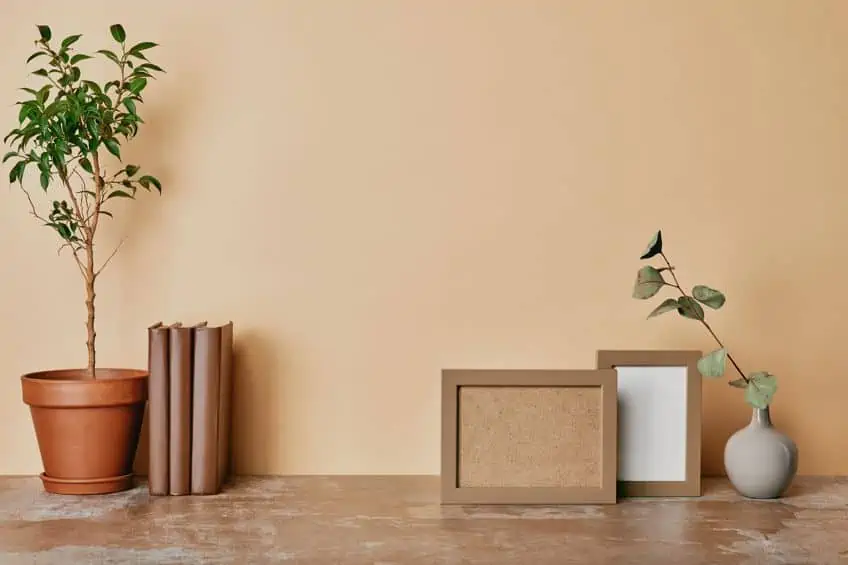
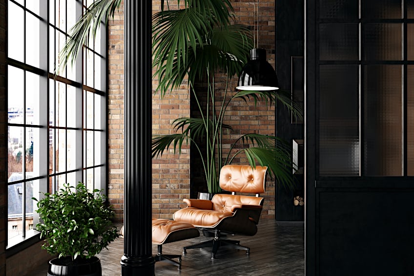
The shades within the earth-tone color palette are excellent additions to the household should you be aiming to bring the beauty and power of nature indoors. Better yet, the colors in this palette are most typically quite versatile and capable of numerous pairings. If you are looking to spruce up your living space with the help of an earth-tone color palette but have never worked with color schemes before, rest assured that this assortment of colors is far easier to work with than most others. Irrespective of the difficulty, here are some useful tips to help better ground your understanding of how to work with earth tones in interior design.
- Pick a neutral earth tone as your main color in your palette. This will make it easier to work with and make the process of pairing colors less laborious. A beige shade undertone with gray, for example, would function well in this regard.
- Incorporate additional elements of nature to enrich the texture of a space. Unpainted wooden blinds, brown curtains, and leather couches work well in this regard.
- Employ the involvement of textiles to further improve texture. Again, curtains can do the trick here. Rugs are also another good option.
- To further accessorize the space, include ceramic elements or thematically relevant cutlery, crockery, and glassware. Some might call this excessive, but we call it attention to detail.
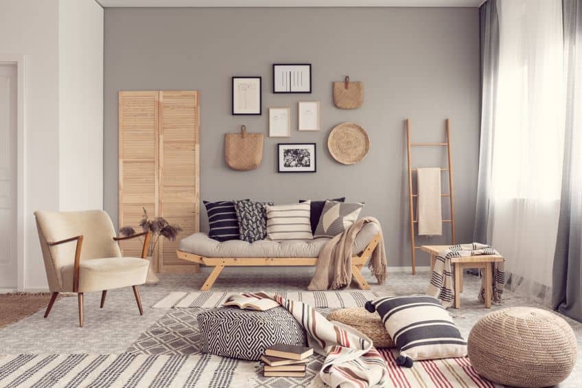
- If you want to add pottery, consider going so far as to incorporate potted plants or other green elements from nature. You can also utilize the verticality of your living space and save space on the ground by opting for hanging plants.
- Should you intend for artwork to be displayed in the space, opt for visual art that represents the green elements of nature. Good examples of this would include paintings or pictures of jungles, forests, woodlands, or farmlands.
- Do not underestimate the importance of proper lighting. If you plan to use darker earth tones, you should only apply them in spaces that receive a lot of natural light during the day. Otherwise, you could end up creating a gloomy, unstimulating space. Mirrors can be used to improve upon these issues, but not in every circumstance.
So, there you have it; a little bit about everything to do with the colors that make up the earth-tone color palette. Hopefully, this article has aided your understanding of how best to work with this palette, not only in art but in interior design as well.
Frequently Asked Questions
What Are the Earth Colors?
Earth colors are loosely defined as colors found in the natural world and originating from the Earth itself. This can include colors both warm and cold like red, green, orange, and blue but they are most commonly associated with colors containing brown.
Are Earth Tones in Style?
Absolutely, yes, and they have been for centuries. While they have dipped in and out of popularity over the ages, there are very few other palettes that have seen as much extensive use in fashion as earth tones. As of now, earth tones remain incredibly popular in both fashion and design.

Megan is a writer and researcher who holds a degree in Social Sciences, with a specialization in Psychology and Environmental Science, from the University of Cape Town. Her dedication to acquiring knowledge and making a positive impact has driven her current work in promoting conscious and sustainable growth in Southern Africa. Megan’s interests encompass exploring the physical and psychological impacts of color in our environment on our mood and well-being. She is also passionate about the role of art and creativity, which has been an integral part of society since the beginning of human history. Since 2022, Megan has been contributing blog posts on painting and color theory at artfilemagazine.
Learn more about Megan van Schoor and about us.
Cite this Article
Megan, van Schoor, “Earth-Tone Color Palette – A Look at the Earth-Tone Color Scheme.” artfilemagazine – Your Online Art Source. December 9, 2022. URL: https://artfilemagazine.com/earth-tone-color-palette/
van Schoor, M. (2022, 9 December). Earth-Tone Color Palette – A Look at the Earth-Tone Color Scheme. artfilemagazine – Your Online Art Source. https://artfilemagazine.com/earth-tone-color-palette/
van Schoor, Megan. “Earth-Tone Color Palette – A Look at the Earth-Tone Color Scheme.” artfilemagazine – Your Online Art Source, December 9, 2022. https://artfilemagazine.com/earth-tone-color-palette/.