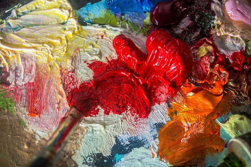
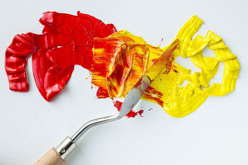
What Colors Make Red? – Tips to Create Different Shades of Red
Red is not only one of the three primary colors but is also the color that carries the warmest tone. The color’s vibrancy makes it incredibly effective at catching the eye, a quality of red that lends extensively to its prominence and utilitarian purposes throughout human history. If you want to learn more about the color red and how to mix different colors to produce red, you have come to the right place.
Contents
What Is Red?
Alongside yellow and blue, red is one of the primary colors in the light spectrum visible to the human eye. As mentioned, red is also the warmest of all the colors on the color wheel. We have discovered over 445 unique shades of red, each having its unique name. The color red boasts the longest light wavelength that the human eye can process.
Red is a particularly dominant color whose aesthetic properties have proven to be remarkably effective at attracting the attention of human eyes.
This, along with the many cultural connotations we attribute to the color red, accounts for the prolific use of red in design for both expressive and utilitarian purposes. Red is flanked by orange and violet on the color wheel and sits opposite green, its complimentary color. There is a school of science centered around the concept of colors and the subconscious effect they may have on human thinking.
This science, called color psychology, focuses on the study of how different colors, both in their inherent aesthetic nature and the semiotic value assigned to them by our cultural history, can trigger emotional responses in humans. Although color theory is relatively in its infancy. However, the general idea behind it has been around for nearly as long as we have as a species. Nowadays, big corporations with products to sell and brands to promote are at the forefront of innovation in color theory as they endeavor to find how to most effectively advertise themselves.
But since the days of early man, we have understood the relationships between colors and the world at large, including how some colors signify danger.
Color psychology informs us that colors can have a distinct influence on our attention, moods, energy, and even our appetites. As an artist, it is thus crucial to understand this relationship between the colors we use in our works and how they may impact the emotional responses from our audiences.
With a good understanding of the guiding principles of color psychology, we can manipulate our use of color to evoke any particular emotional response we are aiming for. In this article, we are going to, among other things, talk about how to make red. We will also be discussing several of the more common shades of red as well as what two colors make the color red (if any).
We are also going to discuss the semiotic contexts of red and how this affects the way the color is used in both art and utility.
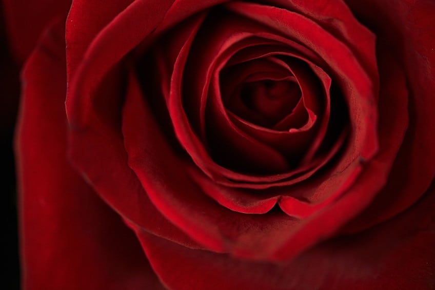
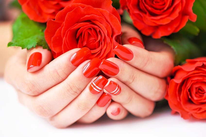
The subconscious associations that we have with the color red based on our cultural values, our world, and history are what determine its symbolic values. The emotional values we tend to equate it with include bold emotions such as passion, anger, and love. In terms of the natural world, red symbolizes warmth in its many forms. Red is the fire that roars in the hearth, as is the blazing sun glaring over the desert.
Terminology of Color Theory
What separates a shade from a tint? What is the difference between a color and a hue? Unless you have a background in art studies, you might struggle with some of the terminology used in this article. Discussions around color theory might involve too much jargon for the average art enthusiast but this is okay! You are here to learn.
And to help you out, we have compiled a list of some important terms that every artist working with colors should know.
Hue
If you ask a visual artist or designer what the term “hue” means, they might tell you that it is simply another word for “color”. In this case, they would only be half right and, for the most part, this is not a big deal at all. That is unless we are discussing color theory.
In color theory, the term “hue” is used independently of “color” to describe how closely associated a pigment is with any of the six primary and secondary colors (red, orange, yellow, green, blue, and violet).
The pigment’s hue will be determined by which of these colors it lies closest to on the color wheel. If any pigment lies closer to red than it does to any of the other 5 primary and secondary colors, we would then say that it has a red hue.
Shade
Individual hues can then be further differentiated into several unique shades depending on how much of the color black they are mixed with. The shade will be measured by how much darker a hue becomes when black is added. A common application of shade in a painting would be for illustrating, as the name would suggest, shaded areas.
Shading is useful for darkening colors for greater depth and mood. In painting, shading can be used to emulate how colors would look under darker lighting.
Tint
The exact opposite of a shade but equally as important in art, tints are defined by the ratio of white color mixed in with a pigment. The mixing of white will increase the pigment’s level of relative saturation, which will lead to the production of a lighter color.
This can make the pigment’s color appear to be brighter. However, on a technical level, tinting colors actually increases their paleness.
Tone
While shades and tints refer to the mixing of black and white into colors respectively, tones tend to the mixing of grays into colors. When it comes to the most common applications of tones, sophistication is the name of the game with designers often applying tones to give their works a smarter, more professional feel.
When using grays to create different tones of a color, be sure to only use grey tints and shades that can be created through mixtures of black and white exclusively. As mentioned prior, red is the color with the warmest tone.
Warm Colors
Semiotics is hardwired into our human brains. We associated certain colors with warmth based on how these colors present themselves in the natural world. Since colors like red, orange, and yellow commonly appear naturally in things such as fires, sunrises, and lava, we may associate these colors with the sensation of warmth.
Red is, of course, the primary example of a warm color.
Cool Colors
Cool colors are the antithesis of warm colors. Found diametrically across from their complimentary warm hues on the wheel, hues such as purple, blue, and green are considered to be cool colors on account of their aesthetic similarities to natural phenomena.
These phenomena include water, ice, and nighttime, to name a few.
Understanding Color Bias
Before we get into what colors make red shades, we must first understand the principle of color bias. This term is an adjectival phrase used to further describe the properties of a color based on the influence that certain hues can have on the primary colors. In painting, you will often hear the term “clean colors”.
To mix clean colors, painters try to avoid combining pigments that have been made using colors that are complimentary to the colors you are mixing.
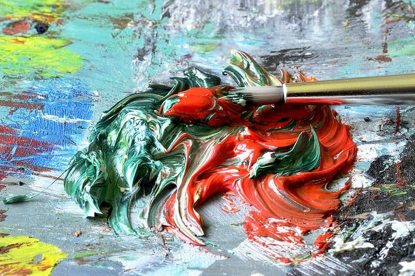
When complementary colors are paired together, they tend to dull each other out no matter the ratio. The hues produced by mixing the colors with their complimentary colors on the wheel are often described as muddy. That is why when mixing paints with red to produce different shades of red, we try not to mix in the color green.
This also applies to colors that are mixed in order to produce a shade of red; neither should have a color bias of green.
Understanding Color Temperature
Color bias is related to another aspect of paint mixing called color temperature. As we have discussed, this involves warm and cold colors. It is a common conception among artists that color temperature is the most vital aspect of color bias. The way to go about producing unique shades of red is by learning how to alter the color’s temperature through the addition of warmer or cooler colors.
Red is an innately warm color. It is, among other things, the primary color that represents warmth best.
That being said, there are ways of cranking up the heat even with pure red. To produce a warmer hue of red, you ought to add warm colors such as oranges and yellows. You can mix in these colors to shift your reds into warmer, toastier hues that are reminiscent of fireplaces and sunrises. Make sure, however, that you do not mix in yellows and oranges produced by color combinations that include green to avoid dulling your red hue.
You can also tweak the temperature of red to produce cooler hues. It all depends on the kind of emotional response you are trying to extract from your audience.
If instead of fiery vibrance, you are trying to create more relaxing shades of red then you can consider mixing in varying ratios of the color blue. In mixing red with blue, you can produce softer reds such as maroon and aubergine. By dropping the temperature this way, you make it possible to produce reds that are fit for cozy spaces reminiscent of warm havens from the cold.
What Colors Make Red?
So, what colors make red? Well, none. It is simply not possible to produce the color red through the mixing of other colors. But the same can be said for blue and yellow because all the primary colors are not made up of a combination of any other colors. While you can still mix colors to produce hues similar to red, you simply cannot produce a pure red color. So, if you have come here to figure out what two colors can make the color red, you are sadly out of luck.
That being said, however, you can alter the color red’s values of hue through tinting, shading, toning, and mixing it with other colors.
This will be our main focus today; we are going to teach you how to combine certain pigments to produce different hues of the color red. If you want to learn how to make red hues with their unique aesthetic qualities and uses, continue reading.
Red Shades
While we cannot explain to you all of the 445 shades of red, we can cover a few common examples. We are going to be covering several different shades of red and how to make them. Applying some of the information supplied above, we will help you learn about some of the more popular shades of red and what sort of aesthetic qualities they bare.
Crimson Red
Nepal’s national color, crimson red is a deep and dark red. Its color bias leans heavily towards purple, lending it cool aesthetic properties that make it similar in color to blood. It is for this reason that the color crimson is most primarily associated with blood, which then leads to further semiotic associations with themes including martyrdom, violence, and bravery.
On the color wheel, you will find crimson nestled gently between rose and red.
But adding tone to crimson, however, can make this shade of dark red less harsh and more elegant. If you are trying to find more sophisticated applications of crimson, you can pair it with accents of neutral shades as well. The shades best paired with crimson include the likes of white, champagne, and serenity blue.
Being a dark red already makes crimson feel right at home on an earth palette.
If you are trying to achieve an earthy, natural look to your work when working with crimson, it can be paired with colors such as brown and gold. Any other colors that can be considered autumnal will typically pair well with crimson for similar purposes.
| Shade | Hex Code | CMYK % | RGB % | Color |
| Crimson Red | #990000 | 0, 100, 100, 40 | 153, 0, 0 | |
| Crimson | #dc143c | 0, 91, 73, 14 | 220, 20, 60 | |
| Alizarin Crimson | #e32636 | 0, 83, 76, 11 | 227, 38, 54 |
Cardinal Red
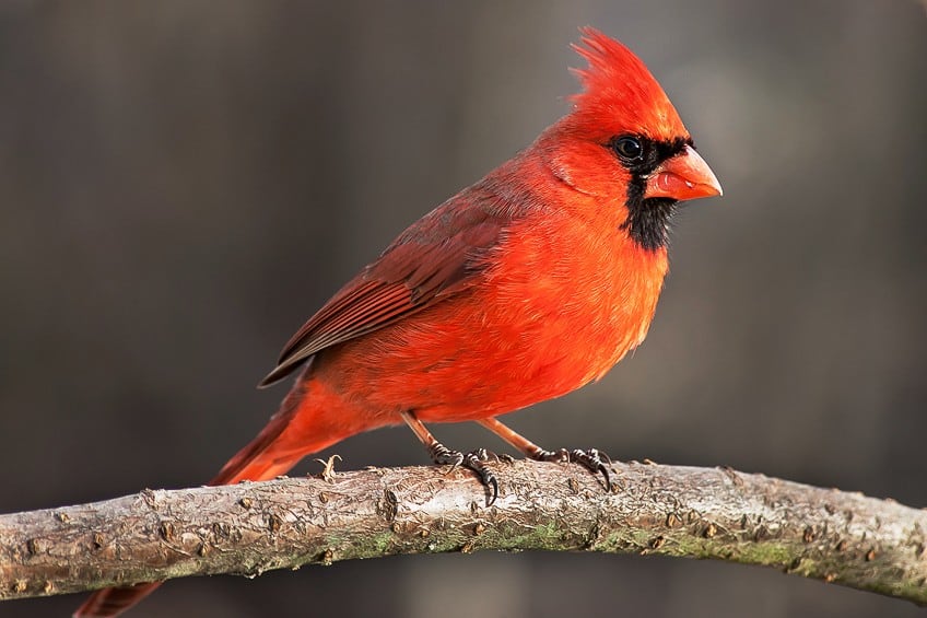
Also referred to simply as “cardinal”, this shade of light red boasts bright aesthetic properties that make the color pop out from its surroundings. This is why cardinal birds, a species of New World Aves Chordata who get their names from the color, are so easy to spot as they dart from tree to tree.
Natively North American, these birds have become symbols for a number of states including Ohio, Virginia, and Indiana. As such, cardinal red is present in several US state flags.
The color itself lends its name from the cassock, a Christian garment worn by religious figures such as clergymen and, of course, cardinals. For this reason, the color can be applied to nativity decorations or to apply an air of pious austerity to a work of art. The color pairs well with many shades of greens as well.
| Shade | Hex Code | CMYK % | RGB % | Color |
| Cardinal Red | #c41e3a | 0, 85, 70, 23 | 196, 30, 58 |
Scarlet Red
This is a bright, light red hue that appears to have an orange tinge to it. This would make perfect sense were we to inspect the color wheel wherein scarlet can be found between red and orange with a 3/4 ratio in favor of the former color. This ¼ orange gives scarlet red its orangey tinge. The ratio of orange to scarlet is less so than vermillion, hence why we make the distinction.
As is the case with many of red’s brighter shades, typical cognitive associations that people tend to have with scarlet red are that of passion, warmth, pleasure, bravery, and force.
However, scarlet is similar to cardinal red in that it also bears relation to Christian piety. In the Christian denomination of Catholicism, cardinals tend to wear garments that are of the color scarlet. This is done primarily to symbolize the themes of sacrifice explored within the Bible, the clearest example of which is the blood of Christ.
But there are two sides to every card and scarlet can also take on a seemingly antithetical meaning within Christian semiotics.
In the Book of Revelation, you can find a passage that refers to a harlot who is robed in scarlet garments. For this reason, another common connotation for the color scarlet among Christians is that of lechery, adultery, and prostitution.
| Shade | Hex Code | CMYK % | RGB % | Color |
| Scarlet | #ff2400 | 0, 86, 100, 0 | 255, 36, 0 |
Red Pink
This is an incredibly pale red shade and is a member of the crimson family of shades of red. You will find this pale red shade to be a particularly bright color with a highly saturated tint. The color can often be referred to as rose pink and raspberry pink as well.
Red and pink pair well together as a color scheme intended for a romantic atmosphere. This is because both colors symbolize love.
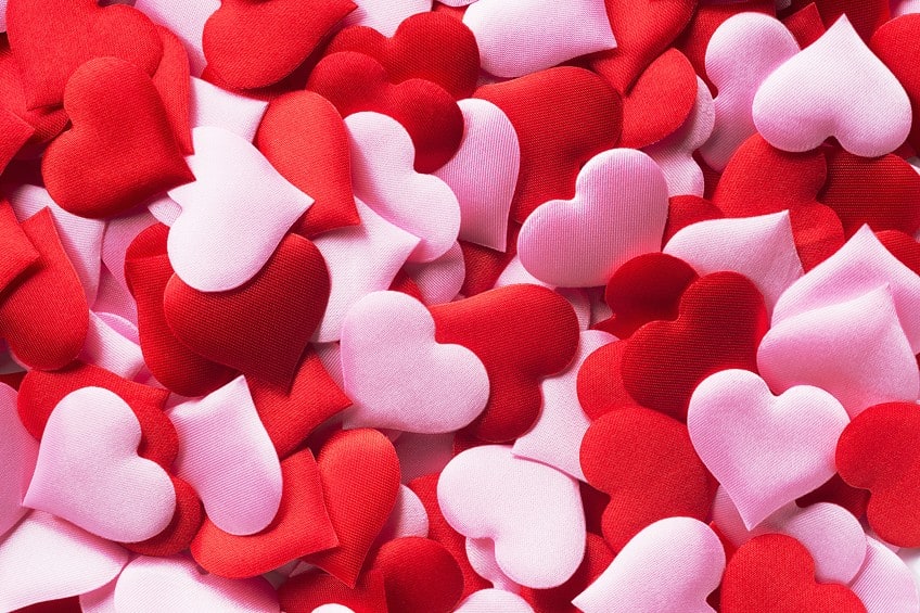
The great thing about mixing these two colors is the fact that they play off of one another’s strengths to produce an especially enchanting shade. While the red deals with the intensity of passion and desire, the pink undercuts the heat with strong elements of charm and playfulness. The result is a gentle, yet affirming aesthetic representation of love.
| Shade | Hex Code | CMYK % | RGB % | Color |
| Red Pink | #dc343b | 0, 76, 73, 14 | 220, 52, 59 |
How to Shade Your Reds
Now that you have gained knowledge on how color theory, color temperature, and color psychology apply to red, we can begin to discuss how to mix paints to produce certain red shades. We have made sure to cover a broad enough range of red shades to give you ample options to work with.
We will show you how mixing reds with yellows can produce warm shades and how you can create cool reds by mixing in blues.
Creating Warm Reds with Yellows
Let us begin, then, by discussing how to increase the temperature of your red by using yellows. Reds and yellows are both bright and warm colors, to begin with, so it makes perfect sense that this theme is amplified when the two colors are combined. But, as you may recall from earlier, we cannot mix paints containing all the primary colors.
For this reason, you should not mix reds with yellows that are made from color combinations containing blues. Otherwise, you will produce a dull, muddy color.
Cadmium Yellow
This is a great example of a yellow suitable for mixing with red. For starters, this vibrant yellow had strong red undertones, to begin with. The combination of the two can come in handy should you be looking to produce a lively, fiery red.
For the best results, try mixing cadmium yellow with cadmium red.
| Shade | Hex Code | CMYK % | RGB % | Color |
| Cadmium Yellow | #ee9626 | 0, 37, 84, 7 | 238, 150, 38 |
Yellow Ochre
If you are looking for more light red shades similar to the one above, consider using reds in conjunction with yellow ochre, a dark yet warm yellow. This mixture produces a red with a prevailing brightness but with deeper hues compared to cadmium yellow.
| Shade | Hex Code | CMYK % | RGB % | Color |
| Yellow Ochre | #b5904b | 0, 21, 59, 29 | 181, 144, 75 |
Creating Cool Reds with Blues
Yellow ochre and cadmium yellow are good mixing pairs for warm reds because they do not contain blue. On the other hand, producing cool red colors should be done using blues that do not contain yellow. Cerulean blue and ultramarine blue are perfect for this!
Cerulean Blue
Between deep sky blues and azure, you will find cerulean blue, which boasts a hue that pairs perfectly with something along the lines of cadmium red. This color is a great option to mix into your reds if you want a light red shade with a cool temperature.
This color can produce pretty potent results with even a few drips so be sure to add it to red slowly so as not to overpower the mixture.

| Shade | Hex Code | CMYK % | RGB % | Color |
| Cerulean Blue | #2a52be | 78, 57, 0, 26 | 42, 82, 190 |
Ultramarine Blue
If you want deeper shades of red you will need to mix in warm blues such as ultramarine. This color’s warmth is actually on account of its reddish composites, making it all the better paired with red. The red shade that results from mixing reds with ultramarine blue is exquisitely deep and dark.
Be sure to add this blue sparingly because applying too much can produce a purple color.
| Shade | Hex Code | CMYK % | RGB % | Color |
| Ultramarine Blue | #1e367b | 76, 56, 0, 52 | 30, 54, 123 |
Thanks for sticking around with us! By now, you should know a bit more about the color red’s semiotic values, its uses, and how to mix and work with several of its more popular shades. Knowing how colors influence the viewer’s perspective and emotions is a great way through which to make your artwork more resonant and impactful to your audience.
Frequently Asked Questions
What Two Colors Can Make the Color Red?
Red, being a primary color, cannot be made using any two other colors. At least, you cannot create pure red by mixing different colors of paint. You can, however, create shades of red using other colors.
Can You Mix Orange with Yellow to Make Red?
No, you cannot mix orange and yellow to make red. Orange and yellow combine to make orange-yellow colors such as amber. However, you can mix orange and yellow into red to create different shades of red.

Megan is a writer and researcher who holds a degree in Social Sciences, with a specialization in Psychology and Environmental Science, from the University of Cape Town. Her dedication to acquiring knowledge and making a positive impact has driven her current work in promoting conscious and sustainable growth in Southern Africa. Megan’s interests encompass exploring the physical and psychological impacts of color in our environment on our mood and well-being. She is also passionate about the role of art and creativity, which has been an integral part of society since the beginning of human history. Since 2022, Megan has been contributing blog posts on painting and color theory at artfilemagazine.
Learn more about Megan van Schoor and about us.
Cite this Article
Megan, van Schoor, “What Colors Make Red? – Tips to Create Different Shades of Red.” artfilemagazine – Your Online Art Source. September 21, 2022. URL: https://artfilemagazine.com/what-colors-make-red/
van Schoor, M. (2022, 21 September). What Colors Make Red? – Tips to Create Different Shades of Red. artfilemagazine – Your Online Art Source. https://artfilemagazine.com/what-colors-make-red/
van Schoor, Megan. “What Colors Make Red? – Tips to Create Different Shades of Red.” artfilemagazine – Your Online Art Source, September 21, 2022. https://artfilemagazine.com/what-colors-make-red/.