Color in Art – Explore Different Examples of Color in Art
Without color in art, what would art be? Color significantly impacts the way we see the world and even informs our emotions, mood, and environment. Reading color is part of the human condition and in art, color plays a crucial role in how one views, makes, and interprets an artwork. This article will take you through color as one of the most important elements of art, including examples of color in art.
The Elements of Art
The elements of art are crucial tools to help you understand the basics of how an artwork is made and can even help you interpret what it is that you are seeing. The elements of art include line, shape, form, value, texture, space, and color. While this article will focus on the art element of color, below we have a summary of the art elements to help jog your memory.
| Art Element | Definition |
| Line in art | Line is the path created between two points. Lines can differ in shape, length, and width. |
| Shape in art | Shape is characterized by its confines, which are limited to height and width. Shape is used to create two-dimensional and three-dimensional objects. |
| Color in art | Color is defined by three defining attributes: hue, value, and intensity (chroma). |
| Form in art | Form consists of height, width, and depth with an enclosed volume and two-dimensional aspects that render a three-dimensional object. |
| Texture in art | The texture is defined by the tactile sensation of an artwork evoked by a visual stimulus that mimics the surface of an object. |
| Space in art | Space consists of both negative and positive space. Space can be understood as the relationship between the main subject of an artwork and the artwork as a whole. |
| Value in art | Value refers to the darkness and lightness of hue (color). Value carries other meanings across economic, social, political, and artistic contexts. |
Color in Art
Color in art carries many meanings. Even if you are not an avid art enthusiast, you probably do have an appreciation of color in some way, be it in your fashion choice, through a technical approach to color psychology, or as a means of expression. Color takes up almost every aspect of life and without it – what would life be? You may imagine a world without color as black and white, but these too are also colors.
So, is it truly possible to imagine a world without color? What is color in art? Below we will outline the definition of color in art.
How Do You See Color?
Color, referred to in this article, forms one of the elements of art. Starting with the basic definition of color in art, it is useful to look at color as something that we perceive biologically. This happens due to the connection between our brain and eyes, which read light as color.
Therefore, at the primary level, what we see is a translation of light.
The human eye contains light receptors, called rods and cones, that “read” this information and send a signal to our brain that generates a sensation of color. Isaac Newton also observed that color is not embedded in an object, rather it reflects and can absorb color and our view of color is merely a perception.
The Science Behind Color
According to research studies, humans can see approximately one million colors. Light, as radiated from the sun, is divided into categories of different colors; red, yellow, orange, blue, violet, indigo, and green. Together, these colors are called white light. When the white light hits a “white” object, we interpret this color as white since it absorbs zero colors while reflecting all the colors equally.
If the object is black, it reflects no color and absorbs all colors equally, therefore, the color appears black to the human eye.
The human eye is known to contain three different types of cone cells, which can interpret roughly 100 color shades and one million different color combinations. Some people suffer from a condition called color blindness, which impairs their ability to see certain colors in the same way. When we talk about cool and warm tones in art, the human eye is also known to interpret more variations of color in warm colors than in cool colors.
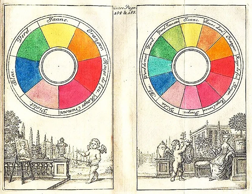
The reason behind this innate ability is due to the cone receptor cells in the eye that process up to ⅔ of warm tones such as yellow, red, and orange, also called long wavelengths. Color also appears in a scientific classification system, devised by American artist Albert Henry Munsell. This organized system divides color into three operational attributes: hue, value, and chroma (intensity).
Munsell’s developments around color began around 1879 in a conversation with Denman Waldo Ross, a design theorist.
The two discussed the possibility of creating “a systematic color scheme” for artists, which would enable creatives to plan their palettes better. Color Notation was published in 1905, which contained Munsell’s definitions for the three attributes of color.
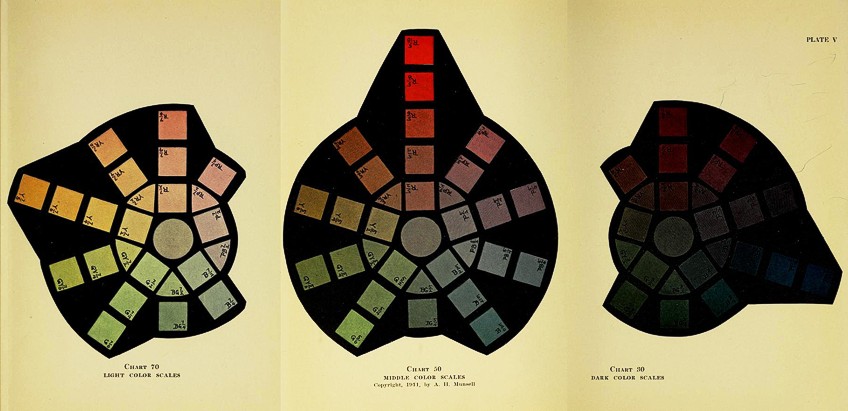
According to Munsell, hue is defined as the color seen as it is, which can be identified by its basic color (as red, blue, or green). The next attribute, value, was defined as the lightness or darkness that helps define the quality of the color, also known as the hue’s brightness.
The last attribute, chroma, is characterized by the strength or weakness of a color; as “the departure of a color sensation from white or gray” or as the color hue’s intensity.
What Is Color in Art?
This article refers to the art element of color, which encompasses the three attributes of color: value, hue, and chroma. One of the first uses of color in art can be seen in prehistoric paintings. Early hominins employed the use of mineral pigments, characterized by red earthy pigments, brown, and yellow sandy shades, as drawing material.
From the 16th to the 17th century, artists such as Rembrandt van Rijn and Raphael also used a red pigment glaze, which originated from the cochineal insect in Mexico.
During this time, the color was very much in demand and even became the hottest import after gold and silver, as stated by Victoria Finlay. The red glaze was known to increase the intensity of other red colors and is still incorporated in makeup today.
Color Theory
Color theory is essential to understand if you are an active artist seeking to grasp the technical basics of color. Color theory is divided into three segments: the color wheel, color schemes, and color value. You may be familiar with the terms primary, secondary, and tertiary colors but as a refresher, let us revise this.
The color wheel was invented by Newton, who divided it into the above-mentioned color categories. Below we have summed up the three definitions of primary, secondary, and tertiary colors to help you visualize the color wheel.
| Color Wheel Category | Definition |
| Primary Colors | Visually identified as red, blue, and yellow and characterized by the fact that no primary color combined can recreate a primary color, therefore, it can only be made by using natural pigments. When primary colors are fused, they create other colors on the color wheel. |
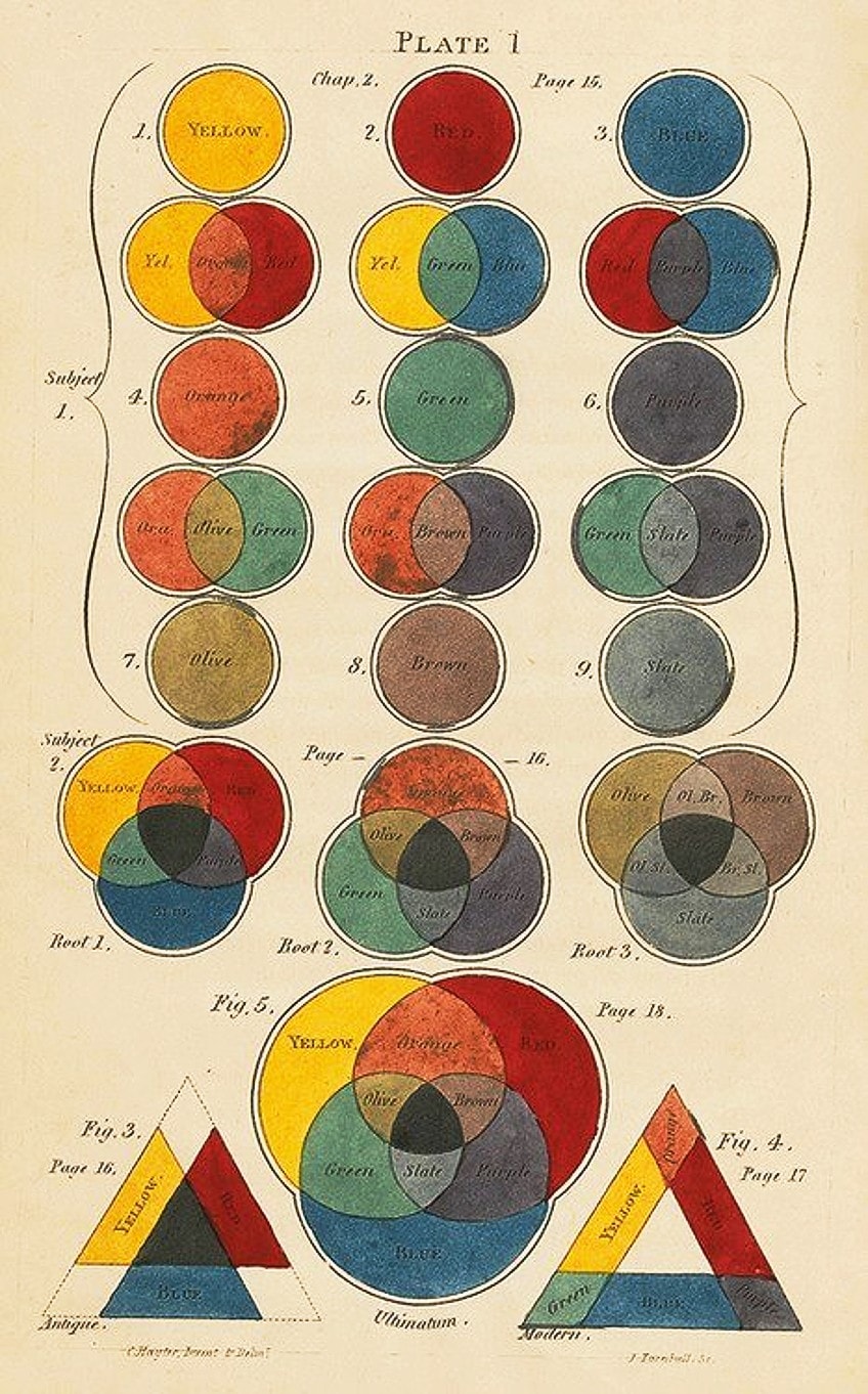
| Secondary Colors | Visually identified as purple, orange, and green. As mentioned above, when you mix primary colors, you will arrive at different colors (purple, green, orange) known as secondary colors. When you combine two primary colors in equal quantities, you will arrive at these colors. Red combined with yellow will give you orange, yellow combined with blue will give you green, and blue combined with red will give you purple. |
| Tertiary Colors | As you might imagine, tertiary colors are the equal amalgamation of primary and secondary colors. According to Newton, there exist six tertiary colors: blue-green, red-purple, yellow-green, blue-purple, red-orange, and yellow-orange. When referring to tertiary colors, you should always state the primary color first, followed by the secondary color. |
Color values refer to the darkness and lightness of color and can be understood as when a color is either receiving an addition of white or black. When a hue receives more white, it is visually understood as varying in tints. As more white is added to a single color (hue), the lighter the tint of the hue. On the other hand, when a hue receives more black, it varies in shade, thus producing darker shades.
When the combination of black, white, and gray is added to a hue, the intensity of the hue changes. Therefore, value and intensity are said to be partners.
Color schemes refer to the different methods through which colors can be combined to create certain “palettes”. These consist of monochrome colors, which are single-color hues with varying shades and tints. You may have also heard of complementary colors, which are used to create strong contrasts and are characterized by colors that oppose each other on the color wheel.
Colors that are used to create dramatic effects are called analogous colors and are colors that are found alongside one another on the color wheel. Color triads refer to colors on the color wheel with equal spacing between them such as red, blue, and yellow. There are also split-complementary colors, which are schemes that pair a color with its closest analogous color (red-purple, yellow-orange, red-orange).
Lastly, warm, and cool colors consist of red, yellow, orange (warm), and blue, purple, and green (cool) hues.
Examples of Color in Art
Color as one of the elements of art, when applied in different ways, can produce different effects on the visual perception of an artwork and the illustration of different subject matter such as light, shadow, illusion, depth, and harmony. Below, you will find a few artworks that employ color in various ways as an art element for specific reasons.
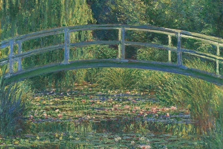
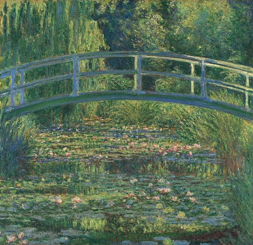
The Water-Lily Pond (1899) by Claude Monet
| Artist | Claude Monet (1840 – 1926) |
| Date | 1899 |
| Medium | Oil on canvas |
| Dimensions (cm) | 88.3 x 93.1 |
| Where It Is Housed | The National Gallery, London |
The Water-Lily Pond (1899) by French Impressionist Claude Monet is a classic example of the integration of analogous colors to create unity in a painting. Monet uses analogous colors such as blue and green to create a sense of unity for the depiction of his cherished garden and serene feature, his water-lily pond.
This is also a perfect example of the use of cool colors in art since both blue and green are cool colors.
Improvisation 31 (Sea Battle) (1913) by Wassily Kandinsky
| Artist | Wassily Wassilyevich Kandinsky (1866 – 1944) |
| Date | 1913 |
| Medium | Oil on canvas |
| Dimensions (cm) | 140.7 x 119.7 |
| Where It Is Housed | National Gallery of Art, Washington, D.C. |
The famous Russian artist, Wassily Kandinsky was also known to be a music-lover. As a child, he played the piano and cello and often drew his associations between music and art. Kandinsky described his use of color as “the keyboard” and as an artist, it is the “hand that plays, touching one key or another to cause vibrations in the soul”.
Kandinsky believed in the connection between color and emotion, as an expression of the spirituality of the soul.
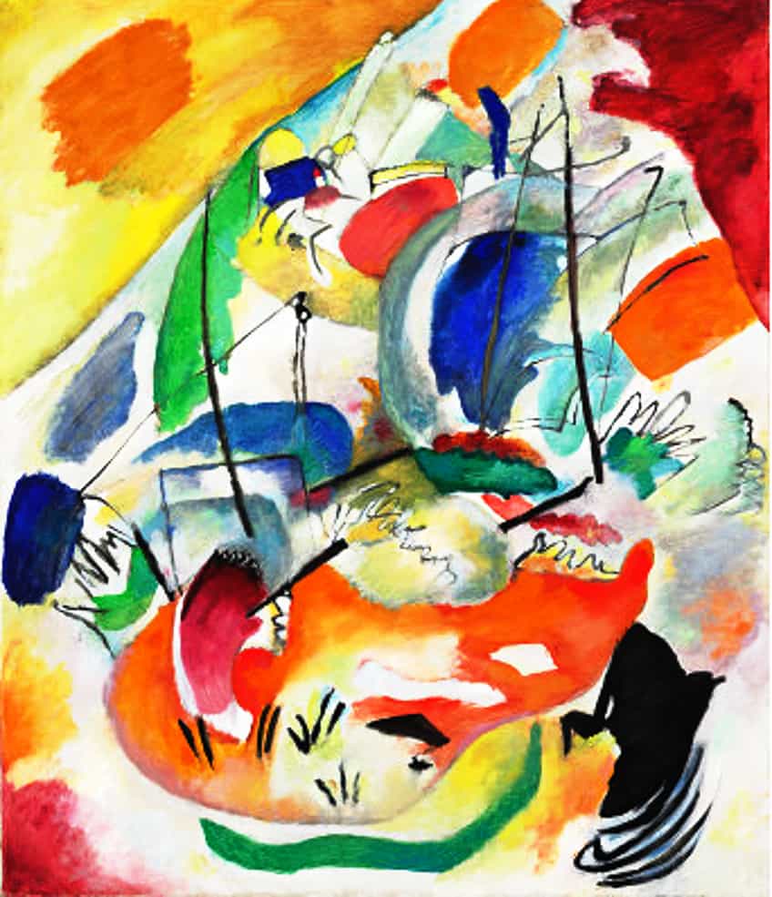
Improvisation 31 (Sea Battle) (1913) is part of a series informed by Kandinsky’s expression of his inner battles and “spontaneous expression”. His painting is said to have been inspired by the biblical narrative in the book of Revelations about the apocalypse.
Here, Kandinsky makes use of complementary colors, combining orange with blue and red with green to create a visually catching painting of inner spiritual turmoil.
Black Iris (1926) by Georgia O’Keeffe
| Artist | Georgia Totto O’Keeffe (1887 – 1986) |
| Date | 1926 |
| Medium | Oil on canvas |
| Dimensions (cm) | 91.4 x 75.9 |
| Where It Is Housed | Metropolitan Museum of Art |
Other examples of neutral colors in art include Sunrise (Marine) (1873) by Claude Monet and Nude Descending a Staircase, No. 2 (1912) by Marcel Duchamp. Black Iris (1926) by Georgia O’Keeffe can be considered an example of neutral color in art. Neutral color refers to colors that emerge from the combination of complementary colors.
The neutral colors expressed in O’Keeffe’s painting of a flower petal include grays, black, white, and shades of brownish red.
Summer Madness (1990) by Cy Twombly
| Artist | Edwin Parker Twombly Jr. (1928 – 2011) |
| Date | 1990 |
| Medium | Oil, gouache, lead, buntstift on paper |
| Dimensions (cm) | 150 x 126 |
| Where It Is Housed | Museum Brandhorst, Munich |
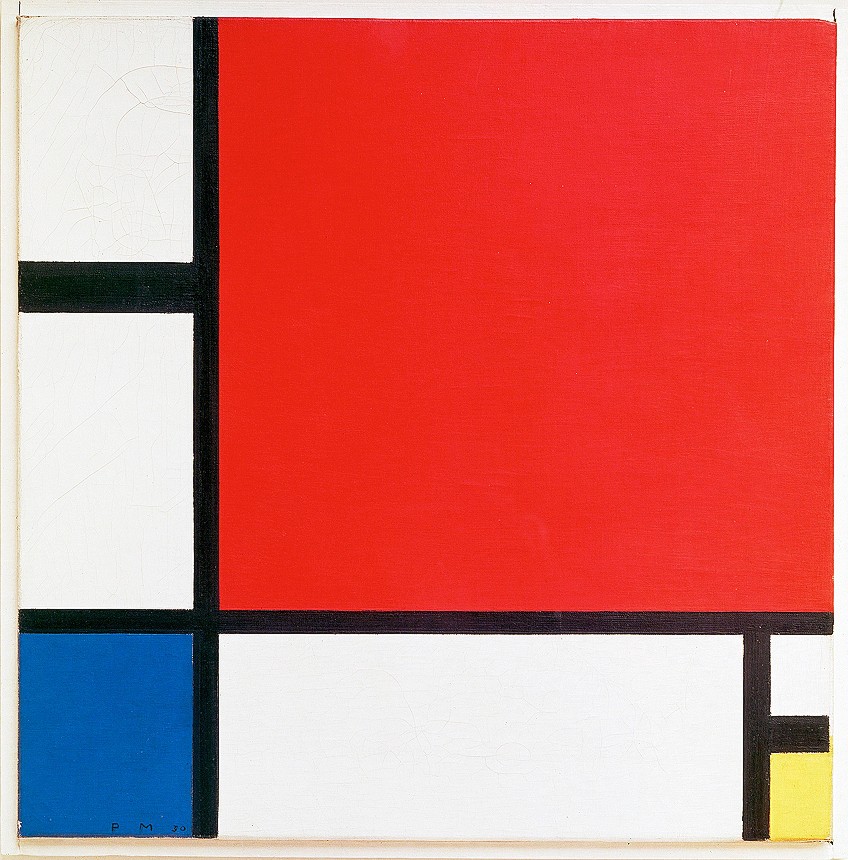
Famous American artist, Cy Twombly is well-known for his Abstract Expressionist artworks composed of carefully curated gestures of color, scribbles, and drips. Other great examples of primary colors in art are works by Piet Mondrian, Mark Rothko, and Pablo Picasso. Twombly makes use of notation in conjunction with symbolic romanticism.
Summer Madness (1990) is a perfect example of the use of primary colors (red and yellow hues) to produce an abstract expression of “madness” and frenzy with short, quick scribbles.
The significance of color in art can be attributed to its use and intention by each artist. From the examples above, you can observe that color in art serves different purposes and the translation of color for meaning-making goes hand-in-hand. Color as an art element is not only external to our experience of art but is also a biological channel through which one can form an appreciation of art.
Frequently Asked Questions
What Is Color in Art?
Color in art refers to the art element defined by three properties: hue, value, and chroma.
What Is the Importance of Color as an Art Element?
As an art element, color is important for understanding the emotional intention behind an artwork and is also a significant element used across design and advertising to evoke a response from the viewer through different color schemes.
What Are Cool and Warm Tones?
Cool tones, also called cool colors are made up of the hues blue, green, and purple. Warm tones are made up of colors associated with warmth such as red, orange, and yellow. These hues may vary in shade and intensity.
How Many Colors Can a Human See?
The human eye can register approximately 100 color shades with an estimated one million colors.
Jordan Anthony is a Cape Town-based film photographer, curator, and arts writer. She holds a Bachelor of Art in Fine Arts from the University of the Witwatersrand, Johannesburg, where she explored themes like healing, identity, dreams, and intuitive creation in her Contemporary art practice. Jordan has collaborated with various local art institutions, including the KZNSA Gallery in Durban, the Turbine Art Fair, and the Wits Art Museum. Her photography focuses on abstract color manipulations, portraiture, candid shots, and urban landscapes. She’s intrigued by philosophy, memory, and esotericism, drawing inspiration from Surrealism, Fluxus, and ancient civilizations, as well as childhood influences and found objects. Jordan is working for artfilemagazine since 2022 and writes blog posts about art history and photography.
Learn more about Jordan Anthony and about us.
Cite this Article
Jordan, Anthony, “Color in Art – Explore Different Examples of Color in Art.” artfilemagazine – Your Online Art Source. August 24, 2022. URL: https://artfilemagazine.com/color-in-art/
Anthony, J. (2022, 24 August). Color in Art – Explore Different Examples of Color in Art. artfilemagazine – Your Online Art Source. https://artfilemagazine.com/color-in-art/
Anthony, Jordan. “Color in Art – Explore Different Examples of Color in Art.” artfilemagazine – Your Online Art Source, August 24, 2022. https://artfilemagazine.com/color-in-art/.


