Ochre Color – Exploring Different Shades of the Ochre Color Palette
Our history with color palettes spans eons, and goes all the way back to the precursory periods of early man. Since the very beginning, it has been the earth color palette that has permeated and dominated as one of (if not the) most popularly utilized palettes in the world. One of the most commonly used examples of a color from the earth tone palette is called ochre, the subject of today’s article. If you want to learn a bit more about this fascinating color, join us as we dive into the topic.
Contents
What Color Is Ochre?
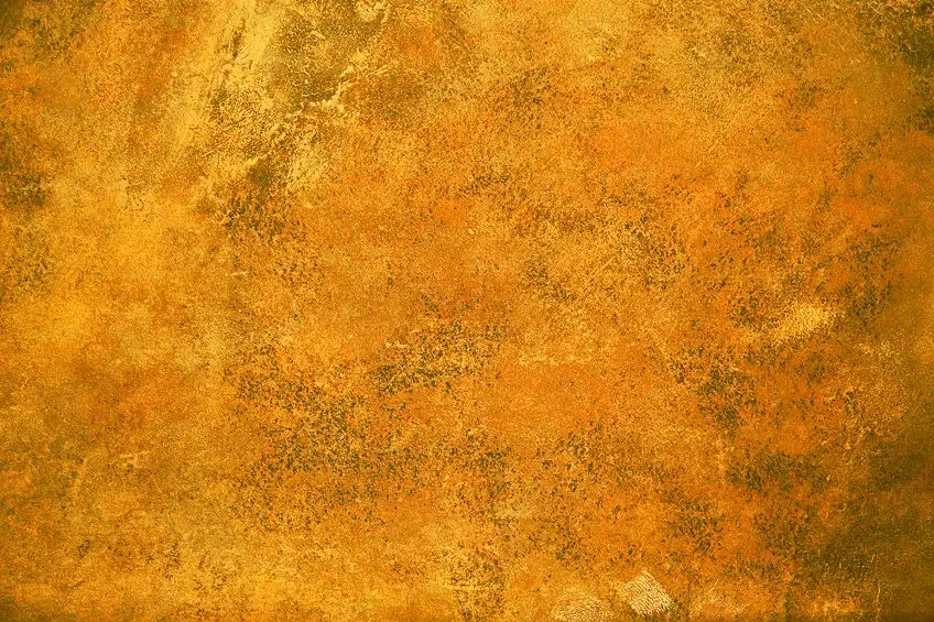
Ochre as a color we work with in art and decoration was originally derived from ground-based earthy minerals such as clay and iron-oxidized sand, the latter of which is also commonly referred to as ferric oxide. Hence, the shade spectrum of ochre encompasses a variety of brown, yellow, and red tones. If you are well versed in your color theory, you might know this indicates that ochre is considered a warm color best described as a yellowed brown.
This, however, is by no means a comprehensive definition for the color since there are numerous pigment varieties that contain higher volumes of hematite, a mineral similar in chemical composition to rust, that boast more of a red undertone than anything else.
To differentiate between these two versions of the color, we refer to them as yellow ochre and red ochre respectively.
Yellow ochre occurs naturally more commonly and contains iron oxide minerals that have been hydrated. To produce red ochre, you can heat up yellow ochre until it has been dehydrated. Other shades of ochre do exist, though. For instance, there are shades that have golden and brown undertones as well. In the modern era, synthesized iron oxide is used to produce pigments of ochre. These paints are available in both acrylic-based and oil-based varieties.
| Shade | Ochre Hex Code | RGB | CMYK (%) | Color |
| Ochre | #cc7722 | 204, 119, 34 | 0, 42, 83, 20 |
A Short History of Ochre Color
As aforementioned, ochre is one of the earliest colors to have joined the palette of pigments we humans use in art and decoration to this day. The oldest examples of ochre being used in art, for example, can be found in Sub-Saharan African cave paints that date back thousands of years ago. Back then, the color was produced through the use or combination of ochre, sienna, and umber minerals.
We can also find more cave-dwelling evidence of ochre being used in art in both France and Spain. This is the case for both red and yellow ochre.
Shortly after the turn of the 21st century, archaeologists discovered stone and shell tools within the Blombo Cave located in Cape Town, South Africa. Through forensics, they were able to deduce that these were implements that were once used to toil animal bones and ochre minerals together to produce the pigment used to produce this color. The most common uses for ochre back then were to paint cave walls, skin, and many other objects both decorative and utilitarian.
Besides African art, this paint was also used frequently by the Aboriginals in Australia. To this very day, the history of this color within Australia is celebrated annually during the Red Ochre Award ceremony, which was established as a means to recognize and laud the accomplishments of the country’s top indigenous artists. The color was also used extensively in Ancient Egypt where it proved itself as a symbol of eternity, life, and well-being.
The women of Ancient Egypt applied red ochre in much of their cosmetics, primarily as rouge or as lipstick.
Beyond that, the color was used to paint the interior walls of their burial tombs. In one of Canada’s provincial regions, a region called Newfoundland, ochre was a color used frequently by the Native American tribes of the Beothuk. Similarly to a number of indigenous African cultures, the Beothuk applied grease mixed with ochre pigments to their bodies as part of their traditional rituals. During the lengthy period of time that was the classical era, red ochre was most primarily sourced from the Mediterranean region known as Pontus Euxinus, located in the Pontine City of Sinope along the Black Sea in what is now modern-day Turkey. The pigment’s high demand made its cost price quite high and its availability was carefully regulated.
Even its packaging carried a fair degree of austerity, going so far as to be branded with a special seal.
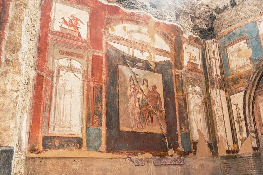
During the era of antiquity as well, yellow ochre was used widely by the Romans in their paintings, decorations, and murals. Its popularity among Roman artists was on account of how similar the color is to gold. Second to this, the color also closely resembled the appearance of sun-kissed skin and was thus often used to paint human subjects. Additionally, yellow ochre was a popular color used in the backgrounds of paintings. Before its tragic demise, the volcanic city of Pompeii boasted many murals containing yellow ochre.
During the time of the renaissance era, red ochre saw frequent use in all sorts of art mediums, including but not limited to drawings, frescos, paintings, and tempera. A key contributing factor to its popularity had to do with how effectively it could blend with other popular colors of the time and how many natural shades it could produce.
To produce the many shades of ochre that were available, ochre was mixed with a variety of minerals and combined with a linseed oil base.
These shades were very prominent in the workings of Rembrandt. His famous Self Portrait (1659), for example, was produced using a wide variety of ochre shades. The Little Street (1657–1658) by Vermeer also involved a lot of red ochre in its palette. Being the shade of Tuscany’s plastered walls, red ochre saw frequent use in the backgrounds of its artists’ paintings.
Ochre Color Symbolism
Ochre color, as we have addressed, is a warm color hailing from the earthy palette. Too many and for most of history, the ochre color symbolizes fertility, well-being, eternity, and vitality. Across the board throughout many independent cultures throughout history, the color ochre had much ritualistic significance.
Red ochre, in particular, was used as a means to symbolically reference prey’s blood in hunter-gatherer cultures.
As for yellow ochre, its strong color bias towards the primary color from which it derives its namesake saw it symbolizing the golden elements of light and the sun. In terms of its semiotic connotations, the color lives in duality. It is not only often used to represent optimism and vigorous youth but is also applied as a means to represent cowardice in many cases. Yellow ochre color is very good at grabbing the eyes of the observer, but too much of it can tire out the mind.
Shades of Ochre
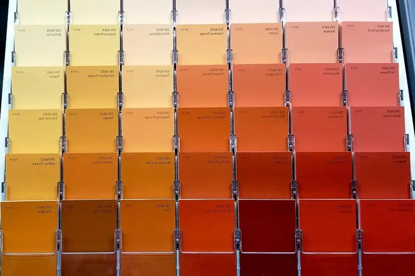
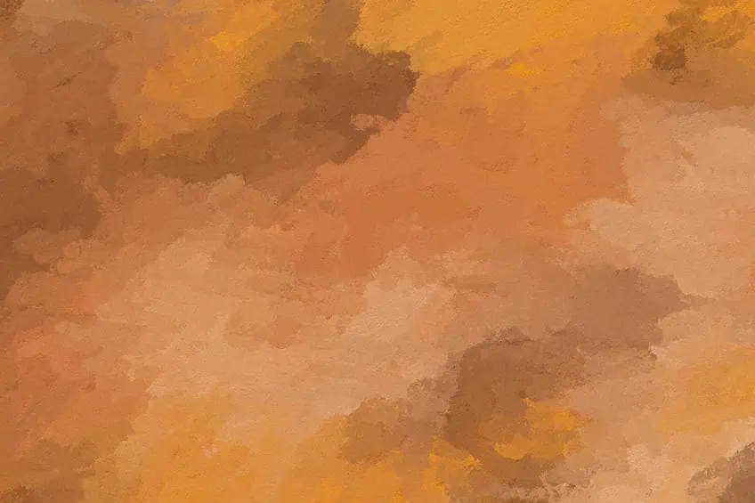
As is the case with every color in the visible light spectrum, ochre comes available in a wide number of tones, shades, tints, and hues. The degree of variance between the shades of ochre shifts between the brownish, lighter yellows all the way to dark browns and even goes so far as to include shades with gold, purple, and red undertones. If we are talking about genuine ochre pigments derived from natural minerals, the yellow bias present comes on account of the iron oxide particles within.
Following the advent of RGB digital color technology, however, we now have access to an even greater wealth of shade options
Although we simply cannot cover every single one of the many shades of ochre in this article alone as this would be an insurmountable task, what we can do is run through some of the more common examples thereof. Down below, you will find several popular examples of shades from the ochre color palette along with their hex codes, RGB color codes, and CMYK percentages.
Yellow Ochre
First things first, let us discuss the original pigment from which the rest of the ochre color palette is derived. Yellow ochre, as aforementioned several times prior, occurs naturally and is extracted from clay deposits found within the earth. Its now-famous pigment comes from the hydrated iron oxide, known as limonite, present among other minerals within the clay.
The etymology of the word ochre itself comes from the term ochros, a Greek word meaning either yellow or pale yellow.
Whether it be for painting pigments or dye, yellow ochre has seen an immense amount of use in art and decoration for centuries upon centuries. The natural yellow ochre pigment also boasts several utilitarian purposes as well, as it can be used as an additive in cement or as a catalytic element in numerous chemical processes.
| Shade | Ochre Hex Code | RGB | CMYK (%) | Color |
| Yellow Ochre | #edb525 | 237, 181, 37 | 0, 24, 84, 7 |
Red Ochre
Symbolizing life, blood, and fertility in many primeval cultures, red ochre saw frequent use in ancient societies from both Africa and Europe. The primary component of the natural material that gives us that iconic red-brown is the hematite present in its composition. This occurs either naturally through the process of weathering or the manual dehydration of the material.
The amount of redness in the pigment rises proportionally to the volume of hematite present. The hotter and more tropical the climate, the faster the ochre color will redden, hence its greater abundance in coastal regions along the equatorial belt.
In the past, red ochre was a popular pigment used to paint the body. This was not done in an entirely ritualistic sense as red ochre has some utilitarian advantages as well. For instance, it can protect the skin against sun damage and repel insects.
| Shade | Ochre Hex Code | RGB | CMYK (%) | Color |
| Red Ochre | #913831 | 145, 56, 49 | 0, 61, 66, 43 |
Brown Ochre
Belonging to the same net of naturally occurring shades in the ochre color palette, brown ochre is produced under similar circumstances as the priorly discussed shades. The factors affecting the pigmentation of brown ochre include its mineral content, degree of oxidation, and levels of hydration. When partly hydrated, the iron oxide produces manganese oxide, which gives the pigment its brown color. It is often described as either being a brown shade or a darkened shade of orange.
| Shade | Ochre Hex Code | RGB | CMYK (%) | Color |
| Brown Ochre | #99632b | 153, 99, 43 | 0, 35, 72, 40 |
Burnt Ochre
Describable as a modest red, dark orange, or a brown, it is primarily a combination of the first two colors. Despite its similarities to the color brown, the shade is more closely associated with reds and oranges than anything else. Traditionally, the shade is acknowledged as an orange with a strong bias towards red.
| Shade | Ochre Hex Code | RGB | CMYK (%) | Color |
| Burnt Ochre | #bb4f35 | 187, 79, 53 | 0, 58, 72, 27 |
What Color Is Ochre Best Paired With?
Let us now discuss the colors that go with ochre. If you want to add some stunning earth tones to either your artwork or living space, look no further than the ochre color palette. But, with what color is ochre paired well? Well, ochre shades are typically best paired with purples, burgundies, blues, cooler grays, and pretty much most natural and neutral colors. Ultimately, however, this is dependent on the shades of ochre you choose to work with since they vary from yellow to red.
| Shade | Ochre Hex Code | RGB | CMYK (%) | Color |
| Ochre | #cc7722 | 204, 119, 34 | 0, 42, 83, 20 | |
| Strong Blue | #2277cc | 34, 119, 204 | 83, 42, 0, 20 |
Your choice of ochre colors to work with should always be guided by an understanding of color theory. That is, the aesthetic relationship between ochre and other colors on the wheel. To fully understand the colors that go with ochre, you should brush up on this theory
You would do yourself a lot of favors by getting to know your color wheel.
Learning about the various color schemes in which ochre colors work, for example, is a great way in which to figure out how to work with this color. We are going to give you three examples of traditional color schemes that you can plug ochre shades into to find a palette that works well with balanced aesthetic values:
- Complementary colors: These colors, when paired, always produce the strongest degree of contrast conceivable for either color.
- Monochromatic colors: By combining colors adjacent to one another on the color wheel, you can produce a beautifully homogenous gradient among similar shades, tones, hues, and tints.
- Analogous colors: If they are located in close proximity to each other on the color wheel, they can be combined in a palette to produce a stunning gradient.
How to Make Ochre Color Using Acrylic Paints
Ochre pigments and acrylic bases are both non-toxic, making acrylic-based ochre paints ideal for painting with the lowest likelihood of compromising your well-being. The surface area coverage of ochre pigments is also impressive, to say the least. The degree of variance between shades of the “same” ochre pigments is wide considering the different climatic conditions of the areas wherein the pigments are mined. If you want to know how to make ochre color, this section is for you. Hence, we recommend that you maybe consider using the synthetic varieties sold worldwide instead. Not only are they cheaper but they also produce the same shade every time.
If you want the natural pigment of ochre, however, look out for the color index name called PY-43 on the labeling of the paint.
If you have a proclivity towards Plein air painting, you also have the option to use yellow ochre as either a background color or to stain your canvas. Since ochre is a natural earthy color regardless of its shade, it usually works excellently as a landscaping color in painted works of art. Its redder shades can also be used as a means to depict the color of flesh. If you mix in a bit of lead white, you can also create various skin tones.
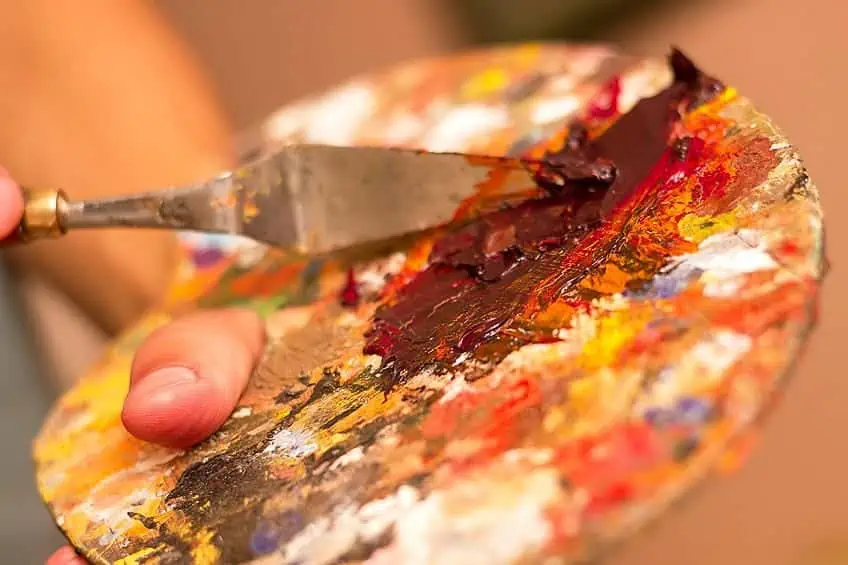
If you would like to create your own shades of yellow ochre, you could start with a base of cadmium yellow. You can then begin to introduce a sprinkling of red to heat up the temperature and darken the shade. You can then desaturate the mixture with a little bit of blue, which will also darken the shade even further. You can play around with these variables until you have created your perfect shade of yellow ochre for whatever task you are busy with.
You can also create ochre through a combination of green, white, and orange.
Start by taking some orange and applying it to your palette. Next, you can mix in a bit of green until you are left with a color close to brown. You can then start adding a small amount of white, which should achieve an ochre color. feel free to play around with these variables until you find the color of ochre you were hoping for.
Shades of Ochre in Interior Design
Ochre sits alongside colors like umber and sienna in the list of the most versatile earth colors within its palette. If you want to work with a less obtrusively bright shade of yellow, you should consider using the ochre variant. During the 70s, yellow ochre saw a massive rise in popularity alongside colors such as the avocado shade of green.
But, as we have discussed, ochre has been popular for as long as humans have known how to produce paint using natural pigments.
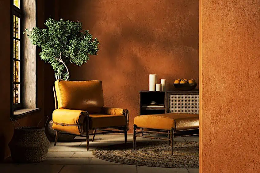
Shades of ochre afford any space a degree of comfort and palpable sophistication, regardless of which room in the household you choose or its size. If you want to achieve that rustic Tuscan look within your household, look no further than the ochre color palette. You need not even paint the walls of your house to achieve this effect since you could instead introduce ochre into the palette of your household through other means, such as by adding a throw rug or pieces of furniture and décor carrying the color.
In terms of pairing ochre with other colors within your living space, look towards adding whites and grays as they tend to pair the best. Just be sure to veer toward the lighter shades of gray as the darker shades tend to subdue the earthy tones of the ochre. Alternatively, browns and blacks pair exceptionally well with ochre too. Shades of blue such as teal also pair well with ochre for high-contrast, stimulating palettes. If you are working with yellow ochre, consider pairing it with a purple color to strike up a remarkable contrast that is sure to catch eyes.
Ochre is a color as old as art itself and any aspiring artist would do well to learn how to master it. From cave paintings to the timeless works of the Masters, ochre has solidified its position as one of the most distinguished colors at our disposal. We hope that this article has enlightened your understanding of the color, its shades, its meaning, and how best to use it in a variety of contexts.
Frequently Asked Questions
What Are the Colors That Go With Ochre?
Ochre’s most common pairing is with grays. Neutral colors in general, however, should mix well with ochre. The same goes for most natural and earthy colors as well. Ranking high on the list of potential pairings is blues and purples as well. More popular pairings also include yellows and greens.
What Color Is Ochre?
Ochre can be described as an earthy color. This can range from shades of yellow, all the way to brown and red. You can, however, find shades of ochre that lean heavily toward the color purple.
What Is Ochre’s Relationship With Interior Design?
The color ochre has seen extensive use in not only art, but also in both interior and exterior design. It boasts a wealth of versatility and has a broad number of shades to choose from. More recently, the popularity of ochre in interior design has skyrocketed.
Megan is a writer and researcher who holds a degree in Social Sciences, with a specialization in Psychology and Environmental Science, from the University of Cape Town. Her dedication to acquiring knowledge and making a positive impact has driven her current work in promoting conscious and sustainable growth in Southern Africa. Megan’s interests encompass exploring the physical and psychological impacts of color in our environment on our mood and well-being. She is also passionate about the role of art and creativity, which has been an integral part of society since the beginning of human history. Since 2022, Megan has been contributing blog posts on painting and color theory at artfilemagazine.
Learn more about Megan van Schoor and about us.
Cite this Article
Megan, van Schoor, “Ochre Color – Exploring Different Shades of the Ochre Color Palette.” artfilemagazine – Your Online Art Source. April 4, 2023. URL: https://artfilemagazine.com/ochre-color/
van Schoor, M. (2023, 4 April). Ochre Color – Exploring Different Shades of the Ochre Color Palette. artfilemagazine – Your Online Art Source. https://artfilemagazine.com/ochre-color/
van Schoor, Megan. “Ochre Color – Exploring Different Shades of the Ochre Color Palette.” artfilemagazine – Your Online Art Source, April 4, 2023. https://artfilemagazine.com/ochre-color/.


